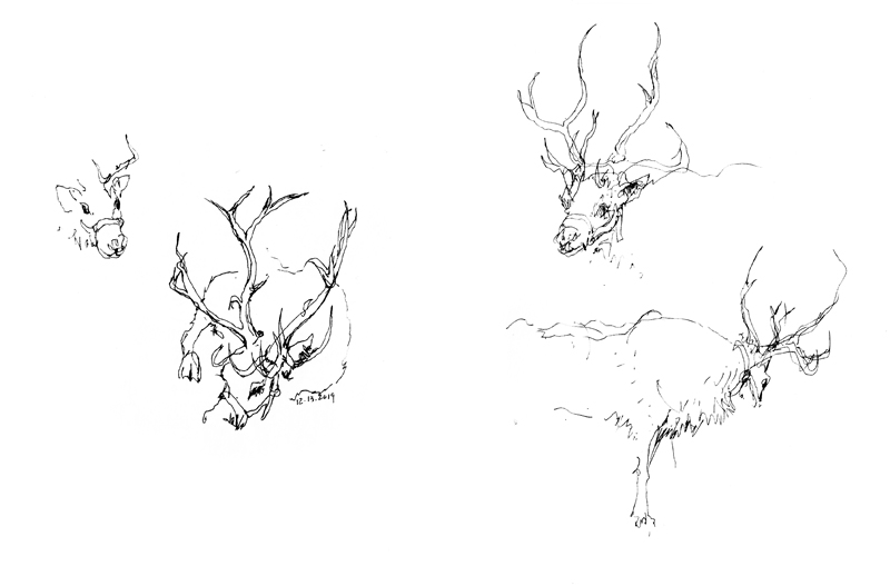
Visiting Swansons Nursery’s annual Reindeer Festival last week, I drew a few vignettes of the featured stars, Dasher and Blitzen. These incomplete views had to be done quickly because of the reindeers’ constant moving about. This exercise reminded me of how drawing from observation sharpens our visual acuity and helps us notice often subtle traits or characteristics. For example, I had always assumed that deer antlers grew symmetrically, but these reindeer had antlers that were not symmetrical at all. In doing some research, I came upon what biologists call fluctuating asymmetry in deer antlers, which can be caused by a variety of genetic and environmental stresses. In addition, these reindeer had a multipronged tine extending over their foreheads on one antler but not the other. This extra blade was supposedly used as a snowscraper!
Category Archives: Visual Thinking
Santiago de Querétaro II
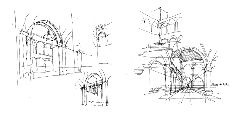
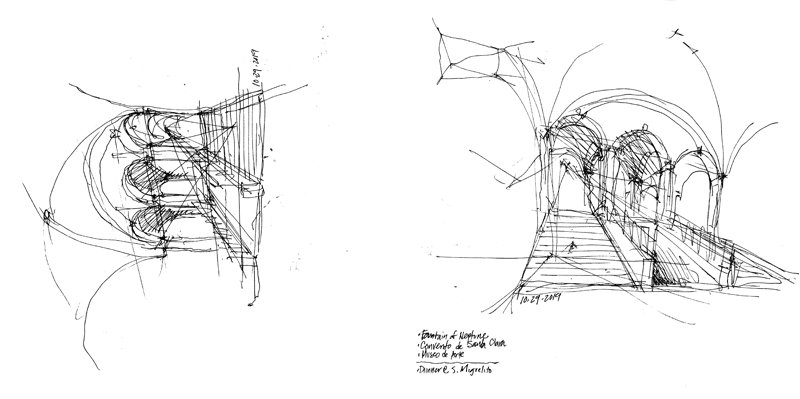
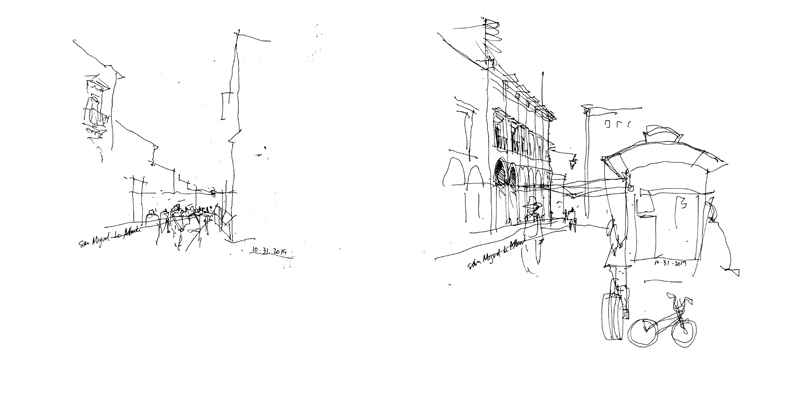
Another set of demonstration sketches from my recent workshop with Monterrey Tec students in Querétaro. It is always enlightening to stand or sit with individual students, view a scene together, and demonstrate the process of developing the basic structure of a drawing.
DeConstructing the Viaduct: Part II
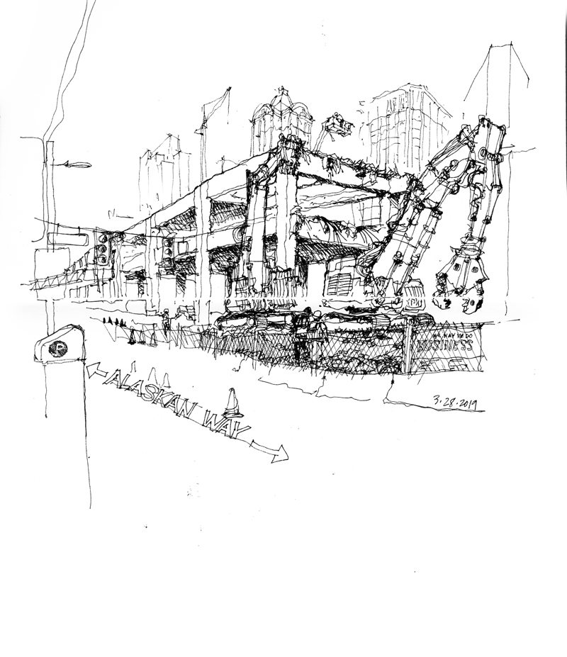
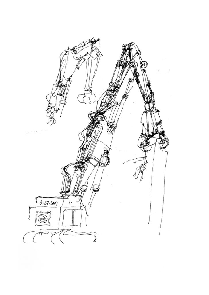
It was somewhat difficult to capture these giant machines as they were moving and munching away at the elevated concrete structure. What I should have been more careful of was establishing the position of the machines’ armatures in such a way that it was clear what was machine and what was concrete structure. The way the forms overlap in the above view makes this distinction a little too ambiguous.
Positive and Negative
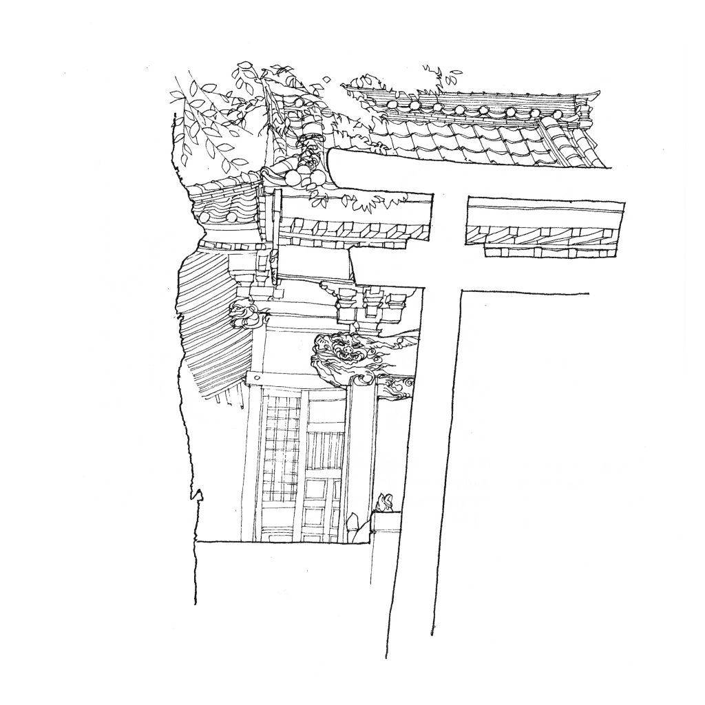
Still waiting for the opportunity to draw the upper level of the Alaskan Way Viaduct being broken through. In the meantime, here is a drawing done in 1990 of a shrine in Jiyugaoka, a small town west of Tokyo. The composition consists of an interplay of positive and negative shapes and spaces, which interlock to form a unified image. In one instance, we can discern the edge of a tree trunk on the left and the outline of a torii on the right. At the next moment, we can focus on the details of the shrine itself as seen between the white spaces in the foreground.
Composing Possibilities
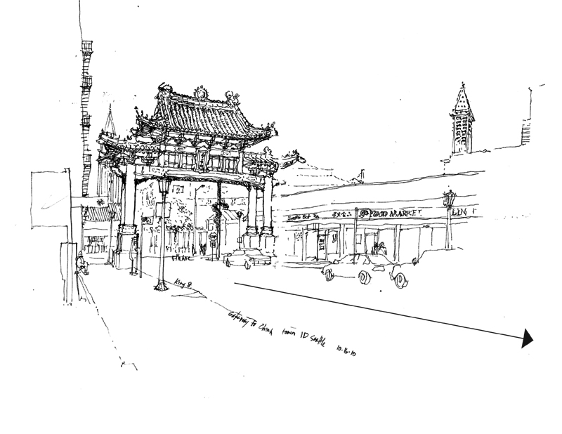
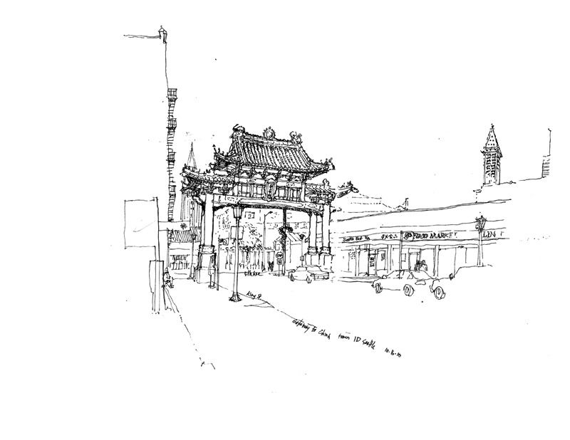
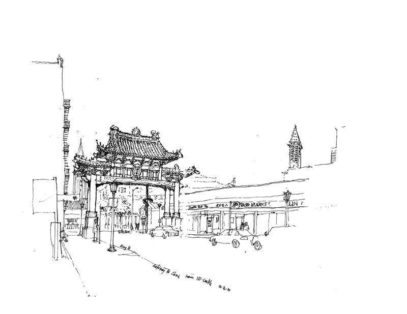
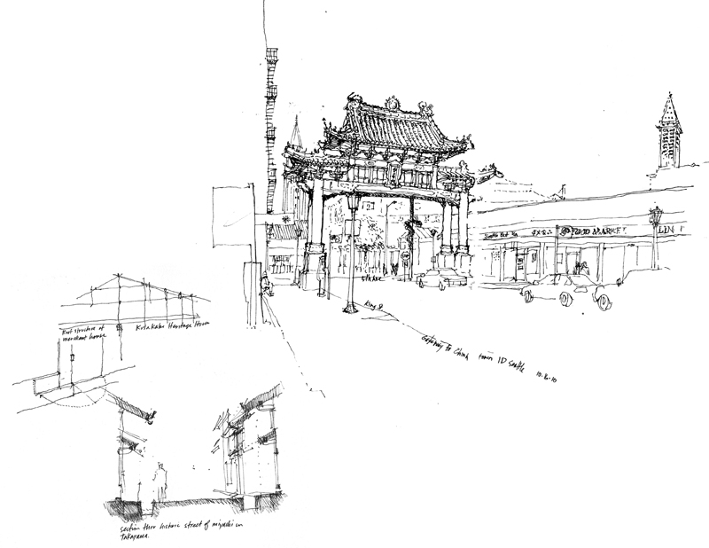
The Chinatown gateway in the last post is a good subject to use in illustrating how placing the focus or principal subject of a drawing on a page affects drawing composition. I tend to see that certain subjects, such as the gateway, have a directional aspect to them. They face a certain way and project visual energy in that direction. So in placing such subjects, I use white space to absorb that energy.
Here are two other possibilities for placing the gateway on a page.
Of course, if the gateway is not the only drawing on a page, then other elements can be used to rebalance the drawing composition.
Planes of Focus
Looking out at a scene, whether it be an interior space or a public square, we can usually discern three zones of depth—what is near to us in the foreground, what is in the middle ground, and what lies beyond, in the background. As we scan what lies before us, both at what is near and what is farther away, our eyes are capable of focusing and refocusing extremely fast, making it seem that everything is in focus all of the time.
But to convey a sense of space and depth—spatial depth—on the page, an effective graphic means is to treat each zone of depth differently. So we might, as in the first example above, treat the background with more emphasis and merely outline or suggest what lies in the foreground and middle ground, which we use to frame the view.
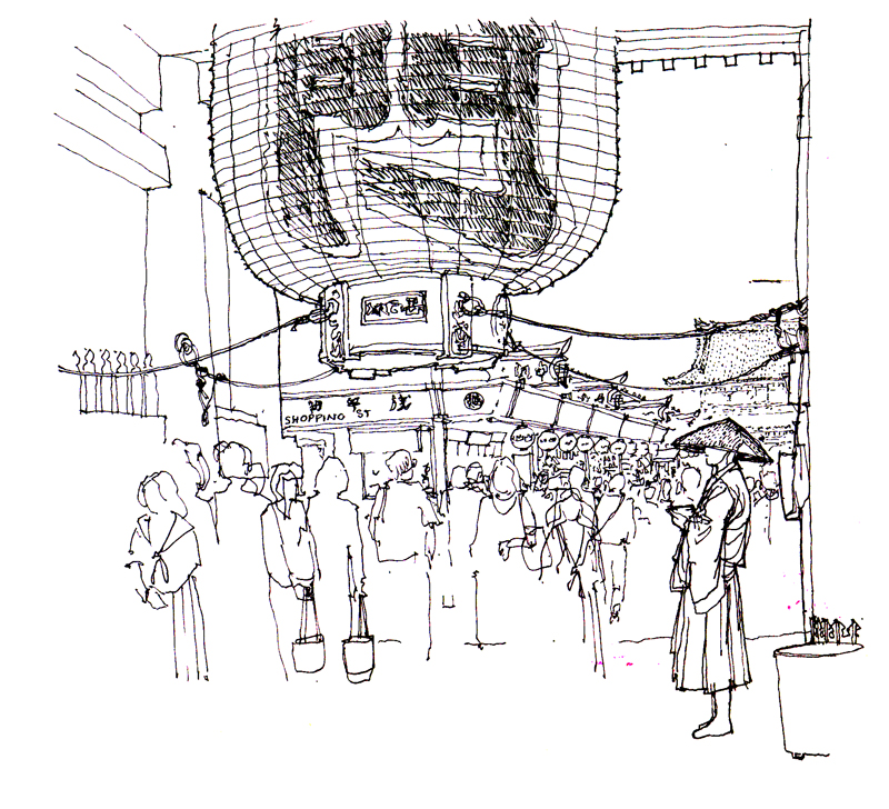
Or we can focus on what is in the foreground and blur or merely hint at what lies beyond, as in the view of Asakusa Temple in Tokyo above.
Or we can emphasize the middle ground and outline the foreground and fade out the background, as in the above view of New York City.
Beginning a Drawing
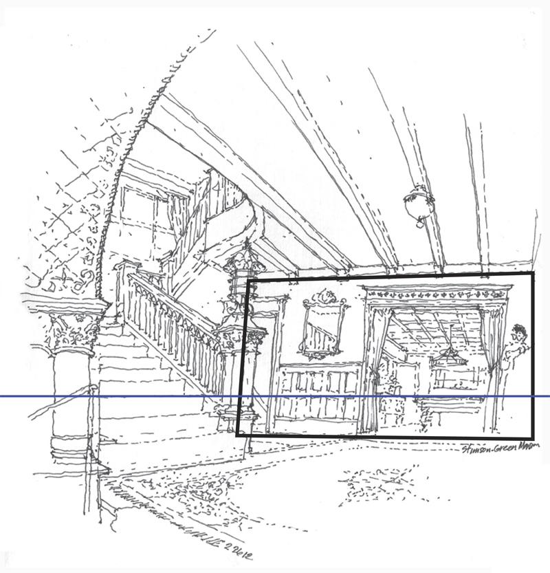
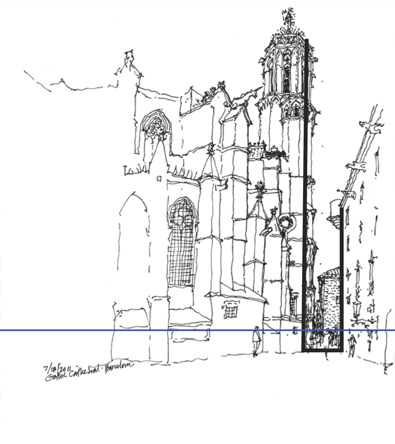
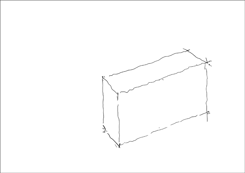
A question often asked is how to begin a drawing on location. Once we have selected a point of view and mentally composed the picture, one way to begin is to select a vertical plane in the scene, which can be the facade of a building or a wall of an interior space, and drawing this plane before delineating the horizon line—our eye level—relative to that plane.
It is important to properly size and locate this vertical plane relative to the page or sheet of paper to ensure that the entirety of the intended image will fit. If the initial plane is drawn too large, we may have to crop some of the intended image or worse, we might be tempted to alter the proportions of the scene to fit the page. Also, if the vertical plane is placed too far to the left or right, or too high or low on the page, the resulting composition may be distorted.
The initial vertical plane need not be a physical one. It can also be a virtual one, such as the cross section of a church nave or the width of a street.
More to come…
Drawing Composition
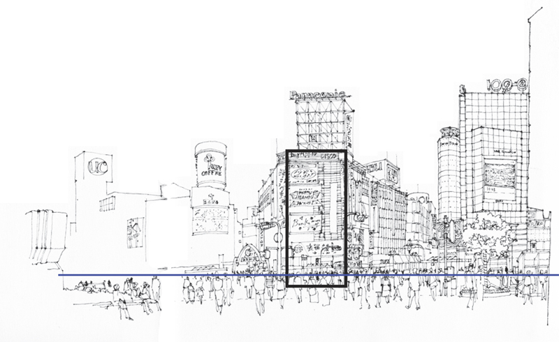
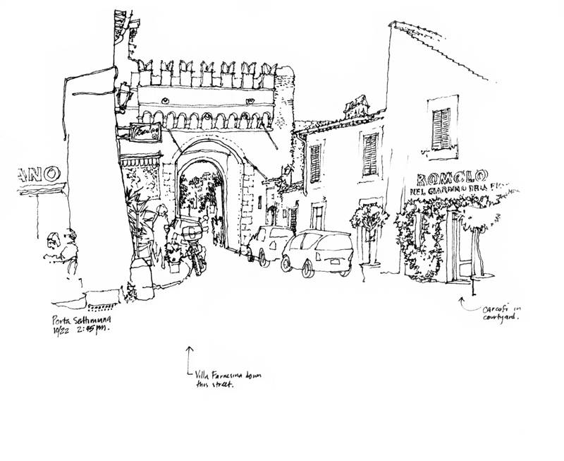
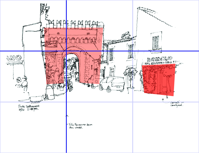
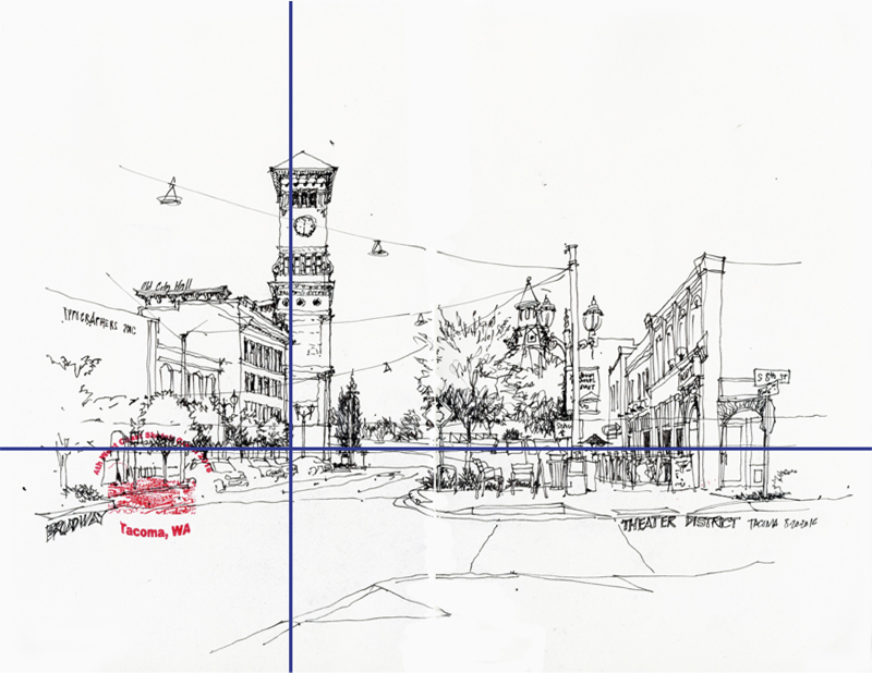
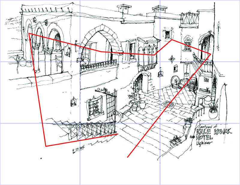
Once we have decided on the subject matter for a sketch and established a particular point of view, we turn our attention to framing and composing the view on the page. A useful guide about which I had posted five years ago is the rule of thirds. Many photographers are familiar with this strategy of divided the image field into nine equal parts with two equally spaced horizontal and vertical lines, and placing points of interest at any of the points of intersection or laying out important compositional elements along any of the horizontal or vertical lines.
Overlaying this grid of thirds onto the above drawing shows how the plane of the porta is placed at the upper left intersection and is balanced by the element on the right.
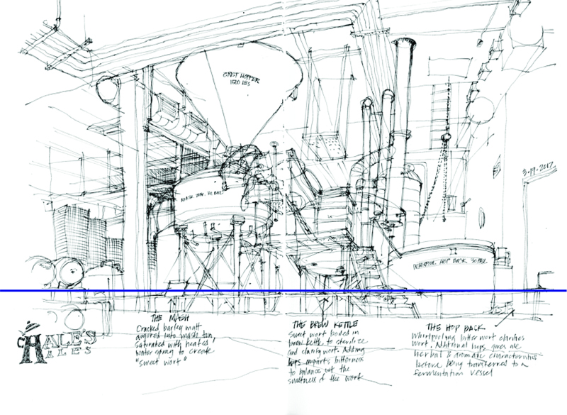
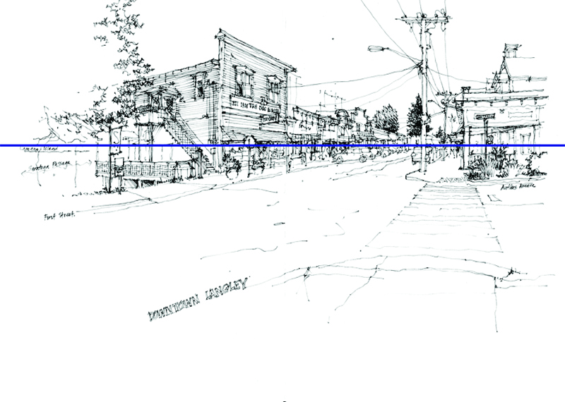
Here are two drawings, both of which use a horizontal line as the basis for the composition. One is along the lower third to emphasize the view upward while the other is on the upper third to show the foreground and convey a greater distance between the viewer and what is viewed.
In this drawing, both a horizontal and a vertical grid line serve to organize the urban scene.
Of course, the rule of thirds is not a precise method for placing compositional elements. Rather, the general idea is to place important points of interest off-center to create greater visual tension and more dynamic compositions.
And sometimes, the scene requires accommodating multiple centers of interest that draw the eye into and around a drawing.
Points of View
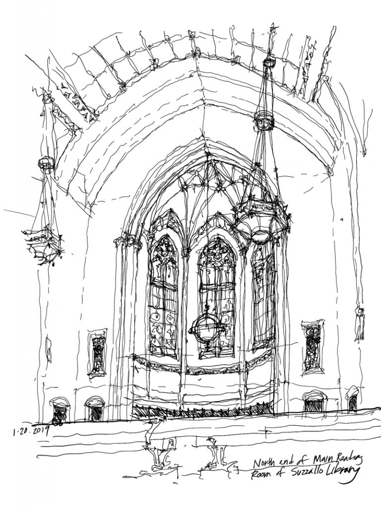
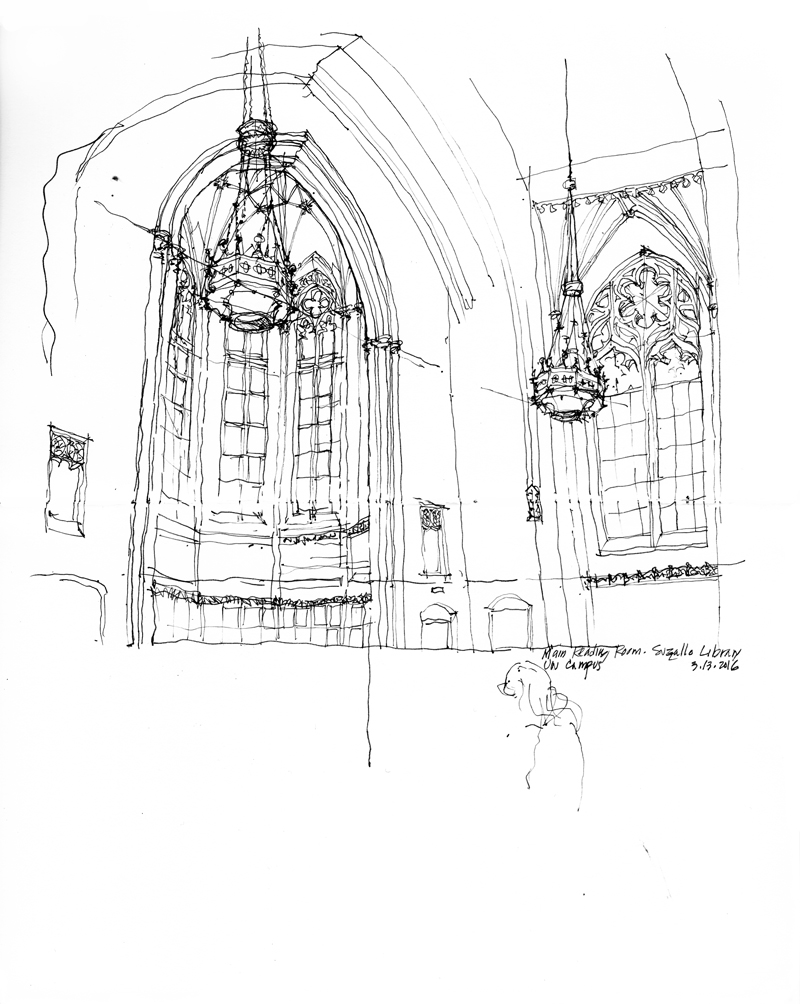
Once we have decided on the subject for a sketch—a scene, a building, or a fragment of a building—the next step is an important one in which we search for a vantage point from which to view and capture the subject. In so doing, we are in effect organizing the visual elements and focus of the drawing composition. Moving one way or another alters our viewpoint and thus the way the compositional elements relate to each other on the page.
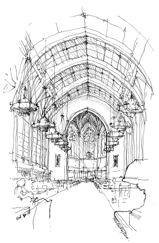
And so, deciding where to stand or sit should be more than a matter of convenience or comfort. Rather, it should be determined by the composition a particular viewpoint offers. To illustrate, here are three different views of the main reading room of Suzzallo Library on the University of Washington campus, a beautiful example of Collegiate Gothic architecture.
“Art does not reproduce the visible; it renders visible.” Paul Klee
Occasionally, I will be reposting items from my Facebook page, which I had used to illustrate my drawing activities from January 2010 to February 2012. This one is from June 2010.
The above quote brings to mind the distinction between the vast richness of our visual perception as we survey a scene and our limited ability to capture that richness in a drawing. So in sketching, rather than attempt to reproduce every detail exactly the way we see it, we should simply try to make what we perceive visible to others. We do this by remembering that all drawing is abstraction, editing what we choose to include in our drawing, and relying upon suggestion rather than replication.
For example, here are a few enlargements of a sketch I did of the Sannenzaka slope in Kyoto. The lines and shapes are barely recognizable as being representative of anything. But in the context of the whole drawing, it is convincing enough to suggest to the mind’s eye a scene that we recognize. The whole is truly greater than the sum of the parts.