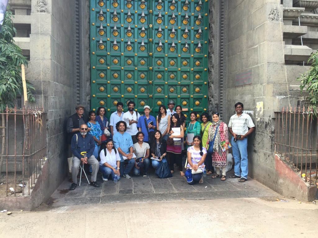
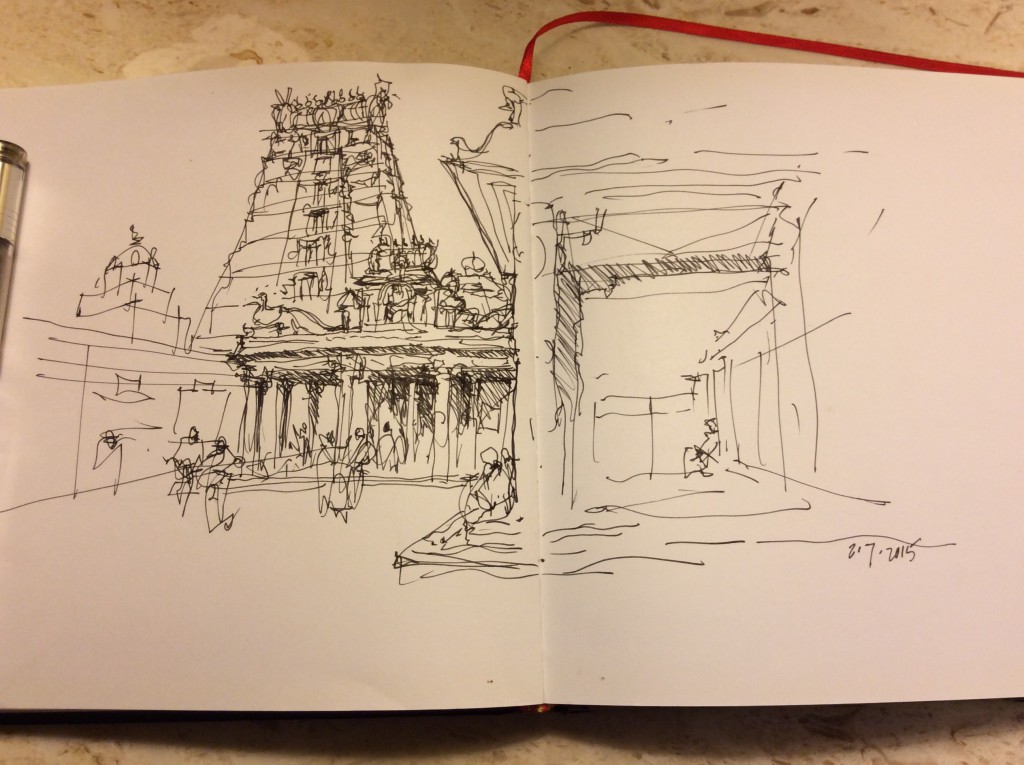
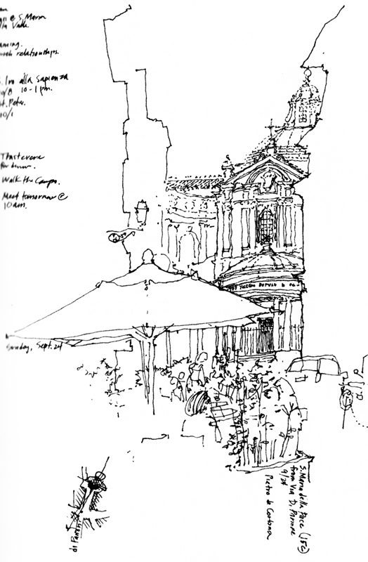
My second attempt at entering India was successful and we began the first of two days of a drawing workshop sponsored by the AARDE foundation. Many thanks to Xavier Benedict for hosting my visit and to the students and architects who persevered and returned to make this weekend possible. We began at the Luz Church, built in 1516, and then moved onto the 7th century Kapaleeshwarar Temple in the Mylapore neighborhood of Chennai. Here is the group in front of the main doorway and a quick study I did of the interior of the temple complex. The temple architecture is a difficult subject because of the multiple layers of sculptural details. The approach has to first establish the geometric framework that holds the details together. Tomorrow we head to Parry’s Corner to visit a prime example of Indo-Saracenic architecture.
Category Archives: Visual Thinking
Iconic Images
If we think of the Eiffel Tower, the Sydney Opera House, or the Chrysler Building in New York City, we can see the image in our head, even if we have never seen the real thing. It appears as though the stream of images we have seen in photographs and movies have been seared into our memory banks. And we might even be able to sketch reasonable facsimiles if asked to.
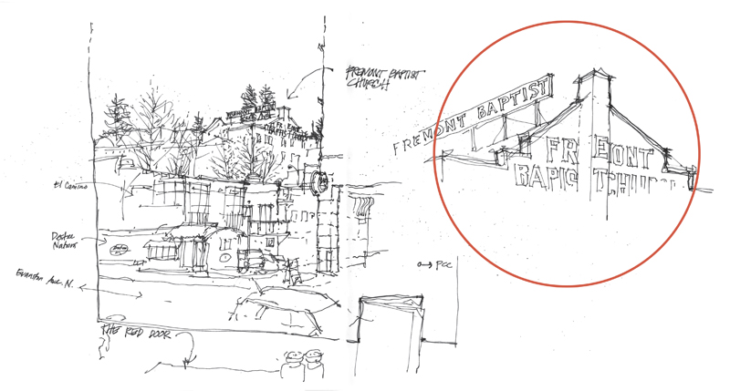
After we have visited a place several times, or lived near to, driven by, or walked past a place for a number of years, we might also form an iconic image of that place. A personal example is the Fremont Baptist Church, established in 1892 with the current brick building being constructed in 1924, perched on a hill above downtown Fremont in Seattle.
For me, this iconic image of Fremont has materialized over the years. Yet the image I hold in my mind’s eye does not correspond to what you can actually see from any position on the street. What seems to occur is that our mind is able to recombine the fragmented, partial views we’ve experienced into a single iconic, memorable image.
Evolution of a Drawing
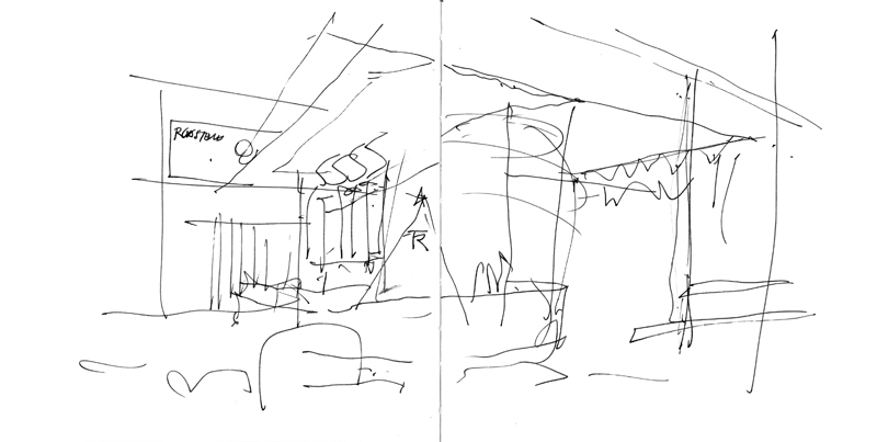
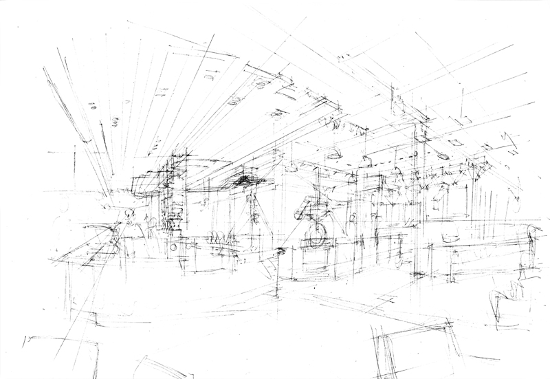
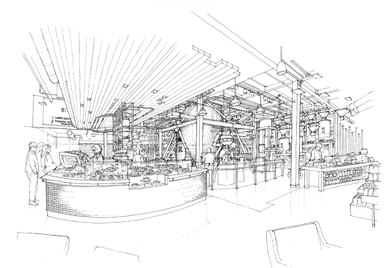
Few drawings are executed in a single pass. When drawing on location, my process usually involves first blocking out the overall structure of a scene before refining the forms, making adjustments, and filling in the details. And for studio work, the process becomes a little more involved. For example, for a drawing of the interior of the new Starbucks Reserve Roastery and Tasting Room in the Capitol Hill neighborhood of Seattle, there were three phases in the process. The first is a very quick study of the possible viewpoint. The second is a rough pencil layout of the final view submitted for approval. And finally, the finished ink-line drawing.
Surface and Depth
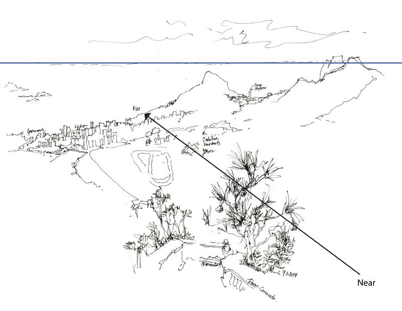
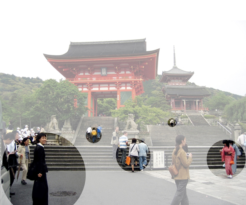
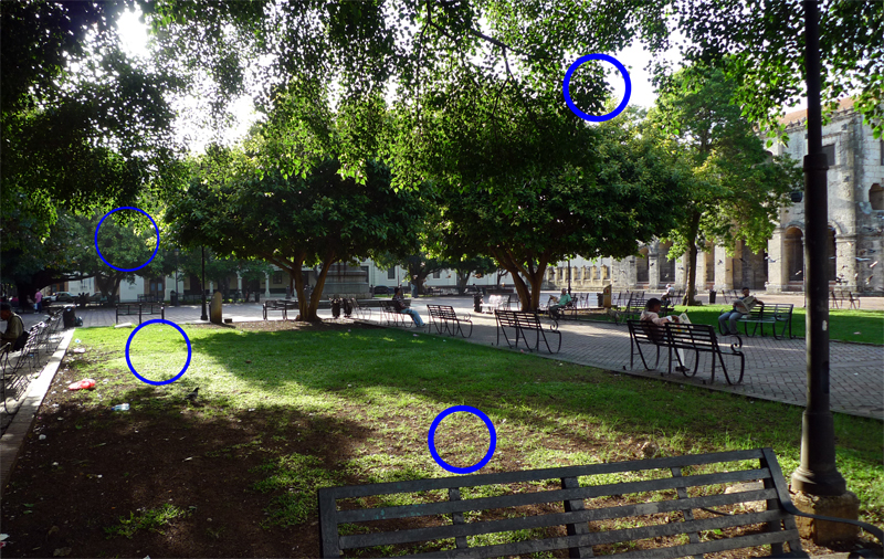
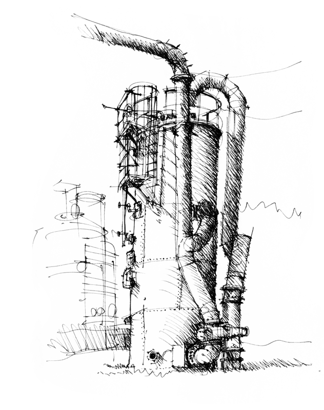
In the 1950s, the psychologist J.J. Gibson outlined a number of cues to depth perception. A few rely on our binocular vision and therefore do not apply to 2-dimensional drawings and paintings. Others, however, are psychological rather than physiological in nature. As such, these depth cues are pictorial in nature and are applicable to drawing and painting on a 2-dimensional surface. In the following, I try to use simple terms and snippets of my own drawings and photographs to illustrate each of the depth cues that I consider to be relevant to drawing on location.
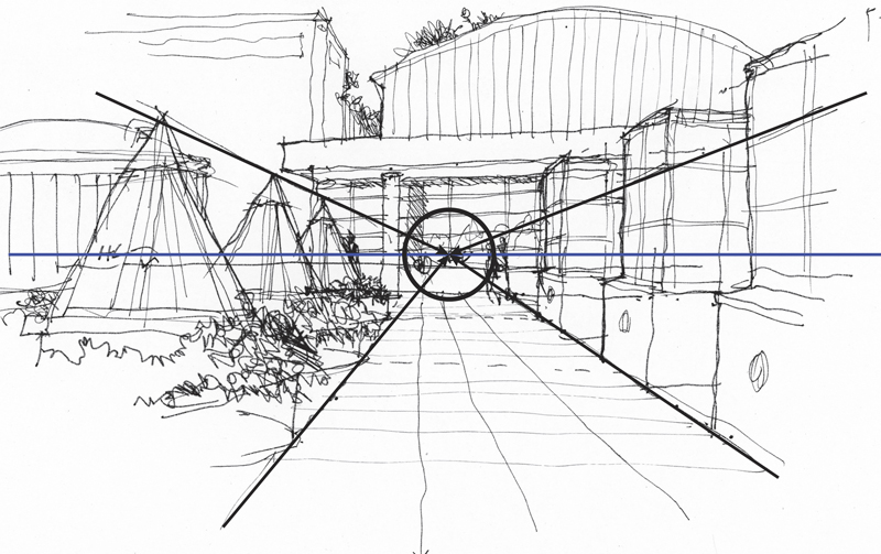
Convergence of parallels: This is a key characteristic of linear perspective in which parallel lines appear to converge as they recede into the distance. Despite the usefulness of the other depth cues, linear perspective remains the structural scaffolding upon which to build a sense of spatial depth on the page.
Overlap: Near objects overlap or partially block the view of objects farther away. Locating effective overlaps can be useful in selecting a viewpoint and composing a drawing.
Position relative to the horizon: Objects below our eye level rise toward the horizon as they recede; objects above our eye level descend toward the horizon as they recede.
Relative size: Objects known or assumed to be of similar size appear to shrink in size with distance from the observer.
Texture gradient: Surface texture appears to get finer and smoother with distance from the observer.
Shading and shadows: Contrasts in light and dark can convey the shape, form and depth of objects.
Aerial perspective: Particles in the atmosphere affects the color and visual acuity of objects at varying distances from the observer; distant objects appear grayer or bluer and less distinct than nearer objects.
As we can see, scenes more often than not comprise a number of these depth cues operating simultaneously. Seeing how these depth cues occur in our real-life perception can aid our understanding of why things appear as they do, counter to what we know of the things we draw, which are often in conflict.
Casa das Canoas
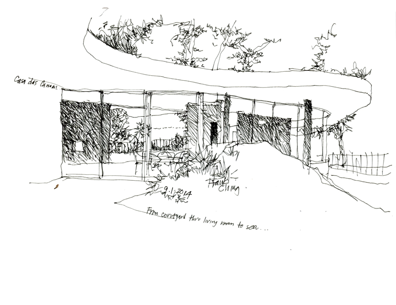
While in Rio de Janeiro a month ago, we had the opportunity to visit Casa das Canoas, the first residence designed by Oscar Niemeyer in 1952. It is a true gem, nestled in a beautiful hillside setting and displaying the characteristic flowing lines of Niemeyer’s architecture. Thanks to Caique Niemeyer, Oscar’s grandson, for allowing us the privilege of touring this fine example of modern architecture.
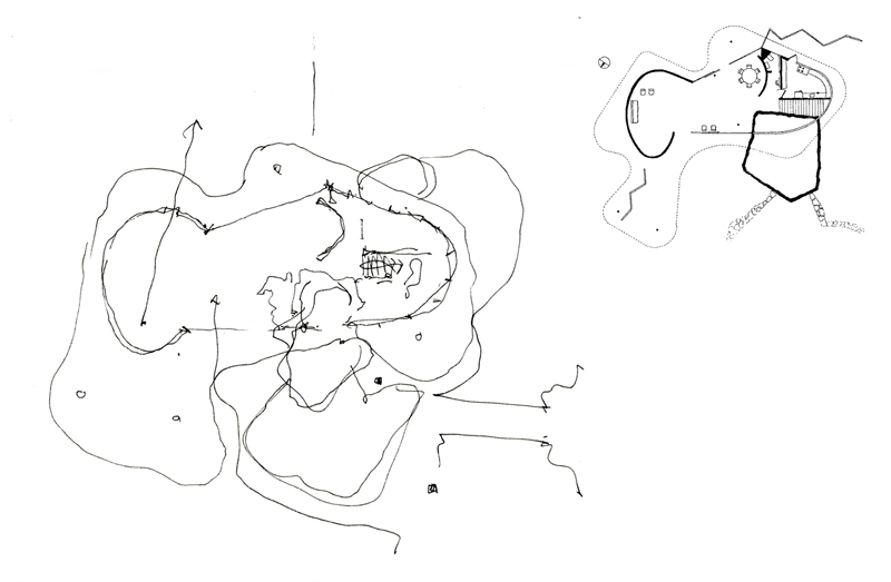
After doing a few sketches of the exterior and interior of the deceptively simple structure, I attempted to draw a plan to try to understand the two-dimensional origin of what I saw in three dimensions.
To verify my plan, I perused several books on the architecture of Oscar Niemeyer but none contained a plan of this house. Upon returning to Seattle, I did an internet search and found this plan drawn by Jeff Hottinger, which is included next to the plan I drew.
In this age of digital 3D modeling where much design thinking and decision-making is made from a perspective viewpoint, it is still a useful mental exercise to try to imagine the orthographic relationships that plans and sections reveal and which perspective views do not. As designers, we should be able to think two-dimensionally as well as three-dimensionally.
Negative Spaces
Along with a few fellow architect-volunteers from the community service committee of the AIA Young Architects Forum, I met this morning with a group of middle schoolers attending the Northwest School Summer Camp. Our task was to introduce some basic drawing concepts to the young students. My topic was negative space, a concept that is somewhat difficult to grasp, especially when translating the in-between spaces that we see in real life into the two-dimensional shapes we draw on paper. After the session, I remembered an animation that I had created a while back when I was conceiving of a ebook on drawing. Here is an unedited version of Seeing Shapes.
Keep in mind that it is often easier to see shapes in a photograph and more difficult to see them when drawing on location from direct observation.
Oratorio dei Filippini
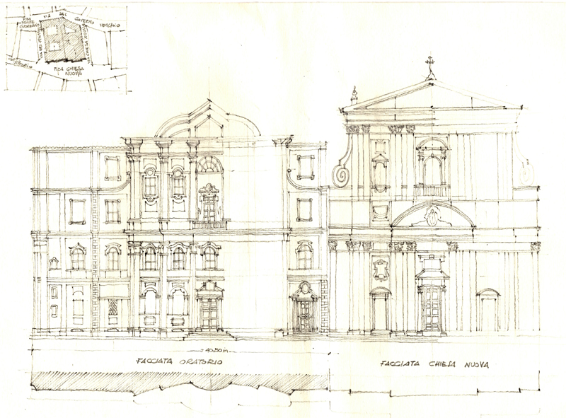
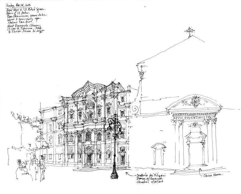
This measured drawing of the facades of the Oratorio dei Filippini (Oratory of Saint Phillip Neri) and the Chiesa Nuova (Santa Maria in Vallicella) in Rome was beautifully crafted by hand by Professor Emanuela Chiavoni of the Università Sapienza di Roma, who I met at the UID conference in Matera last year. Designed by Francesco Borromini and erected between 1637 and 1650, the Oratorio achieves a measure of strength and elegance not through decorative features but rather by careful proportioning and the use of opposing geometries, particularly of the interplay between the convex and the concave.
Professor Chiavoni executed this drawing as part of her Ph.D thesis and graciously presented it to me as a gift. The drawing shows the use of orthographic projection to objectively describe the formal and proportional relationships between the parts and the whole of a design.
Below is my drawing of the same facades that I had done while Professor Chiavoni accompanied me for an afternoon of sketching in Rome. These two drawings show the difference between the objective and perceptual descriptions of the same subject.
Black and White
With the rise of digital photography color has become pervasive, unlike the film era where black-and-white photography was prized for its confident and raw visual style. In the field of sketching, too, color sketches are often seen as richer and communicating more information than monochrome drawings, which many consider to be primitive and lacking emotion. Yet, utilizing a range of strokes, black-and-white sketches can express a wider range of feelings than one might expect…
from light and airy…
to dark and heavy…
from descriptive…
to illusory…
Architecture: Form, Space &, Order
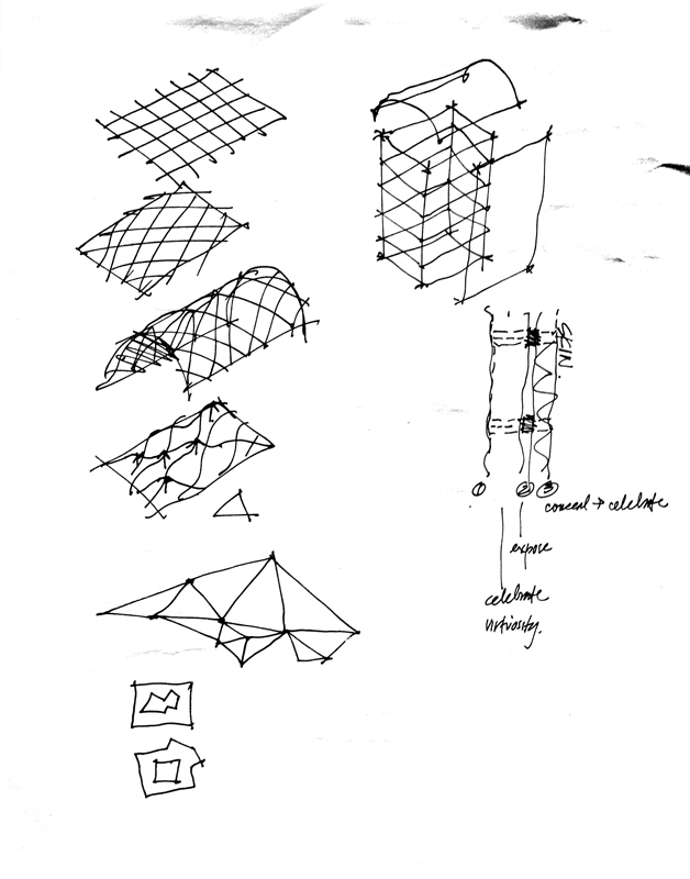
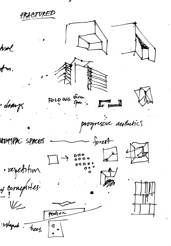
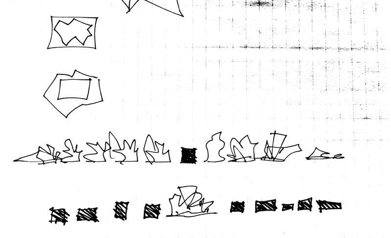
Much of my attention recently has been attuned to preparing the fourth edition of Architecture: Form, Space & Order. Working on this revision is giving me the opportunity to explore and attempt to understand the spate of irregular forms and compositions that dominate our consciousness.
Beginning a project is always enjoyable; thinking about all of the possible directions a work can take can be liberating. But beginnings can also be difficult when innumerable false starts interrupt the work flow and inhibit a sense of progress. I have come to realize, however, that these friction points are a necessary part of the creative process for they compel us to slow down, to pause, and to think ahead rather than simply charge forward into uncharted territory. One way I occupy these uncertain spaces is by roughing out ideas with a pen on paper and teasing out possibilities with a certain tactile rhythm. Here are a few examples.
Another View of Foreshortening
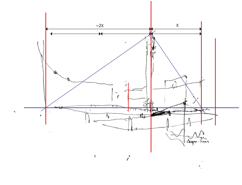
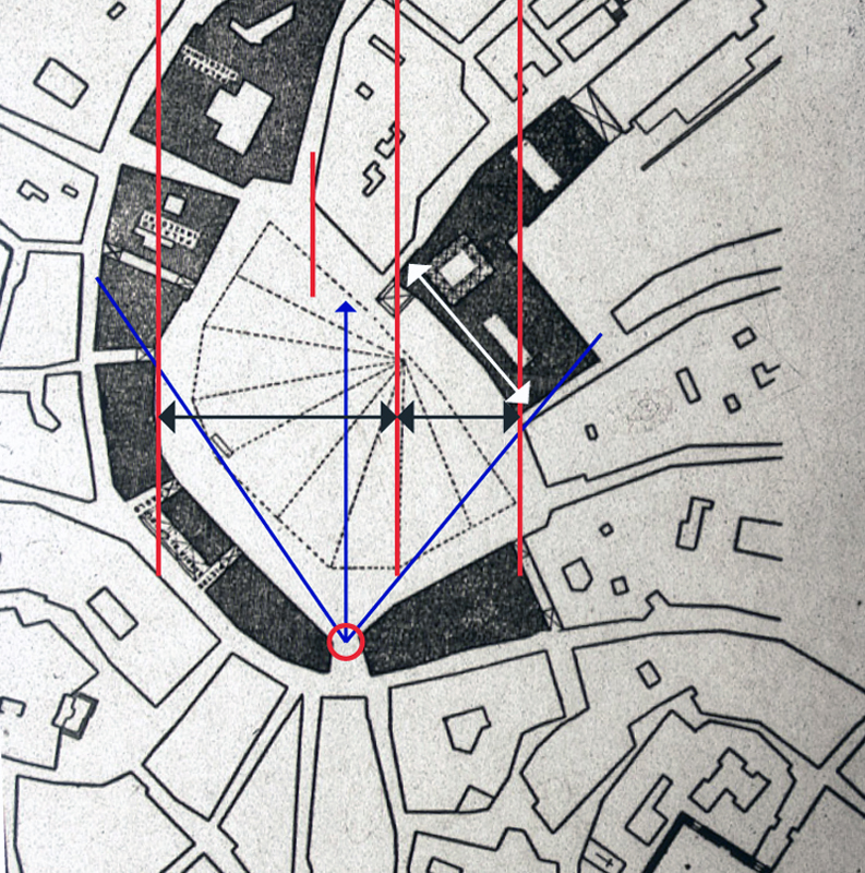
Using the same broad outline of the Campo in Siena from two posts ago, I’ve overlaid the sketch with a diagram of the important points that I visualized in the scene—the extent of my view, the relative position of the Torre del Mangia, and the foreshortening of the Palazzo Pubblico.
To further illustrate the phenomenon of foreshortening, I’m using a plan diagram of the Campo to show where I stood as I sketched and my angle of view. You can compare the actual width of the Palazzo Pubblico, shown with the white arrow, with my foreshortened view of it, shown with the black arrow, and notice its position relative to the horizontal sweep of the Campo space.
You can also see, both in plan and in the perspective sketch, the positioning of the Torre about one-third of the way across from the right-hand edge of the view. I visualized diagonals to estimate the height of the Torre relative to the width of the space.
While these are necessarily optical judgments, not precise measurements, seeing these types of relationships and imagining them on the page as you set up a drawing on location are important steps in the process.

