Another View of Foreshortening

Print

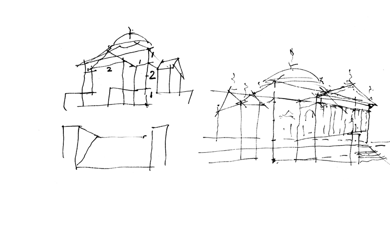
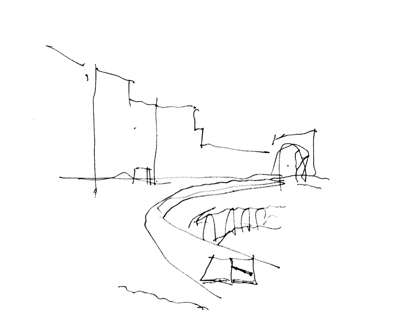
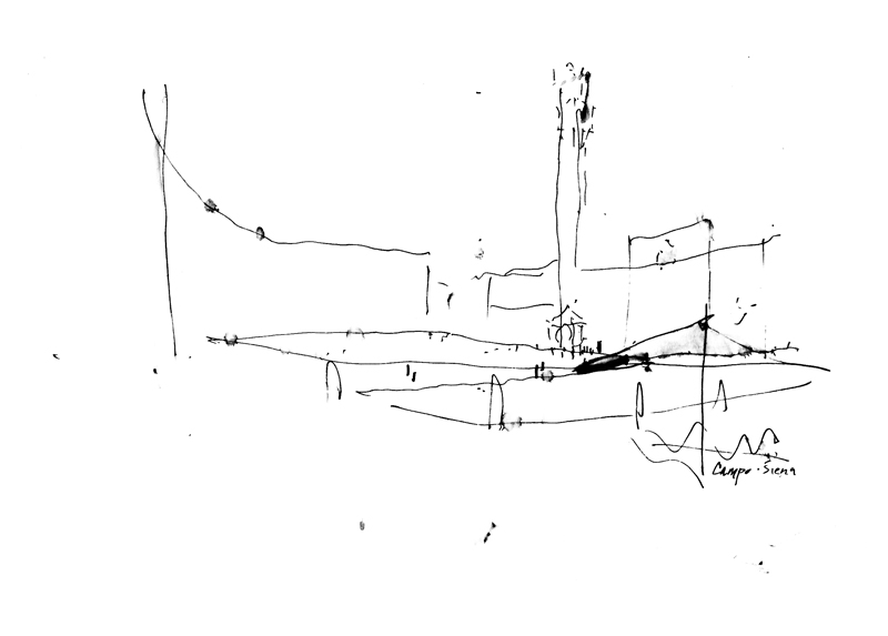
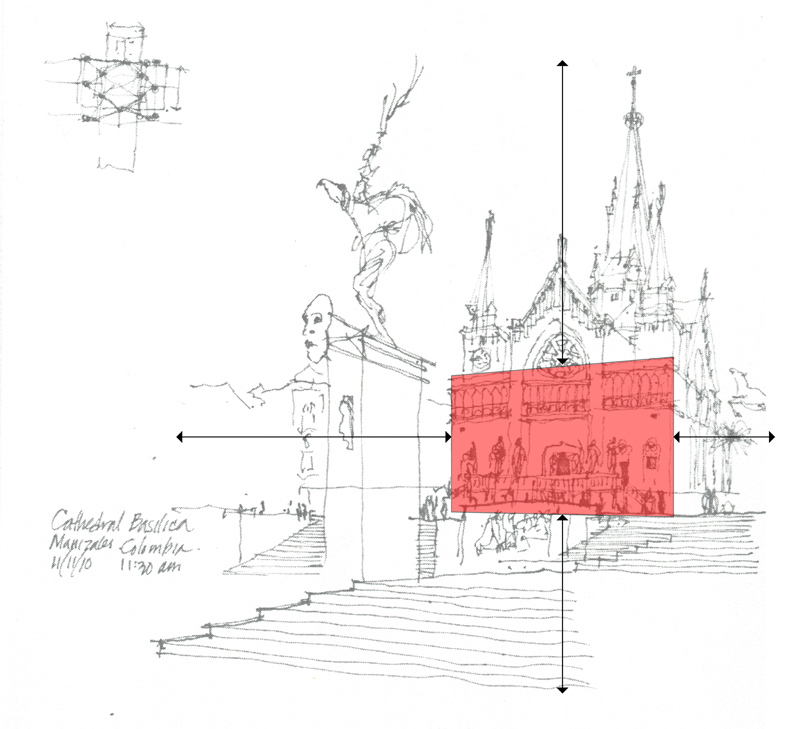
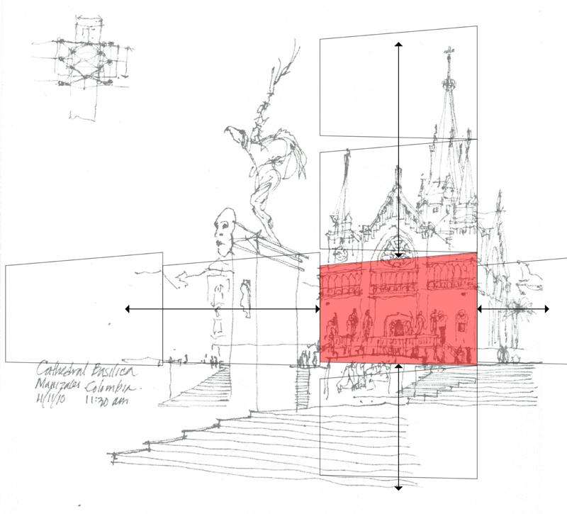
Using the same broad outline of the Campo in Siena from two posts ago, I’ve overlaid the sketch with a diagram of the important points that I visualized in the scene—the extent of my view, the relative position of the Torre del Mangia, and the foreshortening of the Palazzo Pubblico.

CampPlanDiagram

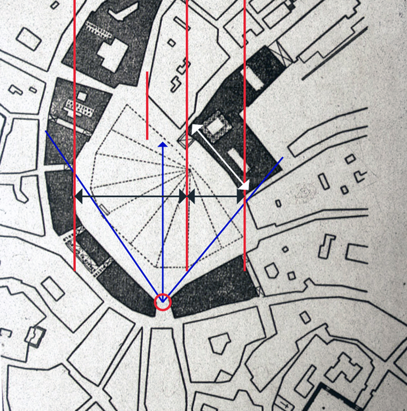
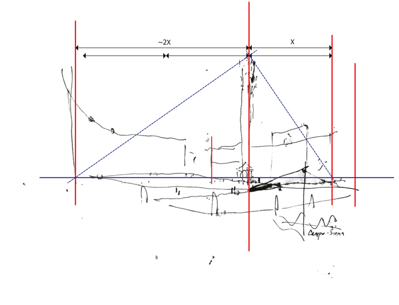
To further illustrate the phenomenon of foreshortening, I’m using a plan diagram of the Campo to show where I stood as I sketched and my angle of view. You can compare the actual width of the Palazzo Pubblico, shown with the white arrow, with my foreshortened view of it, shown with the black arrow, and notice its position relative to the horizontal sweep of the Campo space.

You can also see, both in plan and in the perspective sketch, the positioning of the Torre about one-third of the way across from the right-hand edge of the view. I visualized diagonals to estimate the height of the Torre relative to the width of the space.

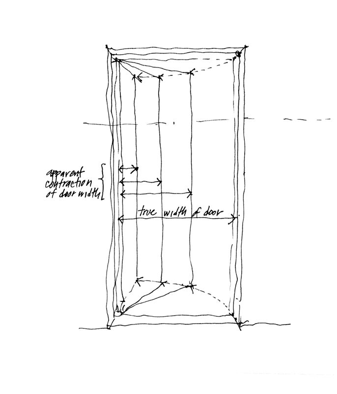
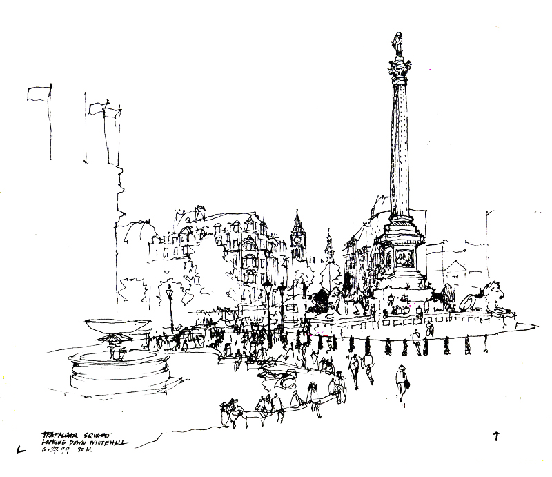
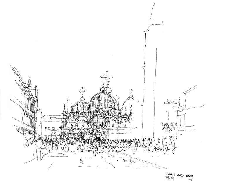
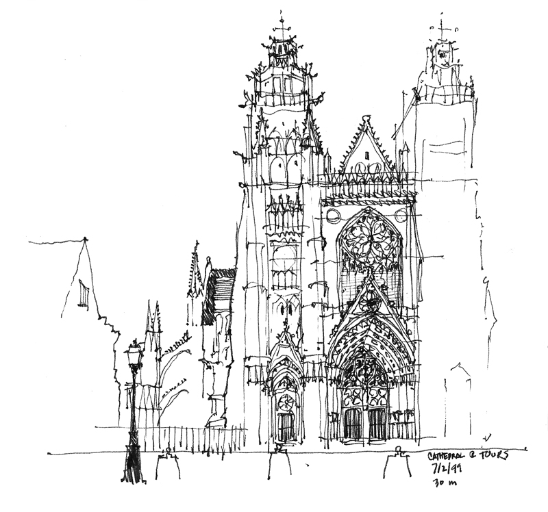
While these are necessarily optical judgments, not precise measurements, seeing these types of relationships and imagining them on the page as you set up a drawing on location are important steps in the process.

Foreshortening

Foreshortening

Foreshortening is the apparent change in form an object undergoes as it rotates away from our point of view. This phenomenon is usually seen as a contraction in size or length in the direction of depth, the amount of contraction depending on the degree of rotation. The more a line or plane is rotated away from our point of view, the greater its apparent contraction. You can easily see this as a door opens away from you. Gauging and drawing the phenomenon of foreshortening can be a bugaboo for sketchers because our mind can persuade us to draw what we know—the actual size or length of something—rather than how that thing might appear to the eye—its apparent size or length.

VirginiaV

To illustrate a case of foreshortening I want to use this view of the Virginia V that I sketched this past Sunday before the Seattle UrbanSketchers group met at the Museum of History and Industry for its January meeting. One of the reasons for gathering at MOHAI is the beautiful exhibit there of Gabi Campanario’s impressive work documenting the life and times of Seattle over the past six years for the Seattle Times.

The Virginia V, built in 1921 by Anderson & Company and launched in 1922, was part of the mosquito fleet that plied the Puget Sound waters largely between the First and Second World Wars. After WWII, the Virginia V changed hands several times as it served as an excursion vessel. It was placed on the National Registry of Historic Sites in 1973. Completely refurbished by the Steamer Virginia V Foundation, the Virginia V is now anchored at the south end of Lake Union and continues to be used for public excursions and private charters.

Print

In this view of the same Virginia V sketch, I’ve overlaid some markers to show the relationships that I gauged and used to control the foreshortening of the ship. The most important step is ensuring that the apparent length—from the prow on the left to where the hull curves away from our view on the right—is correctly foreshortened relative to the height of the prow. Then, I positioned elements, such as the wheelhouse and bridge, relative to the left and right extents. Note how I try to suggest the way the hull is curved from fore to aft. You can use the span of your hand, the shaft of your pen or pencil, or any similar means to gauge these measurements but it is an essential step in the process. Otherwise, your mind will strongly suggest that you should draw what you know rather than how it appears to the eye.

The First Lines…

When an architect, designer, or builder says that a building has “good bones,” this generally means that it is well built. Like others, however, I would extend the meaning of the phrase to include not just the sturdiness of a construction but also the soundness of its underlying organization and layout. A design with good bones should be able to endure flaws in workmanship or execution and gracefully accept the changes made to improve it.

Bones1

So it is also with a sketch. To begin a drawing done on location, we must first select an advantageous viewpoint that conveys a sense of place and frame the composition to fit on the page. Then, a crucial step is establishing the “bones” of the drawing—its basic structure—with the first lines we draw. I like to say that the number of lines is five but this, of course, is arbitrary. For some views only a few lines may be necessary while for others, more might be required to establish the structure of a drawing.

Bones2

Bones3

It is essential to understand that once this structure is established, changes can still be made to calibrate scale, improve proportional relationships, and adjust the positioning of elements. Drawing these first few lines is simply a way to block out the essential relationships on a page quickly, before expending too much time on a drawing only to find out that a portion might be misplaced or is out of proportion to the rest of the composition.

CampoSiena

Here is an example—a very quick outline of a view of the Campo in Siena that I did as a demonstration. With more time and better weather, I might have finished it but I think it is possible to see and visualize the space even in this incomplete state.

The Tempietto

Tempietto

Standing in the courtyard of San Pietro in Montorio on the Janiculum Hill sits this almost ideal example of Italian Renaissance architecture by Donato Bramante. What makes classical architecture such as this beautifully harmonious work so difficult to draw is that any slight deviation from the intended proportions becomes very noticeable. I’ve attempted to draw the Tempietto several times and I still haven’t got it quite right, although this one comes close. It’s just a little too tall for its base.

315 North 36th Street

I’ve always admired this building for its presence in the neighborhood as I walk by it daily, especially the tower portion that rises on its south end with its exposed fire escapes. Piece of Mind fronts North 36th Street while off the alley level in the back is an arcade and beer joint. Just to the east of the building in the adjacent parking lot stands the Flair Taco truck. Word is that a development is planned for this location but I don’t know if the plans include this structure.

315N36Notes

In the left foreground is the edge of Free Range Cycles. Beyond, across the alley from 315 North 36th Street, you can see just the corner of the Fremont Fine Arts Foundry, started more than 30 years ago by artist Pete Bevis. This is where the Lenin statue was assembled and the Jimi Hendrix statue crafted. He sold it last year and is currently undergoing remodeling for a restaurant and retail complex.

Foreseeing the Future

CanaleScheme

Stepping away from drawing from location for a while, I want to mention design drawings—drawings designers use to initiate and develop ideas and make them visible so that they can be acted upon. Whether we start with orthographic views, such as plans, elevations, and sections, before moving on to 3-dimensional views, or we begin the design process with paraline and perspective drawings, we should move back and forth from 2D to 3D and have the confidence that our visualizations are dependable predictors of future outcomes.

CanaleVision


CanaleBuilt

In an actual project nearing completion, it is interesting to compare a design study created in SketchUp with a photo of the constructed space. While not exactly identical, these two images are similar except for nuances of color and material. This shows the usefulness of preliminary studies to reliably foresee the result of our design decisions. Of course, these studies include not only graphic representations but also study models and prototyping. But for efficiency of time and fluency of thought, it is difficult to beat the graphic tools at our disposal.

Vignettes

Trafalgar

Some sketchers start by drawing a border and then filling in the frame. I prefer not to restrict my images to fit within a predetermined frame; my only size constraint is the page or two-page spread on which I’m drawing. And even then, I try to leave myself room for the drawing to develop and grow if necessary. For this reason, I tend to draw vignettes, images that fade into the background without a definite border.

Structure

You can see here how I typically start a drawing by roughly outlining the basic forms and establishing a skeletal structure upon which I can elaborate. Then, depending on how much time I have, I select what I want to focus on and develop those details, textures, and values. This approach allows me to leave parts of a drawing unfinished if pressed for time, especially when drawing on location.

SanMarco

Here is another example of how I’ve left portions of a drawing unfinished, allowing the viewer to fill in or sense the missing parts without those parts being actually drawn. Unfinished drawings, in fact, can often engage viewers by exercising their visual imagination.


The Rule of Thirds

Balance

Back in January, I posted a piece on maintaining a delicate balance between a static state and one of dynamic disarray when composing a scene and laying it out on a page. Thinking about this subject again brought to mind the rule-of-thirds, a principle of composition that has been used for centuries by painters, photographers, and other artists.

RuleofThirds

We can visualize this principle by dividing our canvas or page into nine equal parts with two horizontal and two vertical lines spaced equally apart.

Thirds1

Thirds2

The rule-of-thirds postulates that we should place points of interest at any of the four points of intersection or lay out important compositional elements along these lines. Applying the rule-of-thirds in these ways is supposed to create visual tension and an image that is more dynamic than one with the subject matter simply centered on the page.

Horizon

Consider how moving the horizon line in these three compositions can affect how we perceive the same subject matter in subtle ways.

Thirds3

Of course, rules are alway subject to being broken but experimenting with the rule-of-thirds is a good first step before deciding to disregard it. Even when applying the rule-of-thirds, we should remember that it is not an exact rule to be applied in a precise manner. It merely serves as a guide.

SymmetricalAsymmetrical


The first decision we have to make is whether a composition is to be balanced in a symmetrical or asymmetrical manner. If the latter, then the rule-of-thirds can serve us well.

Understanding Geometry

I’m sure not everyone would share my love for geometry but an appreciation of the subject has served me well in my years as an architect. Understanding geometry, especially spatial relationships in three dimensions, makes it easier to draw these correspondences in real life.

Geometry

Take this interior view of St. James Cathedral. Because of the ornamentation, textures and color, it is easy to get confused when confronted by the richness of the scene. But underlying all of the lavish decorative features is a clear geometric scheme.

Geometry2

Imagine looking from above at the square crossing where the nave of the church intersects the transepts. From each side of the square crossing rises semicircular arches. From the apex of each arch, we can extend lines until they intersect at the center of the dome’s oculus. The diagonal groin lines that mark the intersection of the two vaults rise from each corner to intersect at the same center.

Geometry3

If we understand these geometric relationships and, just as important, we can see them as we sit in one of the pews looking upward at the dome, we can draw the square crossing and estimate the placement of the oculus without guessing. We can place it at the peak of the dome, at the intersection of the crossing groin ribs, directly above the center of the crossing.

Composing the Page

The page proportions of our sketchbook influence the composition of our drawings. Tall or narrow pages suggest the drawing of vertical compositions or horizontal panoramas, while rectangular or square formatted pages provide more flexibility in layout. Even so, we should not allow the proportions of a page to cripple our imagined views in unintended ways. The page should not constrain the limits of a drawing nor restrict its composition.

VerticalPlane

Where do we start a drawing…? Personally, I try to locate a vertical edge—or preferably a vertical plane—in the scene or view and use its size to mentally anchor the composition on the page. This vertical element can be a building facade, an interior wall, or even a row of trees or lamp posts…

VerticalSpace

Or it can be the imagined space between two building elements, as in a street scene or the nave of a church.

Projection

Using a vertical element in this manner requires projecting the imagined view onto the page and locating and sizing the vertical element relative to the overall composition to ensure that the entire scene will fit on the page. Providing breathing space around the intended image is a good strategy. Starting too large or misplacing the vertical element can force us to either cut off part of our intended view or alter the proportions of the scene.

RelativeSizing

Once we have placed the selected vertical element, we can use it to gauge the relative sizes of all of the other elements in the composition.