Composing the Image II


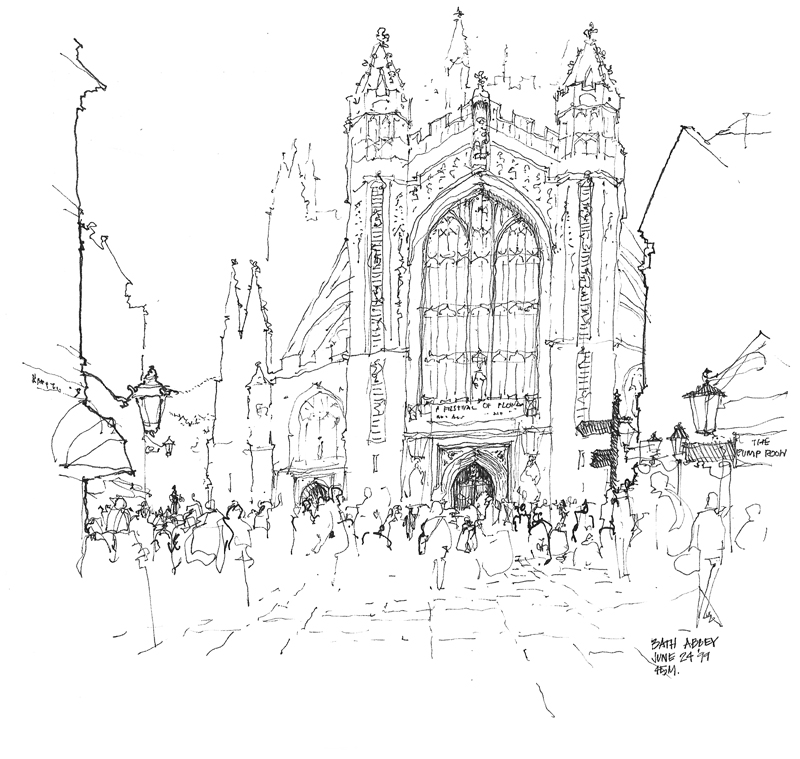
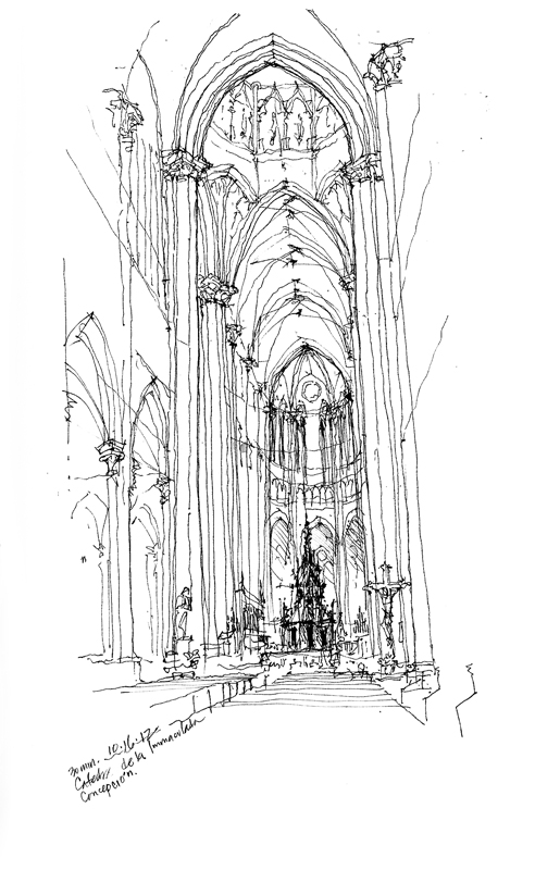
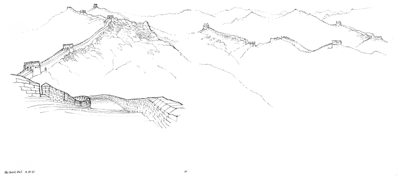
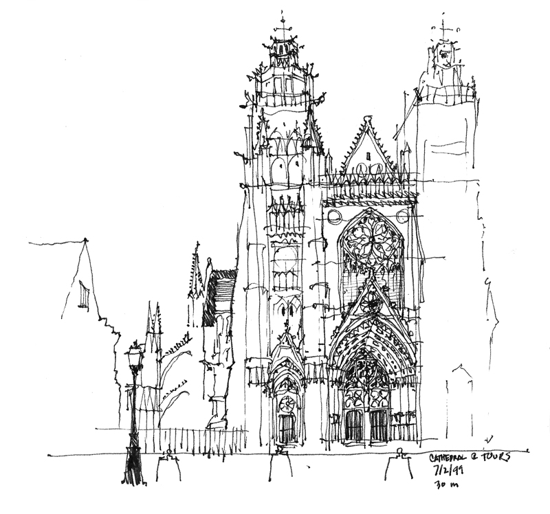
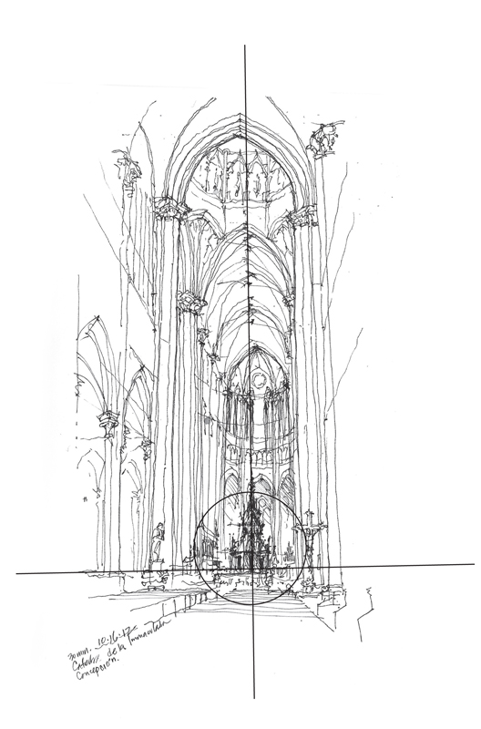
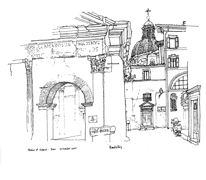
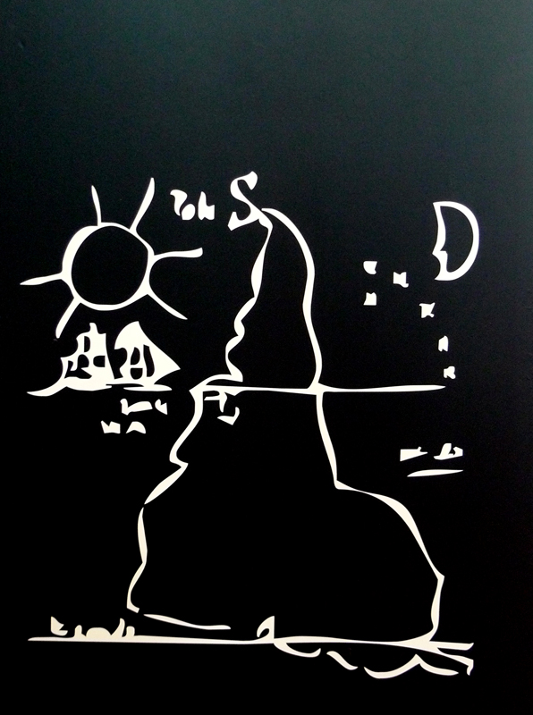
Once we have decided on the subject matter for a sketch and established a particular point of view, we should pay attention to the proportions of the conceived image. Some images may lend themselves to a square or nearly square format, others a vertical composition, and still others a horizontal layout.

BathAbbey Immaculata

GreatWall

At times, the nature of the image we are trying to capture can be odds with the proportions of the pages in our sketchbook. We shouldn’t allow this conflict to alter our intentions. In my next post, I will try to address the question of how to compose the image on the page.

Composing the Image

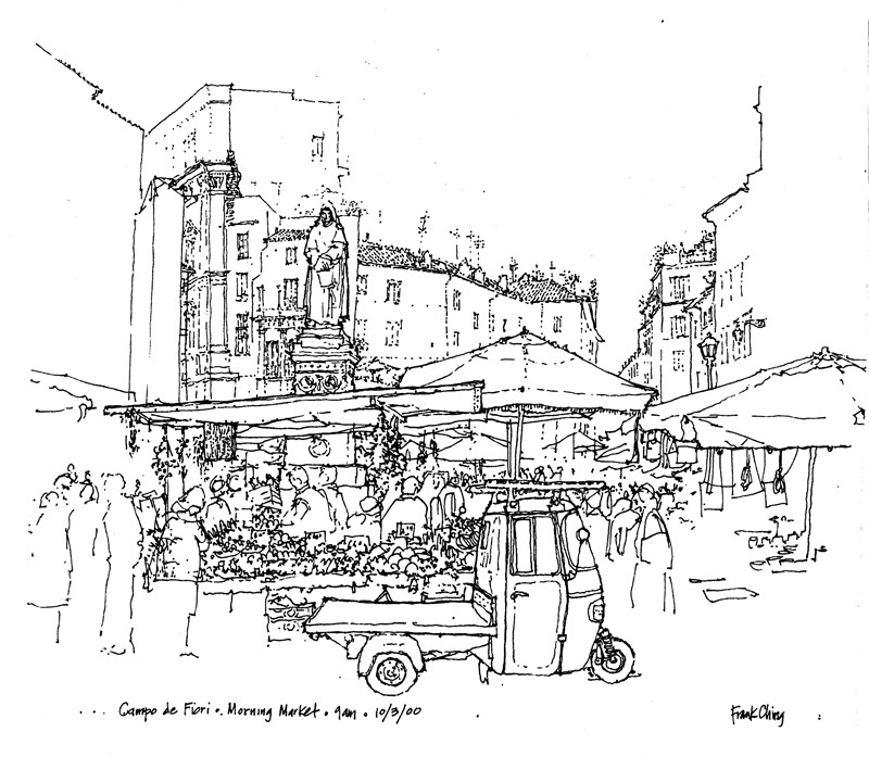
A question that is often asked is: How do I start a drawing? Where do I start? The very first step, before even touching pen to paper, is selecting the subject matter and mentally composing the image—deciding what will be included and what excluded from the scene before us. Will we zoom in on a part of a building, capture one of its interior spaces, or focus on one of its details? Do we see the building merely as an object? Will we try to place a building in its context? Or will we try to capture the life of a street or square with the architecture serving as a container or backdrop?

Fragment

• Fragments

Interior

• Interior space

Object

• Building as object

Context

• Buildings in context

Life

• The life of an urban space

A Delicate Balance

Balance

As we decide how we are going to compose a scene and lay it out on a page, we are juggling drawing elements to maintain a delicate balance between a static state and one of dynamic disarray. The elements that we balance are points of interest that draw the eye—an area of contrasting tone or increased line weights, a level of enhanced detail, even a field of emptiness. Here are a few examples of different ways of maintaining a delicate balance in a drawing composition.

Balance5

When we want to emphasize the stability or serenity of the subject matter, we can use a symmetrical layout and still introduce visual tension through contrast.

Balance

For more dynamic compositions, we can offset one or more points of interest in an asymmetrical composition that leads the eye. We can emphasize height by raising the composition on the page or lead the eye by placing the central point of interest to the left or the right.

Balance2

In the end, what we should strive for is a delicate balance that engages the eye and never lets it stray off the page.


South America

We happened on this graphic of South America during our recent visit to Universidad Nacional de Córdoba in Argentina. It figuratively turned our heads upside down. We had been so accustomed to maps of the world having north oriented up and south down. This graphic shows that there are other ways of seeing our world.

This idea of (dis)orientation manifested itself in another way on our first day in Córdoba, as we walked around the historic center with map in hand. I am usually pretty good at reading maps and orienting myself in new environments but something was amiss. It took a while but I finally realized this was because I had assumed that the sun was in the southern sky. But here in Córdoba, the sun was actually illuminating the northern sides of buildings and so what I had thought was south was actually north on the street map. And even knowing this, it remained difficult to overcome a lifetime of assumptions.

Olympic Sculpture Park

A few Seattle UrbanSketchers joined Washington State University students and their professors Bob, Kathleen, and Linda in a sketching session yesterday at the Olympic Sculpture Park. Here are a couple of my drawings to continue my previous post about drawing on location.

A photograph, whether viewed in print or on a computer screen, is a static, two-dimensional image that makes it easier to see shapes, patterns, and relationships. For some, this is an advantage. But it can be a hindrance if the flatness of the photograph prevents us from interpreting, composing, and editing more freely the visual and spatial relationships before us. When drawing on location, we are not required to recreate or reproduce exactly the visual information that a camera might capture. We can squint or “look askance” to see light-dark patterns better; we can shift our gaze slightly to block out visual noise or improve the drawing composition; we can deliberately underplay some of the visual information to emphasize others.
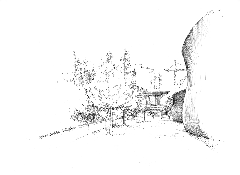
For example, the sloping ground and trees on the left and part of Wake, the large steel sculptures by Richard Serra in the foreground to the right, frame the PACCAR Pavilion beyond. So as not to lose the pavilion, I only suggested the apartment buildings in the background. This editing was easier to do on-site than if I were drawing from a photograph.
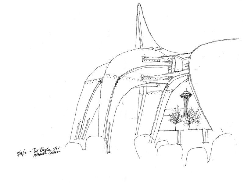
As I mentioned in the previous post, the drawing process often leads to unexpected results. I selected the spot to draw Alexander Calder’s The Eagle so that it framed the Space Needle in the distance. My intention was to draw the entire sculpture but soon after I started, I realized the image wouldn’t fit if I were to maintain reasonable proportions. So I proceeded to draw as much detail as I could and omitted the rest so that I would not lose the sculpture as a framing device.

“Art does not reproduce the visible; it renders visible.” Paul Klee

Inge Druckrey: Teaching to See

Edward Tufte has crafted a beautiful documentary of Inge Druckrey teaching her students how to see, which can be viewed at <https://vimeo.com/45232468> or <http://www.edwardtufte.com/tufte/>. It’s 37 minutes long but well worth the time to view in its entirety. While Druckery’s insightful and empathetic lessons are clearly appropriate for the education of visual designers, we can also apply many of the basic principles to drawing on location because learning to see—not simply the acquisition of technique—is truly the key to learning how to draw from observation.

Spatial Depth

One of the issues Frank B. and I had discussed in our last meeting was establishing layers of depth in a drawing, which is one of the difficulties we face when we try to convey three dimensional environments on a two-dimensional page. There are a number of depth cues that we can rely on, such as linear perspective, size perspective, and overlapping shapes. But the one I want to illustrate here uses one of the principles of atmospheric perspective to enhance spatial depth—contrasting levels of detail to distinguish near from far.

Here are three examples, each one drawing attention to a different extent or range from the viewer. The first focuses on what is near and blurs the background.

The second details the middle ground and blurs the foreground and background by drawing their outlines only.

The third drawing focuses on the Amalfi cathedral toward the rear and suggests the middle ground and foreground to establish the context.

In each case, choosing what to emphasize and then using sufficient contrast are necessary to distinguish near from middle and far.

Looking Askance

This unusual phrase came to mind the other day when thinking about how to describe how I view a scene, both in real life and in its graphic form in a drawing. While “looking askance” currently connotes viewing with envy, suspicion, or even contempt, I would apply its more literal meaning—to look obliquely, with a side glance.

In preparing to draw, I often find myself taking a sideways glance at a scene. This slightly off-center view of things gives me a better sense of value patterns and compositional possibilities. Something similar is occuring, I think, when you see someone with their head turned or cocked slightly in evaluating a drawing or painting. I can’t fully explain how or why this happens, but someone more knowledgeable about the human eye and our optical system could provide a physiological reason. Perhaps a sideways glance uses not the cone cells required for our visual acuity but rather the rod cells, which are responsible for black-and-white vision and our peripheral view of the world.

Related to this is how I try to look at my own work-in-progress with “fresh eyes.” When we know what it is that we are drawing, we can often fool ourselves that others will see it in the same way as we do. But to see our own work the way others might, it can be helpful to turn a drawing upside down or sideways, or view it through a mirror. Doing this forces us to see in a new way the purely graphical aspects of our drawing or painting without our knowledge of the subject influencing our self-critique.

Deciding What to Draw (And What to Omit)

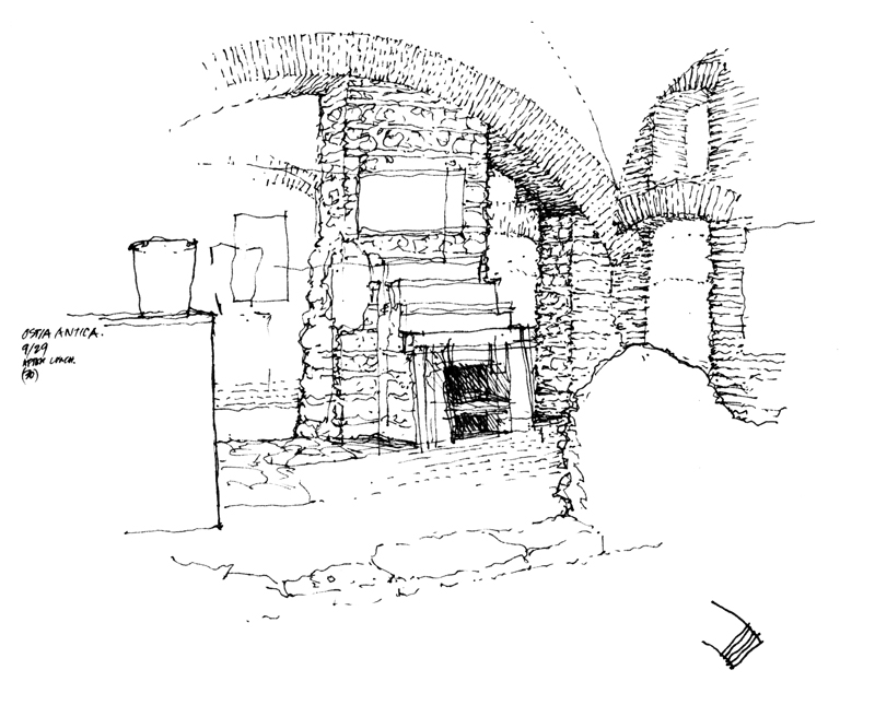
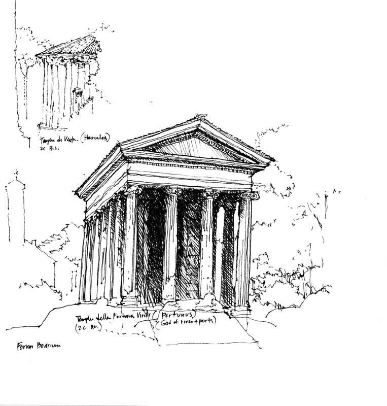
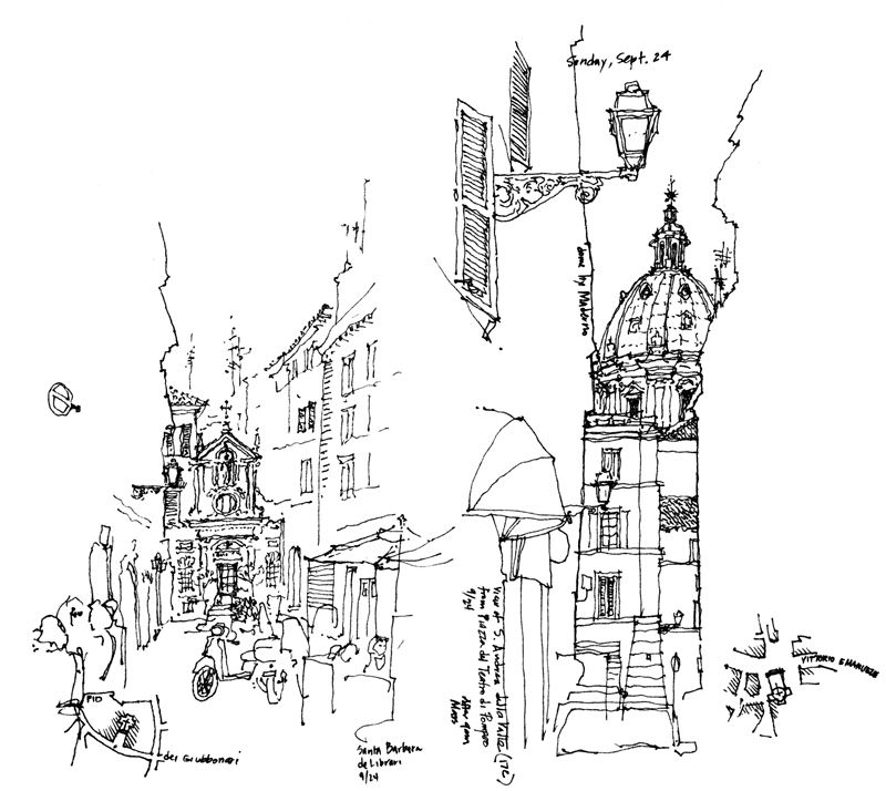
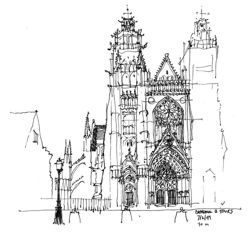
On the same trip to Europe during which I had sketched the Bruges rooftops, my family and I visited London, Paris and points south. I didn’t have a lot of free time but I managed to fit in a few sketches. Looking back at these drawings, I find them to be looser than the pristine contour drawings I had been doing on previous travels.

The quicker technique was no doubt a result of the limited time I had to sketch but another key to saving time was deliberately leaving out parts of the scenes before me. What I’ve come to realize is that deciding what not to draw is as important as choosing what to include. Omitting parts of a scene leads the eye, focuses attention, and allows the imagination of those viewing the drawing to complete the image in their mind’s eye.

Contour Drawing

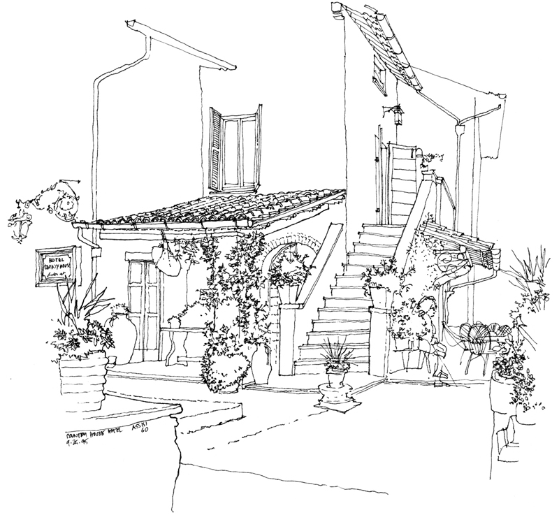
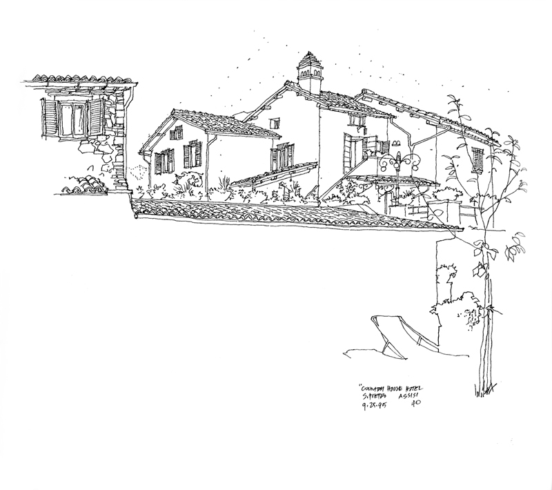
In 1995, my wife and I left the kids behind to travel to Italy, working our way from Varenna on Lake Como to Florence, Cinque Terra, Siena, San Gimignano and Assissi. We had intended to also spend some time in Rome but we found Assissi to be such a spiritually relaxing place that we decided to spend our last few days in Italy at this country house just outside the city walls.

Continuing to employ the contour drawing style I had used in Japan, I made generous use of white space to imply the foreground and draw attention to the main house beyond. Contour drawing requires working from part to part and seeing how shapes and details fit into a larger pattern. Because I was drawing with a fountain pen, I used dots to help me visualize the placement of the image on the page and to work out the roof forms before I started drawing the contours.

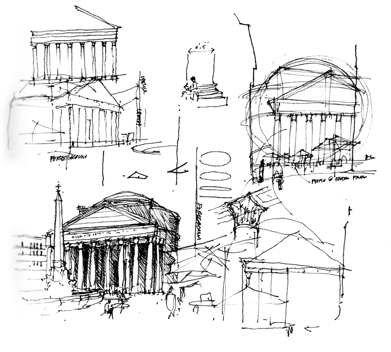
It is interesting that later, in teaching drawing, I advocate a more structural approach based on analysing geometric forms and their spatial relationships. As the years go by, I find myself using a combination of the two approaches, as seen in these studies of the Pantheon done a few years later.