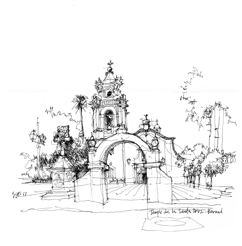
Rainier Tower

On the way home last week after viewing the Andrew Wyeth exhibit at the Seattle Art Museum, I noticed that the low-rise portion of Rainier Square had been demolished, exposing the iconic Rainier Tower to view on all sides. I immediately made a mental note to draw that scene. A few days later, a post by Andika Murandi on the Seattle Urban Sketchers blog reminded me to head downtown to draw Rainier Tower amid the demolition work that is making way for a new 58-story mixed-use highrise. It will be interesting to see how the old and new towers coexist on the same block.

Designed by Minoru Yamasaki in association with NBBJ and the structural engineering firm of Magnusson Klemencic, Rainier Tower is unique for its 11-story high pedestal base that tapers downward, like an inverted pyramid with curving sides. When I first saw Rainier Tower after moving to Seattle in 1980, I remember wondering how the structure could resist toppling over during an earthquake.

One sidenote: I drew this scene with a rollerball pen, which made me miss how sensitive the nib of a fountain pen is to the slightest applications of pressure.

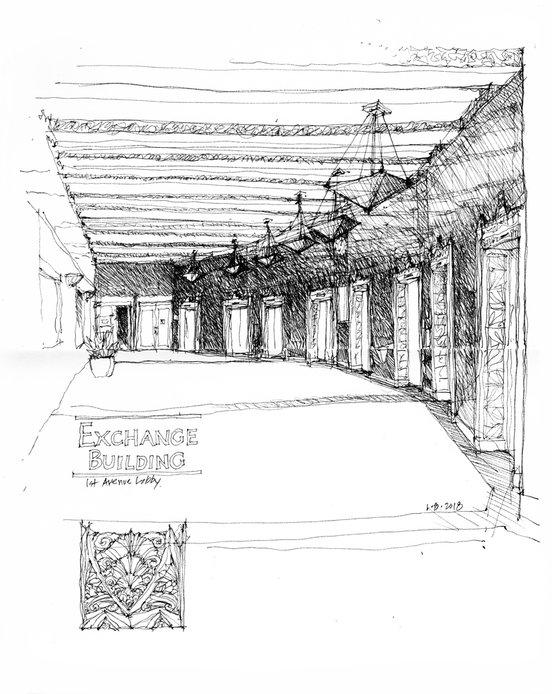
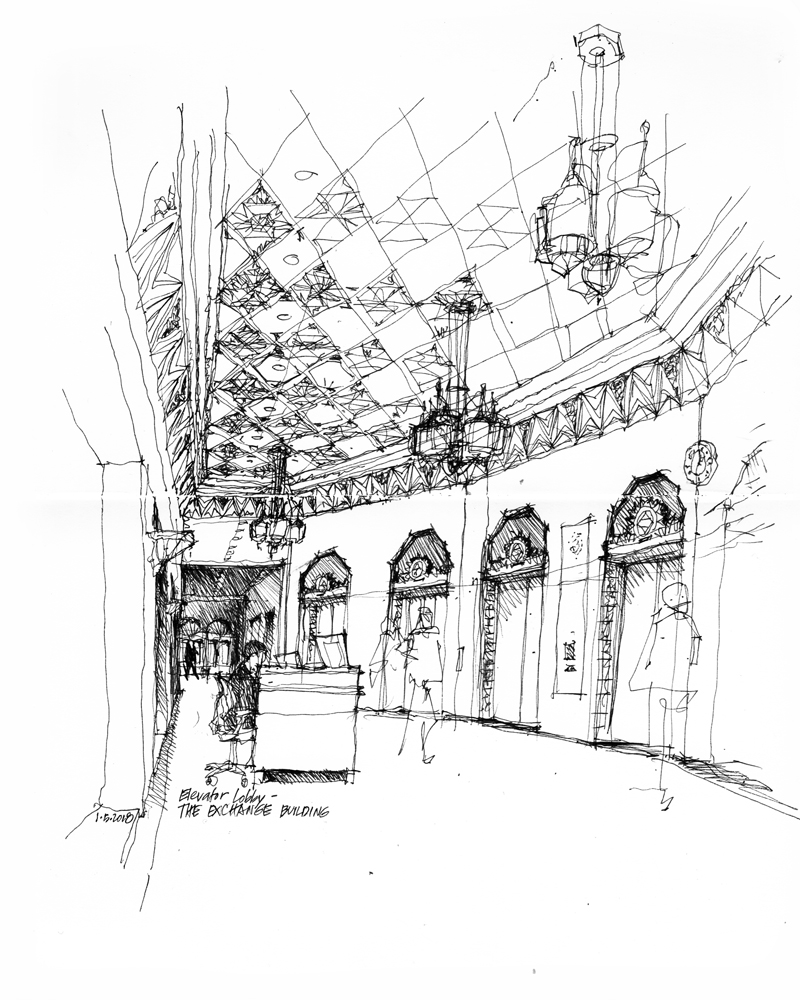
Exchange Building 2nd Avenue Lobby

This is the 2nd Avenue elevator lobby of the Exchange Building, which is situated on Marion Street between 1st and 2nd Avenues in downtown Seattle. John Graham and Associates designed the Art Deco building to house grain, ore, bond, and stock exchanges but the stock market crash of 1929 forced the conversion of its upper floors to offices. Reflecting the building’s original intentions, this lobby incorporates such motifs as sheafs of wheat and bunches of grapes into the Art Deco interior. The exterior of the Exchange Building and both the 1st Avenue and 2nd Avenue lobbies were granted landmark status in 1990 by the Seattle Landmark Preservation Board.

A Creative Process


Like sketching, composing each page of a journal or sketchbook is an extemporaneous act. We may have a plan for how to organize the drawings and notes on a page before we begin, but we should also be open to altering the plan as each element is executed.

For example, we may find that having executed a drawing, its size, shape and proportions may differ, as so often happens, from what we originally intended. By carefully considering the visual shape and weight of the drawing, we can re-balance the page or give it a more dynamic quality with the placement of the next graphic element, whether that element is graphic or verbal in nature. With the addition of further graphic elements, we continue to encounter this opportunity to re-compose the page.

Hale’s Brewery and Pub

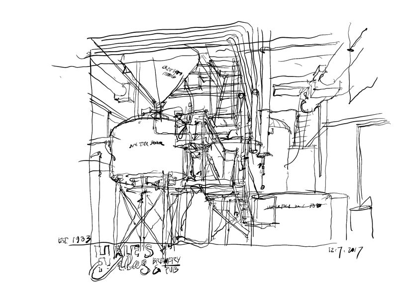
Now that the days are getting shorter, colder, and often rainier here in Seattle, I have to find indoor places to sketch. Here is the equipment at Hale’s Brewery and Pub, the longest running independent craft brewery in the Pacific Northwest.

I drew the above view with an Apple Pencil on an iPad using the Procreate app. Of course, one’s choice of medium always influences how one draws, even though the selected subject matter and point of view may remain the same. I find that unlike drawing with a fountain pen, I have less patience for including fine details, for which I would have to zoom in and out, interrupting the flow of the drawing.

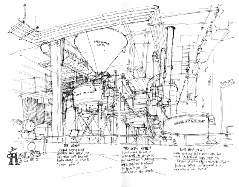
For comparison purposes, here is a similar view drawn with a fountain pen in March of this year.

Using Adobe Illustrator

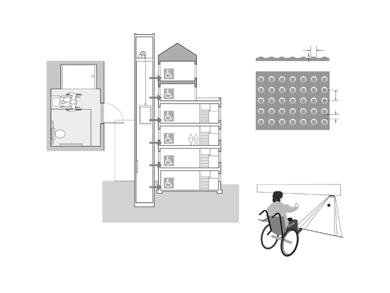
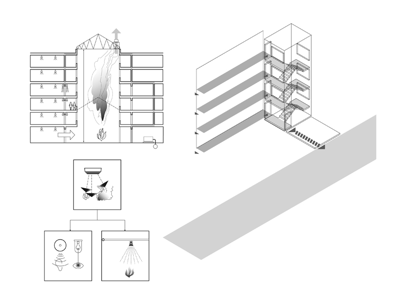
I’m working again with Steve Winkel of the Preview Group, preparing the sixth edition of Building Codes Illustrated: A Guide to Understanding the 2018 International Building Code. When I first began working with Steve in 2000 on the first edition of BCI, I had decided to use Adobe Illustrator to prepare all of the illustrations since I knew that the International Building Code was going to be updated every three years and that many of the graphics would have to be revised on a regular basis.

As I originally posted back in 2013: “I use Illustrator basically as a drafting tool to create the visual ideas I have in mind. The many benefits of vector graphics include: using the Save As capability to try out different options; having precise control over line weights and tonal values; being able to resize drawings easily to fit a page layout; and reusing elements that I had already drawn. Most importantly, when working on a revision, instead of having to completely redo a hand drawing, I can open an existing drawing file and make the necessary changes to create the updated version.”

Here are a few examples.

Changes over Time


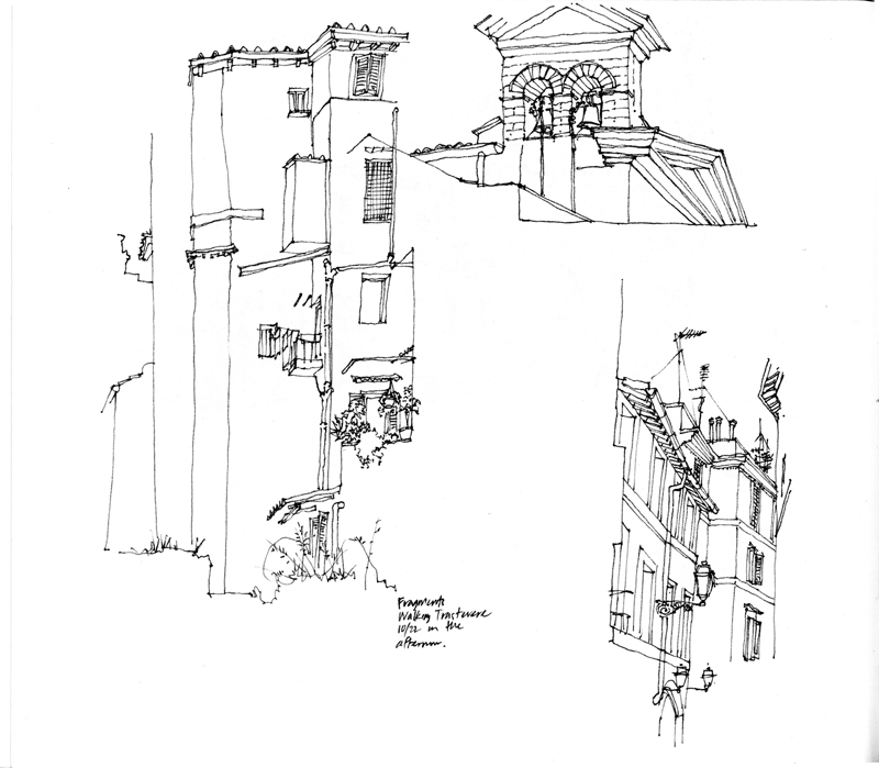
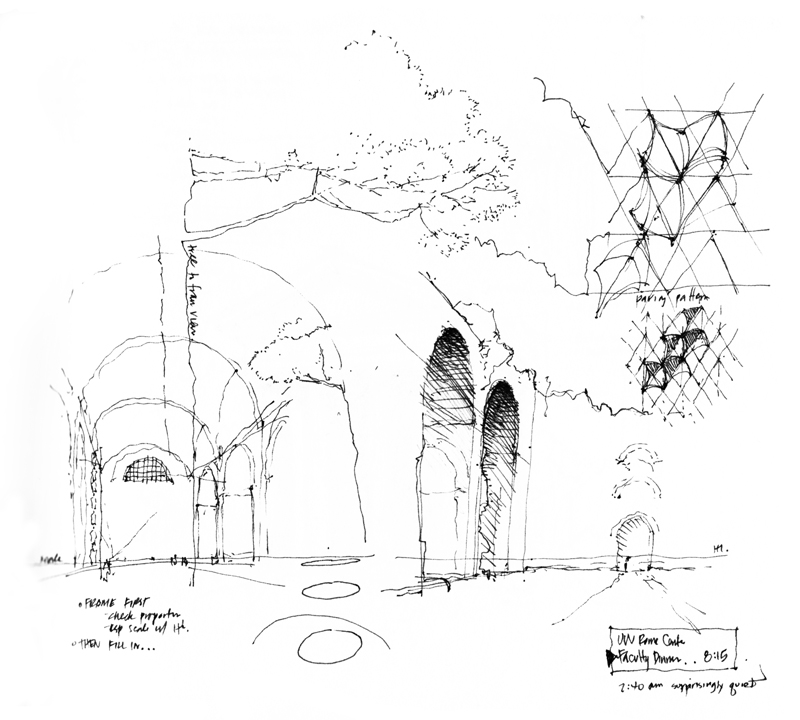
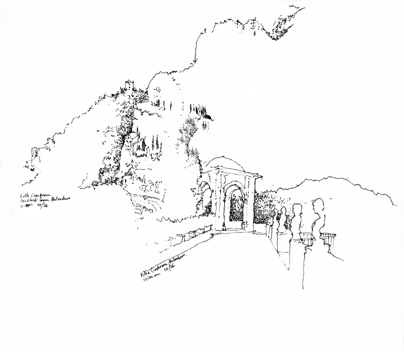
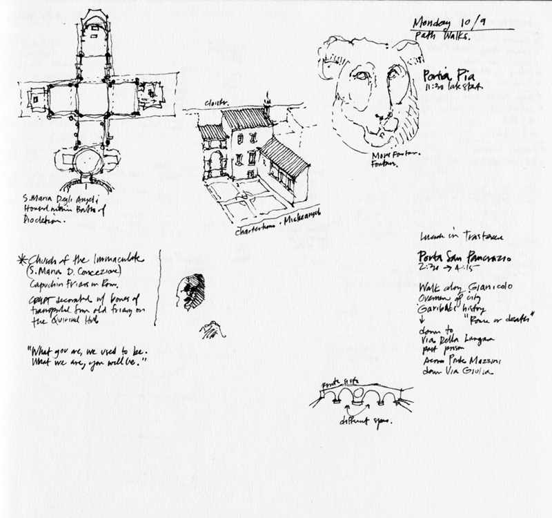
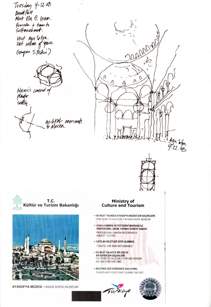
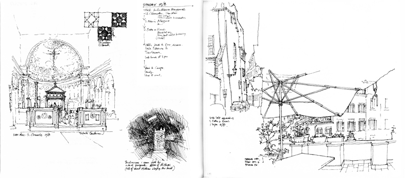
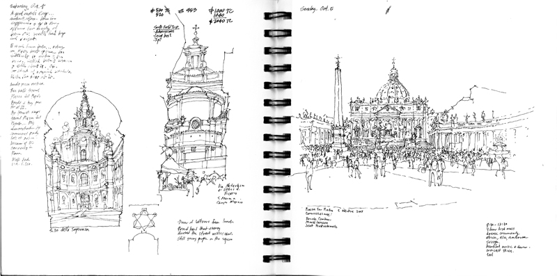
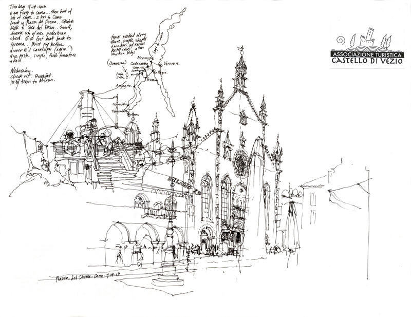
The several times I had the privilege of teaching in the University of Washington’s Architecture in Rome program, I asked my students to keep a journal during the semester to record and document their history walks, field trips, and design studio work. To try and set an example, I kept my own sketchbook along with them. Here are a few sample pages showing how my drawings changed due to the passage of time as well as how my trusty Lamy fountain pen interacted with the different types of paper I used.

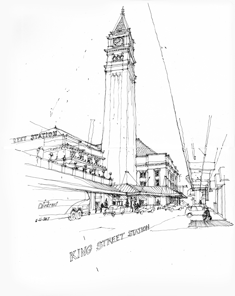
King Street Station


On Saturday, November 11, 2017, Seattle Urban Sketchers met at King Street Station to help mark the 10th anniversary of USk. USk chapters around the world, beginning in New Zealand and ending in Honolulu, participated in this Global 24-Hour Sketchwalk.

Completed in 1906 to serve both the Great Northern and Northern Pacific railways, King Street Station now serves Amtrak and the Sound Transit Sounder commuter trains. The Minnesota firm of Reed and Stem designed the station, which was listed in the National Register of Historic Places and the Washington Heritage Register in 1973. The tower featured in this sketch, with its height slightly exaggerated, was modeled after the Campanile in the Piazza San Marco in Venice.