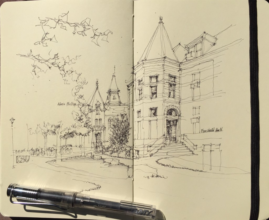
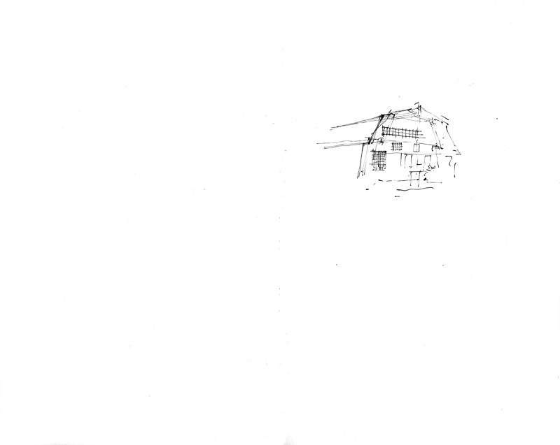
A quick sketch of a scene on the Kansas State University campus in preparation for two days of workshops for beginning students in the College of Architecture, Planning & Design.
Category Archives: Drawing
Two Views from Under the Aurora Bridge
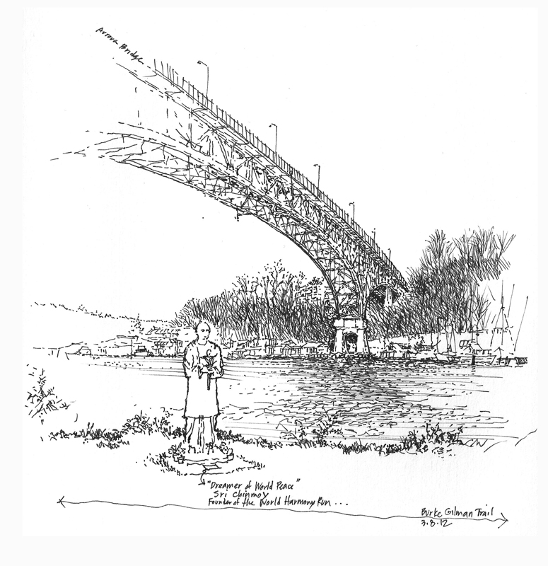
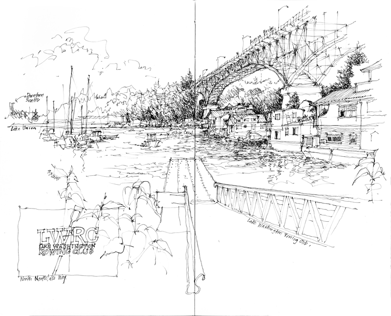
Three years ago, I sketched this view from the Burke-Gilman Trail of the Aurora Bridge as it spans the Ship Canal in Fremont. Yesterday, I took the opportunity of the sunshine to draw this view from further east along the Burke-Gilman, where the dock of the Lake Washington Rowing Club juts out into the waters where the Ship Canal meets Lake Union. On the right, nestled below the Aurora Bridge, you can see a few of the many houseboat communities along the shores of Lake Union.
Destee-Nation Shirt Company
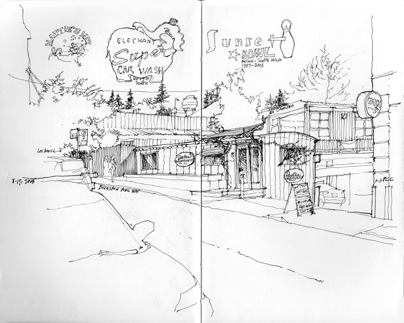
This is Destee-Nation Shirt Company’s retail outlet in the Fremont neighborhood, snuggled next to Les Amis just west of the PCC market. Destee-Nation designs, silk-screens, and sells T-Shirts featuring the logos of locally owned small businesses and other cultural landmarks of Seattle. In addition to gaining permission to use these icons, Destee-Nation gives a percentage of each sale to the neighborhood diner, vintage record store, or mom-and-pop shop being represented. A few are included in the scene above.
Since its beginning in 2004 at its Greenlake warehouse here in Seattle, Destee-Nation has since expanded its offerings to include the logos of small businesses in other states, such as Arizona, California, Texas, and Hawaii.
It’s Been Four Decades…
 To mark the 40th anniversary of the publication of my first book, Architectural Graphics, I want to give a brief history of its birth.
In my first teaching job in the School of Architecture at Ohio University, one of my assignments was an architectural graphics course. This was in 1972, a time before personal desktop computers, when the mimeograph machine was being replaced gradually by the photocopier, and letters, memos, and other correspondence were being typed on an IBM Selectric. To prepare for each class, I would hand-letter and hand-draw notes the night before and have the notes photocopied for the students. At the end of the semester, I had compiled over 400 pages of material.
The chair of the department, Forrest Wilson, took the class notes to his publisher in New York, Van Nostrand Reinhold, who expressed interest in publishing my class notes. I asked that the price for the book be set at $4.95 and VNR said that would be possible if I were able to edit the material down to 128 pages. After the 1974–75 academic year ended, I was able to produce all 128 camera-ready pages in a three-week period, drawing on plain white bond paper with a Scripto lead pencil, a drafting triangle, and a scale.
I still remember delivering the final, camera-ready pages to VNR’s offices in New York City, and, sitting in a small office with the copyeditor, making corrections to the text on the spot using an eraser and an erasing shield.
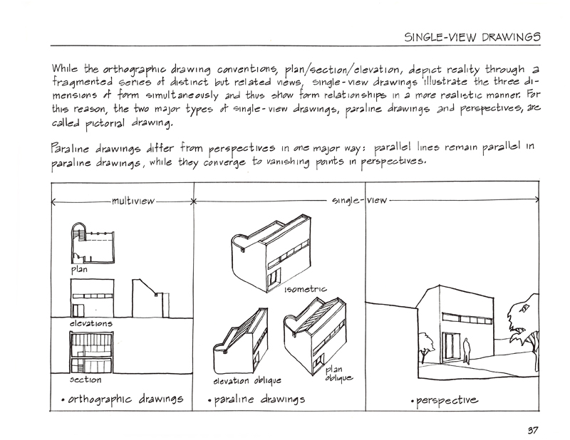
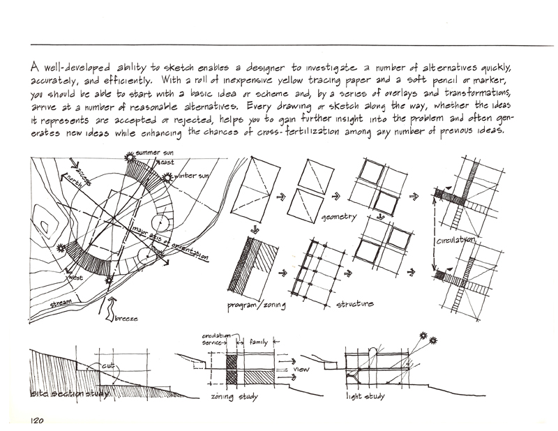
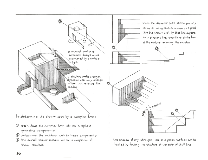
Here are a few sample pages from the first edition of Architectural Graphics.
UW Shell House
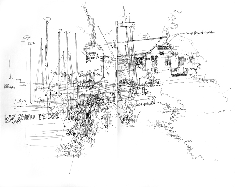
Although this structure was intended to serve as a hangar for military seaplanes, it wasn’t completed until 1918—too late to be of use to the navy. So in 1919, it became the shell house for the rowing crews of the University of Washington. If you read The Boys in the Boat by Daniel James Brown, you would know the story of how the rowing crew from the University of Washington—sons of loggers, farmers, and fishermen—defeated elite European teams and won the gold medal in eight-oar crew at the 1936 Olympic Games in Berlin. The shell house was designated a Seattle Landmark in 1974 and listed on the National Register of Historic Places in 1975.
In sketching, we have good days and bad days. This day was not a good day for me. This spread shows my first attempt at trying to capture the scale and proportions of the shell house. Rather than continuing on and making adjustments, as I usually do, I simply turned the page to begin anew.
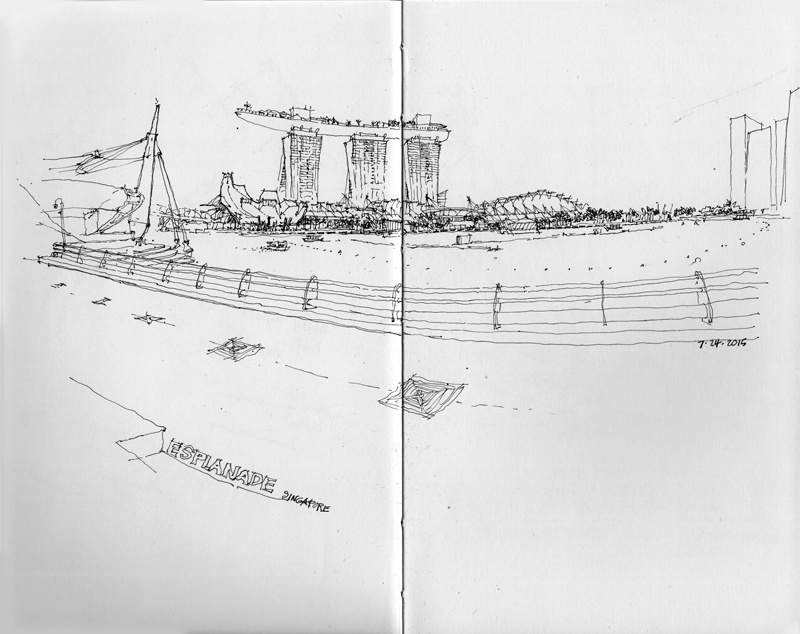
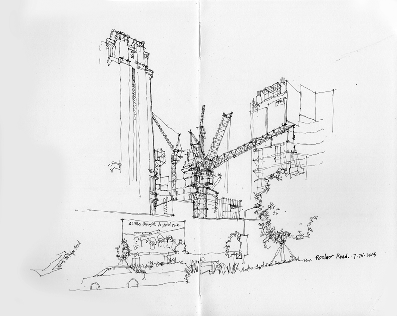
The Varied Faces of Singapore
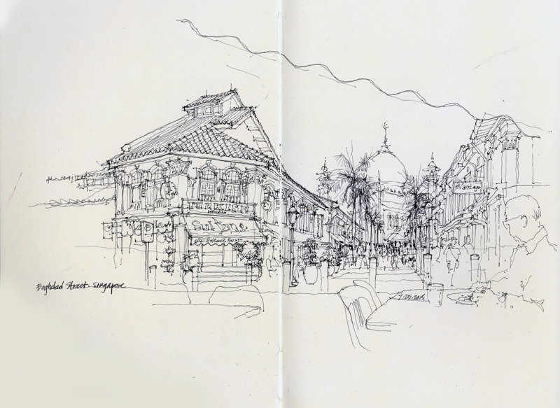
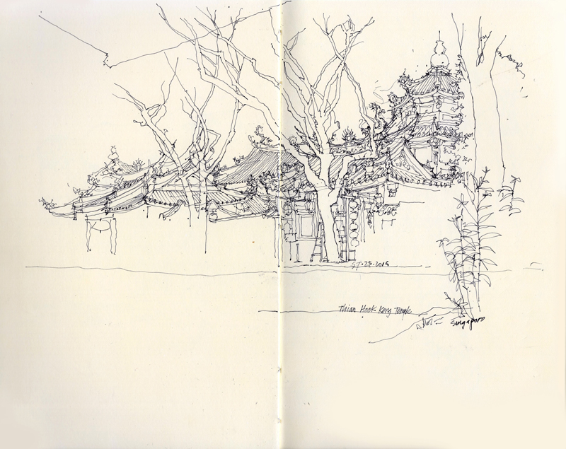
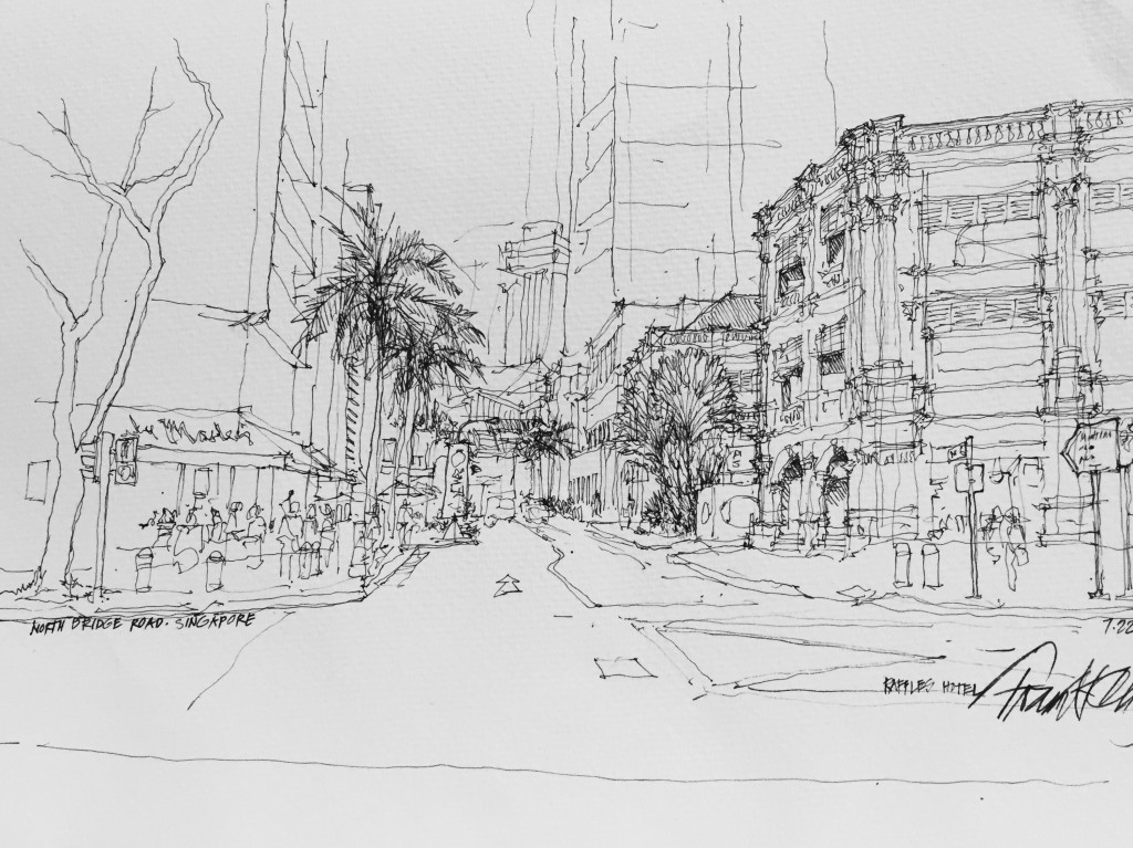
One final post on Singapore. Walking around the city during the Urban Sketching Symposium, I drew a few scenes that illustrate diverse aspects of this metropolis, with evidence of its Colonial past, ethnic neighborhoods, and modern skyscrapers co-existing in a modern Asian city-state. In the last sketch, the circle with SG above the number 50 refers to this year being the 50th anniversary of Singapore’s separation from Malaysia and formation as an independent republic on August 9, 1965.
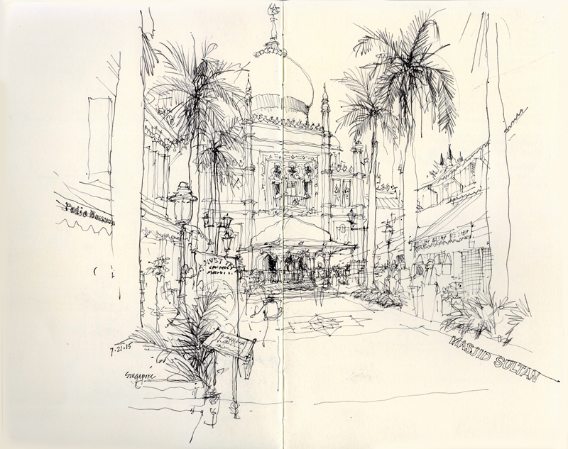
Masjid Sultan
The first day in Singapore, I wandered over to the Kampong Glam neighborhood of Singapore to sketch the Masjid Sultan (Sultan Mosque). Constructed in 1824 as a one-story structure for Sultan Hussein Shah, the first sultan of Singapore, the mosque was remodeled and enlarged in 1932 to its present form. Relative to the surrounding street grid, the mosque was skewed, perhaps to orient the mihrab to Mecca. It was important for me to capture this subtle shift as I drew this view looking down the pedestrian way of Bussorah Street.
A few days later, I again visited the area hoping to draw one of the side streets. Instead, I chose to enjoy a refreshing iced coffee at an outdoor cafe with a view both of the Masjid Sultan as well as some the shops along Baghdad Street.
Two Chinese Temples
The day before the Urban Sketching Symposium started in Singapore, I wandered along Waterloo Street, the site of my workshop. I came upon this Chinese temple, seemingly grafted onto a three-story office building.
In contrast to the Waterloo Street temple is the Thian Hock Keng Temple in the Chinatown district, which is one of the oldest Hokkien temples in Singapore. The more traditional layout was completed in 1842 to accommodate Chinese immigrants giving thanks for a safe voyage. Because of the heavy street traffic, I decided to focus on the composition of tiled roofs and animated ridge and hip lines, leaving the rest to the imagination.
Raffles Hotel Singapore
The Raffles Hotel is an icon in Singapore, having been established in 1887 by two Armenian brothers. Named after Stamford Raffles, the founder of modern Singapore, it was designed by the architect Regent Alfred John Bidwell of Swan and Maclaren.
This view, looking down Seah Street from North Bridge Road, is one of the many drawings done during the 6th International Urban Sketchers Symposium in Singapore that wIll be auctioned off to benefit the urban Sketchers organization.
More Signs of Fremont
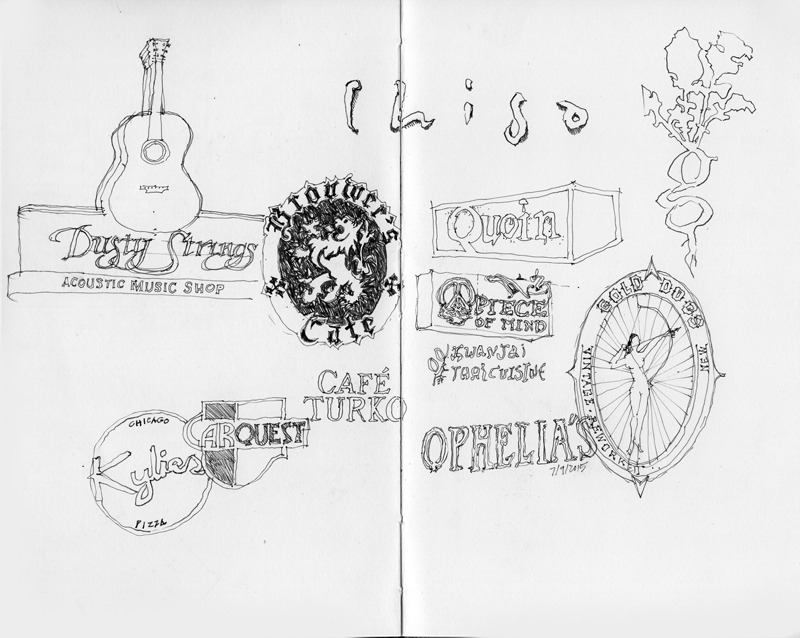
Continuing from a previous post from this past January, these are more signs of Fremont. While I am concentrating on those of places with a history here, a few relative newcomers have probably snuck into the picture. In drawing these, I am struck by the subtle differences in typography that we normally do not notice but which convey the character of a place

