Happy New Year!

2015Color

Before looking forward to new and rewarding sketching prospects in 2015, I want to take a look back with appreciation for the opportunities to conduct workshops during the past year. I will always be grateful for these chances to connect with others who share the same passion for drawing.

EPSON MFP image

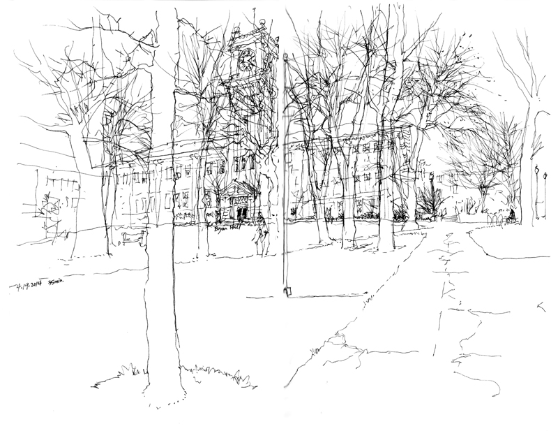
A sketch of the campus clock tower at the ending session of the workshop at Washington State University with Gail Wong and Gabi Campanario.

EPSON MFP image

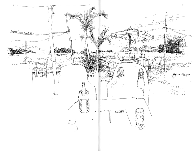
Enjoying a cool Itaipava on the Praia do Jabaquara during the Urban Sketchers Symposium in Paraty, Brazil.

EPSON MFP image

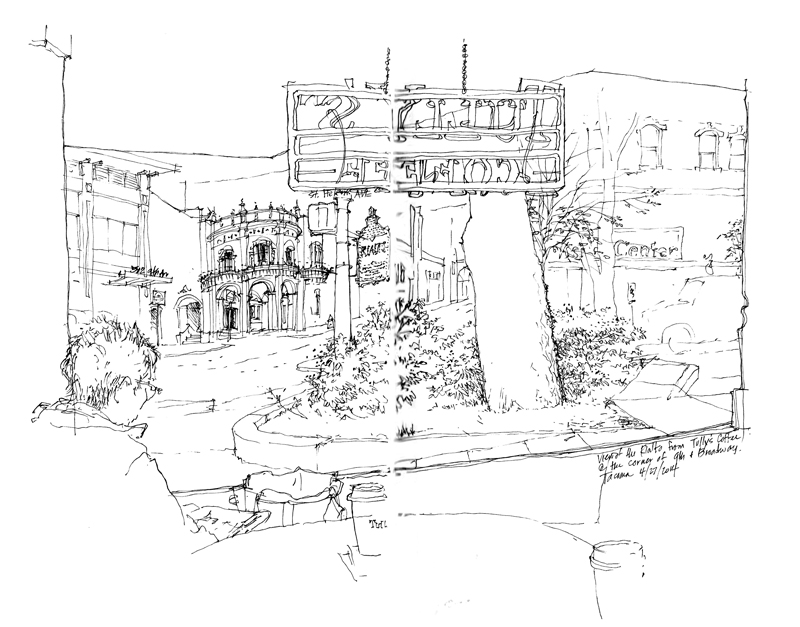
A view from inside Tully’s coffee shop during the Line to Color workshop with Gail Wong in Tacoma, Washington.

Seattle Winterfest

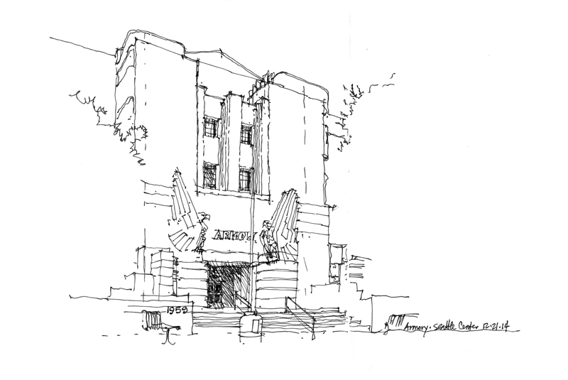
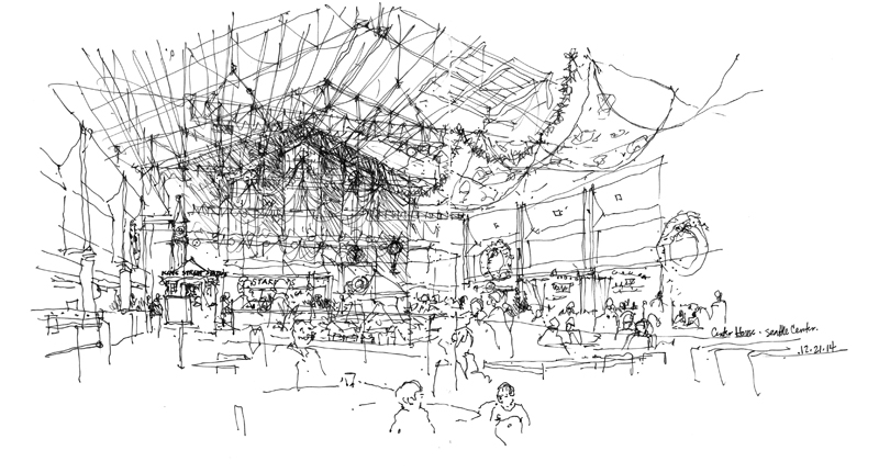
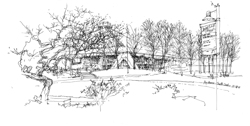
Here are three scenes from Seattle Center I drew during the monthly meeting of the Seattle Urban Sketchers group. The first is a quick study of the east entry to the former Armory, which is now known as the Center House.

EPSON MFP image

The second is the interior of the Center House, which houses a large food court, entertainment stage, and a super-sized model train layout for the holidays.

EPSON MFP image

The last is of Key Arena, former home of the Seattle Supersonics but still a successful venue for many sporting and cultural events.

EPSON MFP image

Evolution of a Drawing

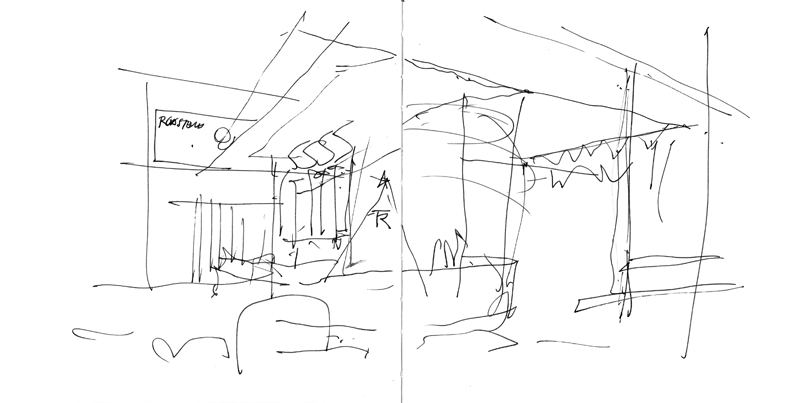
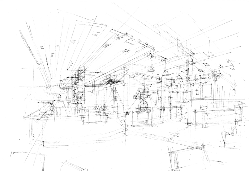
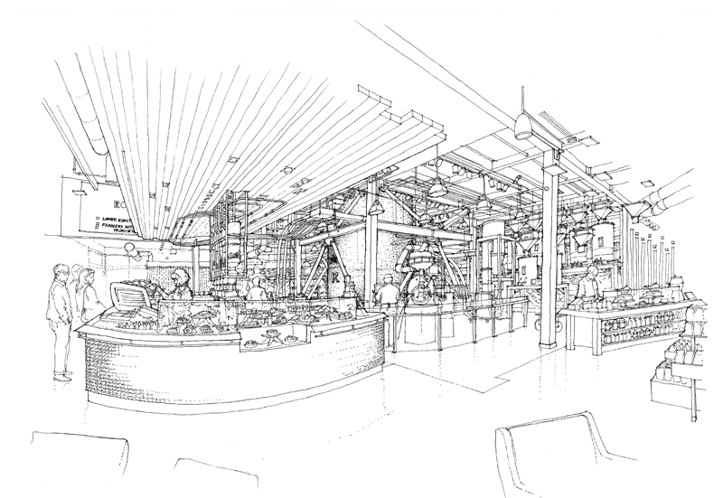
Few drawings are executed in a single pass. When drawing on location, my process usually involves first blocking out the overall structure of a scene before refining the forms, making adjustments, and filling in the details. And for studio work, the process becomes a little more involved. For example, for a drawing of the interior of the new Starbucks Reserve Roastery and Tasting Room in the Capitol Hill neighborhood of Seattle, there were three phases in the process. The first is a very quick study of the possible viewpoint. The second is a rough pencil layout of the final view submitted for approval. And finally, the finished ink-line drawing.

EPSON MFP image

EPSON MFP image

EPSON MFP image

Two Views of Red Square

RedSquare1

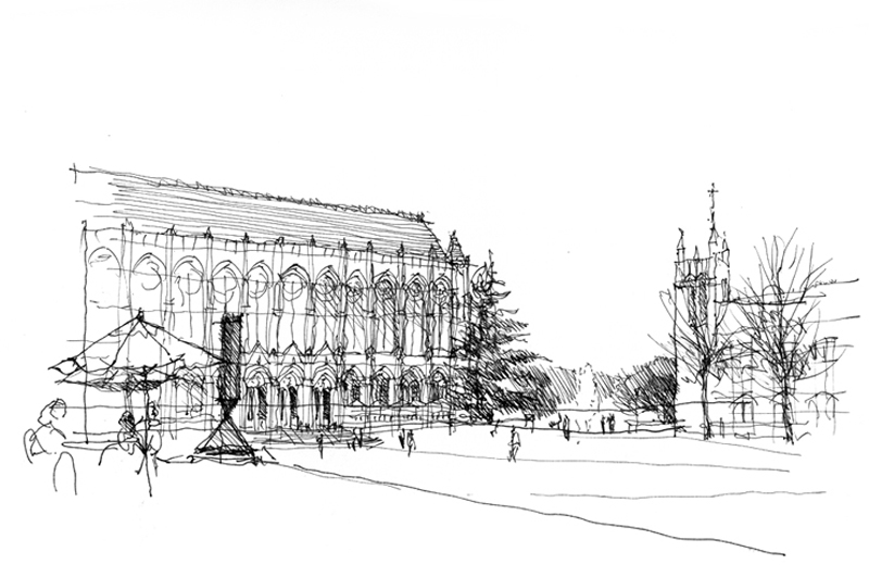
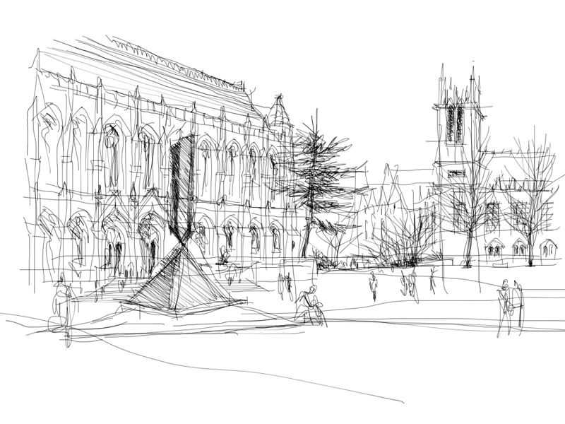
Back in 2010, a number of videos were shot of me drawing scenes on the UW campus. Here is the sketch I did of Red Square with Suzzallo Library in the left background, Gerberding Hall to the right, and a table setting and Barnett Newman’s sculpture, Broken Obelisk, in the foreground. During a break in the rainy weather we’ve been having the last few days, I again went to draw Red Square, this time drawing a slightly different view with my iPad Mini and the Brushes app.

RedSquare

Drawing with my forefinger on a glass surface that is only 6.25 x 4.75 inches in area fosters the use of more gestural strokes and inhibits the drawing of fine details. Even though the strokes are only one pixel wide, I found myself suggesting rather than describing because I wasn’t willing to constantly zoom in and out and painstakingly work pixel by pixel. I’ve tried a number of styli but haven’t found one that is a reasonable substitute for the nib of a fountain pen due to the nature of the capacitive touchscreen display.

Still, the overall process of establishing perspective structure first before adding tones and details remains the same as when drawing with a pen on paper. I hope to show this when I export the data and convert the actions into a Quicktime movie.

About Copying

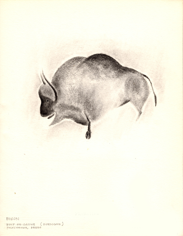
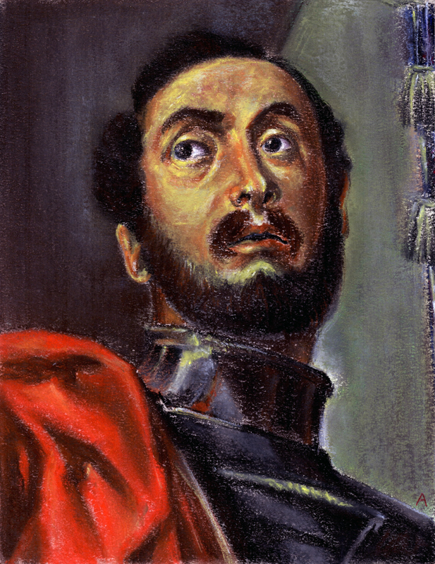
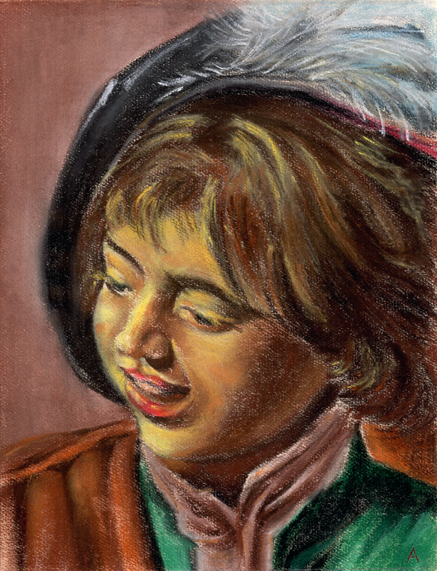
Back in 1963, an art history course at the University of Notre Dame required me to copy a number of art works. The idea was to supplement the reading about and viewing of art with the act of reproducing art. Here are three examples from my course notebook that I happened upon recently.

EPSON MFP imageDordogne Cave fresco of a bison

EPSON MFP image

Veronese’s Head of St. Mennas (detail)

EPSON MFP image

Frans Hals’ Young Flute Player

It had long been a tradition in the studio arts to copy masterworks as a way to gain proficiency, the thinking being that one could learn by imitating the compositional strategies, the strokes and blending of colors, and other techniques used by artists more skilled than ourselves. There are art teachers, however, who consider this type of copying to be a crutch and an obstacle to developing one’s own creative mind. Whether the practice of copying is good or bad depends ultimately on the reasons for doing so. The motivation for copying should not be merely the reproduction of a work. Rather, it should be seen as an attempt to explore the process of the original artist and just a single step in the learning process.

I should point out that drawing on location neatly sidesteps the question of copying. But note that even here, we are in a sense copying what our visual system takes in and interprets.

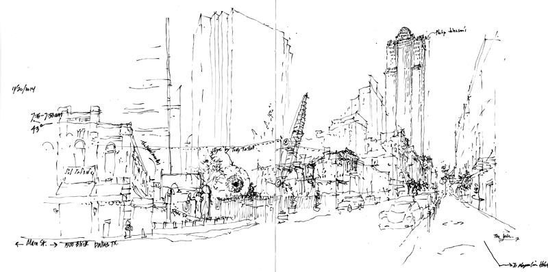
Main Street Dallas

EPSON MFP image

During a brief visit to Dallas recently, I woke up early one morning and sketched this view of the city’s Main Street. To capture the feeling of a city in transition, this panorama takes in the high-rises of a typical downtown, including the Bank One Center by Philip Johnson and John Burgee (now the Comerica Bank Tower) on the right; one of the many older structures being torn down to make way for new projects in the middle; and the Laumeier Sculpture Park featuring the Eye, a 38-foot diameter sculpture by Tony Tasset. What surprised me was how roughly the sketch developed until I realized that the ink in my pen was not flowing as freely as it normally does because of the 43° weather.

Faces

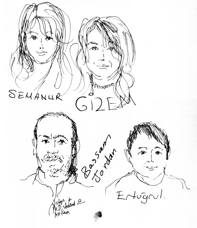
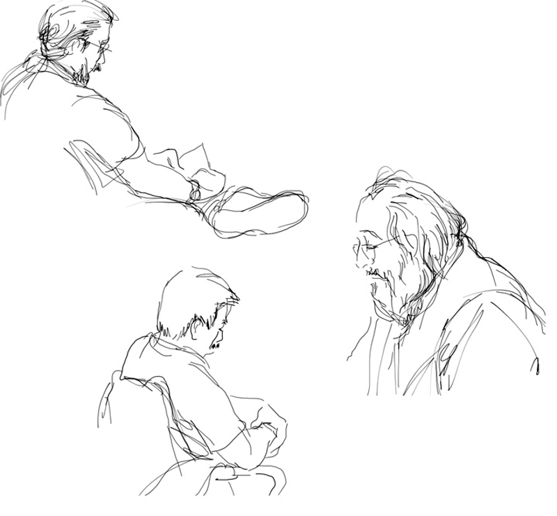
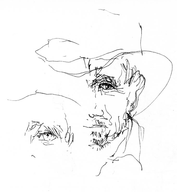
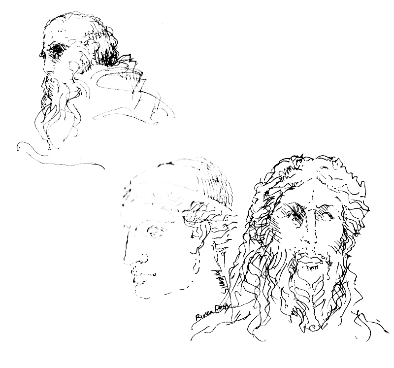
In the community of urban sketchers, architects are sometimes viewed as practiced in drawing buildings but not as adept at drawing people. While my focus is usually on capturing architecture and spatial environments, the drawing of people is often required to give scale to spaces and animate the places I try to capture in my work. And when drawing portraits, sometimes I am lucky enough to capture the personality of an individual with just a few well-placed strokes. At other times, I struggle and make people look younger or older than they really are.

Faces1 Faces2 Faces3

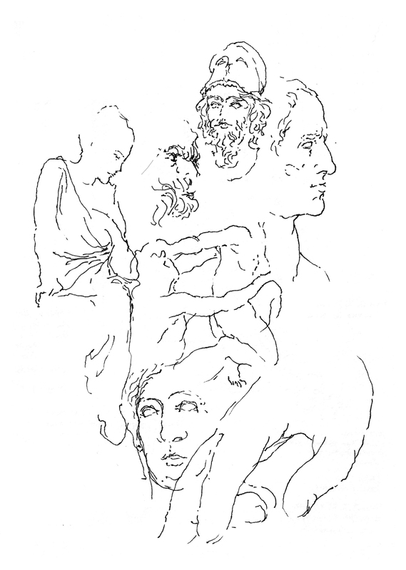
The human face and body are difficult to draw, much more difficult than drawing architecture. Except for the cartoonists who are able to distort salient characteristics to emphasize the personality being caricatured, most of us can easily fall prey to mistakes in proportion and unintentionally distort our subjects. Still, drawing people is often necessary and always a challenge to draw. Good practice subjects are classical sculptures because they don’t move around as you try to draw them.

Sculptures1 Sculptures2

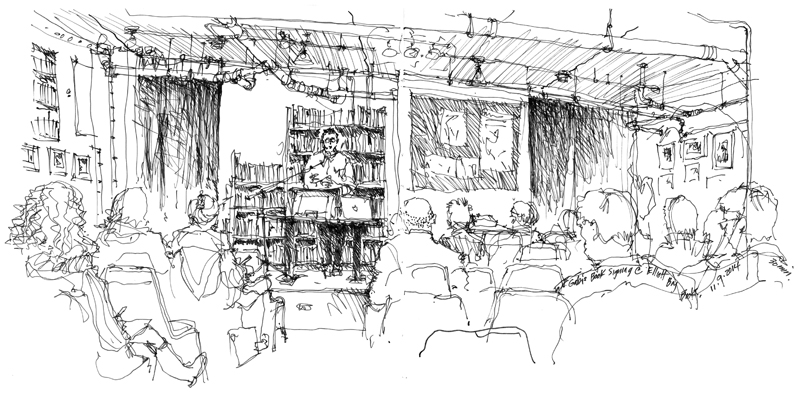
Gabi’s Book Signing

EPSON MFP image

Last Sunday, I attended a book signing by Gabi Campanario at Elliott Bay Books in the Capitol Hill neighborhood of Seattle. In addition to The Art of Urban Sketching, the event featured two more of Gabi’s recent publications. The first is Seattle Sketcher, based on Gabi’s exhibit at the Museum of Science and Industry highlighting his five years of work documenting the people, places, and events in the Pacific Northwest for the Seattle Times. The second is the first in a series of more focused urban sketching handbooks, Architecture and Cityscapes: Tips and Techniques for Drawing on Location. Both are highly recommended.

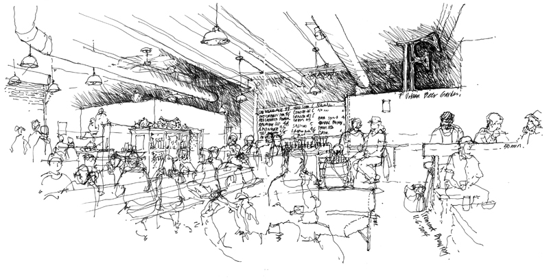
Fremont Brewing’s Urban Beer Garden

During the cool, gray days of Seattle’s fall season, we have to find interesting indoor places to draw. Yesterday afternoon, I chose Fremont Brewing’s Urban Beer Garden. The combination of an informal atmosphere and a large variety of artisanal brews makes this a great place to spend some time on a rainy day. And when the sun’s out, especially in the summertime, the space spills outward with long tables and communal seating. Fremont Brewing will soon be moving to a larger brewing facility closer to Ballard but will retain this space as a lab and experimental brewery.

EPSON MFP image

This is a view of the converted industrial space that I drew while enjoying a pint of FB’s Cowiche Canyon Fresh Hop pale ale. I first sketched in a rough outline of the major forms and elements and then overlaid the people before filling in some of the details. I’m realizing more and more that my views are tending to be panoramic in nature just as my taste in camera lenses leans toward the wide angle rather than the telephoto.

Surface and Depth

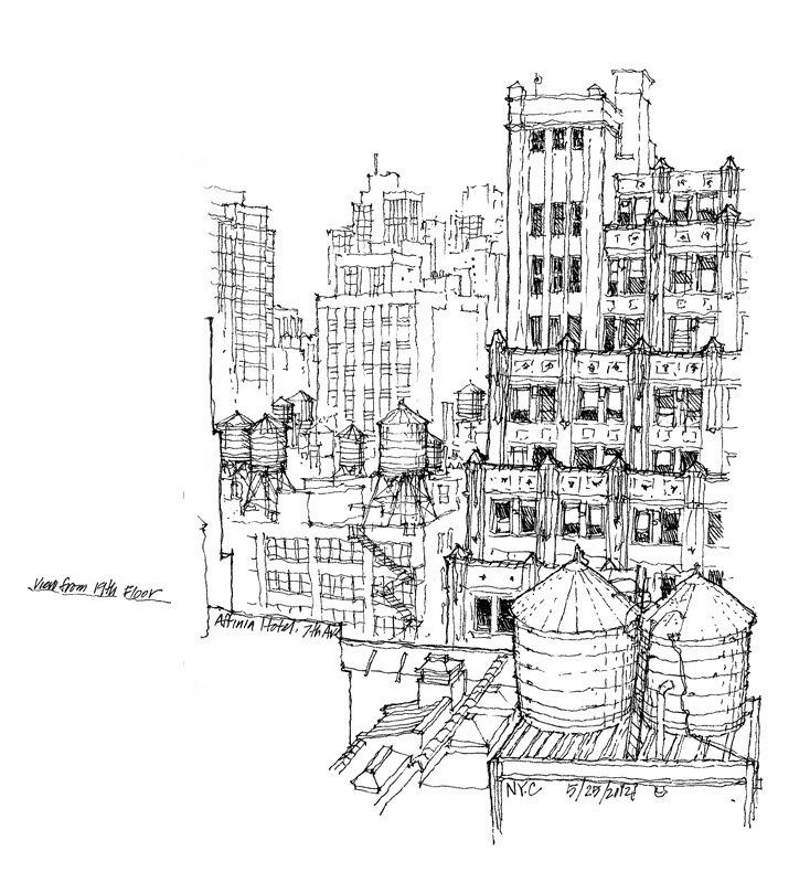
In the 1950s, the psychologist J.J. Gibson outlined a number of cues to depth perception. A few rely on our binocular vision and therefore do not apply to 2-dimensional drawings and paintings. Others, however, are psychological rather than physiological in nature. As such, these depth cues are pictorial in nature and are applicable to drawing and painting on a 2-dimensional surface. In the following, I try to use simple terms and snippets of my own drawings and photographs to illustrate each of the depth cues that I consider to be relevant to drawing on location.
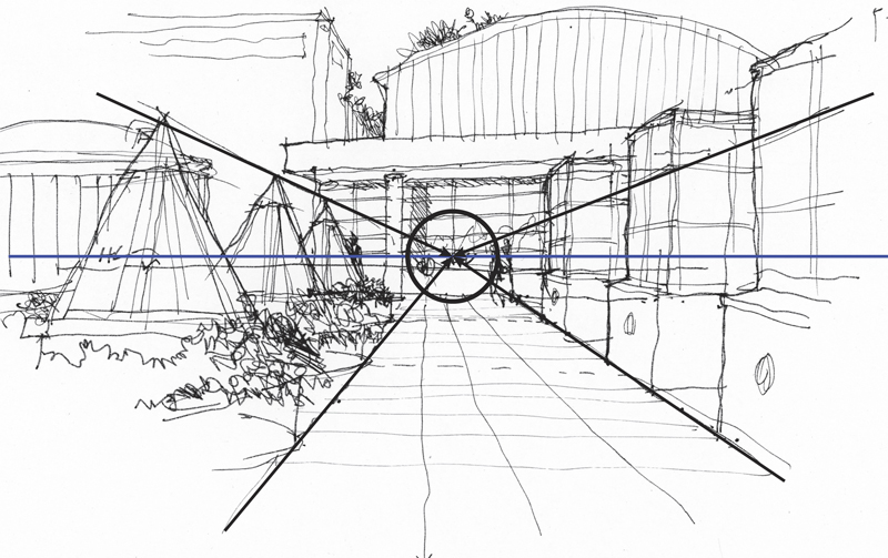
Convergence

Convergence of parallels: This is a key characteristic of linear perspective in which parallel lines appear to converge as they recede into the distance. Despite the usefulness of the other depth cues, linear perspective remains the structural scaffolding upon which to build a sense of spatial depth on the page.
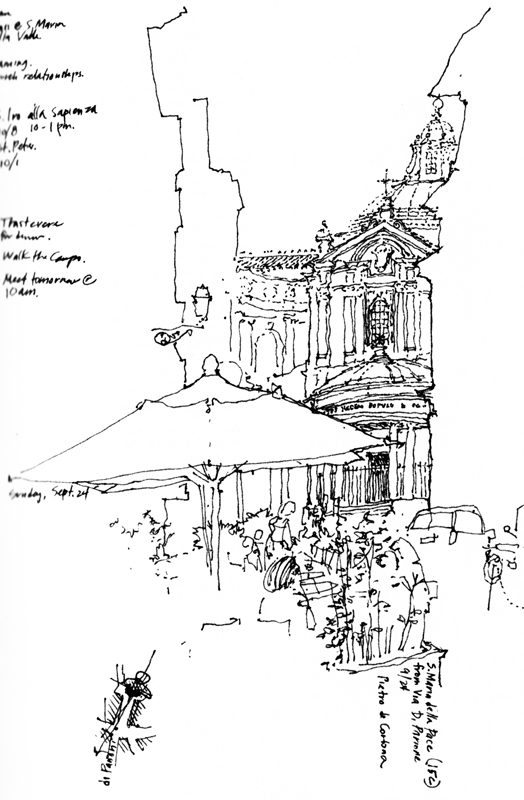
Overlap

Overlap: Near objects overlap or partially block the view of objects farther away. Locating effective overlaps can be useful in selecting a viewpoint and composing a drawing.
Position

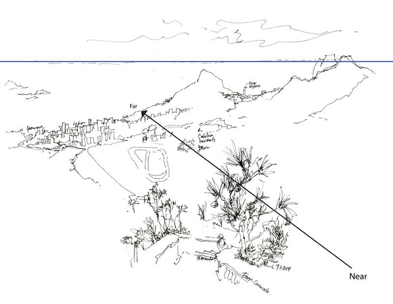
Position relative to the horizon: Objects below our eye level rise toward the horizon as they recede; objects above our eye level descend toward the horizon as they recede.
SizePerspective

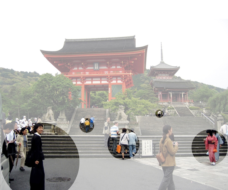
Relative size: Objects known or assumed to be of similar size appear to shrink in size with distance from the observer.
TexturePerspective

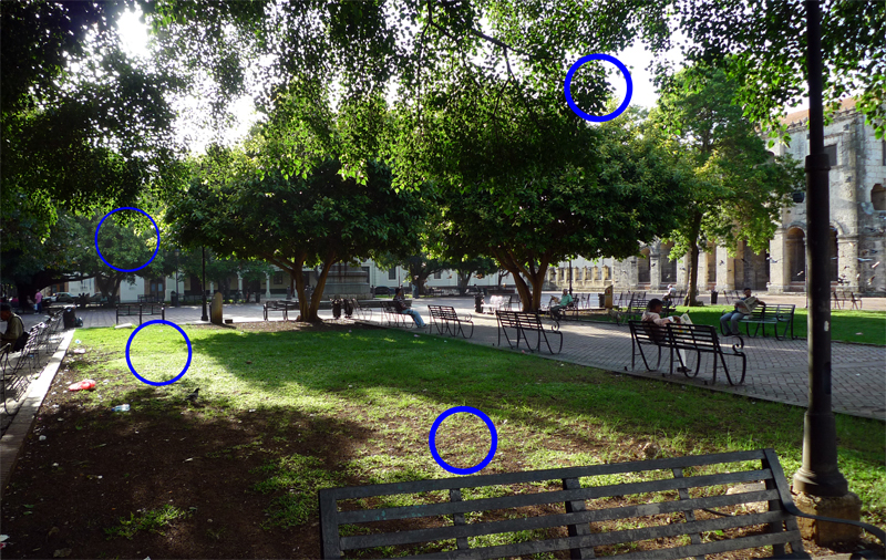
Texture gradient: Surface texture appears to get finer and smoother with distance from the observer.
Shading

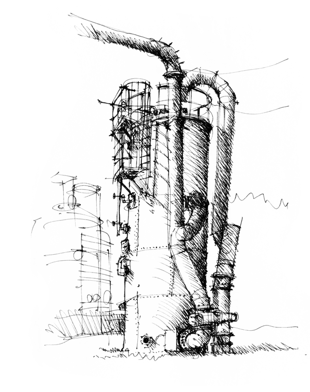
Shading and shadows: Contrasts in light and dark can convey the shape, form and depth of objects.
Atmosphere

Aerial perspective: Particles in the atmosphere affects the color and visual acuity of objects at varying distances from the observer; distant objects appear grayer or bluer and less distinct than nearer objects.

As we can see, scenes more often than not comprise a number of these depth cues operating simultaneously. Seeing how these depth cues occur in our real-life perception can aid our understanding of why things appear as they do, counter to what we know of the things we draw, which are often in conflict.