Another Point of View

EPSON MFP image

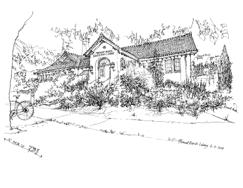
A few weeks back, I had posted this view of the Fremont Public Library. While it shows the architectural appearance of the structure, it says little about where it is—its context. The structure could be in many different places. There is nothing in the drawing to suggest where it is located.

EPSON MFP image

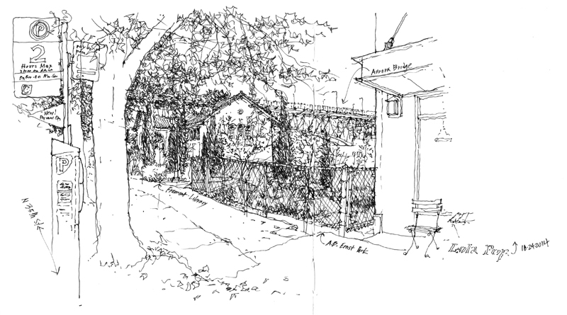
During a break in the rainy weather on Friday, I stopped to draw this view. While it doesn’t capture the frontal appearance of the library, it does show a bit more of how the it is situated in the city of Seattle. In the background, you can see the Aurora Bridge. To the right foreground is the A.B. Ernst Park, and on the righthand edge is the profile of the building to the north. The bottom line is that it is often difficult, if not impossible, for any single drawing to tell the story of a place.

East Pine and Broadway

EPSON MFP image

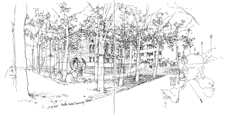
Yesterday at the monthly meeting of the Seattle Urban Sketchers group, I drew this view while sitting in the corner park at East Pine and Broadway in the Capitol Hill neighborhood of Seattle, looking toward the Broadway Performance Hall and Seattle Central Community College. This scene attracted me because of the way the trees in the park filtered the view of the buildings beyond. I began by first drawing the building forms and then worked from back to front, adding elements such as the fencing, the ground terracing, and the sculpture by Charles Smith. I then drew the tree trunks and foliage. Finally, I went back to fill in the details and texture that I could see through the trees.

I think that it’s okay in a sketch like this to draw over previously drawn elements and even be a little messy as long as the lines are lightly drawn. It’s when we add details and darken certain lines that we should pay attention to which elements overlap others. I believe the resulting transparency of the drawing helps convey the depth of the space.

Casa das Canoas

EPSON MFP image

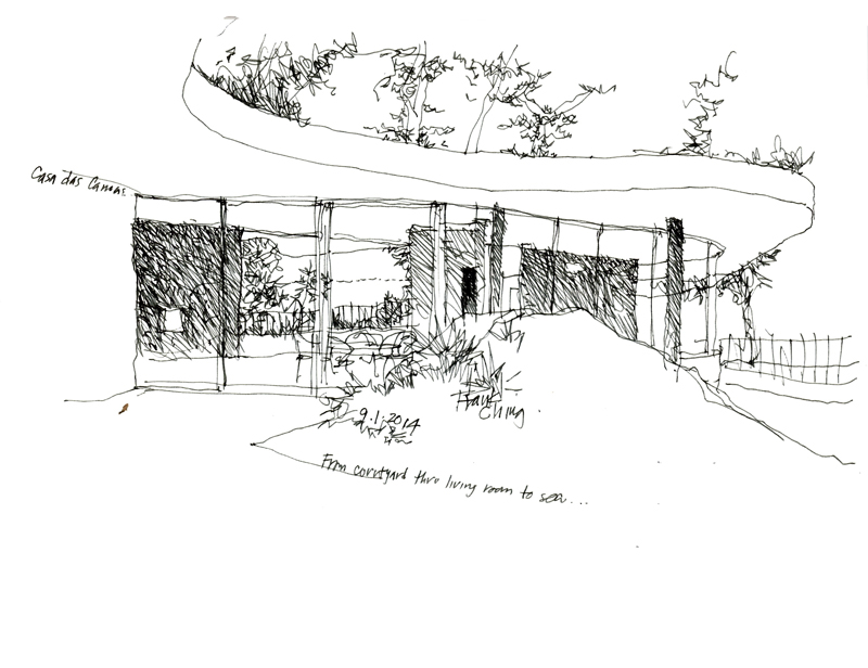
While in Rio de Janeiro a month ago, we had the opportunity to visit Casa das Canoas, the first residence designed by Oscar Niemeyer in 1952. It is a true gem, nestled in a beautiful hillside setting and displaying the characteristic flowing lines of Niemeyer’s architecture. Thanks to Caique Niemeyer, Oscar’s grandson, for allowing us the privilege of touring this fine example of modern architecture.

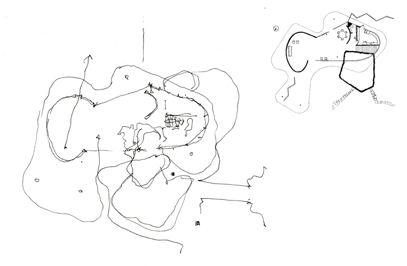
After doing a few sketches of the exterior and interior of the deceptively simple structure, I attempted to draw a plan to try to understand the two-dimensional origin of what I saw in three dimensions.

EPSON MFP image

To verify my plan, I perused several books on the architecture of Oscar Niemeyer but none contained a plan of this house. Upon returning to Seattle, I did an internet search and found this plan drawn by Jeff Hottinger, which is included next to the plan I drew.

In this age of digital 3D modeling where much design thinking and decision-making is made from a perspective viewpoint, it is still a useful mental exercise to try to imagine the orthographic relationships that plans and sections reveal and which perspective views do not. As designers, we should be able to think two-dimensionally as well as three-dimensionally.

DCA Conference 2014

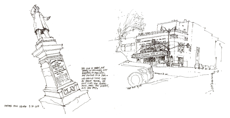
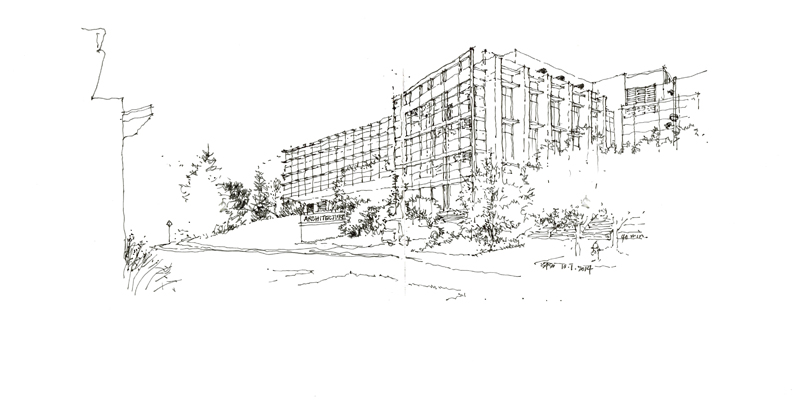
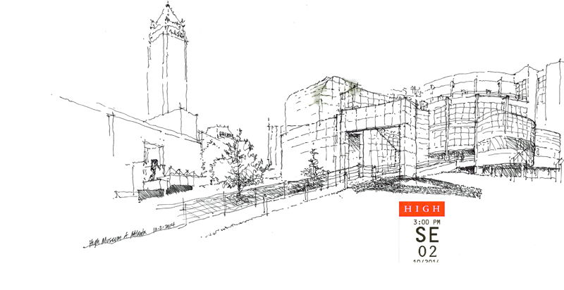
Here are a few sketches I did when attending another stimulating Design Communication Association conference held at Southern Polytechnic State University in Marietta, Georgia. The first are views from Marietta town square; the second is of SPSU’s architecture building; and the third was done during a tour of the High Museum of Art in Atlanta, showing Richard Meier’s building but not Renzo Piano’s addition that creates a piazza beyond.

EPSON MFP image

EPSON MFP image

EPSON MFP image

Panorama

EPSON MFP image

EPSON MFP image

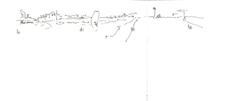
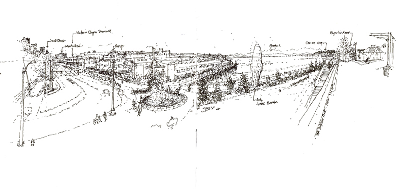
The Seattle Urban Sketchers met last Sunday at the Olympic Sculpture Park. Since I had already sketched there a number of times, I was looking for a new vantage point and found one at the southern end overlooking the waterfront. The panorama begins with downtown Seattle on the left, moves north along the waterfront, and ends with a view of Magnolia on the right. To the right of center stands the newest addition to the park, Echo, a 46-foot tall sculpture by Spanish artist Jaume Plensa.

The first sketch is a quick study of the overall composition I did before attempting the final drawing. Because there was too much visual information for the small two-page spread, I had to abstract quite a bit of what I saw.

Drawing Quickly

EPSON MFP image EPSON MFP image EPSON MFP image

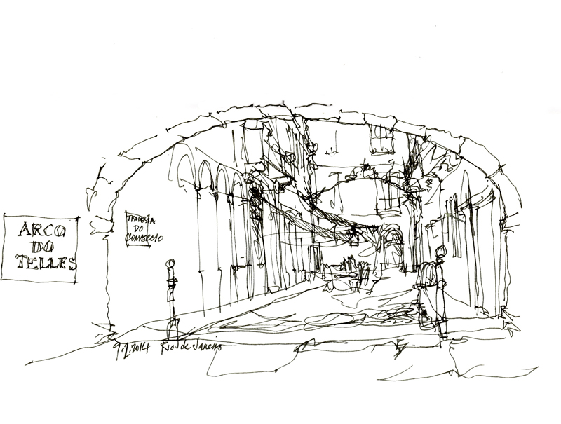
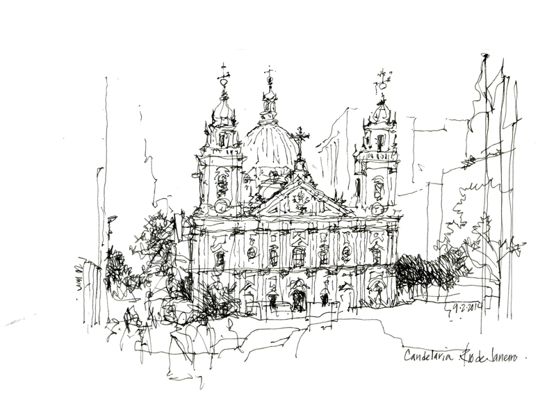
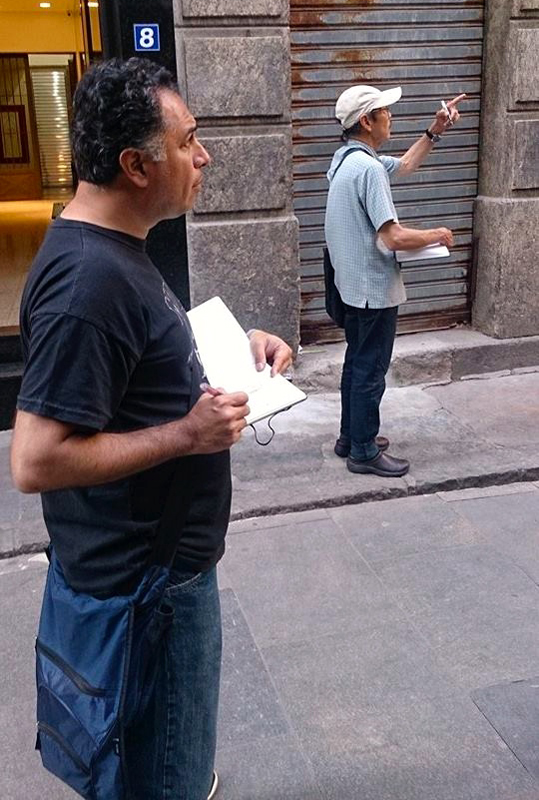
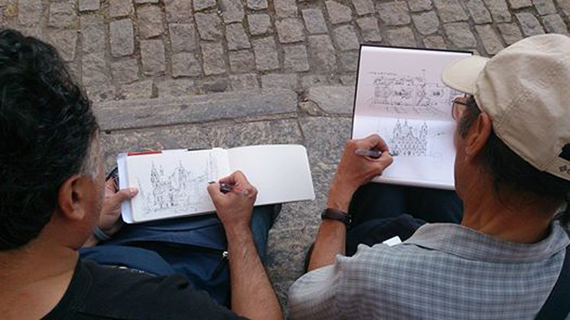
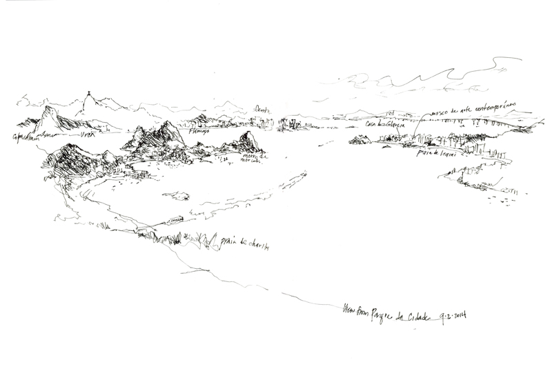
Often when traveling with a small group, we don’t have an hour or more to do a drawing. So if we want to capture a scene, we have to be able to draw quickly. My strategy is to first establish the structure of the overall composition and then, depending on the amount of time available, add whatever details I can to try to capture the spirit of a place. While drawing these very quick 10- to 20-minute sketches in Rio de Janeiro, I was accompanied by my friend and fellow urban sketcher Norberto Dorantes of Buenos Aires, who is a master of flowing lines.

Norberto Norberto2

Many thanks to Glaucia Augusto Fonseca for being such a gracious and generous host during our short visit to Rio de Janeiro. The setting for the city is truly stunning.

EPSON MFP image

Stadium High School

EPSON MFP image

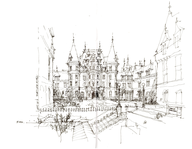
On the last day of the Tacoma Line to Color Workshop this past weekend, we gathered at Stadium High School for an informal sketch crawl. This historic landmark, designed by Hewitt and Hewitt for the Northern Pacific Railway Company in 1891, was intended to be a luxury hotel but became instead a storage facility as a result of the Panic of 1893. After a fire in 1898 gutted the building, the Tacoma School District purchased the structure, which was renovated according to plans by the Federick Heath. Bassetti Architects and Merrit Pardini Architects undertook a major renovation, historic renovation, and seismic upgrade in 2005.

Thanks to my co-teacher Gail Wong and all of the participants in the workshop who endured a lot of hard work facing challenging scenes but displayed amazing progress over the course of the weekend. Their love of drawing and the wealth of sketching sites offered by Tacoma made the weekend both enjoyable and gratifying.

Baia de Paraty

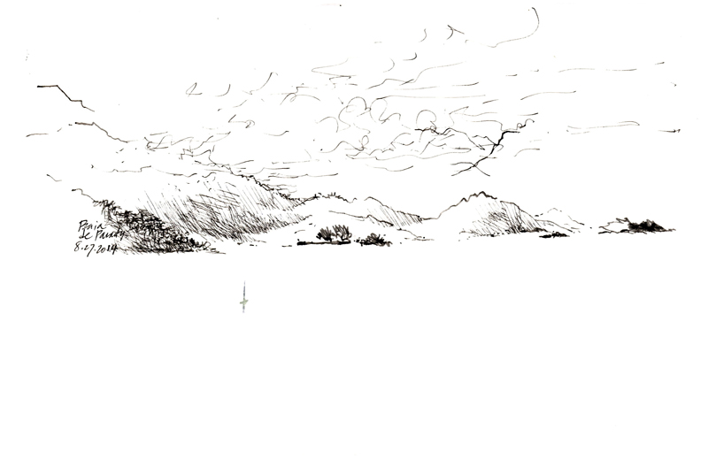
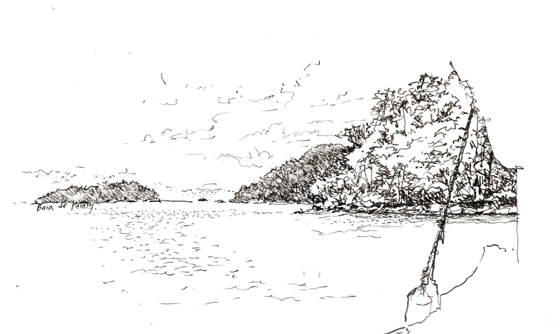
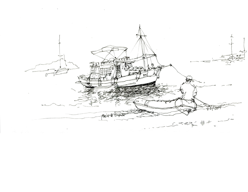
EPSON MFP image EPSON MFP image EPSON MFP image EPSON MFP image

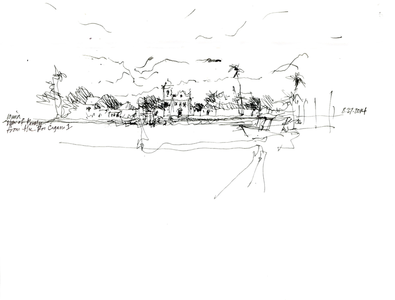
The morning before the symposium in Paraty started, a group of urban sketchers took a boat tour of the Baia de Paraty. Many thanks to Marilia Inke, who graciously arranged the pleasant outing on short notice. Even though it was a slightly overcast day, it was enjoyable to see the beautiful coast line around Paraty from another perspective. Perhaps what was most striking to me were the way the mountains formed a backdrop for the numerous islands seeming to float in the bay.

Igreja de N. Sra. do Rosário e São Benedito

EPSON MFP image

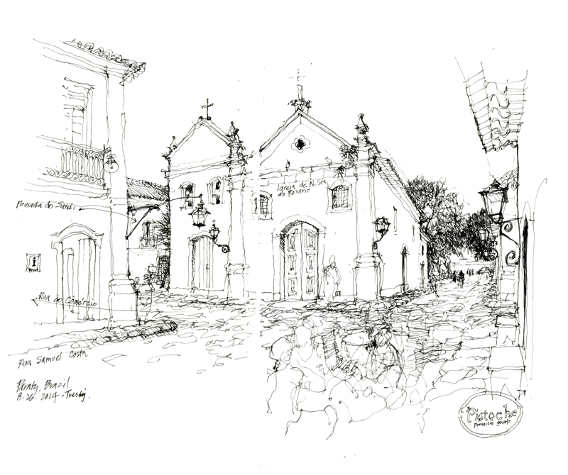
Arriving in Paraty a day before the 5th Urban Sketching Symposium started gave me a chance to walk around the town and do some drawing. This church attracted me because of its situation at the end of a street, where it commanded the intersection. To the left is the tourist information office and to the right is a self-serve gelato shop. Between the tourist information office and the church, you get a peek at the entrance to the Pousada do Sandi, where we were staying.

Urban Sketching Symposium Paraty

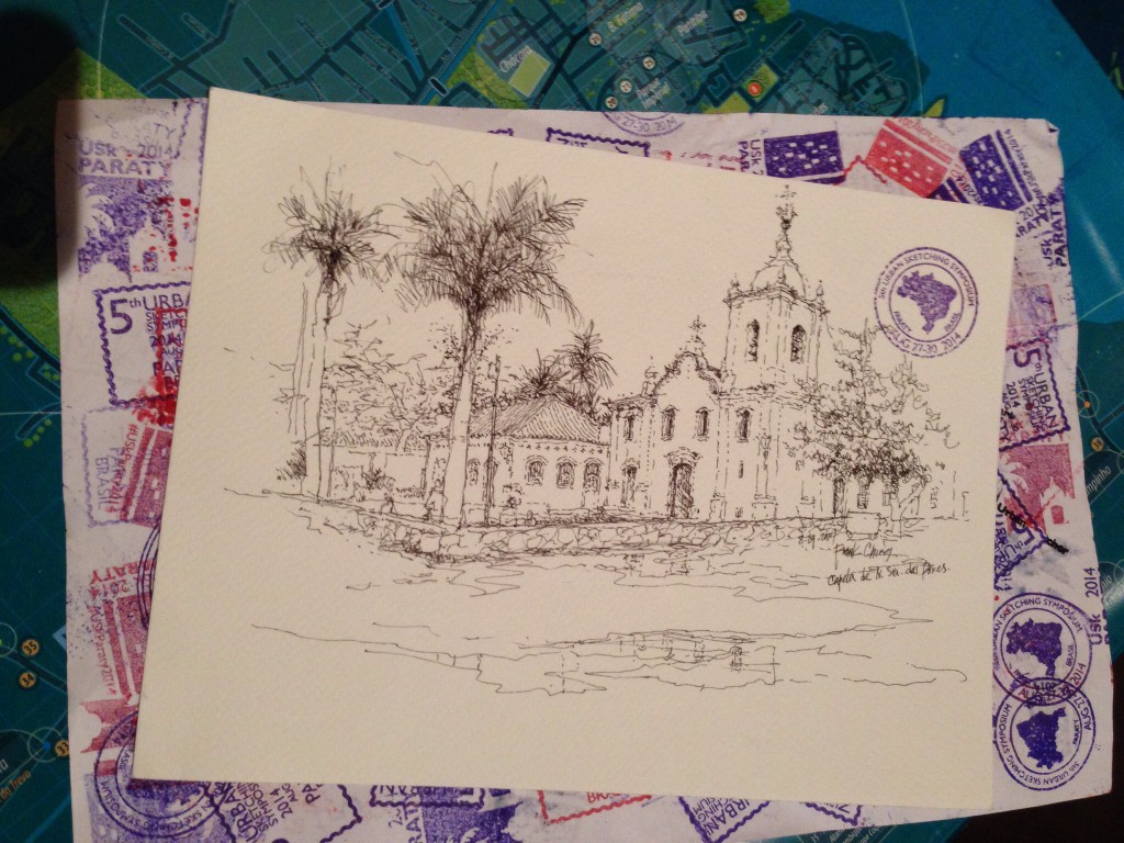
imageA view of Capela de N. Sra. das Dores in Paraty, Brazil, during the 2014 Urban Sketching Symposium. This will be one of the many sketches that will be sold tomorrow evening in a silent auction to benefit the Urban Aketchers organization. I’ve completed two workshops and have a third scheduled tomorrow morning. Great participants, enthusiastic and appreciative in a beautiful colonial village on the Bay of Paraty.