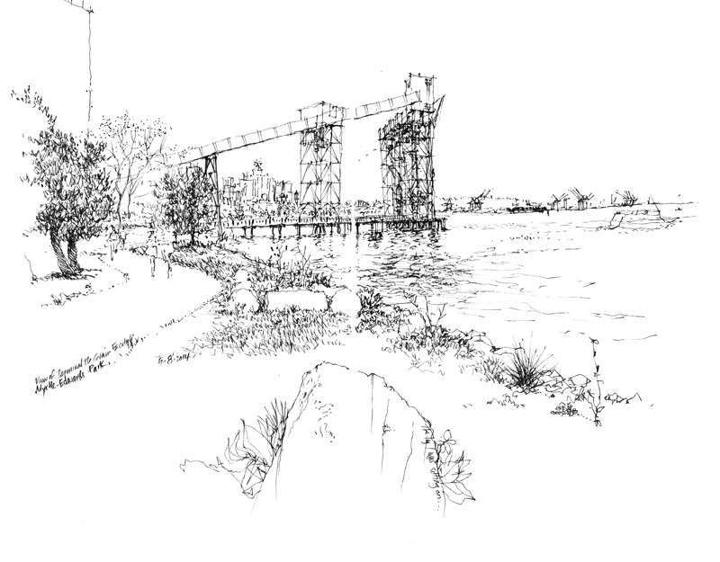
On a nice sunny day here in Seattle, I drew this view of the Terminal 86 Grain Facility. The Port of Seattle built this grain terminal in 1970 to replace the Hanford Street Terminal and satisfy the need for a larger facility as grain exports from the Northwest grew. It sits along and over Myrtle Edwards Park on Elliott Bay and frames a view of downtown Seattle beyond.
Category Archives: Drawing
MOHAI
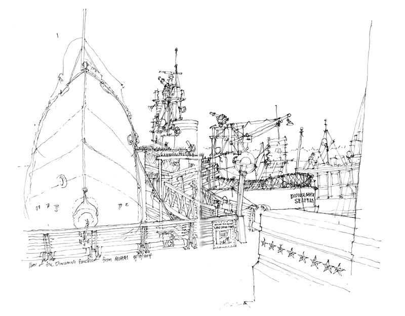
As part of Gabi Campanario’s Drawn to Seattle exhibit at the Museum of History and Industry, individual members of the Seattle Urban Sketchers have been spending Saturday afternoons as an “Urban Sketcher in Residence,” demonstrating and sharing their sketching techniques. Yesterday was my opportunity. After a few warm, sunny days, it turned cool and rainy again and so I had to draw from inside MOHAI. The first view is of the Duwamish, built in 1909 and the second oldest fireboat in the U.S., being retired in 1985 and now moored at the Historic Ships Wharf just north of the museum on Lake Union.
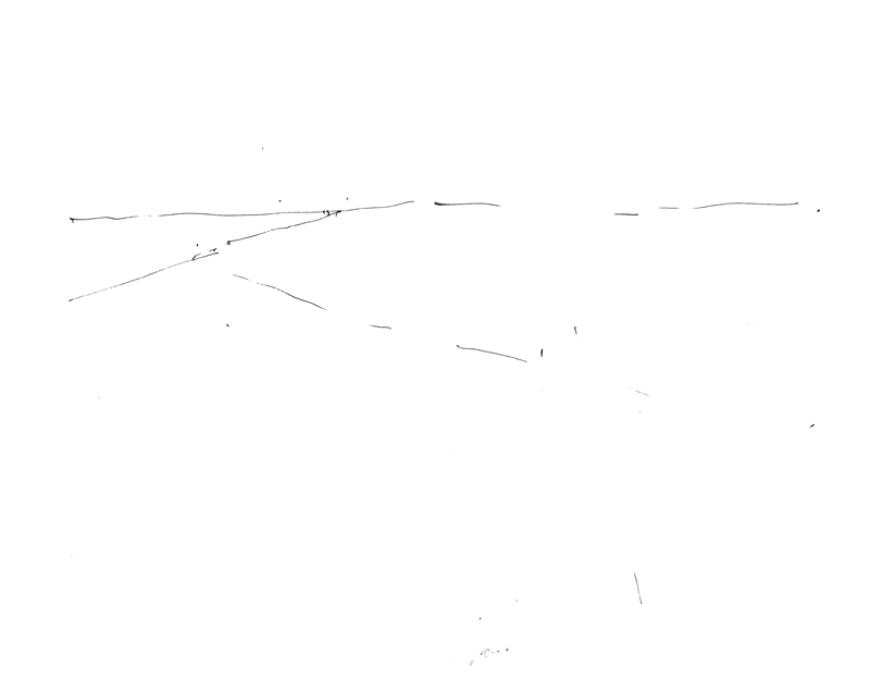
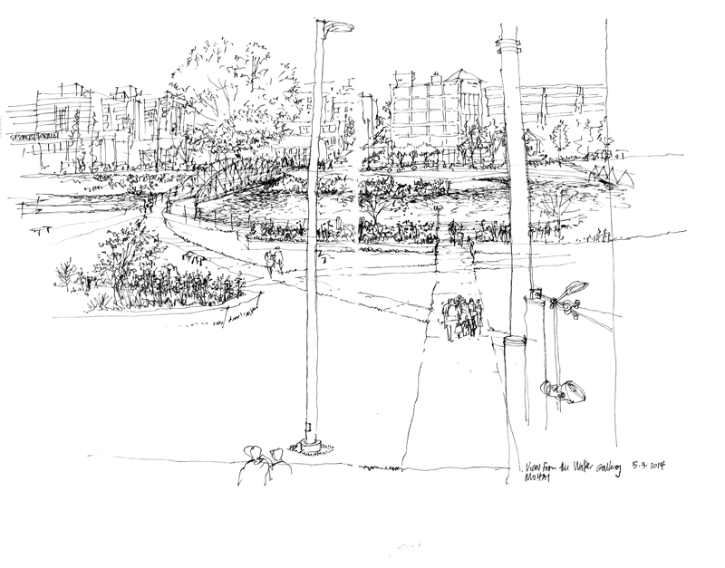
The second “drawing” consists of just three lines, but they represent for me the broad outline of the following sketch, drawn from the second floor Walker Gallery, where Gabi’s exhibit was located. With those three lines, I establish the overall composition of the view and the scale and position of the bridge, which is the focus of the drawing.
Tacoma
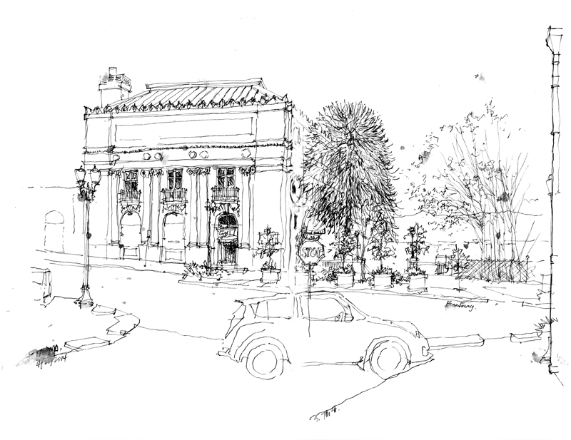
This is a view of the now abandoned Elks Club at Broadway and 7th and Broadway in Tacoma, where the Seattle Urban Sketchers joined the Tacoma group for their monthly meeting. While the weather was chilly but sunny, it soon began to sprinkle. You can see the raindrops that began falling as I was doing this sketch.
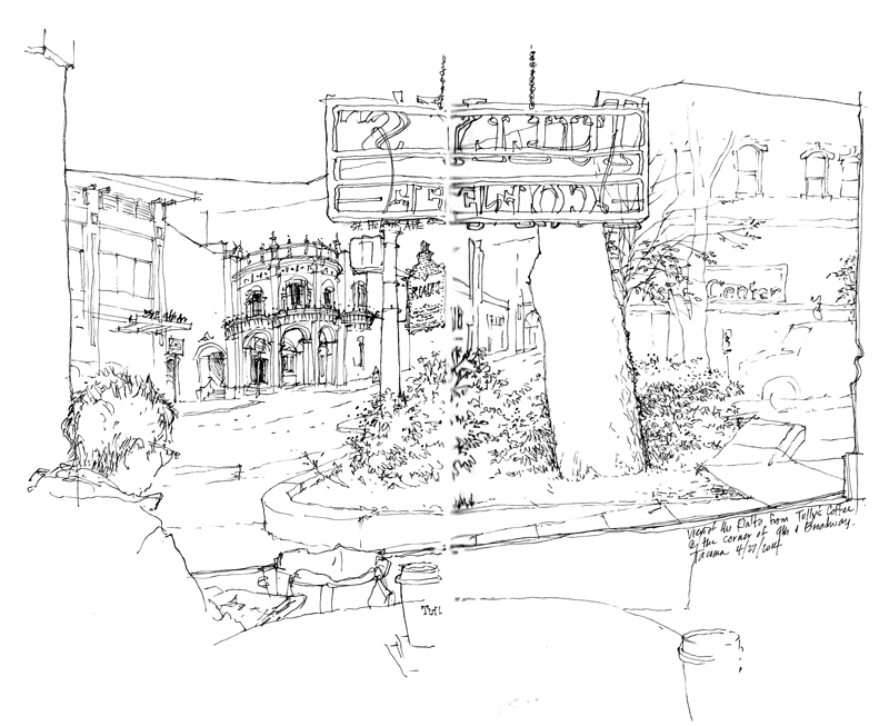
When the rain turned to hail and got blustery, I retreated to Tully’s Coffee at 9th and Broadway and found myself a spot in the corner offering this view of the Rialto Theater. I began by drawing the frame of the window, Tina Koyama drawing on my left, the Tully’s sign above, and a couple of coffee cups in the foreground. Then I moved to what I saw through the window, starting with the tree trunk and planting area and then moving back to the Rialto Theater itself. The vertical white banding is my effort to erase the gray shadows that appear in the binding when I scan my sketches.
Washington State University
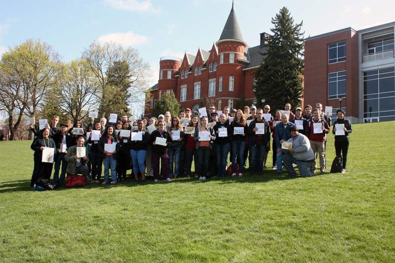
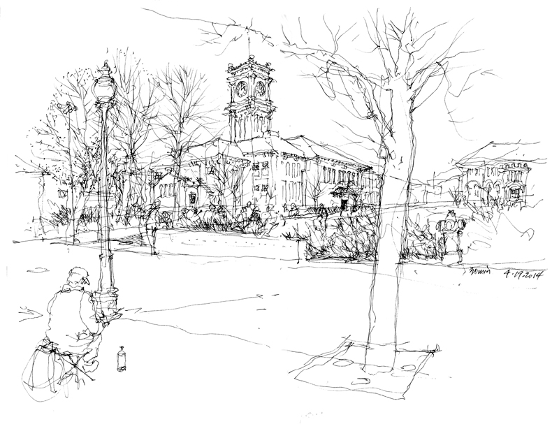
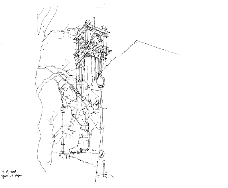
Thanks to Bob Krikac of the Washington State University’s School of Design and Construction, Gabi Campanario, Gail Wong and I were able to spend this past weekend conducting a series of drawing workshops in Pullman, Washington. It was great to see the energy and desire to draw among the mixed group of students, professionals, and individuals simply interested in urban sketching. After the teaching sessions on Saturday and Sunday morning, we all met at Bryan Hall with its iconic clock tower for a final sketchcrawl. Here are two of the three views that I managed to do.
Spring in Seattle
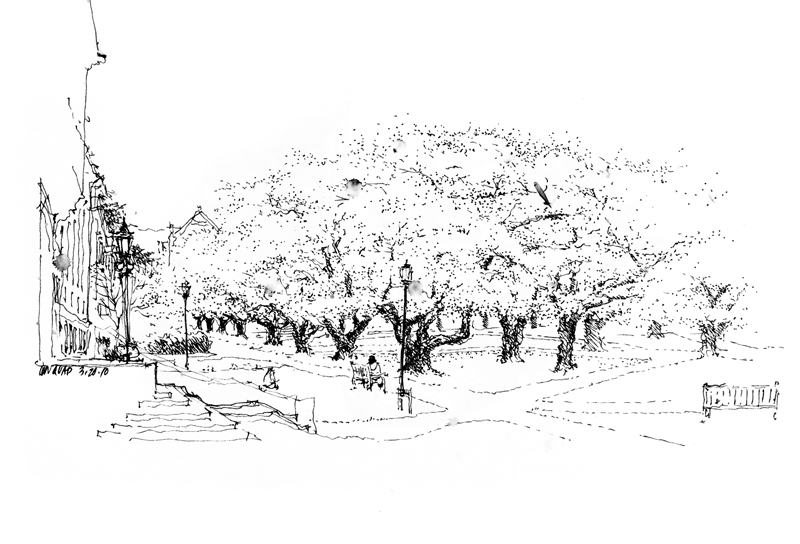
To celebrate the arrival of spring and warm, sunny weather here in Seattle, I offer this 2010 view of the quad on the UW campus with the cherry trees in full blossom.
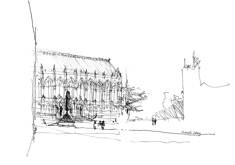
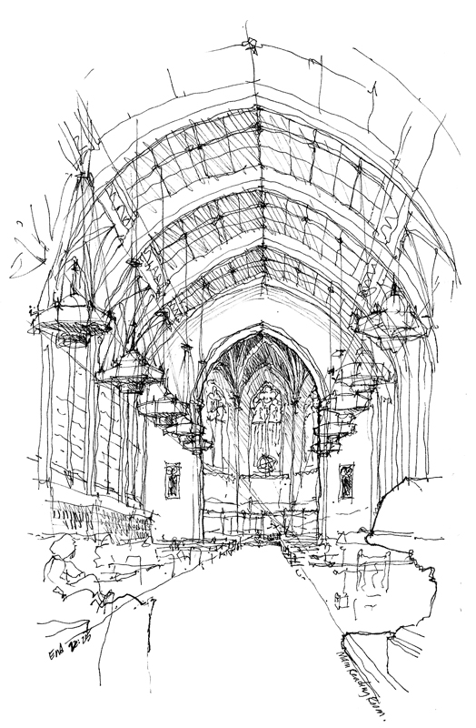
Also, to recognize the UW’s Suzzallo Library being recognized as “one of the coolest college libraries in the country,” here are two views of the Collegiate Gothic structure, designed by Seattle architects Carl F. Gould, Sr. and Charles H. Bebb in 1923.
Black and White
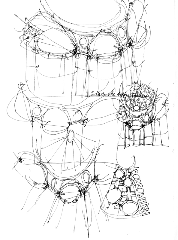
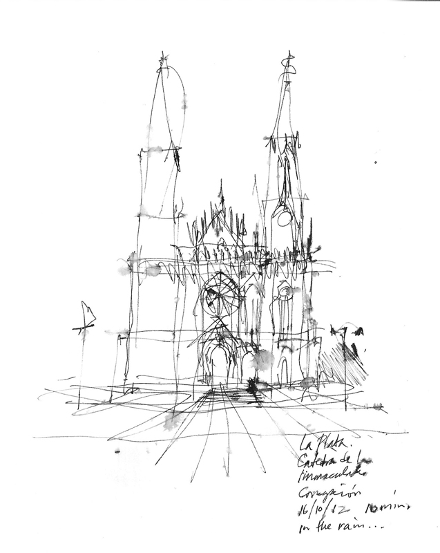
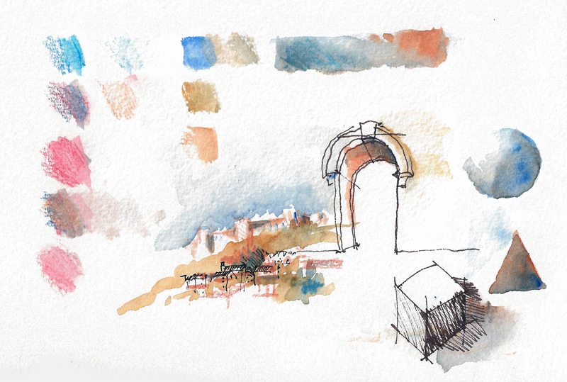
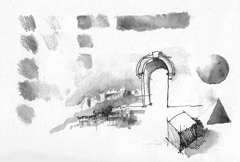
With the rise of digital photography color has become pervasive, unlike the film era where black-and-white photography was prized for its confident and raw visual style. In the field of sketching, too, color sketches are often seen as richer and communicating more information than monochrome drawings, which many consider to be primitive and lacking emotion. Yet, utilizing a range of strokes, black-and-white sketches can express a wider range of feelings than one might expect…
from light and airy…
to dark and heavy…
from descriptive…
to illusory…
World Trade Center
I flew to NYC for a presentation Monday evening by Ian Shapiro, co-author of Green Building Illustrated, which was recently published by Wiley. Sponsored by the Urban Green Council, the New York chapter of the U.S. Green Building Council, the author talk was held in the beautiful Trespa Design Centre in SOHO.
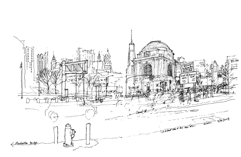
Driving across the Manhattan Bridge from JFK with Ian that Monday morning, I confronted this distant view of the new WTC. Fortunately, I had some time to go back and capture that urban scene at the corner of Bowery and Canal Street.
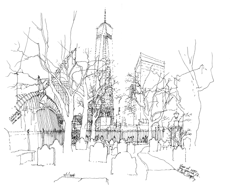
After meetings at Wiley the following day, I had some free time to walk around the WTC site, where I found this view of the WTC from the grounds of St. Paul’s Chapel.
Act without Striving
Sometimes, we do our best work when we are the least concerned with the outcome.
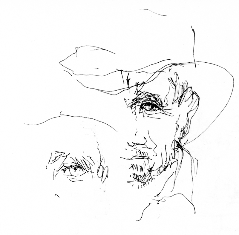
By showing you these images, I do not mean to imply they are examples of my best work but there is a fresh quality to my drawings either when I don’t have the time to overthink a drawing or when I am demonstrating an idea or approach as I am teaching.
Contrast
Whenever I view one of my own drawings or see someone else’s work, my immediate, instinctive reaction is to ask: How could the drawing have been improved? Sometimes, the answer is better composition; at other times, it’s more context. But the more common response for me is increased contrast.
I’ve written about this before but it bears repeating that contrast is a critical part of both seeing and drawing. Without seeing contrast, we are not able to differentiate one thing from another. And without drawing contrast, we diminish the hierarchy that creates interest and focus in a sketch.
There are several kinds of contrast that we can use in a drawing. Perhaps the most obvious is distinguishing between heavy and light line work to enhance spatial depth—what is near versus what is further away.
Another is contrasting areas of greater detail with spaces of lesser detail, or areas of precision with those of ambiguity.
And in the case of watercolor sketches, it is definitely necessary to differentiate not hues but rather zones of tonal values.
International District
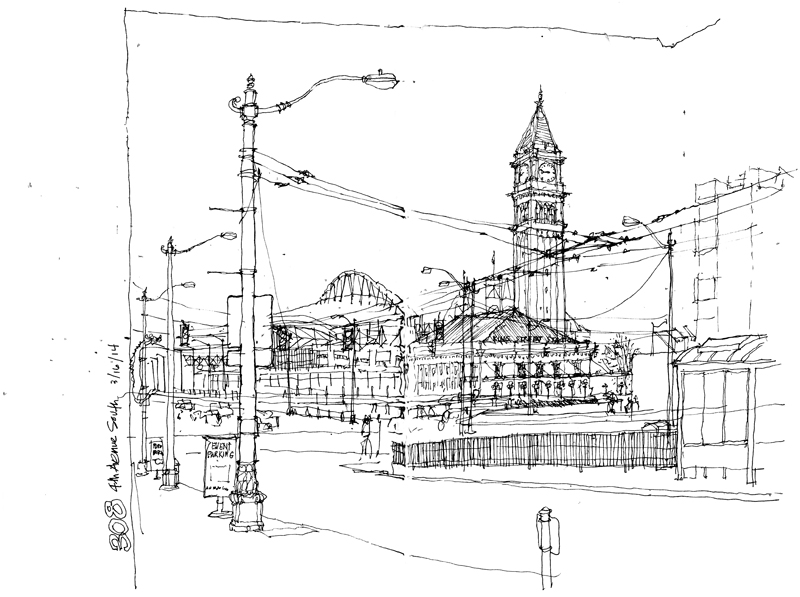
For the monthly meeting of the Seattle Urban Sketchers group yesterday, we met in the International District of Seattle. I caught the bus downtown and as soon as I got off, I confronted this view of King Street Station with Century Link Field in the background and a maze of overhead wires in the foreground. I just had to draw it while standing under the awning in front of 308 4th Avenue South.
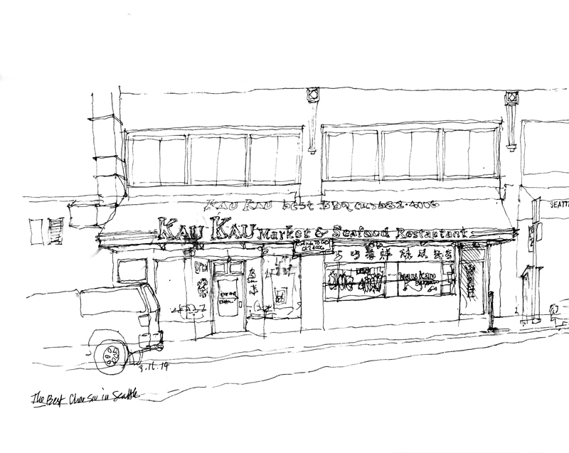
Thinking about what to sketch in the ID district, I was convinced I had to document Kau Kau, which, as the sign on its awning says, is home of the best BBQ (char siu) in Seattle. So tender and juicy. You can see the effect of raindrops on the page.
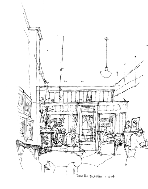
Finally, to get out the rain and damp cold, I joined a few others in the tea shop housed in the Panama Hotel. Designed by Japanese American architect Sabro Ozasa, who was a graduate of the University of Washington, the hotel opened in the summer of 1910 and was designated a National Historic Landmark in 2006. In the basement is the best surviving example of an urban-style Japanese bathhouse in the U.S.

