Smith Tower


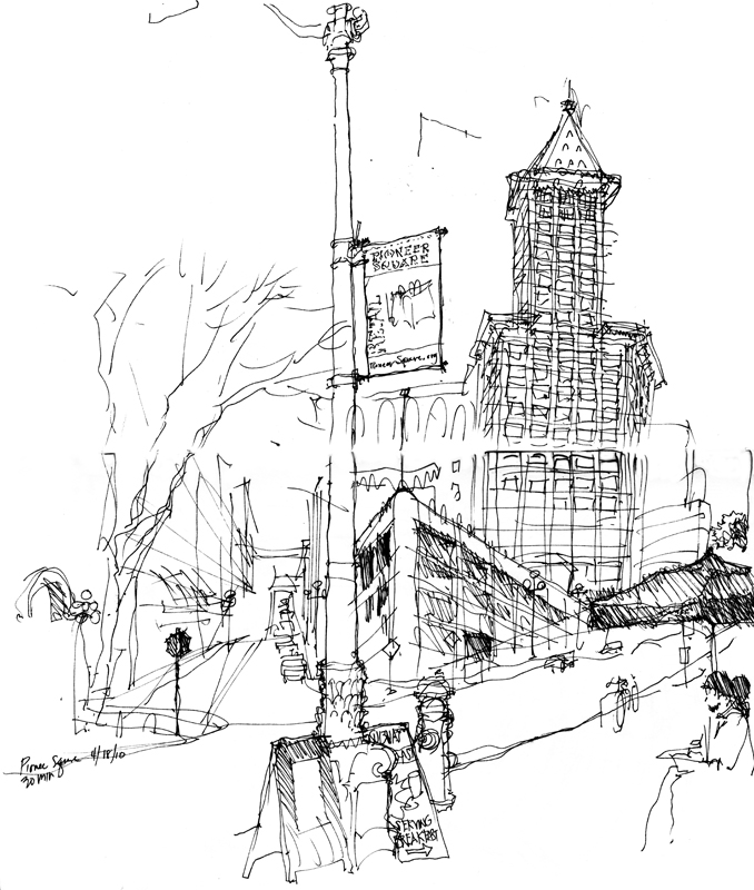
SmithTowerI did this 30-minute sketch of the iconic Smith Tower when the Seattle UrbanSketchers group met in the Pioneer Square district for its monthly gathering back in April of 2010.

New York businessman Lyman Cornelius Smith initially intended to construct an 18-story building on the site at the corner of 2nd Avenue and Yesler but at the suggestion of his son, Burns Lyman Smith, who had witnessed the building of skyscrapers in New York City, the height was increased to 42 stories. Designed by the NY architectural firm of Gaggin & Gaggin, the steel-framed structure began to rise in late 1911 and was finally completed in July of 1914. For almost 50 years, the Smith Tower remained the tallest building on the West Coast. Today it remains an office building with the original Observation Deck and Chinese Room available for rental for private events.

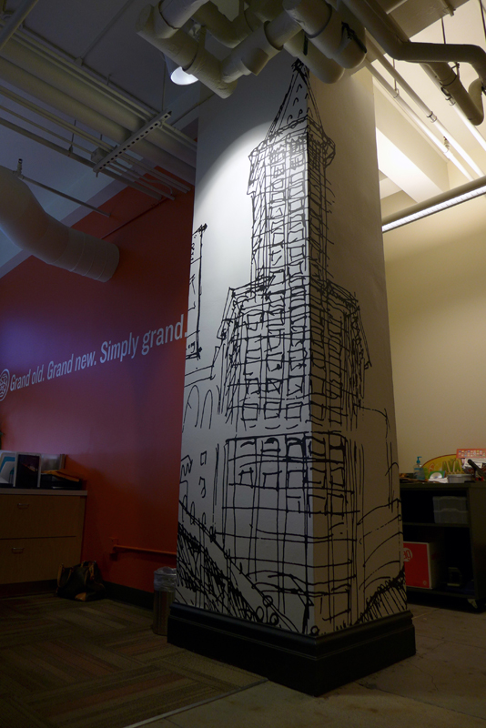
In September of last year, the Smith Tower management office asked for permission to use a scan of my sketch in their leasing space. A few days ago, I finally got around to seeing it. Here is a photo of the installation.

SmithTower2

It is always interesting for me to see how well an inkline drawing holds up after being enlarged and how suggestive ink strokes can be.

Fremont Center

EPSON MFP image

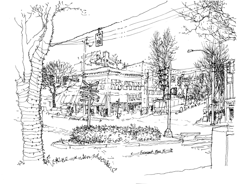
Fremont likes to call itself the Center of the Universe. Here is the literal center of the Center, the intersection where Fremont Avenue North, North 35th Street, and Fremont Place North all meet. On the traffic island, you can see a post with directional markers pointing to places both near and far. It was a bright, sunny day that invited drawing but after about 15 minutes, my hands reminded me of how cold it actually was.

Patient Practice

Practice

Earlier this year, I enjoyed reading Doc, a fictional account of the life of Doc Holliday written by Mary Doria Russell, based on her meticulous research of the Southern gentleman and his cohorts, Wyatt Earp and Bat Masterson. In the chapter titled “Roughing the Edges,” the following words from Doc struck me:

“And paid or not, there is considerable satisfaction in the exercise of a hard-won competence…”

While Ms. Russell was referring to Doc Holliday’s facility with cards, one could apply this to any skill honed by patient practice. Related to this idea are these two lines in Verse 3 of Tao Te Ching, a classic text written in the 6th century BC by Lao Tzu.

“Practice action without striving
and all will be in order.”

What this means to me is that, rather than thinking about what we might receive or attain for doing something well—to the best of our ability—it is the doing for its own sake that is the reward.

CenturyLink Field

EPSON MFP image

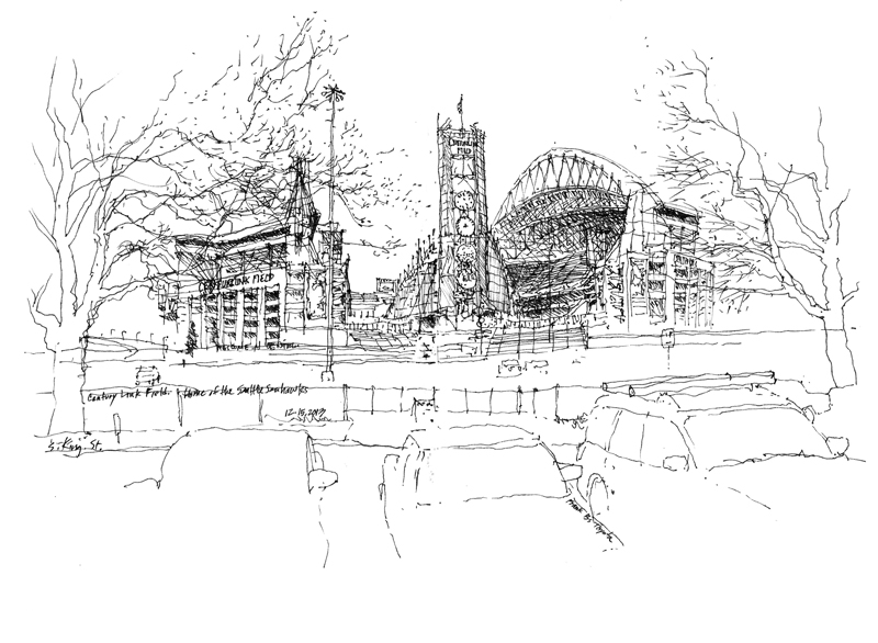
On Sunday morning, as the Seattle Seahawks were overpowering the New York Giants at MetLife Stadium in the Meadowlands of New Jersey, the Seattle UrbanSketchers group was meeting at King Street Station for its monthly sketching session. Not finding the newly renovated and beautiful interior of the main waiting room in the station to be of sufficient interest, I wandered outside for this view of CenturyLink Field, home of the Seattle Seahawks and the Seattle Sounders FC. Designed by Ellerbe Becket in association with LMN Architects and built between 2000 and 2002, the stadium is home to the loudest crowd roar at an outdoor stadium, 137.5 dB, set during a Monday Night Football game against the New Orleans Saints on December 2, 2013.

Back Home in Seattle, Remembering Rome

It’s really cold here in Seattle and until it warms up enough to go out and draw, I will continue to post a few images from Rome. Although It feels good to be home, my mind still wanders occasionally back to Rome.

ArcoAcetari

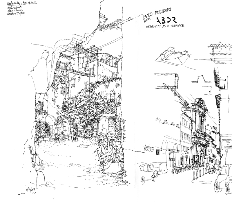
Just off of Via del Pelligrino as it leads away from the Campo dei Fiori is a dark archway, the Arco degli Acetari, which opens onto this quiet courtyard. It is perhaps one of the more photographed places in Rome; you see it on postcards as well as on numerous Flickr sites. I’ve passed by it many times and decided one morning to stop and try to capture the medieval quality of the space. This line drawing cannot do justice to the picturesque, colorful courtyard with its greenery, stairs leading off in different directions, shuttered windows, and tiled roofscapes.

Ciao Roma

I leave Rome tomorrow for Seattle. While it has truly been a privilege and a pleasure to have once again taught in the Eternal City, I’m looking forward to returning home. Before departing, I want to share just a few more drawings.

PantheonRear

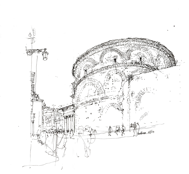
If I absolutely had to pick a favorite building in Rome, it would have to be the Pantheon, which is ideal in its conception and outlook but also attractive in the way it has aged and adapted over the centuries. I’ve drawn the Pantheon many times before but this time I decided to capture an aspect of the structure that rarely gets noticed.

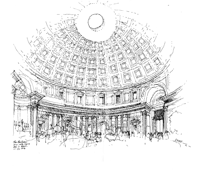
PantheonInt00 PantheonInt13

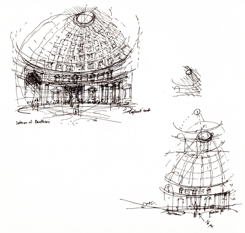
These are two interior views of the Pantheon. The first was done quickly in 2000, while the second took about an hour to do on a recent cold and rainy day, when the idea of sitting inside and drawing felt strangely welcoming. It’s always difficult to convey the way the spatial volume envelops you but the challenge was worthwhile and rewarding.

Two Baroque Masterpieces

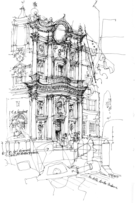
SanCarlo

Designed by Francesco Borromin, San Carlo alle Quattro Fontane is an iconic masterpiece of Baroque architecture, built in the 17th century as part of a complex of monastic buildings on the Quirinal Hill, at the southwest corner of the intersection of of Via XX Septembre and Via delle Quattro Fontane. Four fountains (Quattro Fontane) mark the corners of the now narrow and busy intersection. It’s difficult to capture the complex nature of the undulating facade as it weaves its way across the two-story, three-bay structure, with smaller columns framing niches, windows, and sculptures.

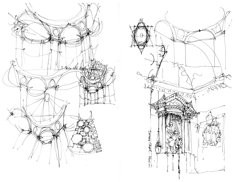
SanCarlo2

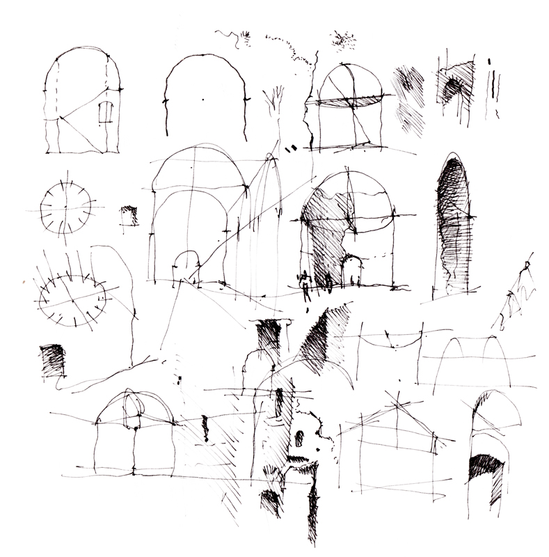
These are a few quick sketch studies of the interior. While initially appearing to be complex, the spatial geometry can be understood with just a little bit of analysis.

img033

Just down the street from San Carlo alle Quattro Fontane is Sant’Andrea al Quirinale, another important work of Baroque architecture, designed by Gian Lorenzo Bernini, and the third Jesuit church built in Rome, after the Church of the Gesú and Sant’Ignazio. The reason for the grayed out area is that I had decided to draw this view over two pages already filled with notes I had taken of student design projects.

Santa Maria degli Angeli e dei Martiri

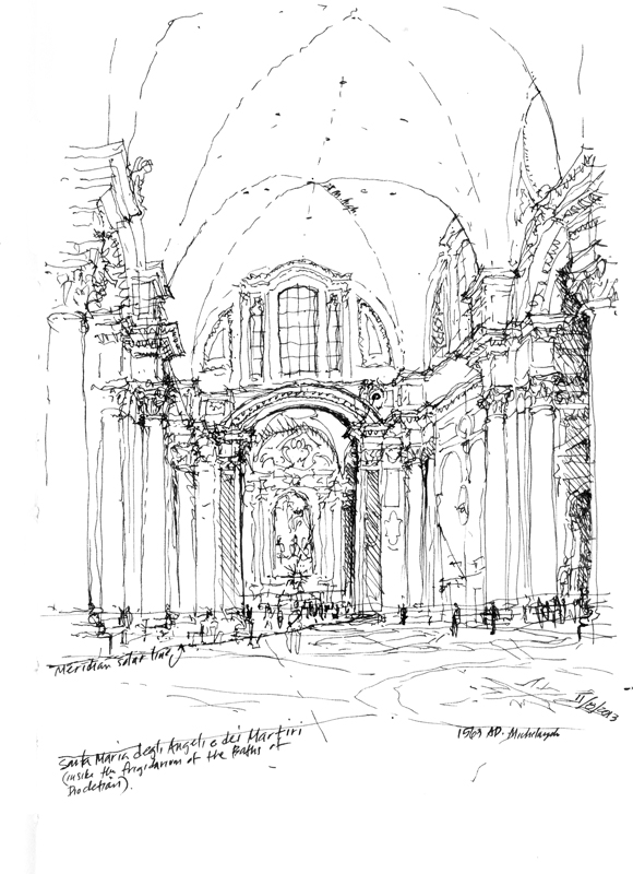
In 1563, Michelangelo used a section of what remained of the Baths of Diocletian to house Santa Maria degli Angeli e dei Martiri. What I like about the vaulted transept space shown here is that, while standing in it, one can feel the grandeur and immense scale of the spaces within the Roman baths.

SMariaAngeli

Noted on the drawing is the meridian solar line, which was commissioned by Pope Clement XI in the 18th century to verify the accuracy of the Gregorian calendar. Astronomer and mathematician Francesco Bianchini installed the brass line across the floor of the church at longitude 12°30’E. At noon each day, the sun, if it is out, shines through a small hole in the south wall to cast its light on the line, marking the progress of the sun through the year.