Remembering Como and Milan

Getting settled in Rome and into the rhythm of field walks, drawing sessions, and studio classes. But before posting views of Rome, I want to share a couple of snippets from our visit to Lago di Como and Milano.

Como

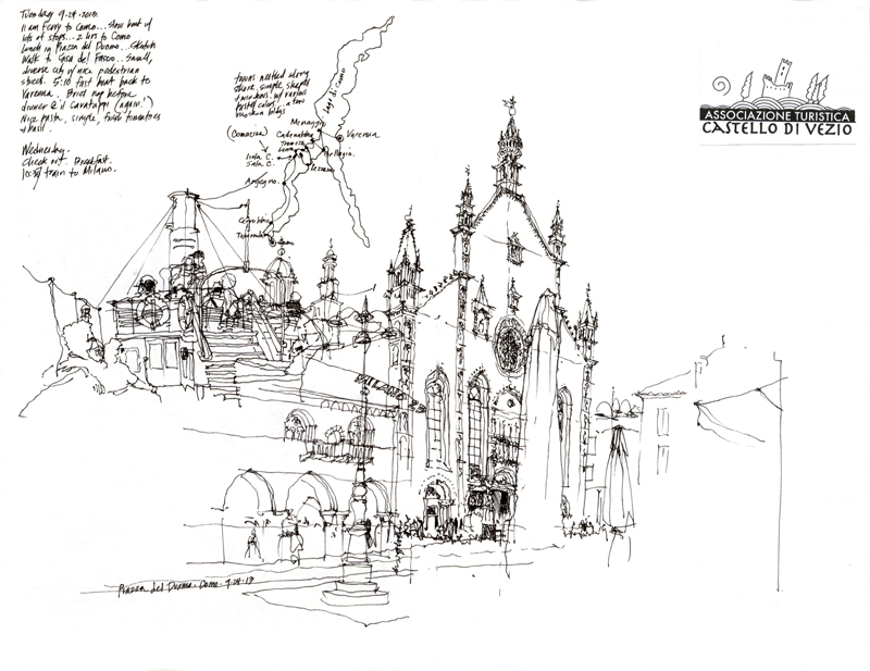
The first view on the left is from the open deck of a ferry my wife and I took from Varenna to Como, which merged with a later, more expansive view of the cathedral in Como. This is an example of how we often compose the pages of our journals in an improvisational manner, thinking not only of the composition of a view but also how it might be placed on a page or across two pages to interact with previously placed writings or drawings. Sometimes, the result is purely accidental and happily so.

Milan

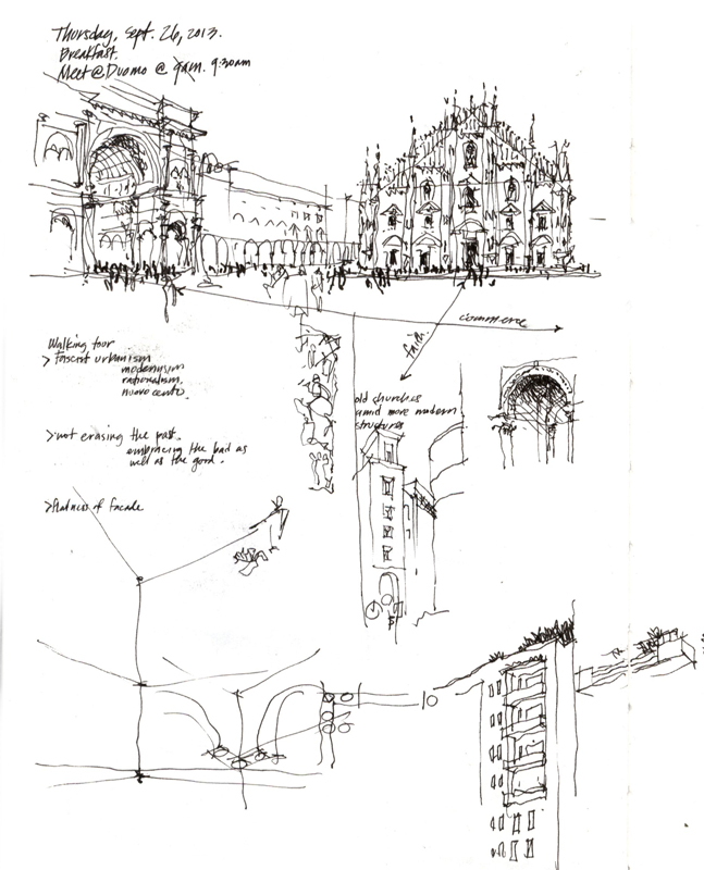
The second view is a very quick sketch to capture not just the Duomo in Milan or  the Galleria but rather the relationship between the two—a church of faith and a church of commerce.

A Day in Siena

Siena13After meeting in Milan and touring sites in and around its historic center, the AIR13 group of faculty and students took a day trip to Como and then headed south to Siena via a brief stop in Parma. All beautiful places, but each in its own way revealing notable examples of architecture from different time periods, from the medieval to 20th century modernism. Here are a couple of pages from my sketchbook, similar to the ones I am requiring all of the students to keep during their quarter in Rome.


Varenna, Lago di Como

image

After spending a day and a couple of nights in Rome to get acclimated to the time change, we took a train up to Milan and another to Varenna on the east shore of Lake Como. This is the view from the Hotel Eremo Gaudio, up the hillside and south of town. The other sketch is from a terrace cafe on Varenna’s waterfront. When we first visited Varenna in 1995, it was a much quieter place. It’s more popular now, especially on the weekends, but it remains a spectacular setting for a respite.

Blessed Sacrament Church

I’ve been attending Blessed Sacrament Church, a Dominican parish in the University District, for over 30 years and I’ve marveled at this view every time I’m in the nave of the Neo-Gothic church. This past Sunday, I finally remembered to bring my sketchbook to Mass and to draw the imposing space from my usual position in one of the rear pews. Even though the design intention when the structure was built in 1925 was for the interior to be clad in wood and marble, the brick walls, concrete columns, and steel roof structure remain exposed to this day. Yet, the rawness of these elements do not detract in any way from the grand scale and proportions of the space.

EPSON MFP image

This evening, I’m leaving for Rome, where I will be teaching for two months and visiting many more beautiful churches.

Seattle Workshop: Fall Edition

SeattleWS1

I want to thank Gail Wong and all of the participants in our Line to Color workshop for a fun and stimulating weekend. For me, it was inspiring to see and feel the energy emanating from the group as we sped through downtown Fremont Saturday morning, settled into Gasworks Park in the afternoon, and then reconvened down at bustling Pike Place Market on Sunday, all the time being blessed with great weather and company. After a workshop it’s always difficult for me to gauge the impact of what two-and-a-half days of drawing can have but I did see a lot of progress and hope all who attended will continue to pursue and enjoy this creative activity.

SeattleWS4

Being occupied with working with each of the participants, I didn’t have much time to draw on my own. But here a couple of very quick sketches. The first is one of my teaching sketches that I do to demonstrate how to block out a composition on a page.

SeattleWS9

The second is a market scene where I dabbled with a waterbrush that I borrowed from Daniel, one of the participants, to see how the it might react with the ink lines. I kind of like the effect even though it’s quite subtle. The ease of creating gray washes with a waterbrush might be the first step toward incorporating color into my drawings.


A Brief History of Bookmaking II

The process of handlettering and drawing camera-ready pages for my books continued throughout the 1980s. But in the early 1990s, armed with an Apple Macintosh SE, a laser printer, and digital typography, I made my first foray into using digital technology as I prepared A Visual Dictionary of Architecture.

After assembling and organizing the terms and definitions into sets, I laid the material out on oversized sheets in Aldus Pagemaker. It was fortuitous that Adobe had just recently scanned my handlettering and created the digital font, Tekton, which I used for the dictionary terms and definitions. After printing the pages out, I laid tracing paper over each page and roughed out the size and position of each illustration to fit. I would then work back and forth, adjusting the placement of text in Pagemaker as necessary to accommodate the illustrations before doing the final drawings by hand on Clearprint vellum. After having the drawings scanned, I placed the .tiff files into the Pagemaker files.

VDA


VDA2

In 2000, I began working with Steve Winkel on the first edition of Building Codes Illustrated. Knowing that the International Building Code, on which the text was based, was going to be updated every three years, I decided to do all of the drawings in Adobe Illustrator, learning the program on the fly.

I use Illustrator basically as a drafting tool to create the visual ideas I have in mind. The many benefits of vector graphics include: using the Save As capability to try out different options; having precise control over line weights and tonal values; being able to resize drawings easily to fit a page layout; and reusing elements that I had already drawn. Most importantly, when working on a revision, instead of having to completely redo a hand drawing, I can open an existing drawing file and make the necessary changes to create the updated version.

IBC

Because I am using digital tools more and more in my bookmaking, I cherish even more the opportunities to draw by hand when out on location. Even as I experiment with drawing on my iPad, the connection between eye, mind, and hand when I draw with a fountain pen in a sketchbook remains a pleasure.

A Brief History of Bookmaking

Following up on a previous post about the making of Green Building Illustrated, here is a brief history of my publications.

My first book, Architectural Graphics, was published 38 years ago, in 1975. Due to the efforts of Forrest Wilson, Van Nostrand Reinhold offered me a contract based on of over 400 pages of notes I had prepared for the very first class I taught at Ohio University. I still remember condensing those notes and handlettering and drawing the final camera-ready pages with a Scripto lead pencil, a triangle, and a scale. I completed all 128 pages in a little over three weeks. Here is a sample page.

AG

Building Construction Illustrated soon followed, using the same tools and process. But this time I worked on tabloid-size paper instead of letter-size bond paper. Interestingly, after a few years of complaints from bookstores, the pages were reduced to letter-size.

BCI

Wanting to use more subtle hatching and shades of gray, I used a 0.3 mm lead pencil to handletter and draw the images on Clearprint vellum for the camera-ready pages of my third book—Architecture: Form, Space and Order. Here are a couple of screen shots for a visual comparison.

AFSO AFSO2

My next post will describe the first time I used digital technology in my bookmaking.

Under the Viaduct

UnderViaduct

Here is a view from beneath the Alaskan Way Viaduct where University Avenue meets Alaskan Way, drawn at the monthly meeting of the Seattle Urban Sketchers yesterday. Built in the 1950s, the two-level highway is a critical connector to Fremont, Ballard, and other points in northwest Seattle. And driving on the northbound upper deck offers impressive views of downtown Seattle and across Puget Sound to Bainbridge Island the Olympic Mountains beyond.

After the 2001 earthquake, civic leaders decided that the viaduct needed to be replaced for safety concerns. After studying various alternatives, including surface streets and bridges, it was finally decided after a long public process that a 2-mile long tunnel beneath downtown Seattle was the best option. On July 30th, Bertha, the world’s largest tunnel boring machine, began drilling operations.

The viaduct is scheduled for demolition in 2016. I will miss it.

Green Building Illustrated

I’ve been busy this summer developing a new textbook, Green Building Illustrated, which attempts to explain the theory, practices, and complexities of sustainable design. Working with excellent material written by engineer and researcher Ian M. Shapiro, my focus is on presenting the ideas and information in graphic form, as I have done with my previous Illustrated texts. Here is a few drafts of page spreads that I hope will whet your appetite.

GBI_S1

GBI_S2 GBI_S3

I’m laying out the book in Adobe InDesign and producing the drawings in Adobe Illustrator. Even before I begin work in Illustrator, however, I usually have a pretty good idea in mind of the image I want to produce and sometimes use freehand sketches to review and refine the possibilities I will be exploring.

GBI_Freehand

In a future post, I will explain the reasons for my use of digital media to produce the drawings.