Serial Vision

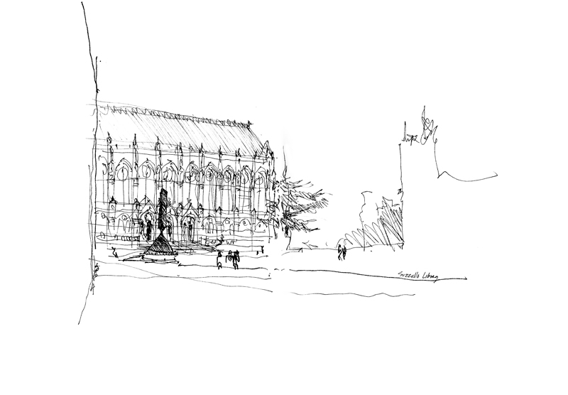
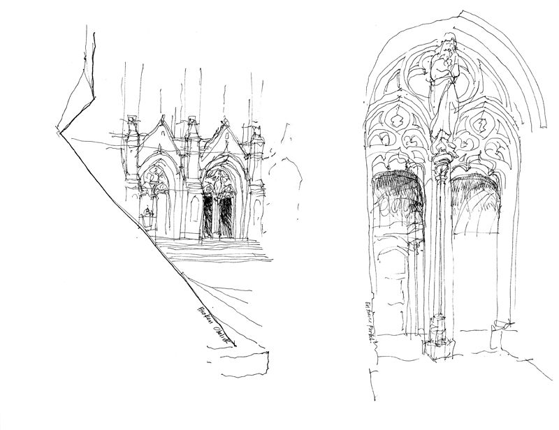
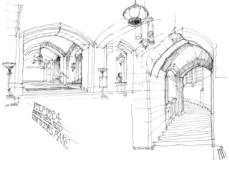
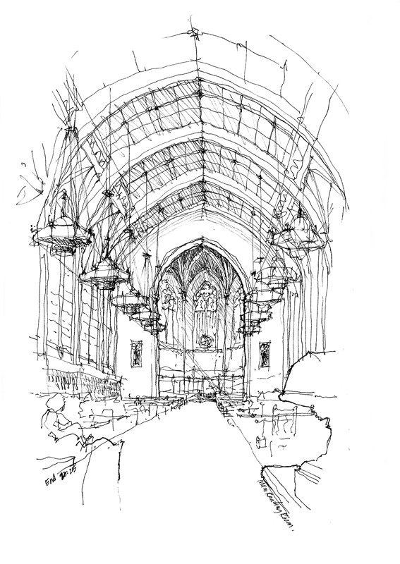
The converging lines and foreshortened shapes of a perspective drawing give it a dynamic quality. Yet, it remains a static view—a moment in time—as seen from a single point in space. To better convey movement through space, we can use a series of changing perspective views, as English architect and urban designer Gordon Cullen did when he coined the phrase Serial Vision to describe what one might see and experience as one walks through a sequence of spaces.

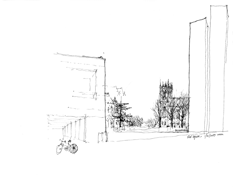
This is what I intended to depict when the Seattle Urban Sketchers met yesterday at Suzzallo Library on the UW campus. These drawings chronicle how one approaches the library from across Red Square, enters one of its portals, moves through the lobby and up the main staircase, and arrives in the main reading room.

Suzzallo1

Suzzallo2

Suzzallo3

Suzzallo4

Suzzallo5

Suzzallo6

Nine drawings done in two hours and twenty-five minutes.


A Delicate Balance

Balance

As we decide how we are going to compose a scene and lay it out on a page, we are juggling drawing elements to maintain a delicate balance between a static state and one of dynamic disarray. The elements that we balance are points of interest that draw the eye—an area of contrasting tone or increased line weights, a level of enhanced detail, even a field of emptiness. Here are a few examples of different ways of maintaining a delicate balance in a drawing composition.

Balance5

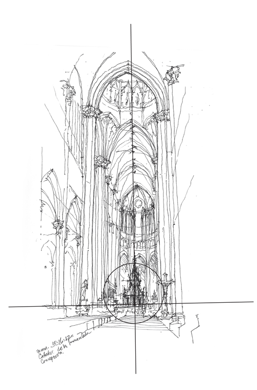
When we want to emphasize the stability or serenity of the subject matter, we can use a symmetrical layout and still introduce visual tension through contrast.

Balance

For more dynamic compositions, we can offset one or more points of interest in an asymmetrical composition that leads the eye. We can emphasize height by raising the composition on the page or lead the eye by placing the central point of interest to the left or the right.

Balance2

In the end, what we should strive for is a delicate balance that engages the eye and never lets it stray off the page.


Caricatures

FDKC_Composite

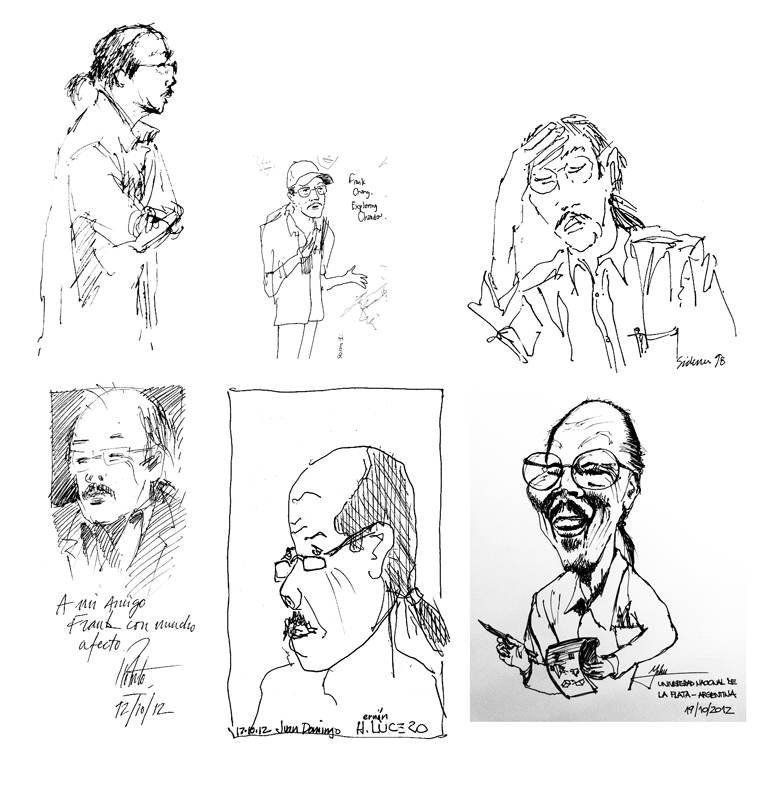
A caricature is a pictorial or literary description of a person or thing that exaggerates certain distinctive characteristics to create an easily identifiable likeness. The result can be insulting or complimentary; I certainly hope these caricatures of me are the latter! These were done and graciously given to me by various individuals during presentations and workshops that I have given.

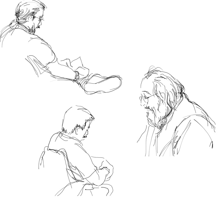
SeattleJurors

While these are definitely not intended to be caricatures, they still represent my attempt to capture the likeness of individuals, which is always an enjoyable and constant challenge. I used my iPad to draw these prospective jurors in the King County courthouse. It helped that these people were sedentary, lost in their own thoughts while waiting to be called for jury duty.

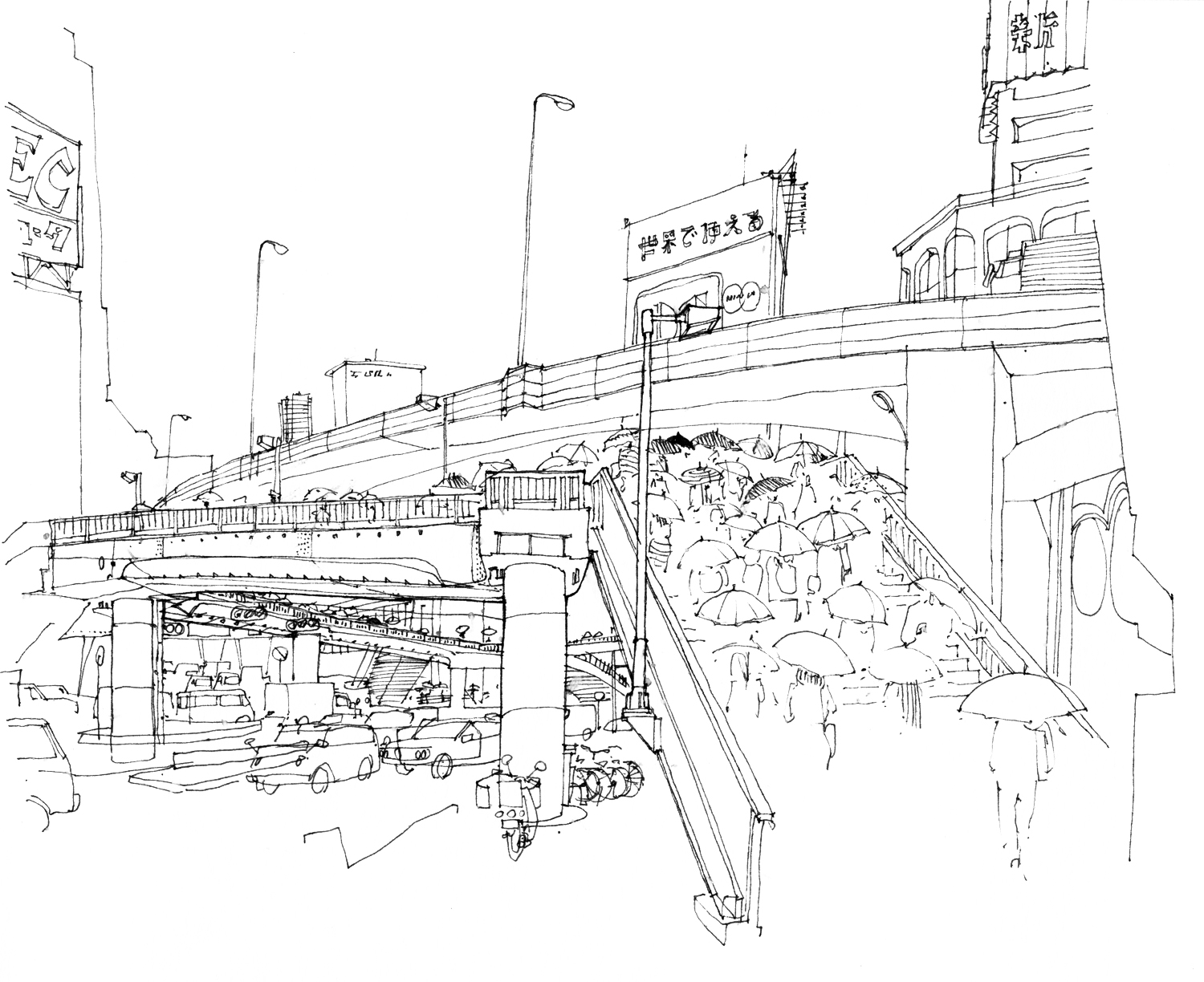
Shibuya

To draw people who are moving is much more difficult, as in this view of a rainy morning in Shibuya, Tokyo. These commuters and their umbrellas provide a sense of scale to the composition and lead the eye across the overpass while the automobile traffic flows below.

Seeing Little Things Largely

Ginkgo

This study of the uniquely shaped leaves of the ginkgo tree, considered to be a living fossil, requires careful observation of shapes, details, and most importantly, the relationships between the two. In Lingua Franca, a column in the Chronicle of Higher Education, Geoffrey Pullum ends his essay with a quote from Otto Jespersen, a Danish linguist who specialized in the grammar of the English language:

“To anyone who finds that linguistic study is a worthless finicking with trifles, I would reply that life consists of little things; the important matter is to see them largely.”

2013: A Year of Changes

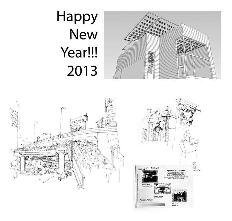
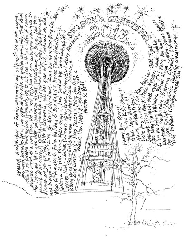
Approaching the big Seven-O, moving from Ballard back to the Fremont neighborhood, adding a new title to my list of publications, teaching in Rome in the fall. I hope everyone’s New Year will be fulfilling as we respond to necessities, take advantage of opportunities as they arise, and prepare diligently always!

The Power of the Line II

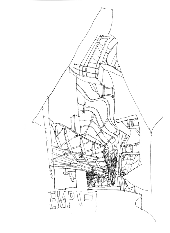
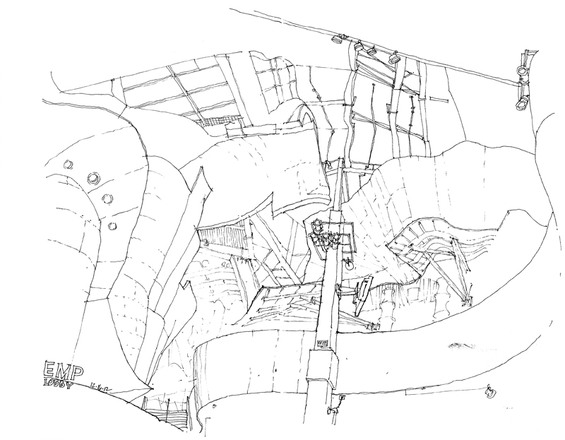
The Seattle Urban Sketchers met yesterday on a cool, rainy Sunday morning at the Experience Music Project, designed by Frank Gehry. While I may not be a fan of the design as a whole, I do appreciate the amazing spatial compositions and vignettes created by the curved steel framework and the metal and plywood sheathing.

On the one hand, spaces such as this lobby of the EMP are relatively easy to draw because there are few straight lines and one need not pay too much attention to the pesky subject of perspective. On the other hand, what is often difficult is ensuring that the curvilinear surfaces do not overpower the sense of space as they hover overhead.

In this case, I started with the one measurable item I could see, the vertical column, and then worked my way from the contours of one curved surface to the next…and the next…and the next, all the time trying to maintain the spatial relationships of the major forms.  The view is obviously beyond one’s normal cone of vision but it does replicate the feeling of being enveloped by the space. The only thing missing are the bright colors of the metal sheathed walls.

The Power of the Line

The line is the essence of drawing. It is a humble element, made simply by the tip of a pen or pencil as we move it across a receptive surface. Once drawn, a line chronicles the movement by which it was created. It can describe contour and shape, even texture.

More importantly, the line is able to convey to the mind’s eye three-dimensional forms in space, often not by its presence but rather by its absence—where we decide to stop a contour…and pick it up again.

These sketches of sculptures in and around Rome and Naples are prime examples of this amazing power of drawn lines to suggest what in reality is not present on the page.

A Story to be Told

I have often dreamed of writing and illustrating a children’s book, or at a larger scale maybe even a graphic novel. Always stopping me, however, was the lack of a genuine story to be told, a narrative with emotional and intellectual content. Technique, no matter how well developed, could only carry me so far.

That is why drawing on location suits me. Instead of having to create imaginary settings and characters, I can rely on the visual stimuli derived from direct observation. Real settings that can be experienced in a straightforward manner provide the raw material for my sketches, which I can then interpret in a purely descriptive manner or alter to suit my temperament.

This view of the train leaving O-Okayama for Tokyo is from real life, but even when drawing from a photograph, which lacks the immediacy of drawing on location, the visual information provides a starting point for thinking about and responding in a graphic manner. It’s a matter of fiction versus reality and I imagine even a lot of fiction is based on personal experiences, perceptions, and insights.

Behind each of these sketches lies a possible story. Maybe some day, if I am fortunate enough, I will be able to knit these into a more compelling one.