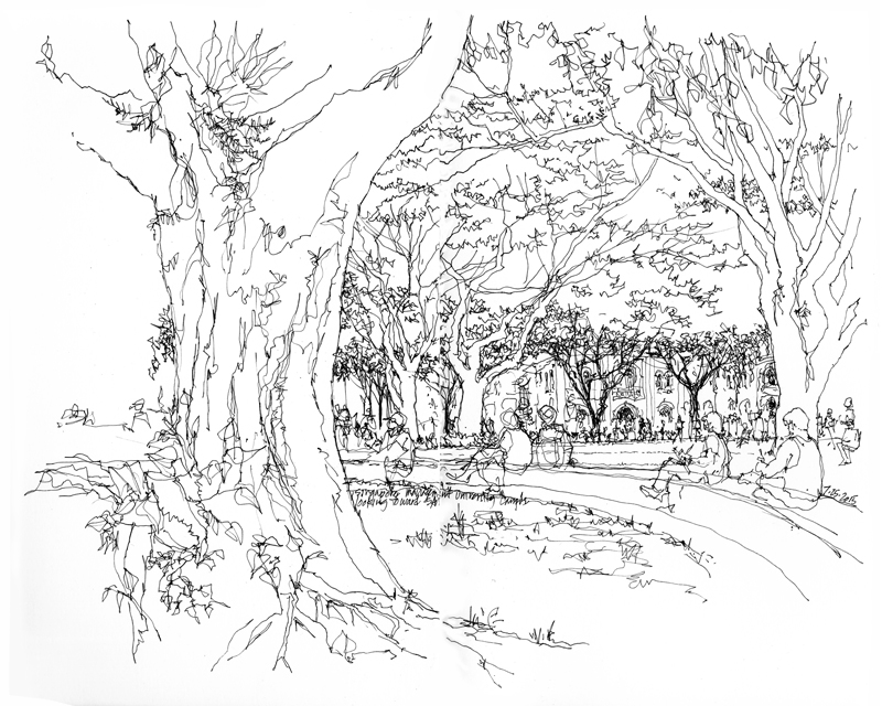
Posting this without comment: I drew this view of the campus park of Singapore Management University, looking northeast toward the Singapore Art Museum, during the Sixth USk Symposium in 2015.
Posting this without comment: I drew this view of the campus park of Singapore Management University, looking northeast toward the Singapore Art Museum, during the Sixth USk Symposium in 2015.
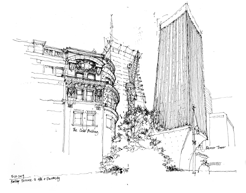
I drew this view from a rootop terrace on the southwest corner of 4th and University Avenues. It depicts buildings from three different periods of Seattle’s downtown development. On the right is Minoru Yamasaki’s iconic Rainier Tower of 1977. To the left is the Cobb Building, a brick-and-terra cotta Beaux-Arts design by the New York firm of Howells and Stokes, which was completed in 1907. And in the background undergoing construction is a new 58-story mixed use tower by NBBJ.
Below is another view of the terra cotta ornamentation atop the Cobb Building, which is listed on the National Register of Historic Places.
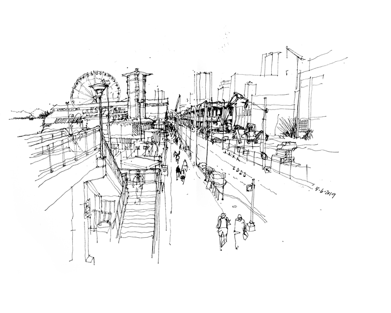
Another view of the Viaduct being deconstructed along the waterfront, as seen from the elevated deck in front of the Seattle Ferry Terminal, looking north along Alaskan Way
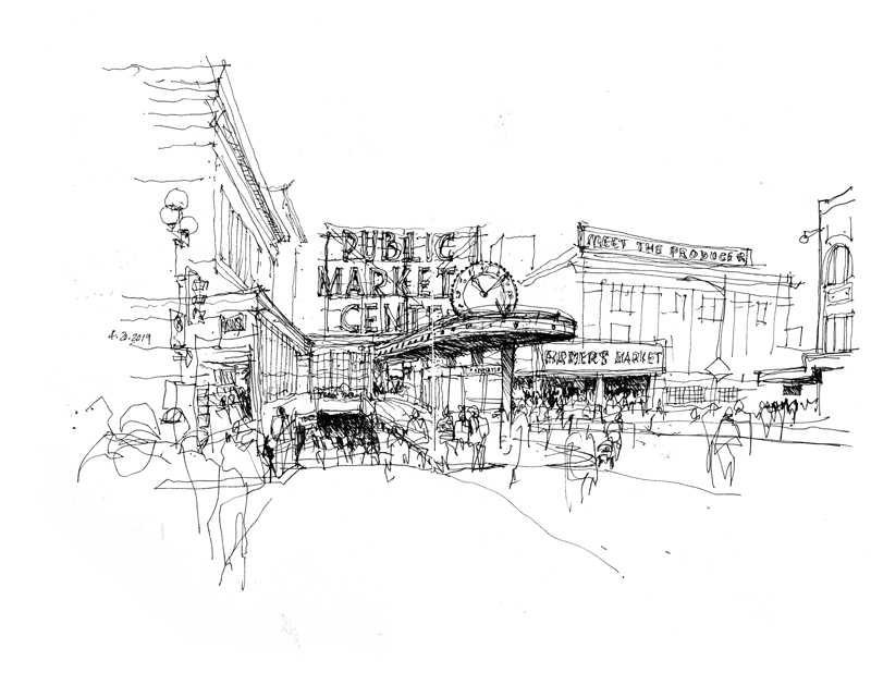
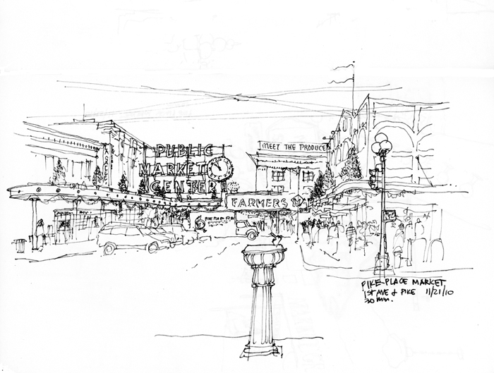
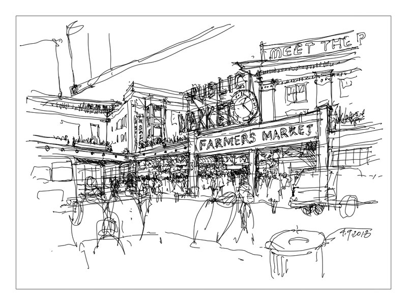
Soon after drawing the Showbox Theater, I wandered over to take in and capture this view of Pike Place Market, looking toward the iconic market sign and clock. The drawing illustrates the use of tonal contrast to animate and draw attention to three specific areas while merely suggesting the context, such as the throngs of people crossing the intersection of 1st Avenue and Pike.
For comparison purposes, here are two additional views of the market entranceway, taken from two different viewpoints of the main market entranceway.
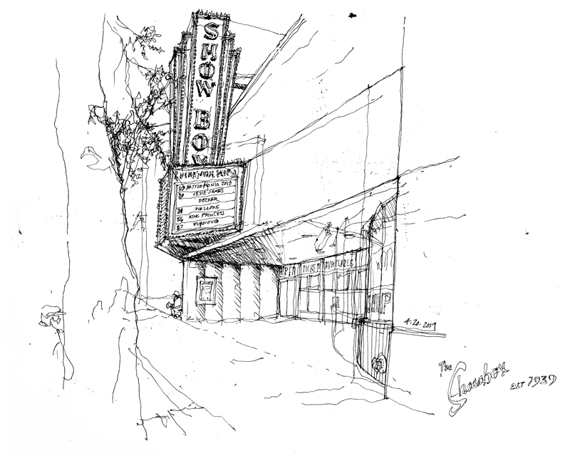
The original market structure built in 1917 at 1426 1st Avenue, across from the entranceway to Pike Place Market, was transformed in 1939 by Bjarne H. Moe, who designed the art-deco interior of the theater and added this marquee out front. Over the past six decades, the theater has provided a venue for musical acts from Vaudeville and jazz to grunge and hip-hop.
In 2018, Vancouver, BC-based Onni Group bought the property and announced plans to demolish the building and replace it with a 44-story residential tower. That same year, local preservation groups organized a campaign to secure a landmark nomination in an effort to save the Showbox. The Seattle City Council recently voted unanimously to extend temporarily the Pike Place Historic District to include the original Showbox building. This has, for a time, protected the building from demolition.
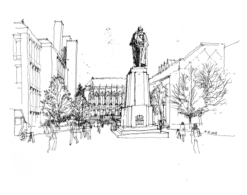
These two views can be seen approaching Red Square, the central plaza on the University of Washington campus. The first uses the statue of George Washington to establish the foreground, with Suzzallo Library establishing depth in the background. The bronze sculpture was commissioned by the Daughters of the American Revolution and sculpted by Lorado Taft for the Alaska Yukon Expedition of 1909.
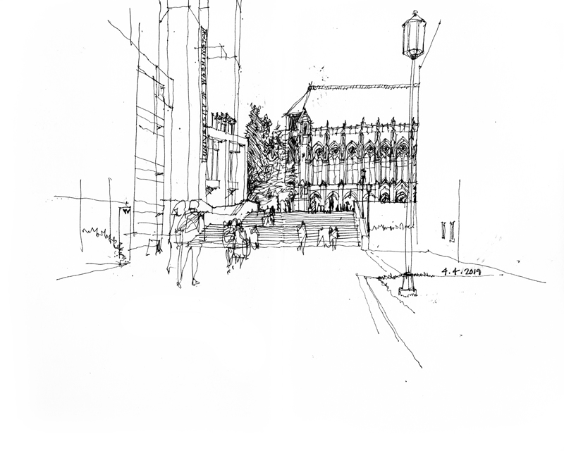
In the second view, the elaboration of the Suzzallo Library facade draws the viewer through the space between Odegaard Undergraduate Library into the scene and Meany Hall, up a broad stairway, and into Red Square.
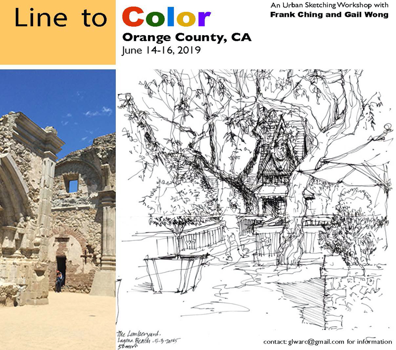
Gail Wong and I will be returning to Orange County, California, for another Line to Color workshop the weekend of June 14–16. We will be sketching and learning at the San Juan Capistrano mission and Laguna Beach.
Learning Goals: LINE 1. Selecting a subject and establishing a point of view; 2. Composing the page: Where to start & how to proceed; 3. Establishing spatial depth: Near & far.
Moving to COLOR: 4. Watercolor and brush techniques; 5. Values: Seeing and using tonal values to create depth and capture the quality of light; 6. Strategies for applying color and limiting your palette.
For information about the schedule of events, registration forms, pricing, and method of payment, please contact Gail at glwarc at gmail dot com.
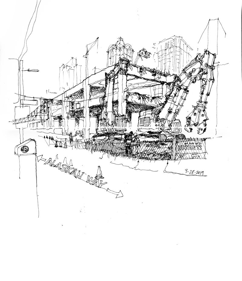
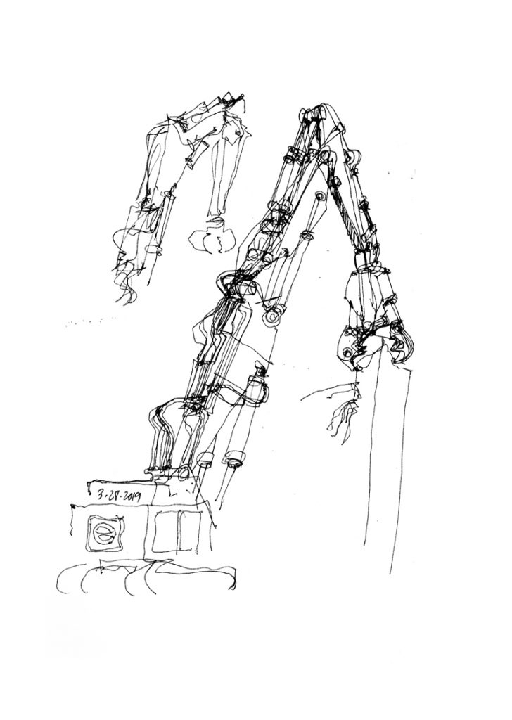
It was somewhat difficult to capture these giant machines as they were moving and munching away at the elevated concrete structure. What I should have been more careful of was establishing the position of the machines’ armatures in such a way that it was clear what was machine and what was concrete structure. The way the forms overlap in the above view makes this distinction a little too ambiguous.
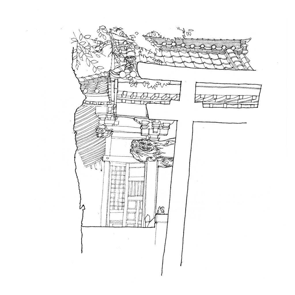
Still waiting for the opportunity to draw the upper level of the Alaskan Way Viaduct being broken through. In the meantime, here is a drawing done in 1990 of a shrine in Jiyugaoka, a small town west of Tokyo. The composition consists of an interplay of positive and negative shapes and spaces, which interlock to form a unified image. In one instance, we can discern the edge of a tree trunk on the left and the outline of a torii on the right. At the next moment, we can focus on the details of the shrine itself as seen between the white spaces in the foreground.
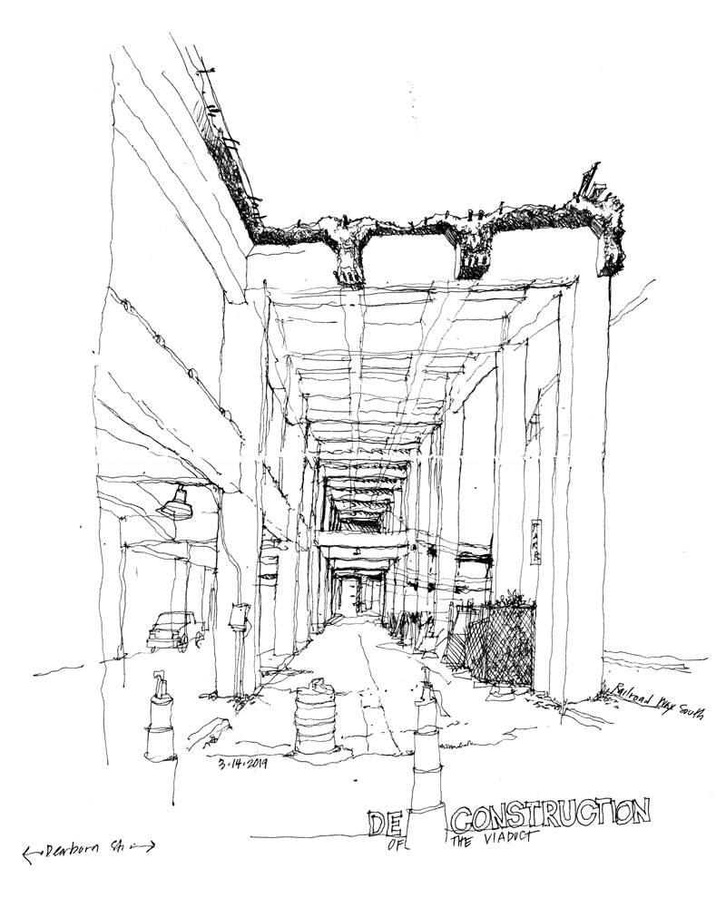
As the spring equinox approaches and the weather gets warmer, time to wander outside and do some urban sketches. The recent completion of the Highway 99 tunnel underneath downtown Seattle has initiated the work of deconstructing the Alaskan Way Viaduct. I wanted to get a view of the elevated structure being munched on by the jaws of concrete eating machines but I was disappointed that the biggest machine had only punched through a little of the upper deck at Columbia Street. Hope to return in a couple of days to see more action. In the meantime, the above view is of the south end where a section has been cut through.