It’s Been 50 years…

…since I first stepped into the classroom at Ohio University to begin my teaching career. To my great good fortune, I was assigned to teach a first-year design studio with Norm Crowe, who taught me how to teach in the way he planned the course syllabus, carefully thought out studio projects, prepared for each class, and displayed admirable patience with beginning students. I also taught an architectural graphics course, the class notes for which resulted in the publication of Architectural Graphics in 1975.

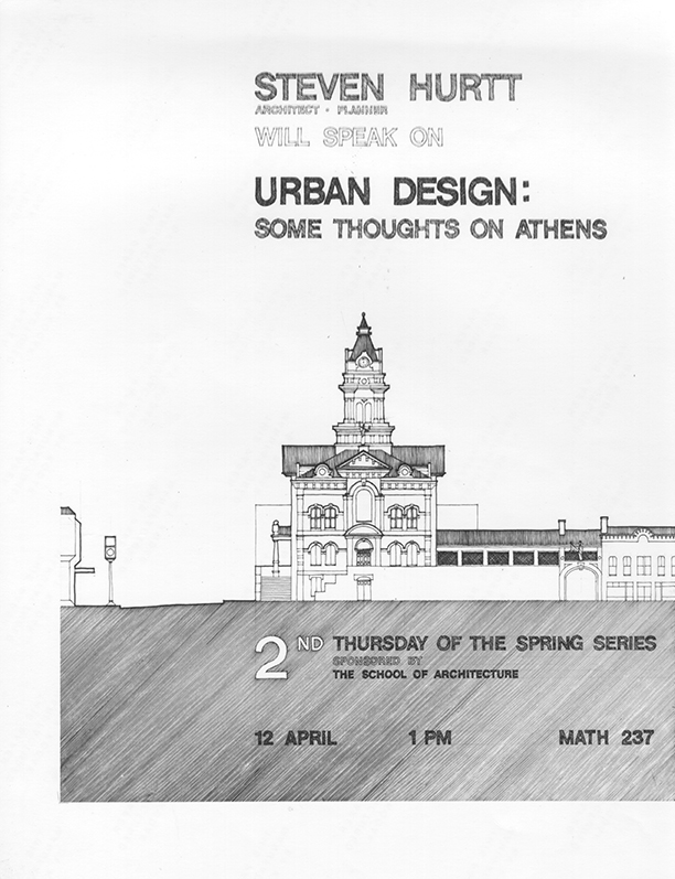
Above is one of a series of posters I did to advertise the School of Architecture’s lecture series. It depicts the Athens County courthouse in the middle of town.

Thinking with a Pen or Pencil

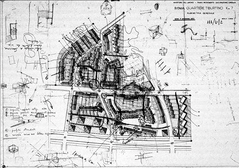
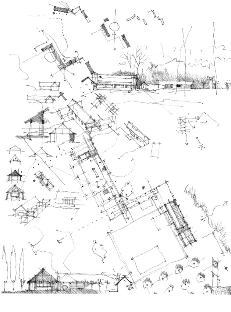
Above is a site plan for the INA–Casa Tiburtino project in Rome, designed by Mario Ridolfi & Ludovico Quaroni in the 1950s. It shows how one can think with a free hand holding a pen or pencil while exploring possibilities, looking at alternatives, working out problems, even doodling on a sheet of paper. Below is another, more personal example of similarly exploring design alternatives, by hand, on paper.

Notan

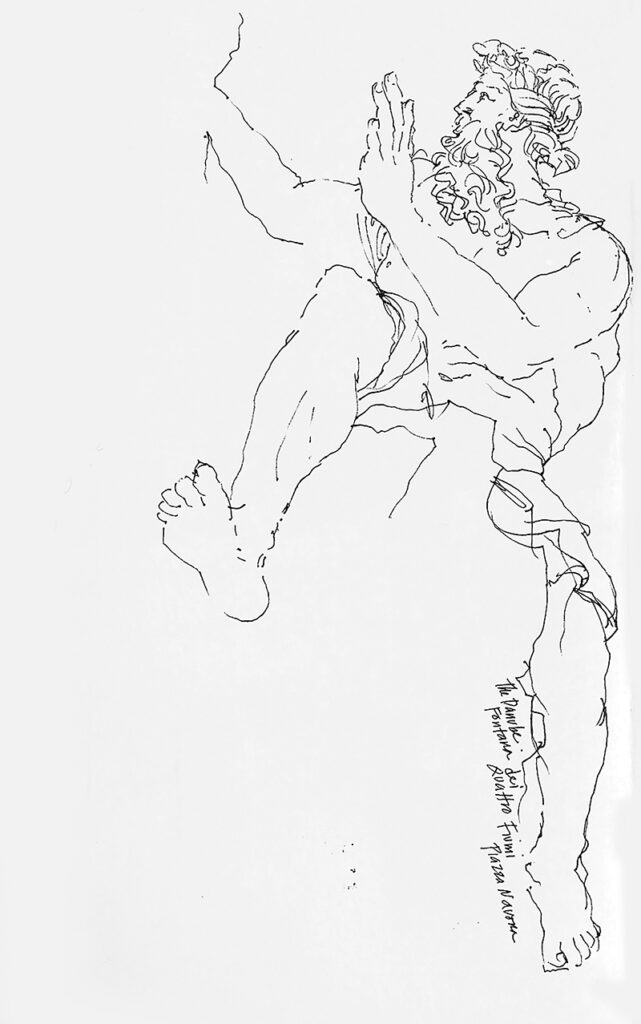
This a line drawing of the Danube, one of the Four River Gods in Bernini’s fountain in Rome’s Piazza Navona. The line is the quintessential element of drawing, able to convey to the mind’s eye three-dimensional forms in space, often not by its presence but rather by its absence—where we decide to stop a contour…and pick it up again.

These cropped enlargements of the original drawing use areas of black to emphasize the negative spaces of the drawing and the white of the sculpture. This brings to mind notan, the Japanese term for “light dark;” some translate it as “light dark harmony.” It is a concept revolving around the placement and interplay of light and dark elements in the composition of a collage, drawing, or painting. It is valued as a way to study possible compositions without the distractions of color, texture, or details.

Drawing Lessons

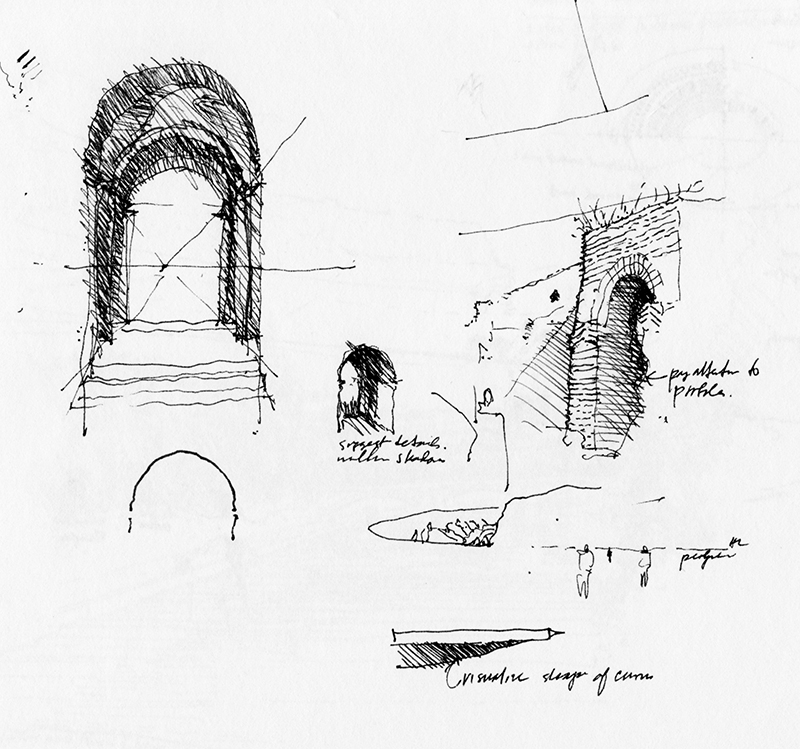
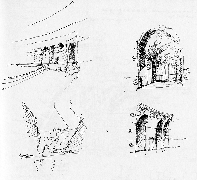
From a Rome journal, two pages of sketches drawn during a teaching session. The first page contains explanatory sketches accompanied by bits of concise text: “Pay attention to profiles”…“Suggest details within shadows”…“Visualize shape of curves.”

The second page illustrates how to estimate proportional heights above and below an imagined horizon line.

Taking Notes

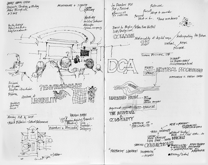
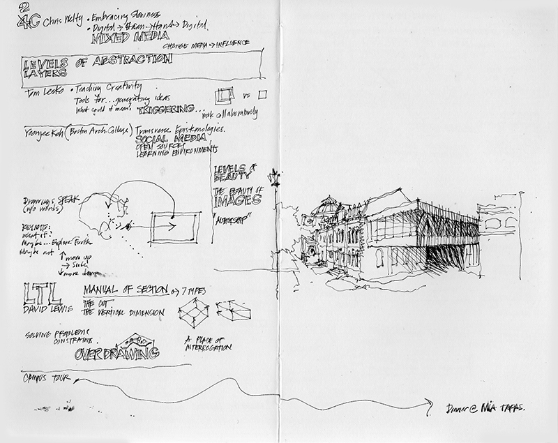
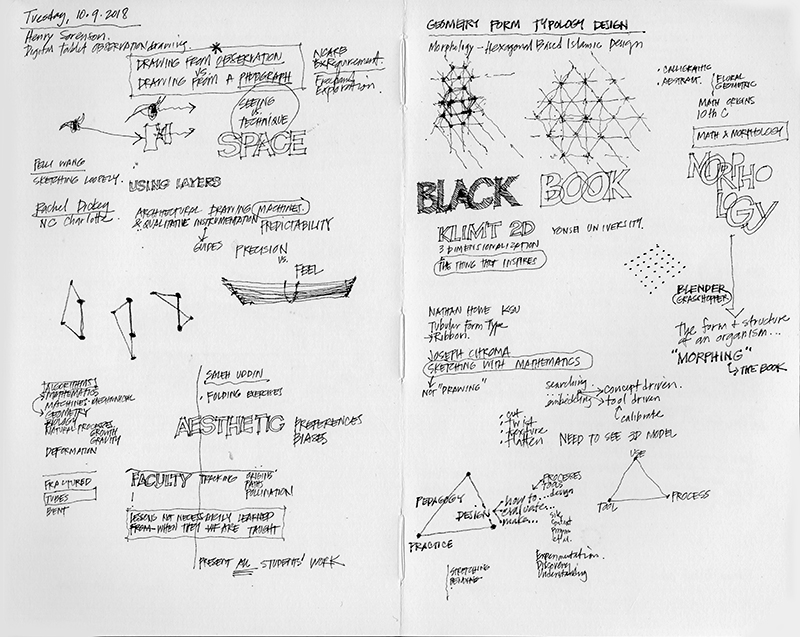
Being able to listen, absorb, and process information during a lecture or conference is a valuable skill, one that can be practiced and cultivated by taking notes by hand. These notes can often be augmented with word diagrams and visual imagery that come to mind to reinforce points being made or expressing one’s understanding of what is being said. Here are a few pages of notes I took during a Design Communication Conference in 2018. See also my posts on 10.30.16 and 10.14.20 on the similar subject of taking visual notes. 

Building Codes Illustrated, 7th Edition

Even with the nice, sunny weather we’ve been having, there hasn’t been enough time to go out and capture scenes in and around Seattle. I’ve been busily working with Steve Winkel and editors from Wiley and the International Code Council on revising Building Codes Illustrated to incorporate the changes effected by the 2021 edition of the International Building Code. For example, the title page above reflects how the development of mass timber construction has led to the creation of new categories of Type IV construction.

This page illustrates the necessary provisions for accessible electric vehicle charging stations (EVCS).

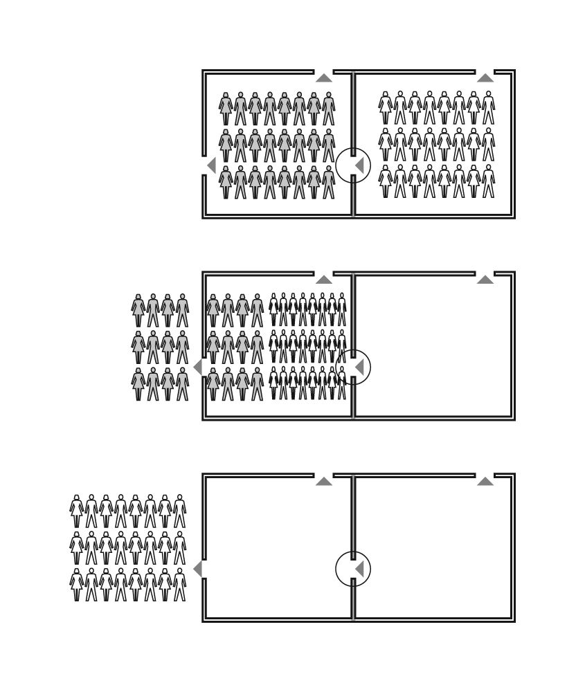
This series of illustrations is an example of how the book attempts to explain in graphical terms the intent of code requirements. In this case, these graphics illuminate the theory underlying horizontal exits.

Note: All of the illustrations in BCI were created in Adobe Illustrator.

Tempietto

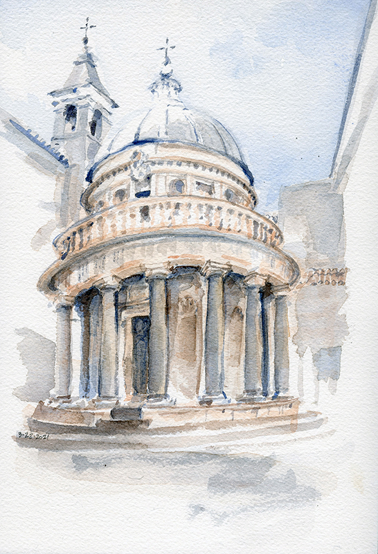
The Tempietto is a small, elegant temple situated in an outer cloister of San Pietro in Montorio, reportedly the site of St. Peter’s crucifixion, on the eastern slope of Gianicolo Hill in Rome. King Ferdinand commissioned Donato Bramante to design the martyrium in the early 16th century. It is basically a cylindrical form ringed by a series of Tuscan columns and topped by a hemispherical concrete dome. This and other examples of western classical and renaissance architecture are difficult to draw well due to the genre’s precise attention to proportion and scale. It is relatively easy to distort their forms, as in this case, where the vertical axis tilts slightly and the cylindrical from droops downward and to the left.

Near, Middle, Far

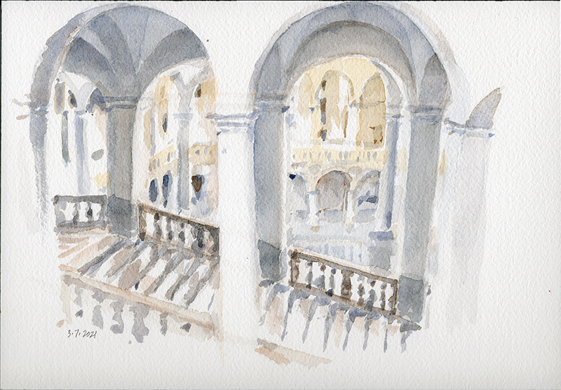
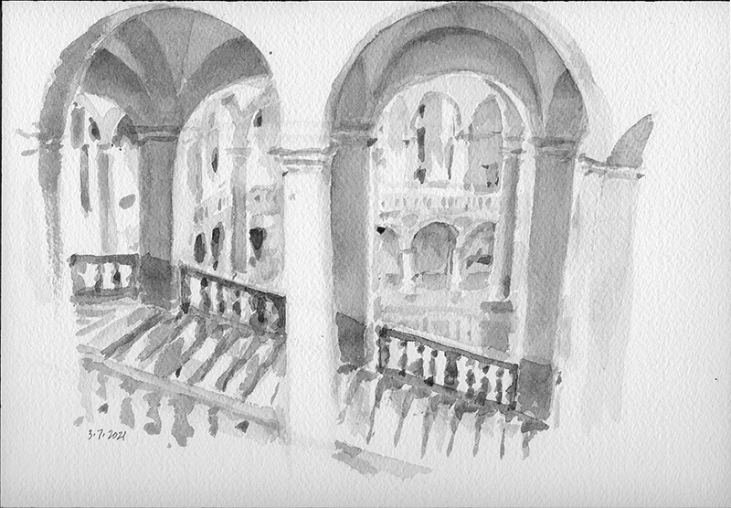
In this view of an art museum in Palermo, I am looking from an upper level, through a staircase in the middle ground, to a courtyard beyond. To convey a sense of spatial depth on the page, I attempted to use relative values and value contrast to suggest what is near, clarifying what is in the middle ground, and again merely suggesting what is far away. In the image below, I have stripped away the color to show the equivalent gray values of the sketch.

An American Austin

Came across this old car in southern Washington on a road trip a few years back. It’s a bit worn, having seen better days, but it still stands proud.

My best guess is that it’s an American Austin from the 1930s, a version of the English Austin 7 that was produced in Pennsylvania. The body of the relatively small, compact car was designed by the Russian-American industrial designer Alexis de Sakhnoffsky. Its short wheel base made it a popular choice for conversion into hot rods and drag racers in the 1960s. The Packrat nameplate on the grille might refer to a customizing shop in California.

Projection: A Search for Meaning

The above image and following quote is from Drawing: A Creative Process.

“Merely looking at an apparently amorphous pattern can sometimes bring to a…searching mind a more specific image. In its search for meaning, the mind’s eye imagines and appears to project familiar images onto seemingly shapeless patterns until it finds a match that makes sense.” This recalls the familiar search for something recognizable when looking up at cloud formations.

The new year’s image I posted recently used as a backdrop this pattern that developed as I mixed and tested watercolors on a piece of paper. While squinting at that same colorful pattern, I can begin to “see” certain images. The following are two of several possibilities. What else can you see in these patterns?