KSU Campus II

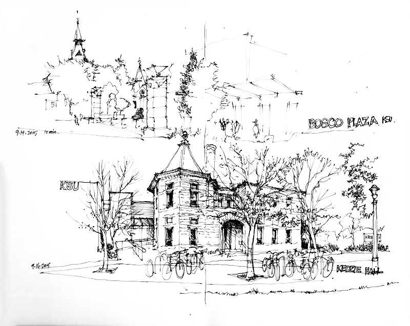
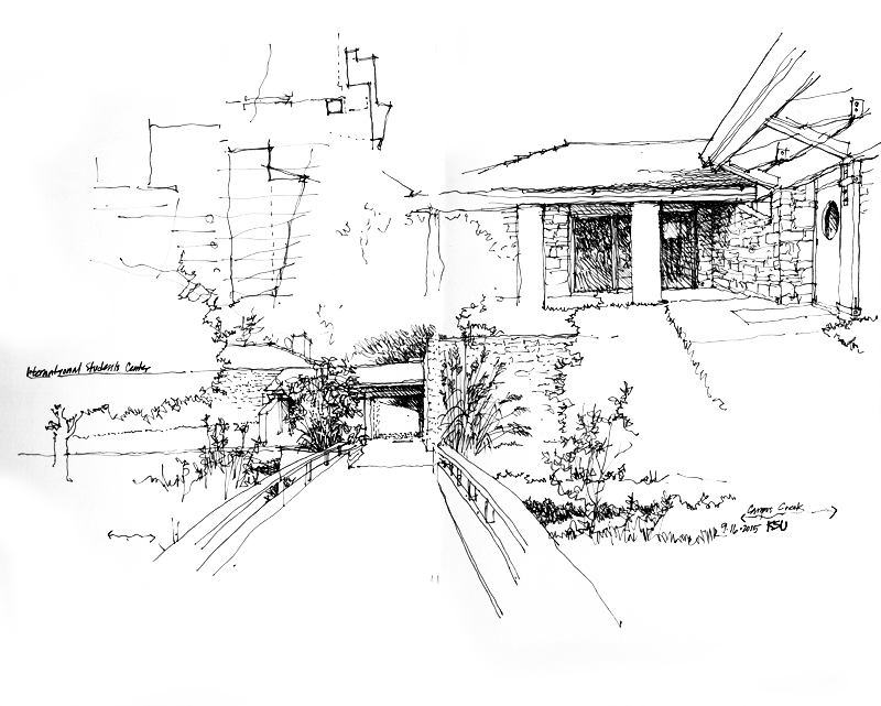
Here are a few more sketches from my recent visit to Manhattan, Kansas. The second is of the International Student Center, which I studied because of its unusual inward orientation to a courtyard, unlike most of the other structures on the KSU campus.

I did this very quick sketch during a walk through the 8000-acre Konza Prarie, a former cattle ranch and now a tallgrass prarie preserve in the Flint Hills of northeastern Kansas, jointly owned by the Nature Conservancy and Kansas State University, which conducts ecological research and manages conservation in the preserve. I drew only the path ahead of me and a treeline in an arroyo between two ridges. All of that white space you see are prarie grasses, a mix of big bluestem, little bluestem, Indiangrass, and switchgrass.

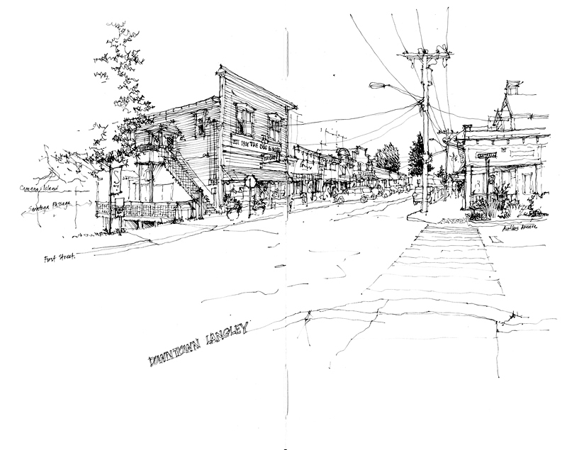
First Street Langley

Spent the 4th of July weekend with a few dear friends on Whidbey Island. On Saturday, we drove into Langley, which likes to call itself the Village by the Sea. While the setting overlooks the Saratoga Passage to the east, its heart lies along First Street with its shops, galleries, and restaurants. Along this main street, no particular building stands out from the others but together they prove the adage that the whole is greater than the sum of the parts.

I chose this particular view of First Street because the sun was intense at midday, the temperature was in the 80’s, and I was fortunate enough to find a bench in the shade.

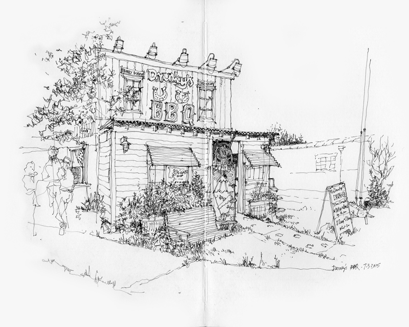
Drunky’s Two Shoe BBQ

A recent addition to the Freelard neighborhood is this BBQ joint at 4105 Leary Way NW. Even though the scene contains a lot of detail, I find that picturesque places like this are easier to draw since slight errors in proportion are much less noticeable than when drawing examples of classical architecture, which followed certain principles of proportional relationships. For example, drawing the Tempietto in Rome was a real challenge. Notice the comment that I wrote after finishing—A little too tall… I had exaggerated the height of the structure just a bit too much.

The Getty Center

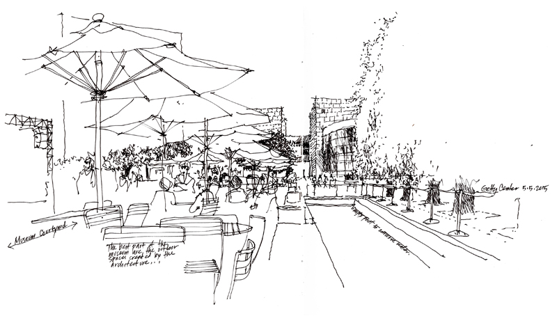
After the Orange County workshop, Deb and I spent a day at the Getty Center, a campus of the Getty Museum in the Brentwood neighborhood of LA. The complex of galleries, library, offices, and research institute designed by Richard Meier is situated along two ridges of a hill in the Santa Monica Mountains. The architecture is striking, but as I noted on my sketch of the museum courtyard, the most attractive and enjoyable part of our visit were the landscaped open spaces and gardens created by the architecture. Notable is the Central Garden designed by artist Robert Irwin.

Industrial Architecture

EPSON MFP image

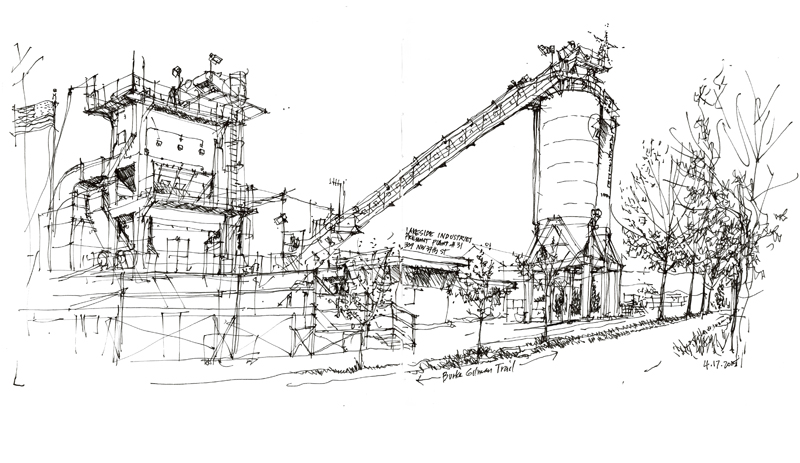
Industrial architecture, through the arrangement of geometric forms, often expresses its utility, function, and process in the most direct and honest way. This example is the Fremont Plant of Lakeside Industries, a third-generation family-owned company dating from 1952. Sandwiched between the Ship Canal and the Burke-Gilman Trail, the plant processes the movement of sand and gravel between trucks and barges

About Copying

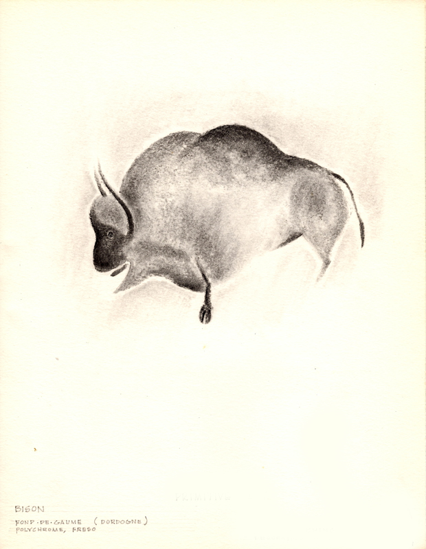
Back in 1963, an art history course at the University of Notre Dame required me to copy a number of art works. The idea was to supplement the reading about and viewing of art with the act of reproducing art. Here are three examples from my course notebook that I happened upon recently.

EPSON MFP imageDordogne Cave fresco of a bison

EPSON MFP image

Veronese’s Head of St. Mennas (detail)

EPSON MFP image

Frans Hals’ Young Flute Player

It had long been a tradition in the studio arts to copy masterworks as a way to gain proficiency, the thinking being that one could learn by imitating the compositional strategies, the strokes and blending of colors, and other techniques used by artists more skilled than ourselves. There are art teachers, however, who consider this type of copying to be a crutch and an obstacle to developing one’s own creative mind. Whether the practice of copying is good or bad depends ultimately on the reasons for doing so. The motivation for copying should not be merely the reproduction of a work. Rather, it should be seen as an attempt to explore the process of the original artist and just a single step in the learning process.

I should point out that drawing on location neatly sidesteps the question of copying. But note that even here, we are in a sense copying what our visual system takes in and interprets.

Casa das Canoas

EPSON MFP image

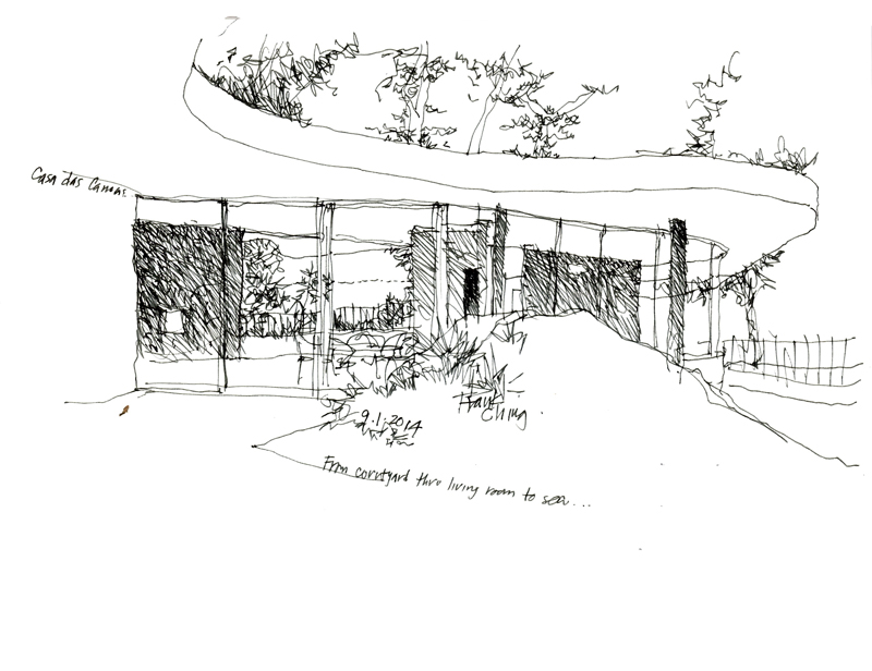
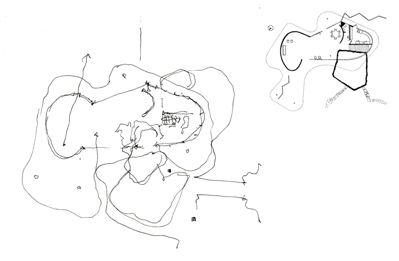
While in Rio de Janeiro a month ago, we had the opportunity to visit Casa das Canoas, the first residence designed by Oscar Niemeyer in 1952. It is a true gem, nestled in a beautiful hillside setting and displaying the characteristic flowing lines of Niemeyer’s architecture. Thanks to Caique Niemeyer, Oscar’s grandson, for allowing us the privilege of touring this fine example of modern architecture.

After doing a few sketches of the exterior and interior of the deceptively simple structure, I attempted to draw a plan to try to understand the two-dimensional origin of what I saw in three dimensions.

EPSON MFP image

To verify my plan, I perused several books on the architecture of Oscar Niemeyer but none contained a plan of this house. Upon returning to Seattle, I did an internet search and found this plan drawn by Jeff Hottinger, which is included next to the plan I drew.

In this age of digital 3D modeling where much design thinking and decision-making is made from a perspective viewpoint, it is still a useful mental exercise to try to imagine the orthographic relationships that plans and sections reveal and which perspective views do not. As designers, we should be able to think two-dimensionally as well as three-dimensionally.

Oratorio dei Filippini

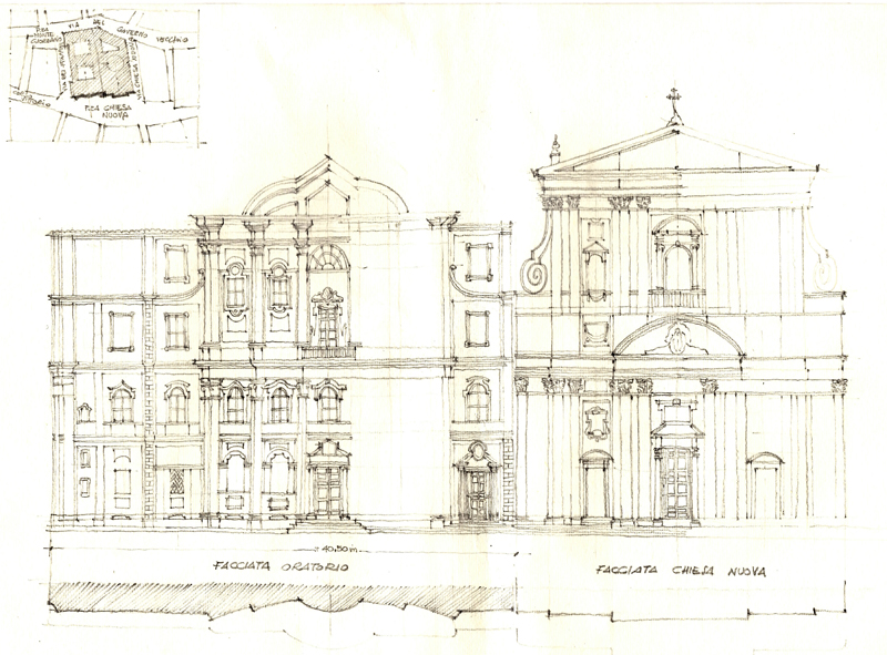
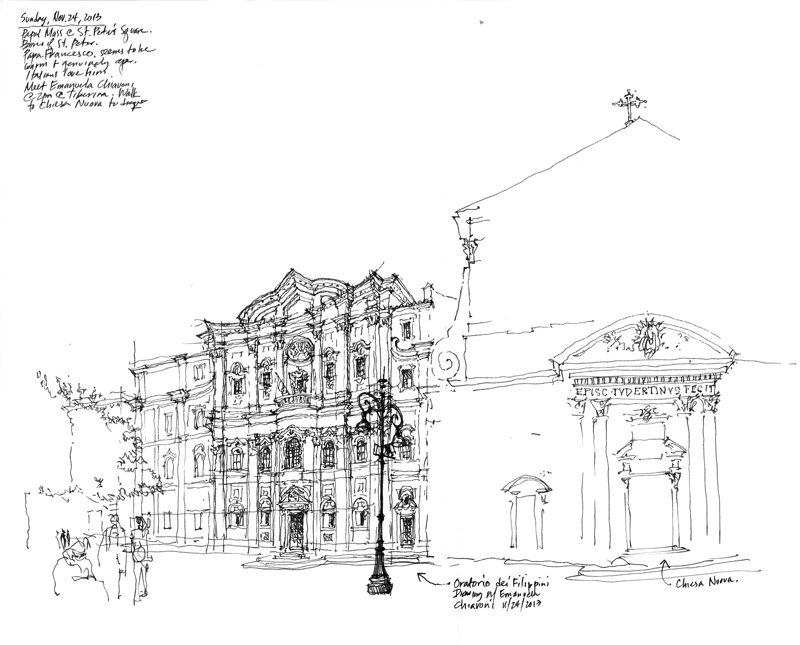
This measured drawing of the facades of the Oratorio dei Filippini (Oratory of Saint Phillip Neri) and the Chiesa Nuova (Santa Maria in Vallicella) in Rome was beautifully crafted by hand by Professor Emanuela Chiavoni of the Università Sapienza di Roma, who I met at the UID conference in Matera last year. Designed by Francesco Borromini and erected between 1637 and 1650, the Oratorio achieves a measure of strength and elegance not through decorative features but rather by careful proportioning and the use of opposing geometries, particularly of the interplay between the convex and the concave.

EPSON MFP image

Professor Chiavoni executed this drawing as part of her Ph.D thesis and graciously presented it to me as a gift. The drawing shows the use of orthographic projection to objectively describe the formal and proportional relationships between the parts and the whole of a design.

Below is my drawing of the same facades that I had done while Professor Chiavoni accompanied me for an afternoon of sketching in Rome. These two drawings show the difference between the objective and perceptual descriptions of the same subject.

EPSON MFP image

Act without Striving

Sometimes, we do our best work when we are the least concerned with the outcome.

Fresh1 Fresh2 Fresh3

By showing you these images, I do not mean to imply they are examples of my best work but there is a fresh quality to my drawings either when I don’t have the time to overthink a drawing or when I am demonstrating an idea or approach as I am teaching.


Contrast

Whenever I view one of my own drawings or see someone else’s work, my immediate, instinctive reaction is to ask: How could the drawing have been improved? Sometimes, the answer is better composition; at other times, it’s more context. But the more common response for me is increased contrast.

I’ve written about this before but it bears repeating that contrast is a critical part of both seeing and drawing. Without seeing contrast, we are not able to differentiate one thing from another. And without drawing contrast, we diminish the hierarchy that creates interest and focus in a sketch.

ConfuciusTemple

There are several kinds of contrast that we can use in a drawing. Perhaps the most obvious is distinguishing between heavy and light line work to enhance spatial depth—what is near versus what is further away.

Ookayama2

Another is contrasting areas of greater detail with spaces of lesser detail, or areas of precision with those of ambiguity.

WC2WC2bw

And in the case of watercolor sketches, it is definitely necessary to differentiate not hues but rather zones of tonal values.