Architecture: Form, Space &, Order

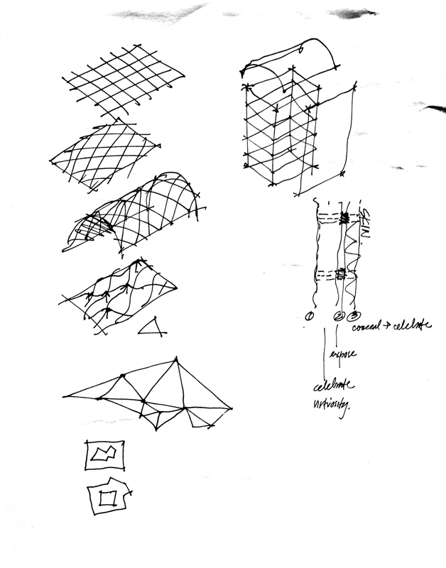
Much of my attention recently has been attuned to preparing the fourth edition of Architecture: Form, Space & Order. Working on this revision is giving me the opportunity to explore and attempt to understand the spate of irregular forms and compositions that dominate our consciousness.

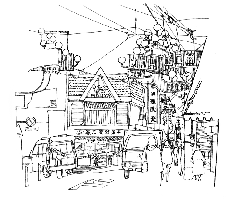
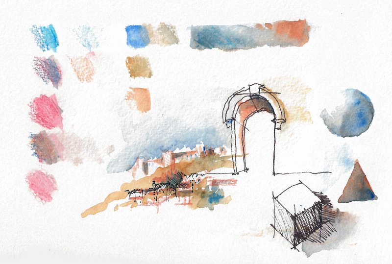
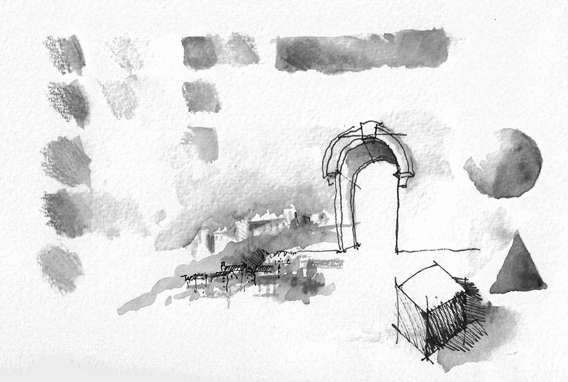
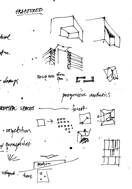
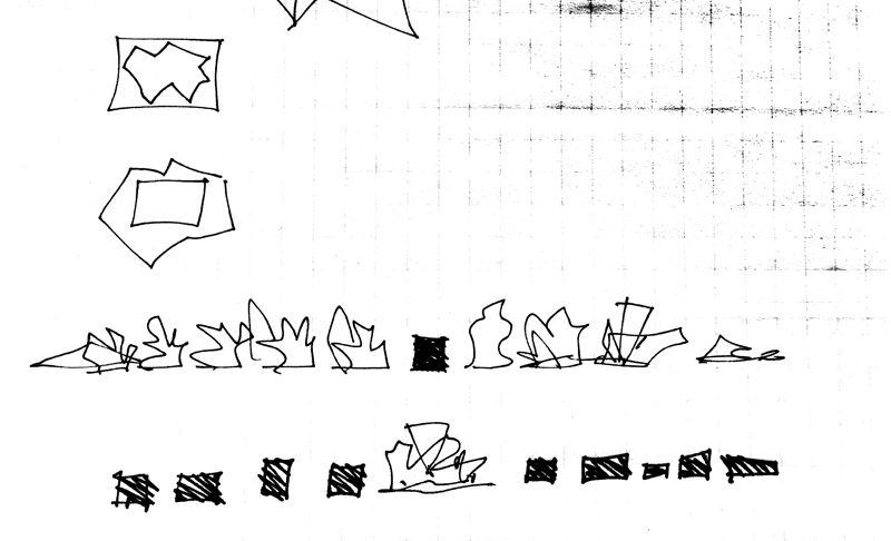
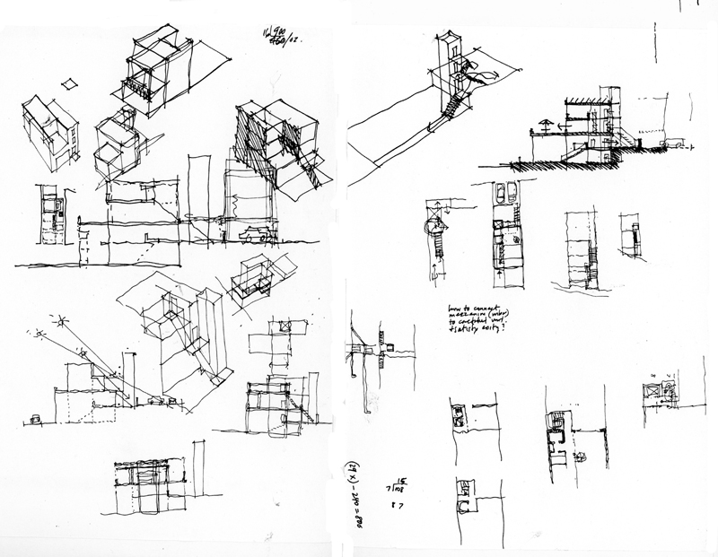
Beginning a project is always enjoyable; thinking about all of the possible directions a work can take can be liberating. But beginnings can also be difficult when innumerable false starts interrupt the work flow and inhibit a sense of progress. I have come to realize, however, that these friction points are a necessary part of the creative process for they compel us to slow down, to pause, and to think ahead rather than simply charge forward into uncharted territory. One way I occupy these uncertain spaces is by roughing out ideas with a pen on paper and teasing out possibilities with a certain tactile rhythm. Here are a few examples.

AFSO4e_Studies1 AFSO4e_Studies2 AFSO4e_Studies3

Two Baroque Masterpieces

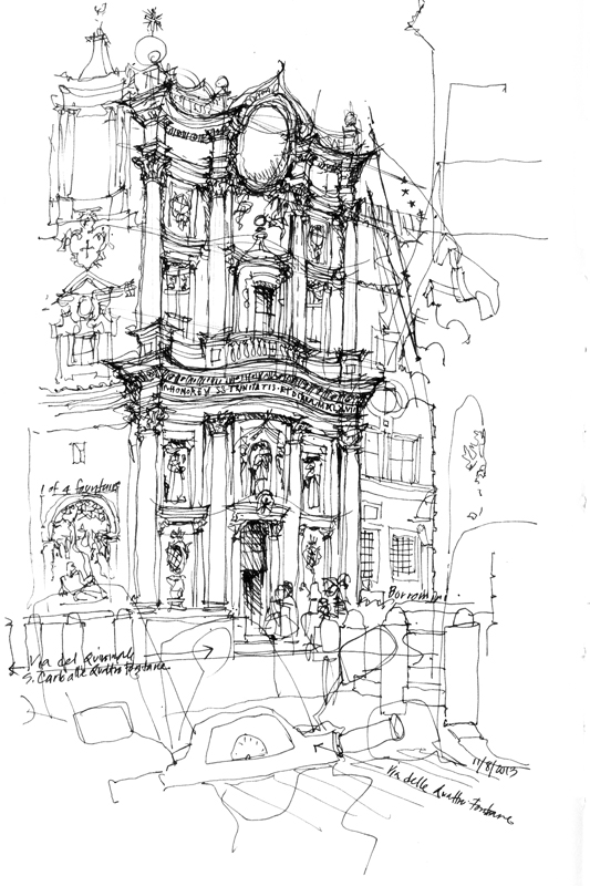
SanCarlo

Designed by Francesco Borromin, San Carlo alle Quattro Fontane is an iconic masterpiece of Baroque architecture, built in the 17th century as part of a complex of monastic buildings on the Quirinal Hill, at the southwest corner of the intersection of of Via XX Septembre and Via delle Quattro Fontane. Four fountains (Quattro Fontane) mark the corners of the now narrow and busy intersection. It’s difficult to capture the complex nature of the undulating facade as it weaves its way across the two-story, three-bay structure, with smaller columns framing niches, windows, and sculptures.

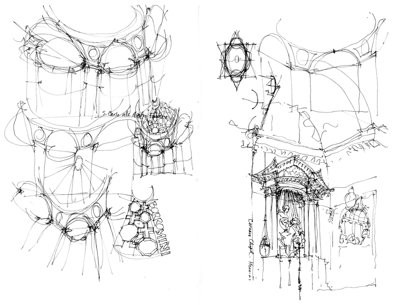
SanCarlo2

These are a few quick sketch studies of the interior. While initially appearing to be complex, the spatial geometry can be understood with just a little bit of analysis.

img033

Just down the street from San Carlo alle Quattro Fontane is Sant’Andrea al Quirinale, another important work of Baroque architecture, designed by Gian Lorenzo Bernini, and the third Jesuit church built in Rome, after the Church of the Gesú and Sant’Ignazio. The reason for the grayed out area is that I had decided to draw this view over two pages already filled with notes I had taken of student design projects.

Remembering Como and Milan

Getting settled in Rome and into the rhythm of field walks, drawing sessions, and studio classes. But before posting views of Rome, I want to share a couple of snippets from our visit to Lago di Como and Milano.

Como

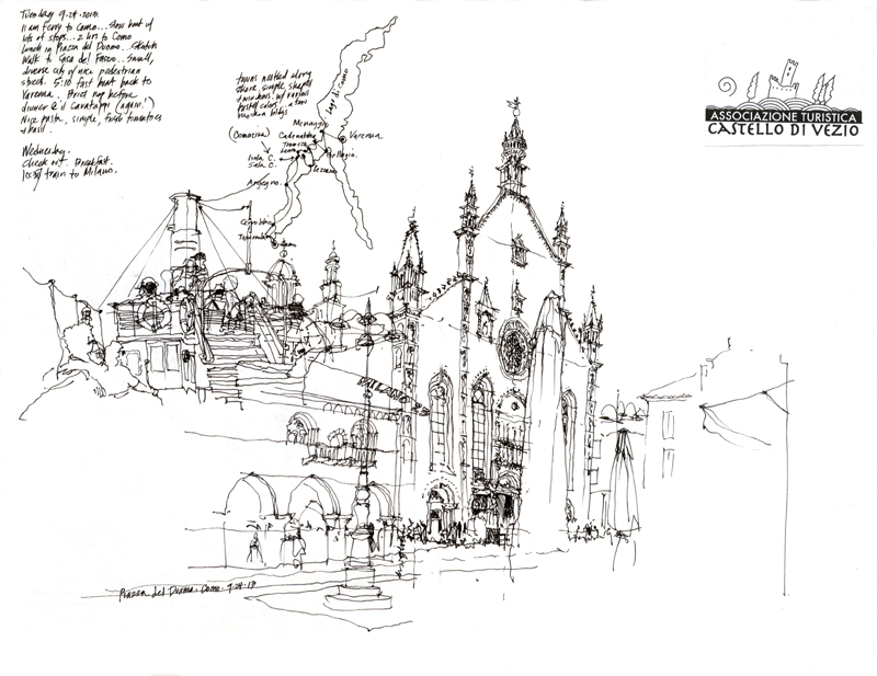
The first view on the left is from the open deck of a ferry my wife and I took from Varenna to Como, which merged with a later, more expansive view of the cathedral in Como. This is an example of how we often compose the pages of our journals in an improvisational manner, thinking not only of the composition of a view but also how it might be placed on a page or across two pages to interact with previously placed writings or drawings. Sometimes, the result is purely accidental and happily so.

Milan

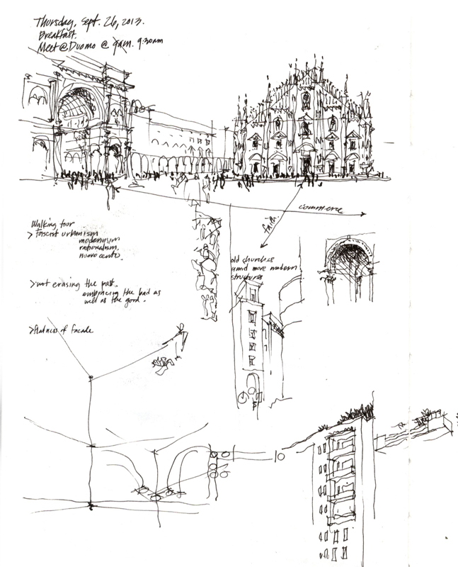
The second view is a very quick sketch to capture not just the Duomo in Milan or  the Galleria but rather the relationship between the two—a church of faith and a church of commerce.

A Brief History of Bookmaking II

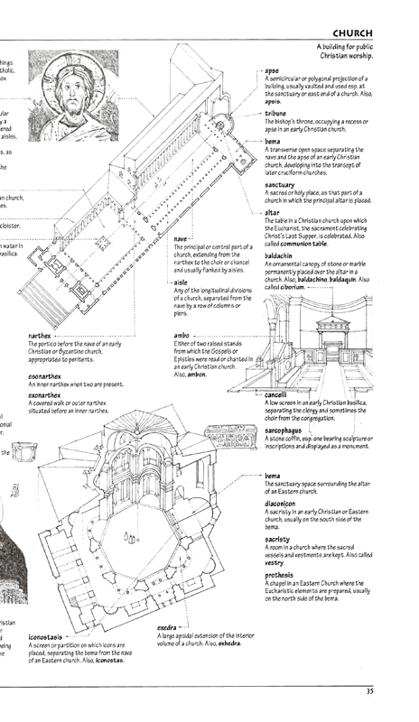
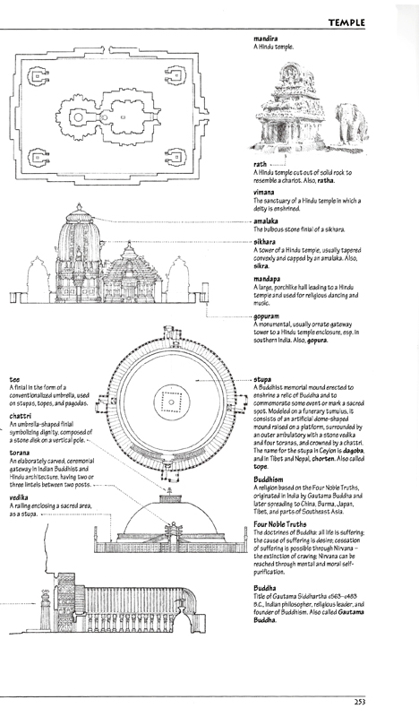
The process of handlettering and drawing camera-ready pages for my books continued throughout the 1980s. But in the early 1990s, armed with an Apple Macintosh SE, a laser printer, and digital typography, I made my first foray into using digital technology as I prepared A Visual Dictionary of Architecture.

After assembling and organizing the terms and definitions into sets, I laid the material out on oversized sheets in Aldus Pagemaker. It was fortuitous that Adobe had just recently scanned my handlettering and created the digital font, Tekton, which I used for the dictionary terms and definitions. After printing the pages out, I laid tracing paper over each page and roughed out the size and position of each illustration to fit. I would then work back and forth, adjusting the placement of text in Pagemaker as necessary to accommodate the illustrations before doing the final drawings by hand on Clearprint vellum. After having the drawings scanned, I placed the .tiff files into the Pagemaker files.
VDA


VDA2

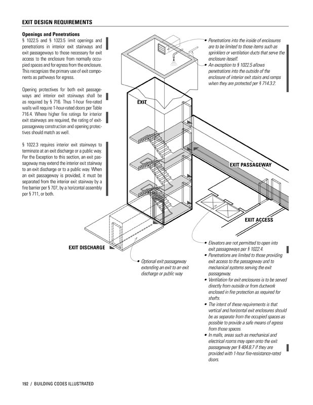
In 2000, I began working with Steve Winkel on the first edition of Building Codes Illustrated. Knowing that the International Building Code, on which the text was based, was going to be updated every three years, I decided to do all of the drawings in Adobe Illustrator, learning the program on the fly.

I use Illustrator basically as a drafting tool to create the visual ideas I have in mind. The many benefits of vector graphics include: using the Save As capability to try out different options; having precise control over line weights and tonal values; being able to resize drawings easily to fit a page layout; and reusing elements that I had already drawn. Most importantly, when working on a revision, instead of having to completely redo a hand drawing, I can open an existing drawing file and make the necessary changes to create the updated version.
IBC

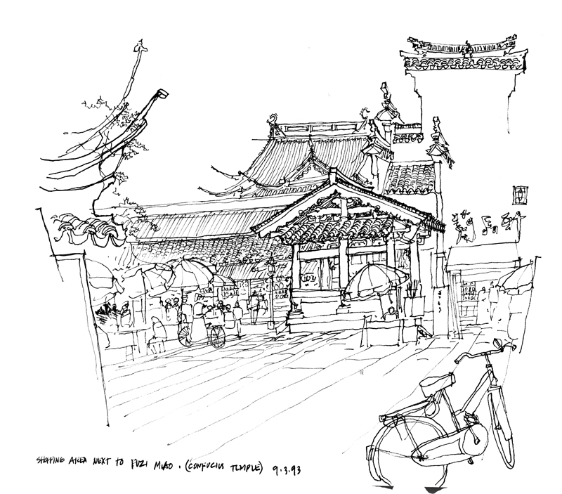
Because I am using digital tools more and more in my bookmaking, I cherish even more the opportunities to draw by hand when out on location. Even as I experiment with drawing on my iPad, the connection between eye, mind, and hand when I draw with a fountain pen in a sketchbook remains a pleasure.

A Brief History of Bookmaking

Following up on a previous post about the making of Green Building Illustrated, here is a brief history of my publications.

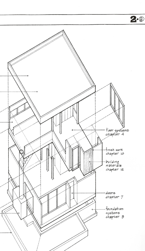
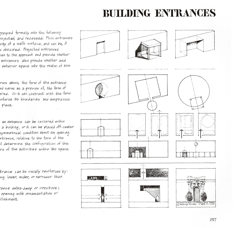
My first book, Architectural Graphics, was published 38 years ago, in 1975. Due to the efforts of Forrest Wilson, Van Nostrand Reinhold offered me a contract based on of over 400 pages of notes I had prepared for the very first class I taught at Ohio University. I still remember condensing those notes and handlettering and drawing the final camera-ready pages with a Scripto lead pencil, a triangle, and a scale. I completed all 128 pages in a little over three weeks. Here is a sample page.

AG

Building Construction Illustrated soon followed, using the same tools and process. But this time I worked on tabloid-size paper instead of letter-size bond paper. Interestingly, after a few years of complaints from bookstores, the pages were reduced to letter-size.

BCI

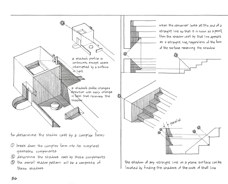
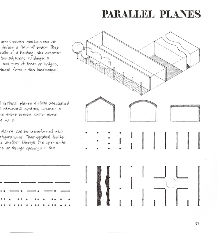
Wanting to use more subtle hatching and shades of gray, I used a 0.3 mm lead pencil to handletter and draw the images on Clearprint vellum for the camera-ready pages of my third book—Architecture: Form, Space and Order. Here are a couple of screen shots for a visual comparison.

AFSO AFSO2

My next post will describe the first time I used digital technology in my bookmaking.

Green Building Illustrated

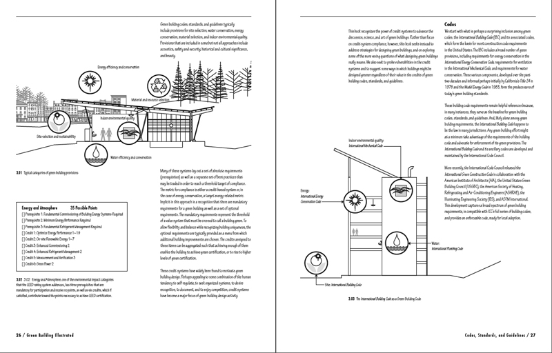
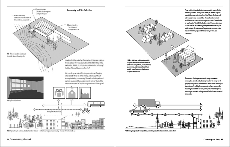
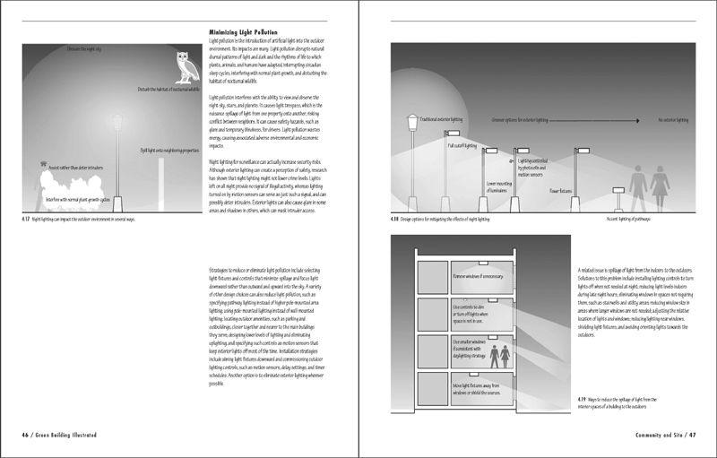
I’ve been busy this summer developing a new textbook, Green Building Illustrated, which attempts to explain the theory, practices, and complexities of sustainable design. Working with excellent material written by engineer and researcher Ian M. Shapiro, my focus is on presenting the ideas and information in graphic form, as I have done with my previous Illustrated texts. Here is a few drafts of page spreads that I hope will whet your appetite.

GBI_S1

GBI_S2 GBI_S3

I’m laying out the book in Adobe InDesign and producing the drawings in Adobe Illustrator. Even before I begin work in Illustrator, however, I usually have a pretty good idea in mind of the image I want to produce and sometimes use freehand sketches to review and refine the possibilities I will be exploring.

GBI_Freehand

In a future post, I will explain the reasons for my use of digital media to produce the drawings.

Building Physical Models

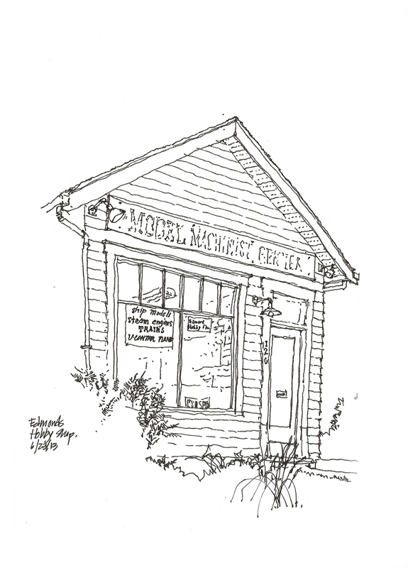
EdmondsHobby

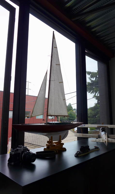
Seeing and drawing this humble hobby shop in Edmonds reminded me of how much I loved building models of all kinds—planes, trains, ships, and for a very brief time, even classical guitars. As you can see in this photo, I still have a few around.

PhysicalModels

Despite the allure of digital models and fabrication techniques, we can still learn a lot by working with real materials with one’s own hands, feeling attributes such as weight, texture, and grain. Unlike digital models, real materials tell us if we try to make them do things that they are not capable of. And in assembling physical models, we learn that sequence is crucial to success. We can turn a physical model over, not in our heads as we sometimes do with drawings or on the computer monitor as we do with digital models, but in real space and in real time. One can examine materials and joinery closely one moment, and then look at the whole from a more objective distance the next.

I still have a few model kits, just in case I ever find myself with some free time and nothing better to do.

Canale Studios

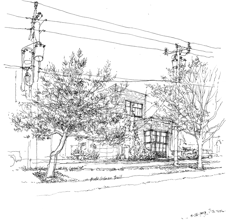
Been busy the past week with moving for the second time in two years. Relocating is never an easy task, especially when downsizing to smaller quarters. However, it feels good to return to the Fremont neighborhood. Here is a view of our building fronting on the Burke-Gilman Trail and the Ship Canal

CanaleThe simple masonry massing of the structure comprises a rental space at the street level, an 800 SF residence on the second level facing a courtyard on the alley side, and studios and offices above.

Foreseeing the Future

CanaleScheme

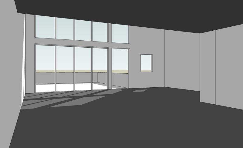
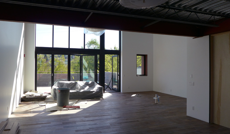
Stepping away from drawing from location for a while, I want to mention design drawings—drawings designers use to initiate and develop ideas and make them visible so that they can be acted upon. Whether we start with orthographic views, such as plans, elevations, and sections, before moving on to 3-dimensional views, or we begin the design process with paraline and perspective drawings, we should move back and forth from 2D to 3D and have the confidence that our visualizations are dependable predictors of future outcomes.

CanaleVision


CanaleBuilt

In an actual project nearing completion, it is interesting to compare a design study created in SketchUp with a photo of the constructed space. While not exactly identical, these two images are similar except for nuances of color and material. This shows the usefulness of preliminary studies to reliably foresee the result of our design decisions. Of course, these studies include not only graphic representations but also study models and prototyping. But for efficiency of time and fluency of thought, it is difficult to beat the graphic tools at our disposal.

Vignettes

Trafalgar

Some sketchers start by drawing a border and then filling in the frame. I prefer not to restrict my images to fit within a predetermined frame; my only size constraint is the page or two-page spread on which I’m drawing. And even then, I try to leave myself room for the drawing to develop and grow if necessary. For this reason, I tend to draw vignettes, images that fade into the background without a definite border.

Structure

You can see here how I typically start a drawing by roughly outlining the basic forms and establishing a skeletal structure upon which I can elaborate. Then, depending on how much time I have, I select what I want to focus on and develop those details, textures, and values. This approach allows me to leave parts of a drawing unfinished if pressed for time, especially when drawing on location.

SanMarco

Here is another example of how I’ve left portions of a drawing unfinished, allowing the viewer to fill in or sense the missing parts without those parts being actually drawn. Unfinished drawings, in fact, can often engage viewers by exercising their visual imagination.