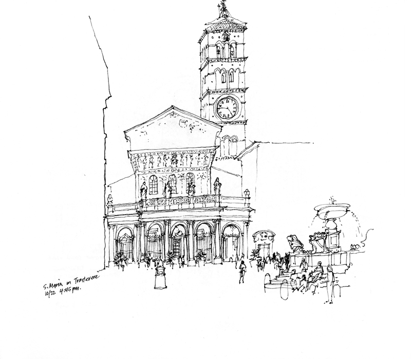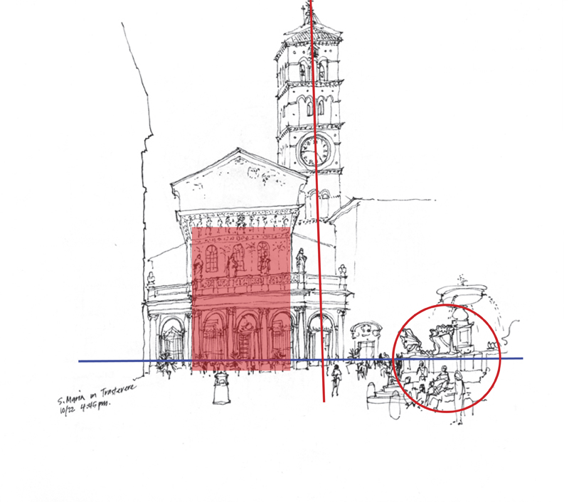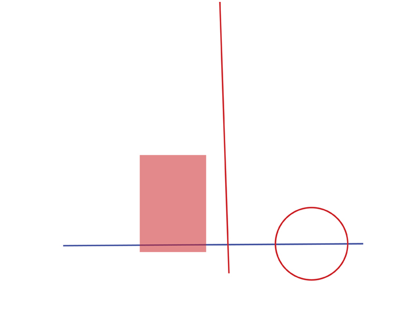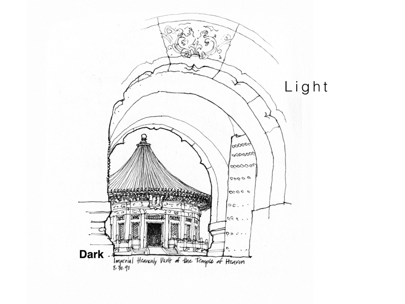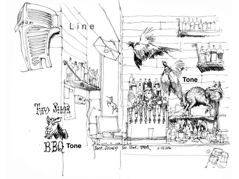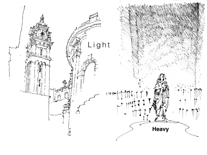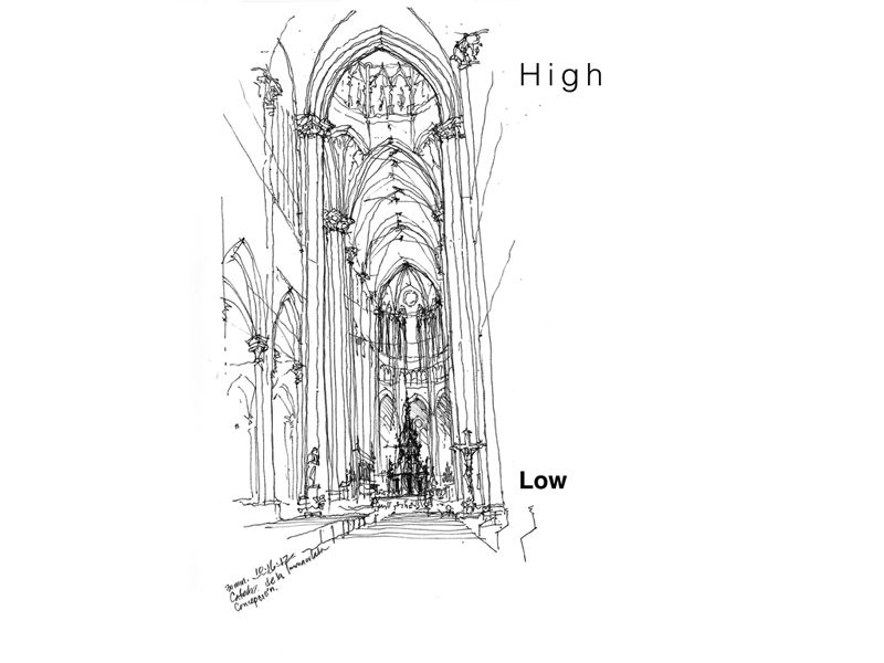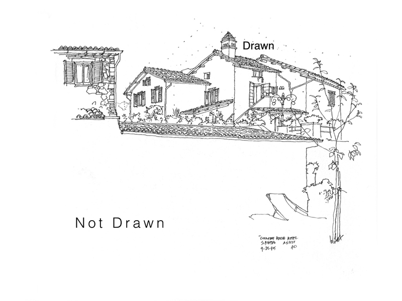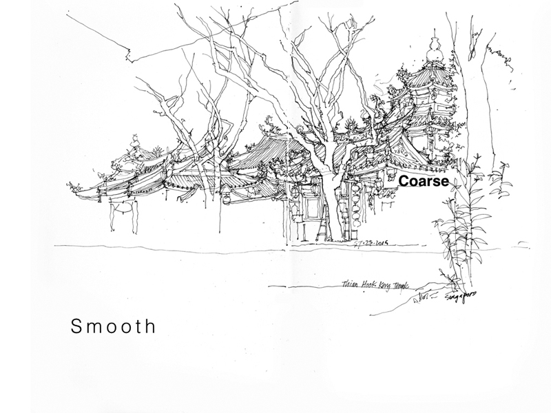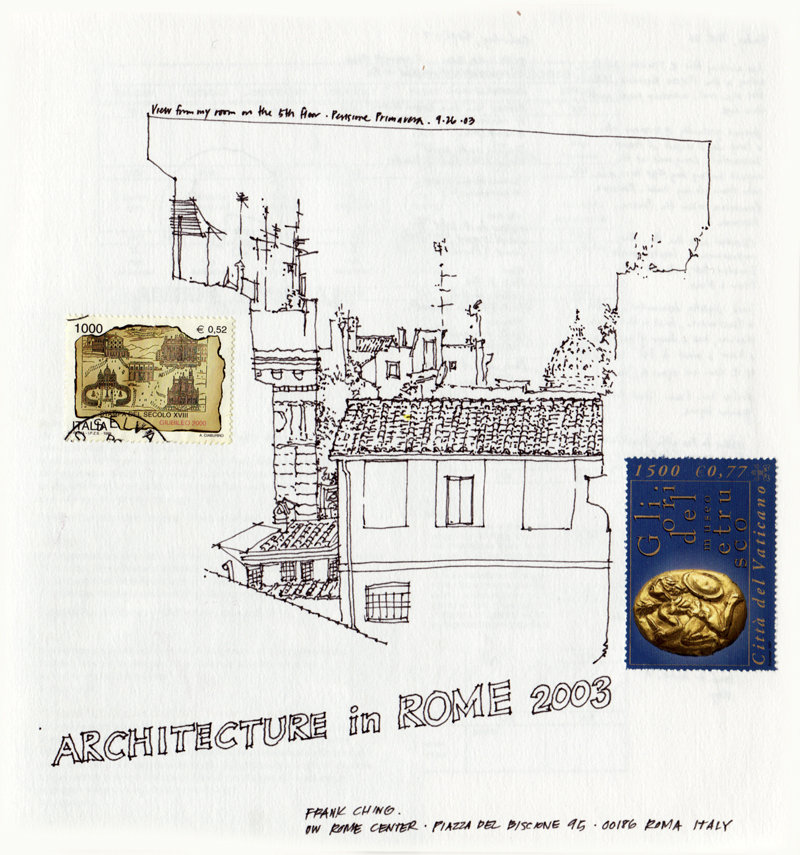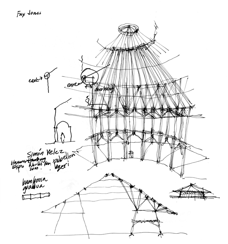
Back in 2012, I had posted a few examples of how I used contrasting tonal values to define form and draw attention to a particular area in a sketch. In this post, I want to expand on the idea of contrast—the discernible distinctions in line weight, tonal values, textures, details, and even relative position on a page—that is essential to avoiding blandness and giving life to a drawing. Here are examples of the different kinds of contrast at our disposal. Note how the visual tension between the two contrasting elements or areas contribute to the composition of a drawing.
Category Archives: Design
Amazon’s Spheres
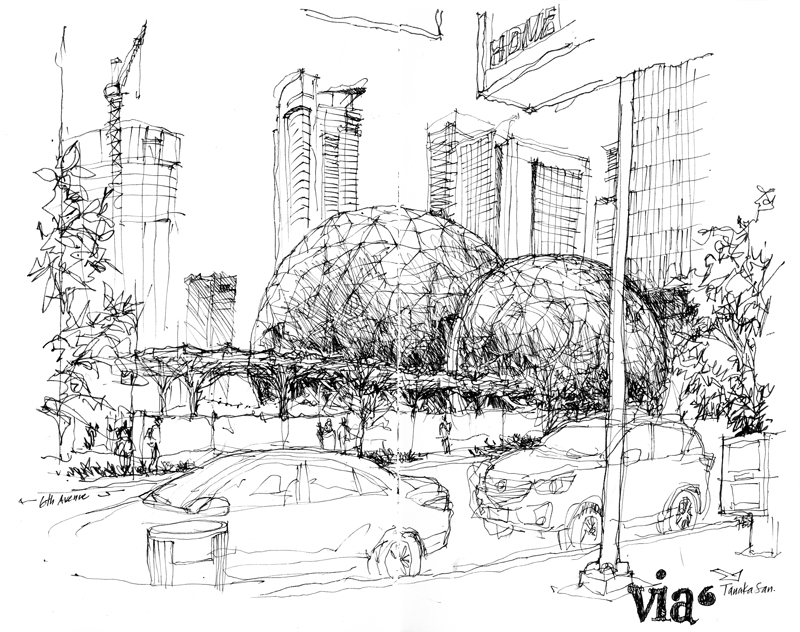
An ad-hoc group of Seattle Urban Sketchers met this past Friday at the Via6 apartment and retail complex, right across the street from these spheres being erected at the heart of Amazon’s urban campus. It’s been almost a year since I first drew these steel-and-glass orbs under construction (see sketch below.)
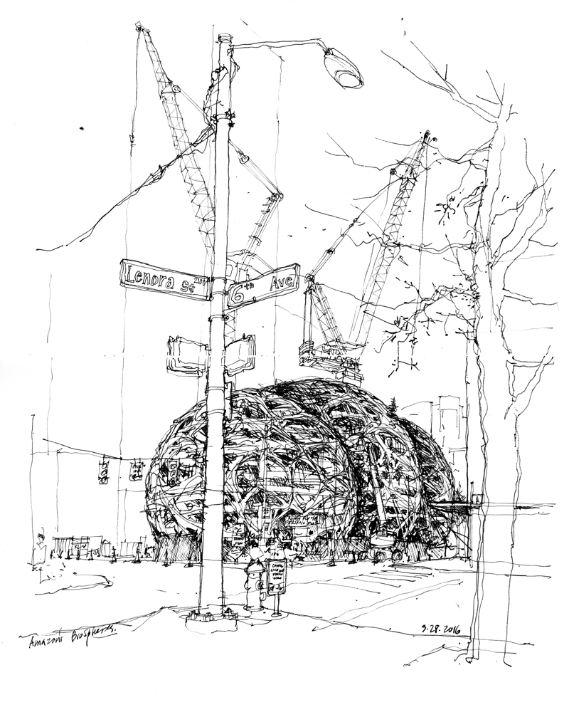
Even though some may find curves to be difficult to capture, spheres are actually quite easy to draw in perspective because they are always seen as circles; they only vary in size, depending on their scale and distance from us. The drawing of circles themselves, however, can be daunting. I find that using a smooth, continuous, lightly drawn stroke works better than a series of short, jerky strokes. The difficult part of drawing these spheres, then, is how to suggest the surface pattern of the steel- and-glass panels, and to convey the overall roundness of the orbs.
Drawing these spheres a second time brought to mind a question. I wonder why the clients or designers chose to use an organic framing pattern rather than an established prefabricated structure, such as Buckminster Fuller’s geodesic system.
Notebook Pages
Notebooks, sketchbooks, journals… whatever one chooses to call these bound collections of pages, they all provide a physical sense of permanence and chronology and, in use, they become a repository of images and writings capable of reminding us of where we have been, what we have seen, and what we have experienced. But even as we acknowledge the pleasure of perusing these collections, we should also appreciate the process by which they are made. No single page in a journal is precious; not all pages must be perfect. In the act of making visible our experiences, reflections, and discoveries, we become more sensitive to and connected with our surroundings, expand our visual memories, and stimulate our imagination.
McGraw Square Revisited
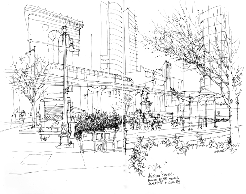
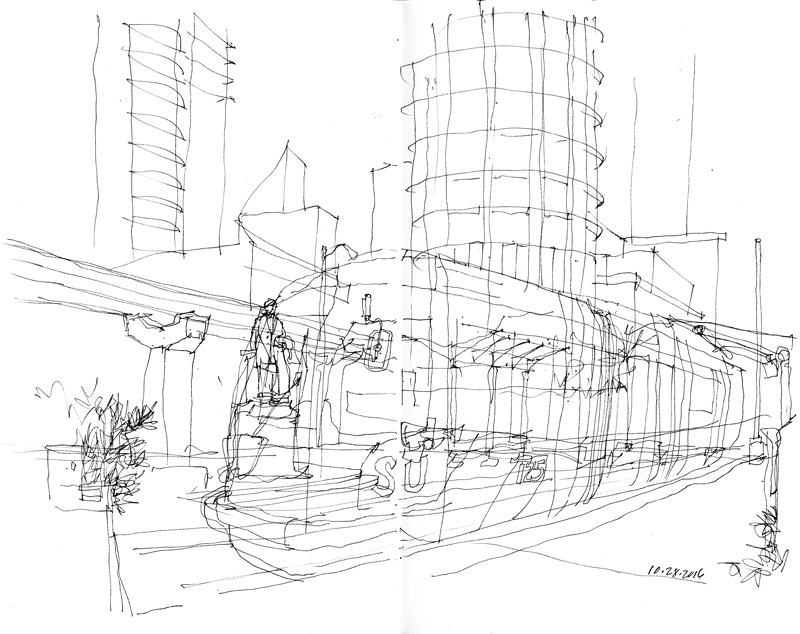
I returned to McGraw Square last week but instead of finishing my original sketch, I decided to annotate it and to redraw the square from a different perspective. I simply moved back about eight feet from my original position and in doing so, dramatically altered both the field of view and the drawing composition. This illustrates how the decision about where to position oneself is an important one when drawing on location and should not be taken lightly.
Sometimes It Just Doesn’t Work Out
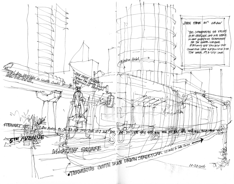
I took the bus downtown a couple of weeks ago to do this drawing of McGraw Square, where 5th Avenue meets Stewart Street and Olive Way. My intention was to document an intersection where various modes of transportation converged—the elevated Monorail that was built for the 1962 World’s Fair and still travels a mile from Westlake Center to Seattle Center; the South Lake Union Streetcar line that runs 1.3 miles from this terminus to the south end of Lake Union; and the multiple buses routes that run east-west along Stewart Street. In addition, of course, there are all of the cars and pedestrians making their way through the downtown corridor.
But sometimes, things don’t work out as planned. Even though it was a fairly pleasant day, I just didn’t have the proper state of mind to finish the drawing. That’s okay. I intend to go back and finish it the next time clear weather is in the forecast.
Upper Queen Anne Hill
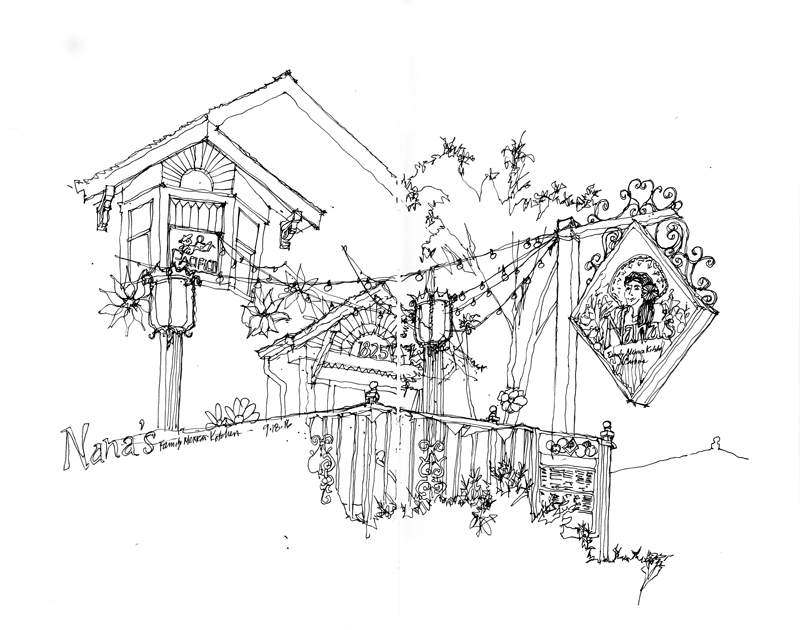
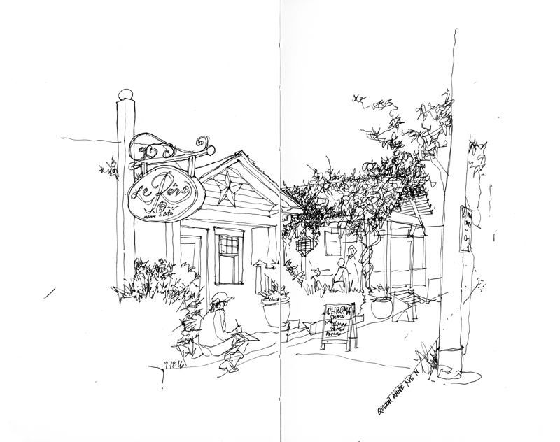
On what turned out to be a beautiful Sunday morning after a few cloudy, showery days, the Seattle Urban Sketchers group met in the upper Queen Anne neighborhood just north of downtown. As I was viewing the subject of my first sketch, Nana’s Mexican Family Restaurant, I realized that the scene presented a multitude of details that would overwhelm the eye. I therefore chose to draw very selectively, leaving a lot of white space for the imagination to fill. This approach required the selection of a dominant element—in this case, the sign above the sidewalk—and then proceeding so that the drawing would lead the eye from one area of interest to the next. The key is never to lead the eye off the page.
I used a similar approach for the remaining two drawings I was able to do during the morning session.
Notational Drawings
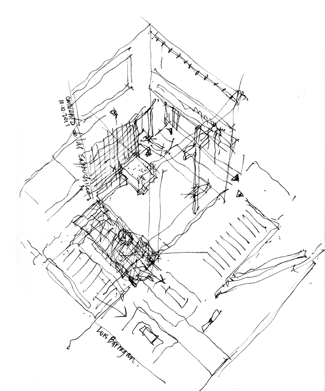
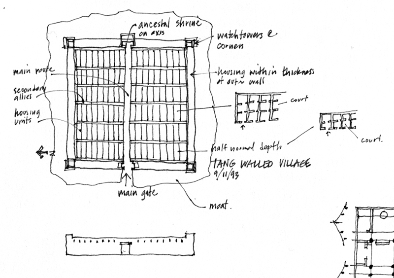
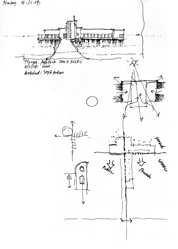
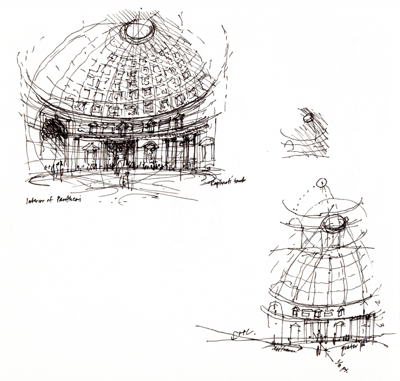
Perusing my sketchbooks, one might discover many small notational drawings that I have used to understand and represent certain aspects of the places visited. When drawing from observation, we can capture not only what the eye perceives but also what the mind conceives. We can use the drawing process to think about, visualize, and explore in imagined and imaginary ways the conceptual basis for the environments we see and experience. These notational drawings may be simple plan or section diagrams or more complex three-dimensional studies but in all cases, they attempt to encapsulate the essence of a place or structure.
Hotel Hotel Hostel
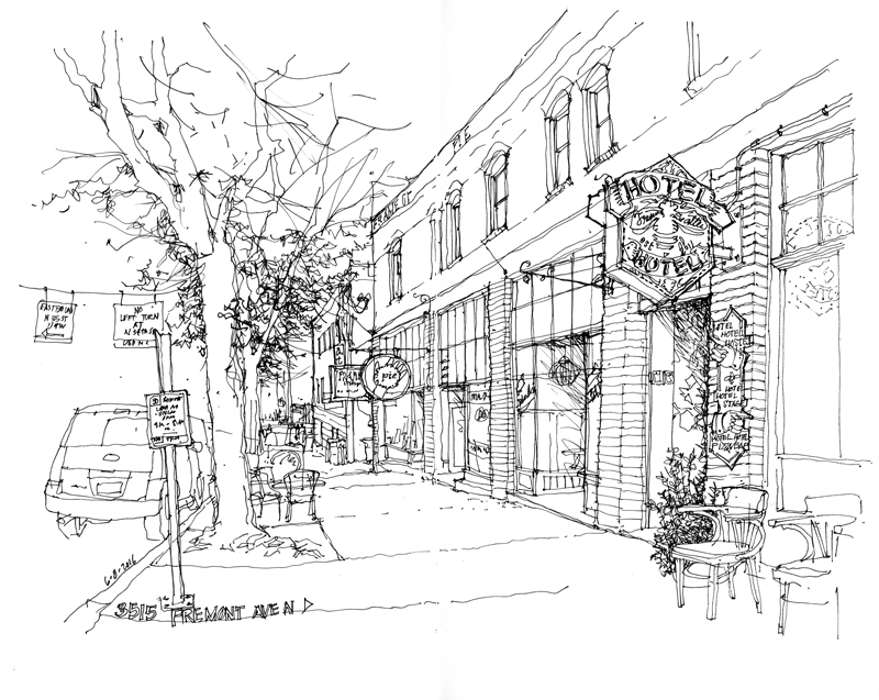
The Hotel Hotel Hostel is an example of a healthy renewal and reuse of an existing piece of urban fabric in the center of a vibrant neighborhood, within easy walking distance to shops, restaurants, and buses. Established in 2011, the hostel offers reasonably priced accommodations in Fremont, ranging from private rooms with private baths to private rooms and dorm rooms with shared baths. In addition, there’s a fully equipped kitchen and TV room to share and a pizza bar on the street level.
Check out their website at <http://hotelhotel.co/hotel_hotel_hostel> for more info.
Playing Favorites
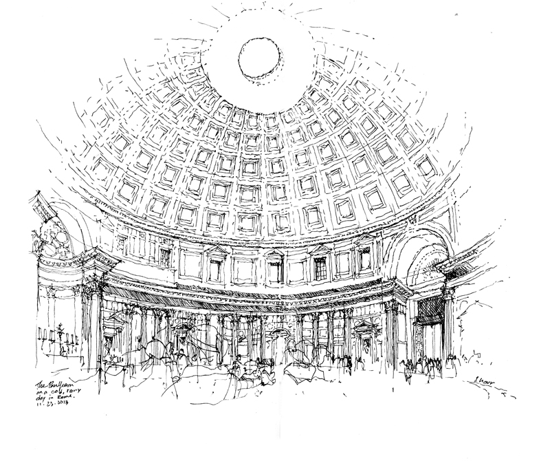
I am sometimes asked what my favorite work of architecture is. Rather than name a historic or popular icon, I usually respond by saying that I like buildings that help build neighborhoods and communities. But if pressed to name one, I can only narrow the list down to two: the Pantheon in Rome and the Hagia Sophia in Istanbul. Both are ideal in conception and outlook but also enduringly attractive in the way they have aged and adapted to different uses over the centuries. It is only over time that any design can be truly evaluated for its worthiness.