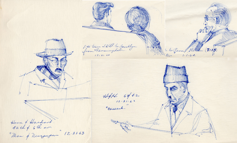
Finding things while rummaging around looking for other items from long ago always triggers memories. One example are these ballpoint-pen sketches from 1963, when an ND classmate invited me to spend Christmas break with his family on Long Island. During a day trip into the City, I was drawn to these individuals—creating “characters”—dining at a Horn & Hardart, an early version of a fast-food restaurant at the corner of 42nd Street and 6th Avenue. I still remember perusing the stacks of glass-doored dispensers containing a variety of hot and cold foods, putting nickels into the selected slot, and removing the plate of food.
Category Archives: Media
A Charcoal Study
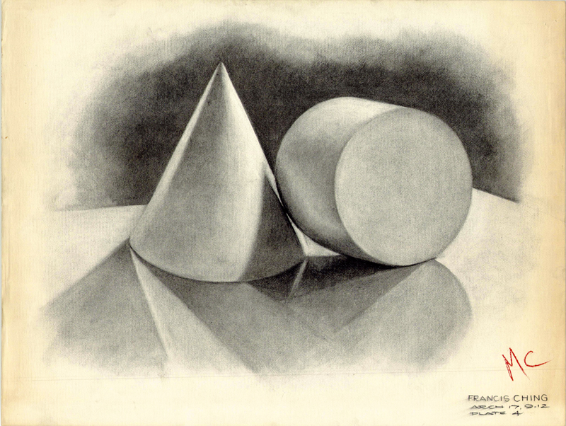
When I entered the architecture program at the University of Notre Dame in the fall of 1961, my first freehand drawing course began with charcoal studies of plaster casts. Being young and naive, I didn’t fully appreciate the pedagogy behind these tasks, but in hindsight, I can see now that these studies helped promote looking closely at geometric forms, noticing how light illuminated and reflected off of their surfaces, and appreciating the resulting subtle gradations of value. And then the challenge was trying to capture these visual qualities with a charcoal stick, a paper stump for smoothing and blending, and a kneaded eraser for lightening and creating highlights.
Coliseum Theater
The Coliseum was the first theater in Seattle built specifically to show motion pictures. Designed by B. Marcus Priteca, it opened on January 8, 1916, at the start of the silent-film era, with a showing of The Cheat, starring Fannie Ward and Sessue Hayakawa. An advertisement at the time called the theater “the world’s largest and finest photoplay palace.” It is just one of a series of vaudeville and motion picture theaters Priteca designed for the Alexander Pantages chain.
The Colesium continued operating as a movie theater until 1990. It sat idle until 1995, when Banana Republic transformed it into a clothing store. It is listed on the National Register of Historic Places and is also a City of Seattle Landmark.
Below is a short video clip of my drawing the view using the Procreate app on my iPad.
Pike Place Market
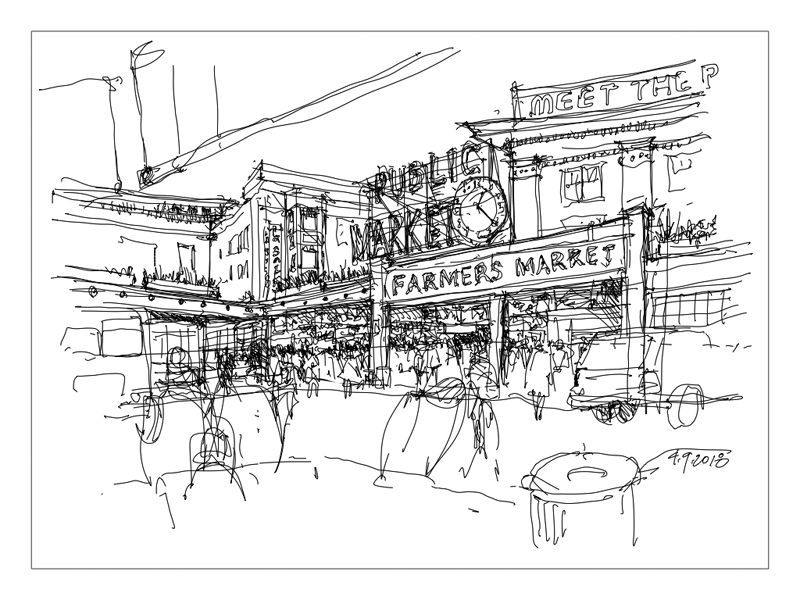 Following up on my previous post, here is another pairing of a sketch and video, this time of the iconic view of Seattle’s Pike Place Market. A key difference between drawing with a fountain pen on real paper and sketching with the Apple Pencil on an iPad is the loss of “feel” experienced when drawing on a glass surface. Even though the Apple Pencil is the best stylus that I have used, there is a tiny but still perceptible distance between the tip of the stylus and the screen that results in a loss of tactility.
Seattle Waterfront
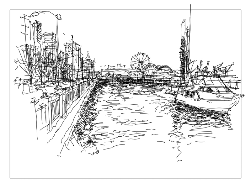
On this relatively warm, sunny spring day, I bused to the Seattle waterfront to sketch this view with the Apple Pencil on an iPad Pro. But instead of Procreate, my customary drawing app, I used the freehand drawing tool in the Keynote presentation app. I wanted to see how well the animated playback of the drawing would work and how easily I could control the pace of the playback. I discovered the process to be not so simple.
Here is a short video of the result. I haven’t yet discovered how to control the pace of the playback and when first watching the playback, I realized that the sequence did not match how I proceeded in marking out my initial judgments and then filling in the details.
A Creative Process
 Like sketching, composing each page of a journal or sketchbook is an extemporaneous act. We may have a plan for how to organize the drawings and notes on a page before we begin, but we should also be open to altering the plan as each element is executed.
For example, we may find that having executed a drawing, its size, shape and proportions may differ, as so often happens, from what we originally intended. By carefully considering the visual shape and weight of the drawing, we can re-balance the page or give it a more dynamic quality with the placement of the next graphic element, whether that element is graphic or verbal in nature. With the addition of further graphic elements, we continue to encounter this opportunity to re-compose the page.
Hale’s Brewery and Pub
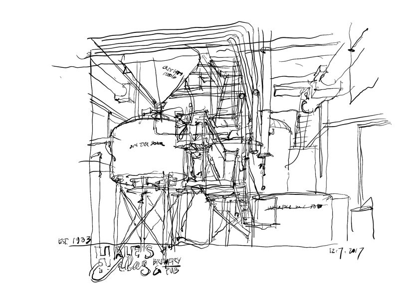
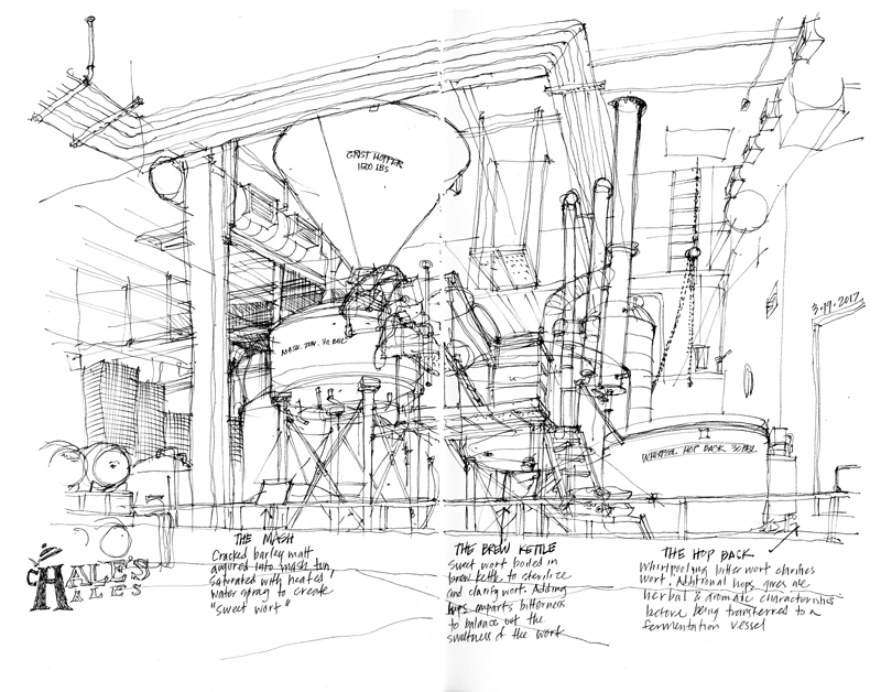
Now that the days are getting shorter, colder, and often rainier here in Seattle, I have to find indoor places to sketch. Here is the equipment at Hale’s Brewery and Pub, the longest running independent craft brewery in the Pacific Northwest.
I drew the above view with an Apple Pencil on an iPad using the Procreate app. Of course, one’s choice of medium always influences how one draws, even though the selected subject matter and point of view may remain the same. I find that unlike drawing with a fountain pen, I have less patience for including fine details, for which I would have to zoom in and out, interrupting the flow of the drawing.
For comparison purposes, here is a similar view drawn with a fountain pen in March of this year.
Using Adobe Illustrator
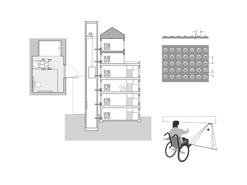
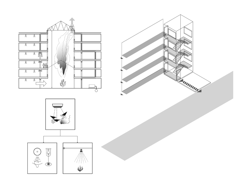
I’m working again with Steve Winkel of the Preview Group, preparing the sixth edition of Building Codes Illustrated: A Guide to Understanding the 2018 International Building Code. When I first began working with Steve in 2000 on the first edition of BCI, I had decided to use Adobe Illustrator to prepare all of the illustrations since I knew that the International Building Code was going to be updated every three years and that many of the graphics would have to be revised on a regular basis.
As I originally posted back in 2013: “I use Illustrator basically as a drafting tool to create the visual ideas I have in mind. The many benefits of vector graphics include: using the Save As capability to try out different options; having precise control over line weights and tonal values; being able to resize drawings easily to fit a page layout; and reusing elements that I had already drawn. Most importantly, when working on a revision, instead of having to completely redo a hand drawing, I can open an existing drawing file and make the necessary changes to create the updated version.”
Here are a few examples.
More Changes, But For Other Reasons
Changes over Time
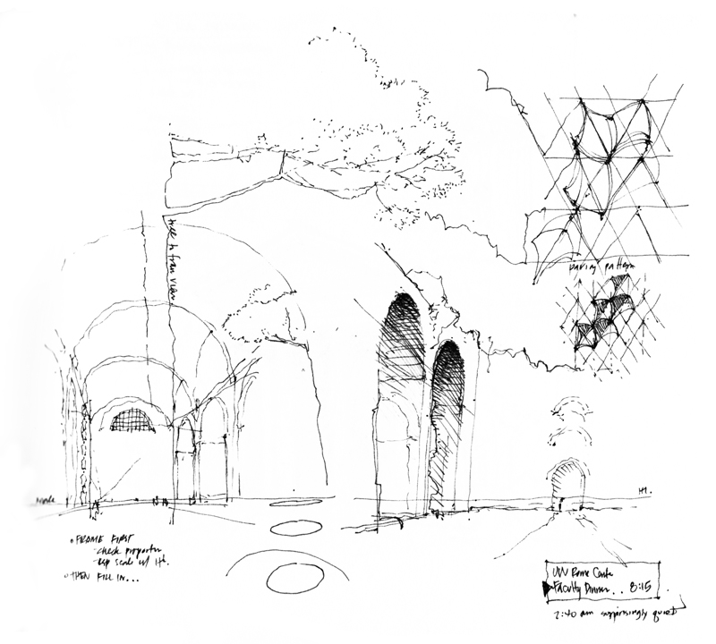
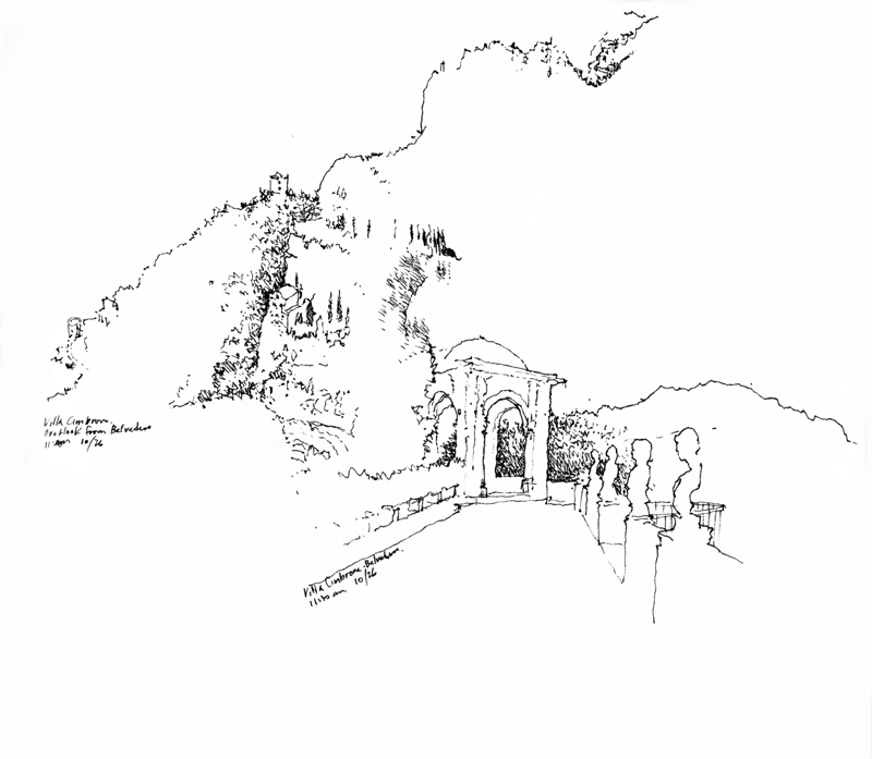
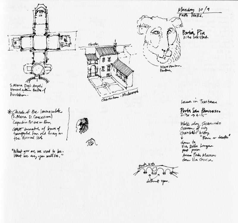
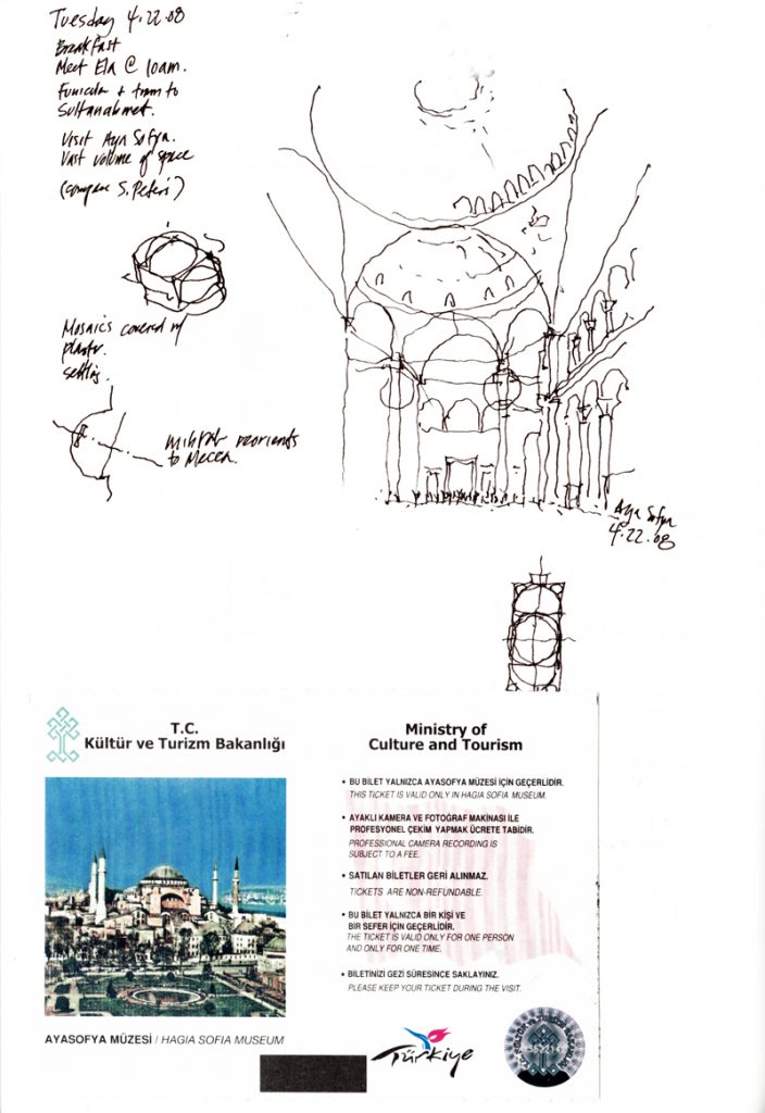
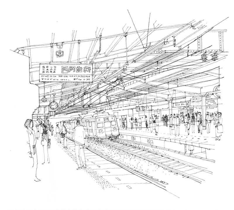
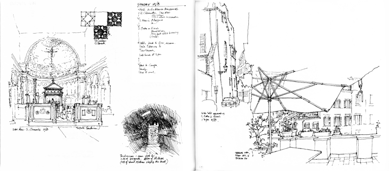
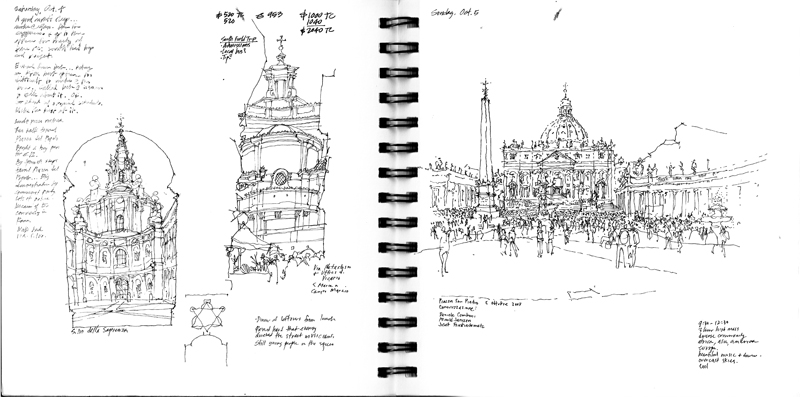
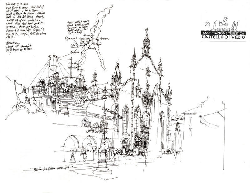
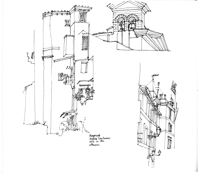
The several times I had the privilege of teaching in the University of Washington’s Architecture in Rome program, I asked my students to keep a journal during the semester to record and document their history walks, field trips, and design studio work. To try and set an example, I kept my own sketchbook along with them. Here are a few sample pages showing how my drawings changed due to the passage of time as well as how my trusty Lamy fountain pen interacted with the different types of paper I used.

