Foreseeing the Future

CanaleScheme

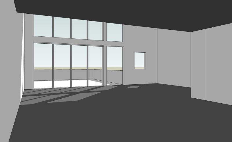
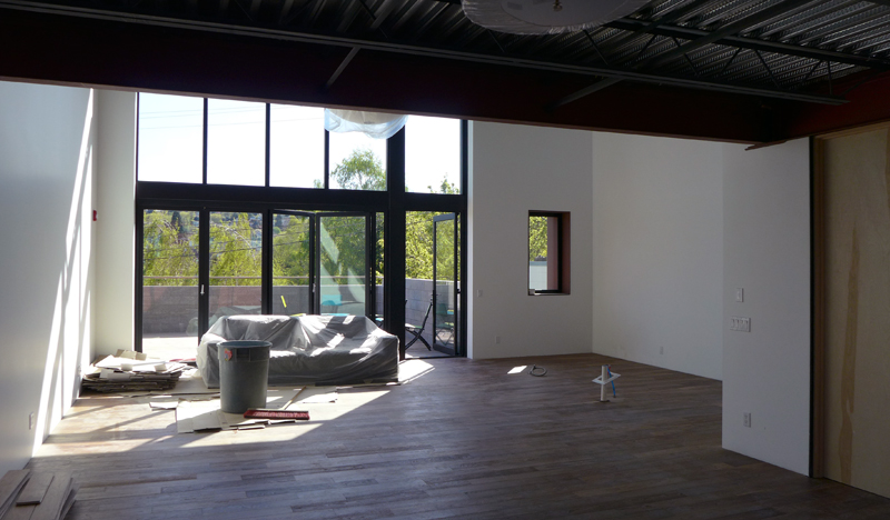
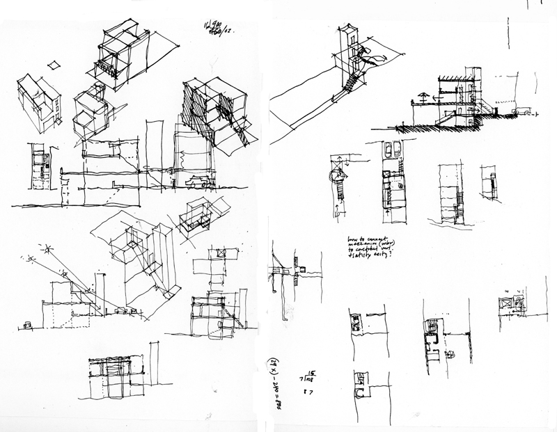
Stepping away from drawing from location for a while, I want to mention design drawings—drawings designers use to initiate and develop ideas and make them visible so that they can be acted upon. Whether we start with orthographic views, such as plans, elevations, and sections, before moving on to 3-dimensional views, or we begin the design process with paraline and perspective drawings, we should move back and forth from 2D to 3D and have the confidence that our visualizations are dependable predictors of future outcomes.

CanaleVision


CanaleBuilt

In an actual project nearing completion, it is interesting to compare a design study created in SketchUp with a photo of the constructed space. While not exactly identical, these two images are similar except for nuances of color and material. This shows the usefulness of preliminary studies to reliably foresee the result of our design decisions. Of course, these studies include not only graphic representations but also study models and prototyping. But for efficiency of time and fluency of thought, it is difficult to beat the graphic tools at our disposal.

Surface and Depth

DrawingMagic

We draw by dragging, pulling, or in some cases, pushing a pen, pencil, or brush across a receptive surface to make marks that represent what we see or envision. This is the magic of drawing, that the ink, graphite, or paint marks we create can call to mind what we have seen and experienced, or what we foresee as an imagined future.

Surface

Some drawings simply lay on the surface on which they are created and tend to be seen and appreciated as 2-dimensional graphics or paintings, viewed through a frame. Due to my training as an architect, however, my personal challenge has always been to overcome the flatness of the drawing surface and create the illusion of space and depth on the 2-dimensional plane.

Depth

Depth2

There are a host of visual depth cues, such as overlapping shapes and size differentiation, that I spoke of in a post from July of last year. Even when drawing 2-dimensional plans, sections, or elevations, we can use contrasting line weights, tonal values, or level of detail to imply depth.

LinearPerspective

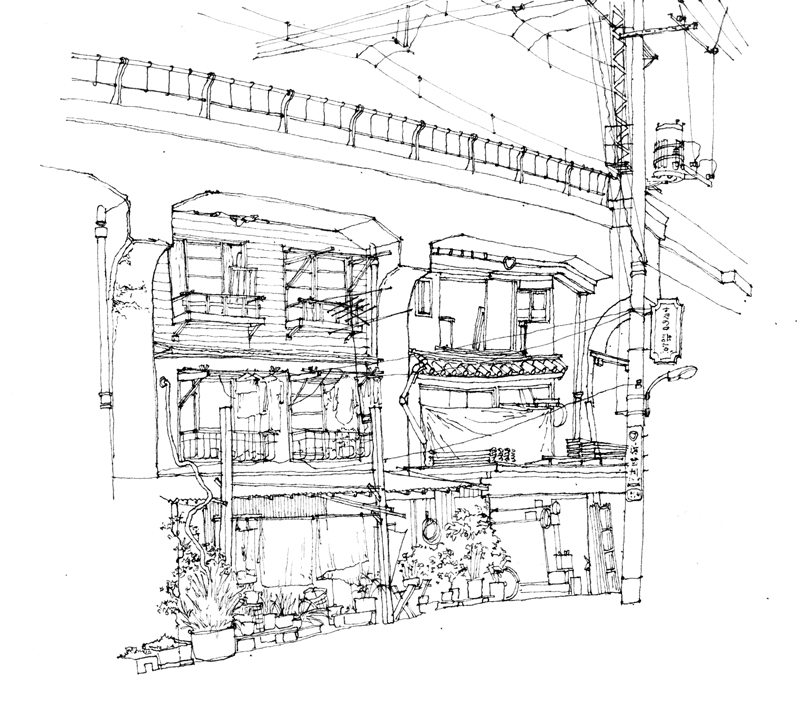
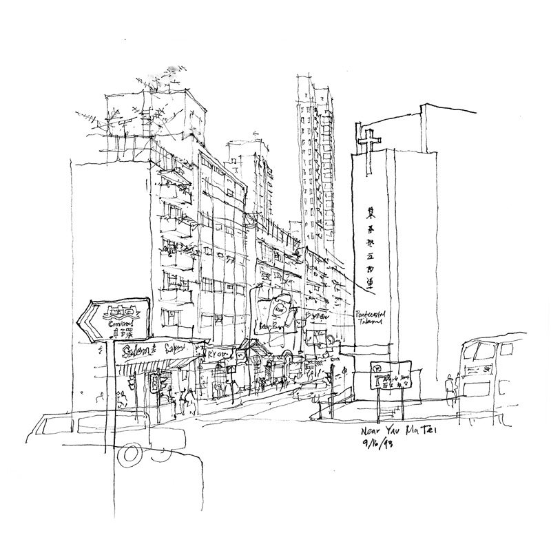
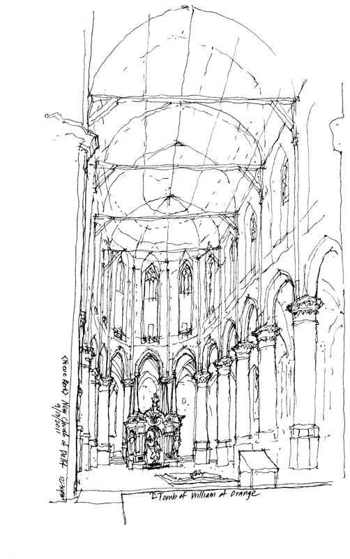
Of course, when drawing experiential views on location, we rely heavily on linear perspective to create the illusion of spatial depth. The convergence of parallel lines, along with the associated principles of size and texture perspective are powerful devices that convince that we are seeing through the paper surface into the depth of a drawing.

LinearPerspective2

Medium & Surface


ZettelZ5

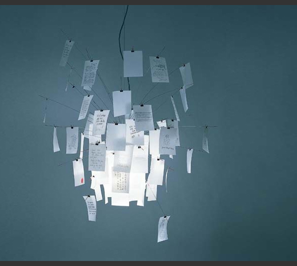
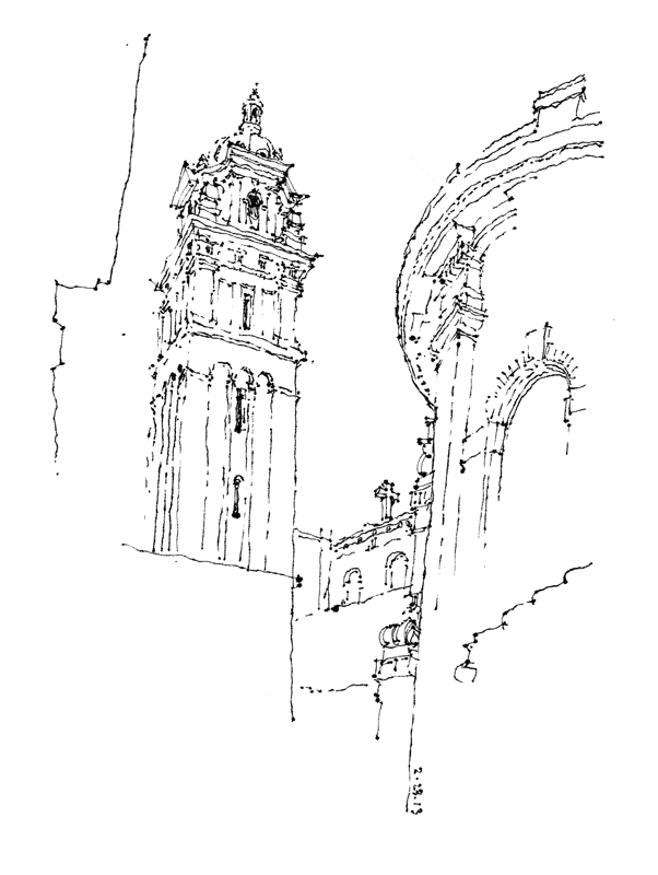
We recently purchased an Ingo Maurer-designed Zettel’z 5 Chandelier. The distinguishing feature of the fixture are the 80 stainless steel wires from which hang sheets of Japanese paper that direct and diffuse the light. So this past Saturday, when the Seattle UrbanSketchers met at St. James Cathedral for their monthly get-together, I set myself the task of doing some drawings on the thin translucent sheets that came with the chandelier kit.

StJames1

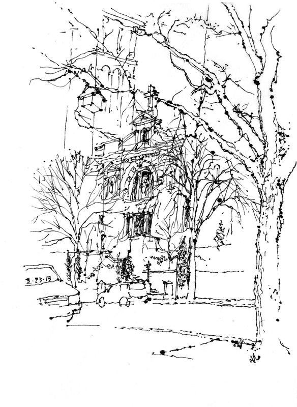
I soon found that ink bled on the paper so I had to adjust the way I drew—moving quickly and touching lightly for thinner strokes; proceeding more slowly and pausing even momentarily resulted in blotting.

StJames2

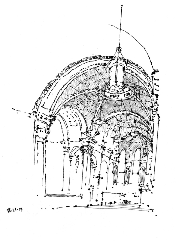
Because of the bleeding, I had to be very careful not to overdraw. Some of the blots you see are unintentional but simply part of the process, reflecting the interaction between medium and surface. I think they actually add character to the drawings.

StJames3

This was just another reminder that while the medium we choose may not affect the viewpoint we choose, it certainly affects the way we execute a drawing and the resulting graphic image.


Mt. Vernon Workshop Update

MtVernon2

For more information on the one-day workshop Gail Wong and I will be offering in Mt. http://glwsketchworks.blogspot.com/p/workshops-and-events.htmlVernon, Washington, please see: <http://glwsketchworks.blogspot.com/p/workshops-and-events.html>.

I should note that Gail and I will also be offering a workshop here in Seattle May 17–19, beginning with a pizza dinner and presentation on Friday evening, followed by two sessions on Saturday and a closing session on Sunday with the Seattle Urban Sketchers group. More details to follow.

Mt. Vernon Workshop

MtVernon

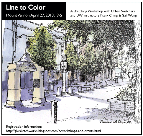
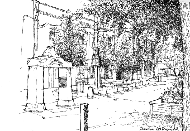
I did this sketch to help publicize a one-day workshop Gail Wong and I will be offering in Mt. Vernon on Saturday, April 20th. Mt. Vernon is an enchanting small town in Skagit County north of Seattle and the Mt. Vernon Downtown Association is hosting the event.

Full disclosure: Due to constraints of time and weather I drew this scene from a digital photograph that was sent to me. I soon realized that drawing from a photo can actually be more difficult than drawing on location. In a 3D environment, we are able to perceive much more than in a 2D photograph. We can shift our gaze, if necessary, to uncover certain details or to see more clearly things that might be hidden or obscured. And we are free to interpret the 3-dimensional information before us. But in a photograph, everything is frozen, including ambiguities that have to be resolved.

Another note: The Namiki Falcon fountain pen is known for its flexible nib. While it is a joy to draw with, I rarely carry the pen for fear of losing it. But since I was in my home office, I took the opportunity to use it for this sketch. The Namiki Falcon is not inexpensive but still it is a reasonably priced introduction to fine quality fountain pens. Highly recommended.

Black-and-White

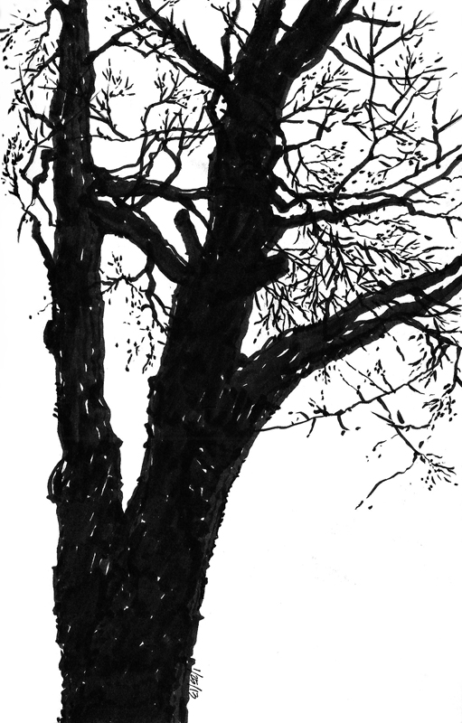
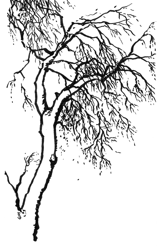
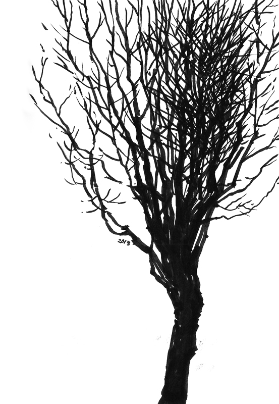
Even though it’s a typically chilly and rainy winter in Seattle, what better time to study the branch structure of trees. For these stark, black-and-white images, I used a Tombow brush pen.

Trees1Trees2Trees3

While I could have relied on my memory or imagination to draw these, I find that the raw material provided by real-life patterns have a specificity that is more compelling than the stereotypical views that we store in our memory bank, and they are much easier to compose and interpret.

Caricatures

FDKC_Composite

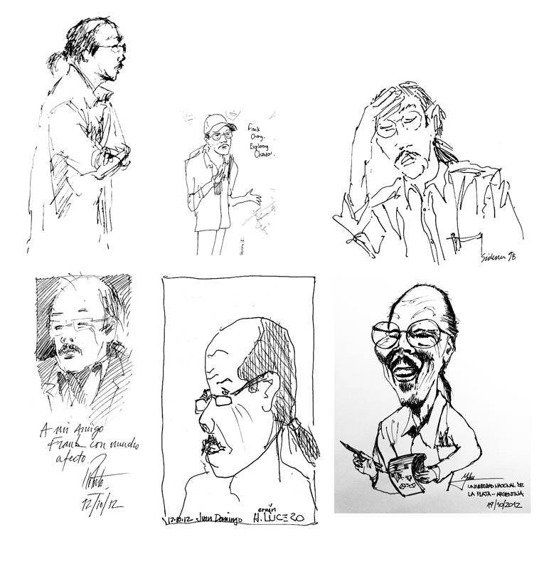
A caricature is a pictorial or literary description of a person or thing that exaggerates certain distinctive characteristics to create an easily identifiable likeness. The result can be insulting or complimentary; I certainly hope these caricatures of me are the latter! These were done and graciously given to me by various individuals during presentations and workshops that I have given.

SeattleJurors

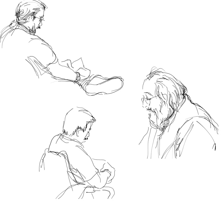
While these are definitely not intended to be caricatures, they still represent my attempt to capture the likeness of individuals, which is always an enjoyable and constant challenge. I used my iPad to draw these prospective jurors in the King County courthouse. It helped that these people were sedentary, lost in their own thoughts while waiting to be called for jury duty.

Shibuya

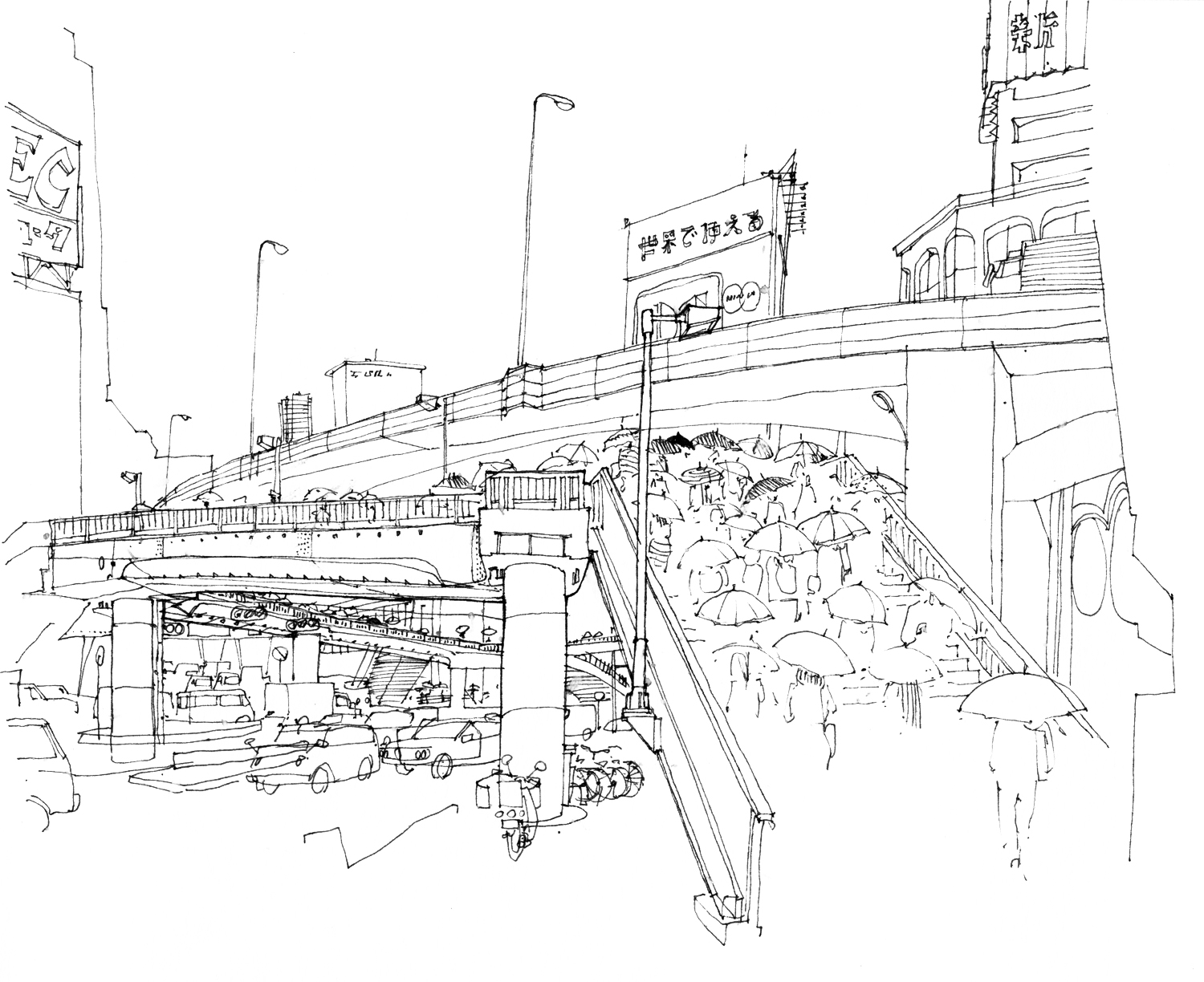
To draw people who are moving is much more difficult, as in this view of a rainy morning in Shibuya, Tokyo. These commuters and their umbrellas provide a sense of scale to the composition and lead the eye across the overpass while the automobile traffic flows below.

The Power of the Line

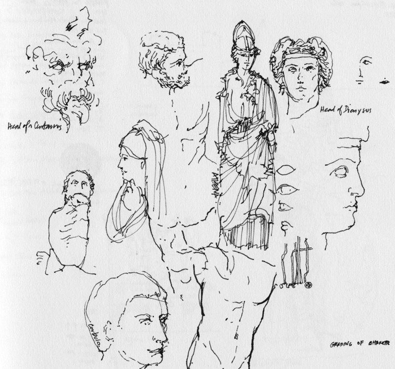
The line is the essence of drawing. It is a humble element, made simply by the tip of a pen or pencil as we move it across a receptive surface. Once drawn, a line chronicles the movement by which it was created. It can describe contour and shape, even texture.

More importantly, the line is able to convey to the mind’s eye three-dimensional forms in space, often not by its presence but rather by its absence—where we decide to stop a contour…and pick it up again.

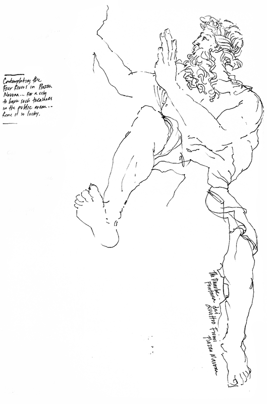
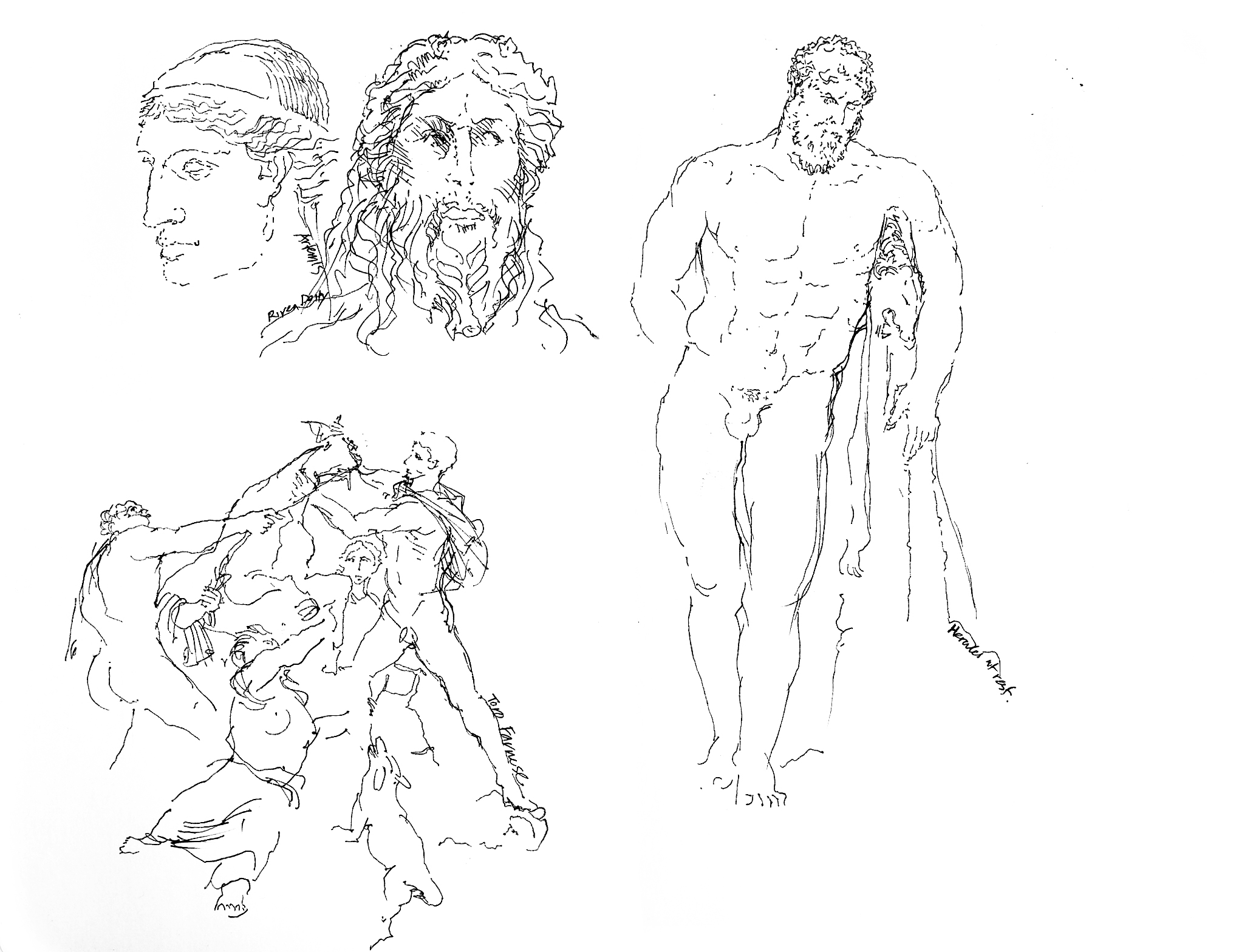
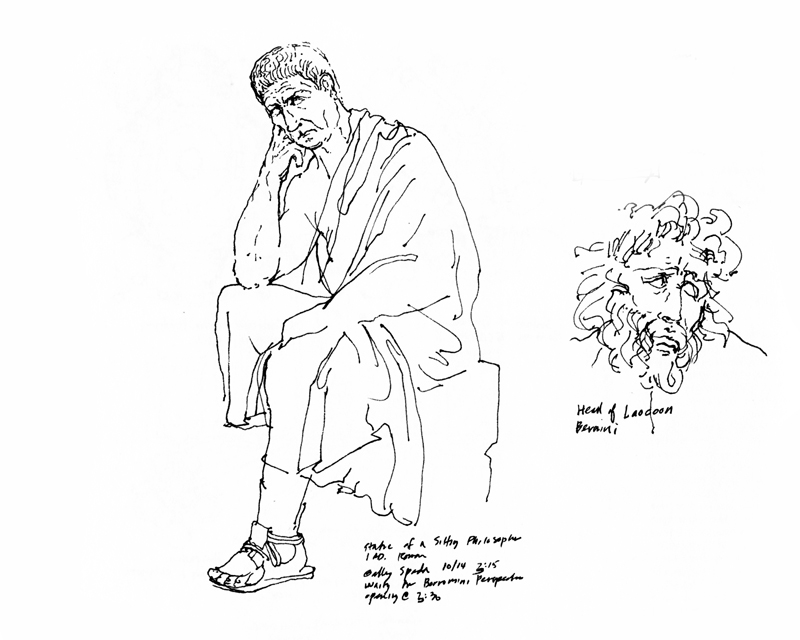
These sketches of sculptures in and around Rome and Naples are prime examples of this amazing power of drawn lines to suggest what in reality is not present on the page.

The Argentina Experience

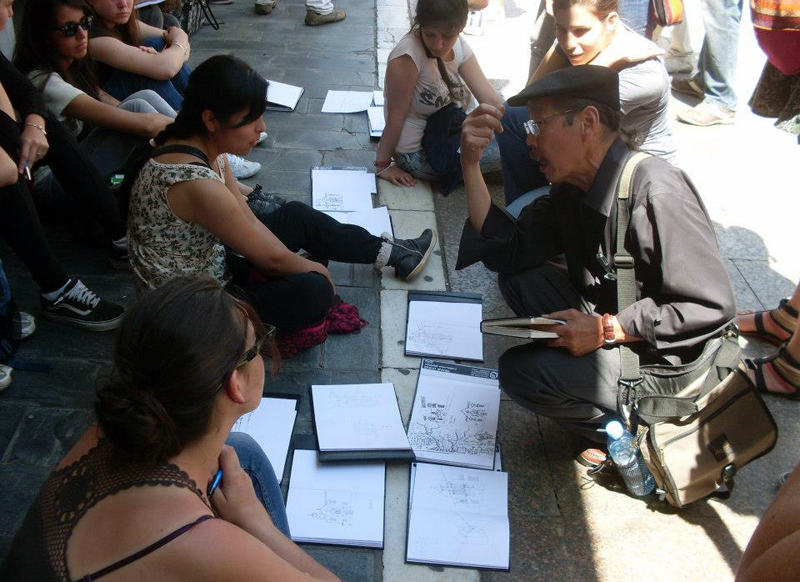
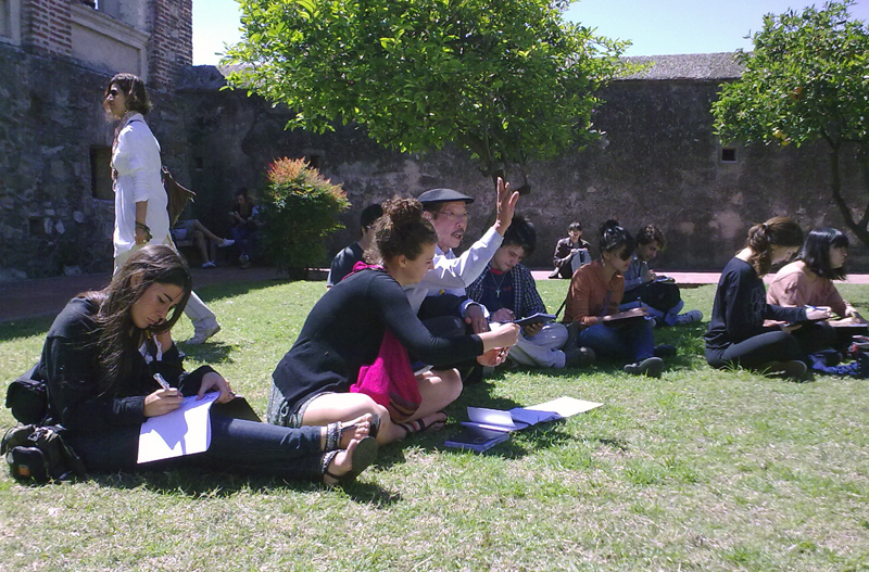
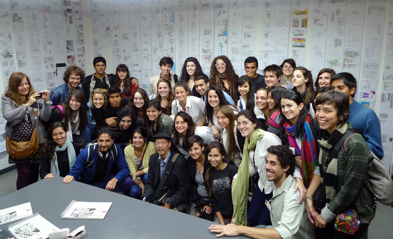
The focus of my visit to Argentina was giving two talks and having the opportunity to work with students from Argentina, Peru, Paraguay and Brazil. I really appreciated the enthusiasm of the students and their willingness to draw without inhibition.

It was an emotional time for me when I saw the students’ work exhibited in La Plata. The students had drawn in accordion-fold sketchbooks, which you can see hanging vertically in the background of this photo. Seeing the display in this manner reinforces the idea that no single drawing is as important as an entire body of work, whether it be a single sketchbook or a whole series of sketchbooks. It was very heartwarming and gratifying for me to see how proud the students were of their work and I hope they will continue to enjoy drawing with increased confidence.

Pilgrimage Stamps

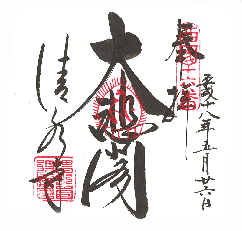
In my Japan sketchbooks, my favorite page contains neither personal notes nor drawings but rather a pilgrimage “stamp” from Kiyomizu-dera, a Buddhist temple and UNESCO World Heritage site in Kyoto. It was and still is customary for pilgrims in Japan to collect these stamps in a book from each Buddhist temple or Shinto shrine visited. While some temples may only give stamps, at others a temple priest will hand-draw the temple’s “signature” in the pilgrim’s book for a small fee, as was done here. Beautiful calligraphy, artfully composed.