Stairs and Stairways


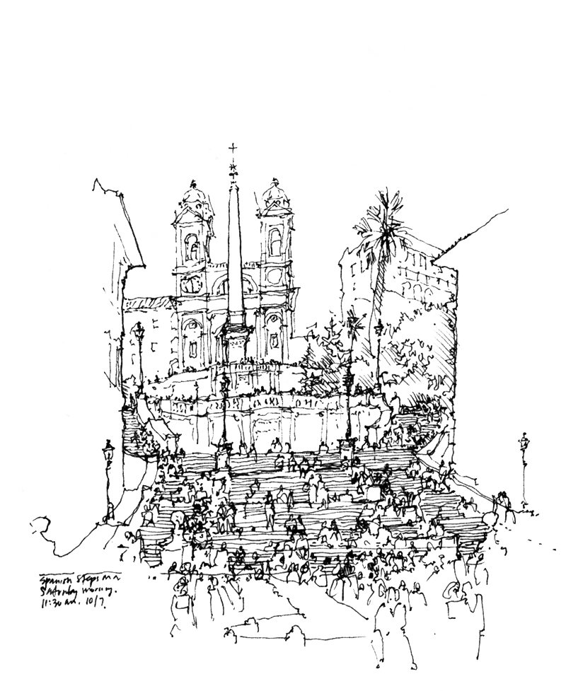
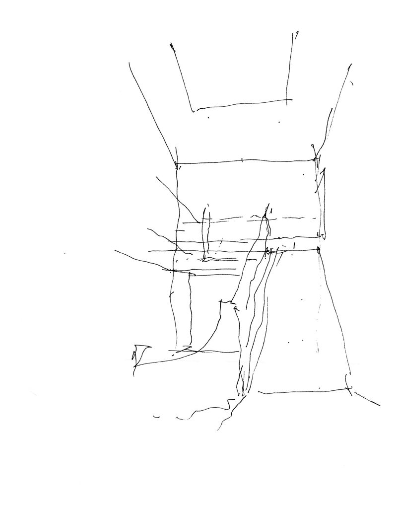
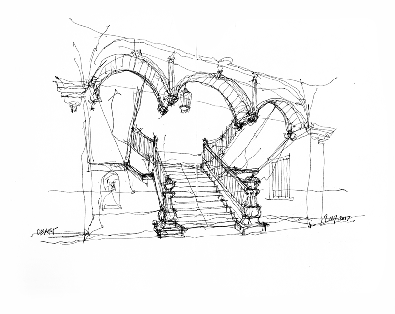
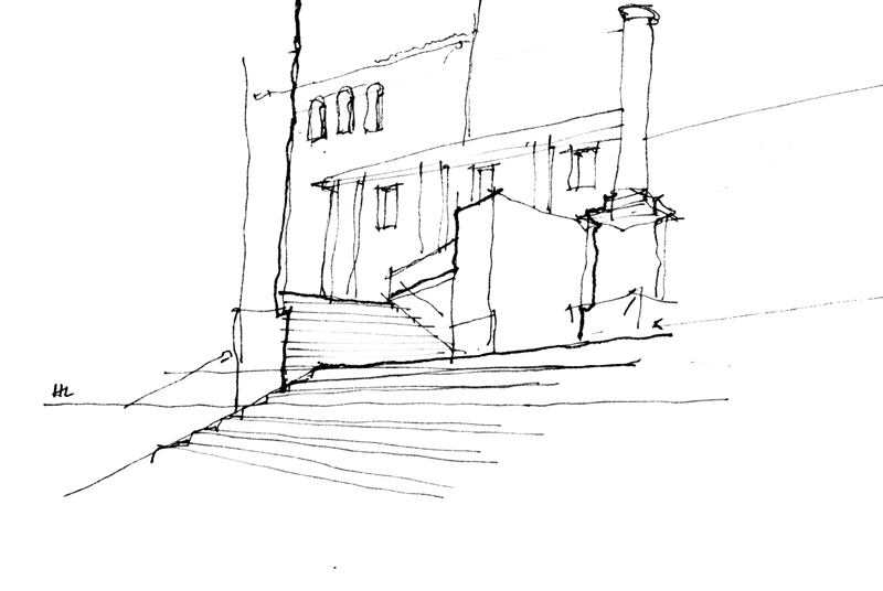
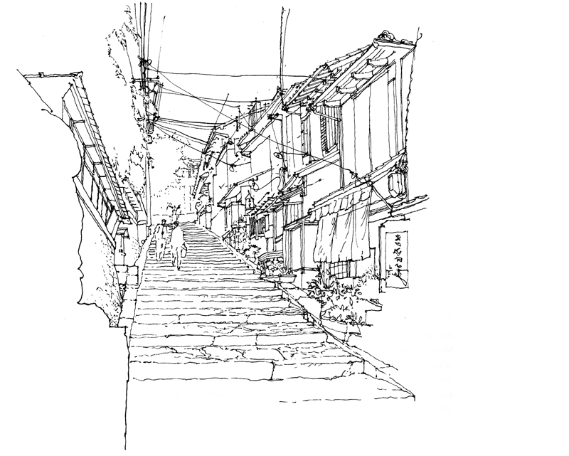
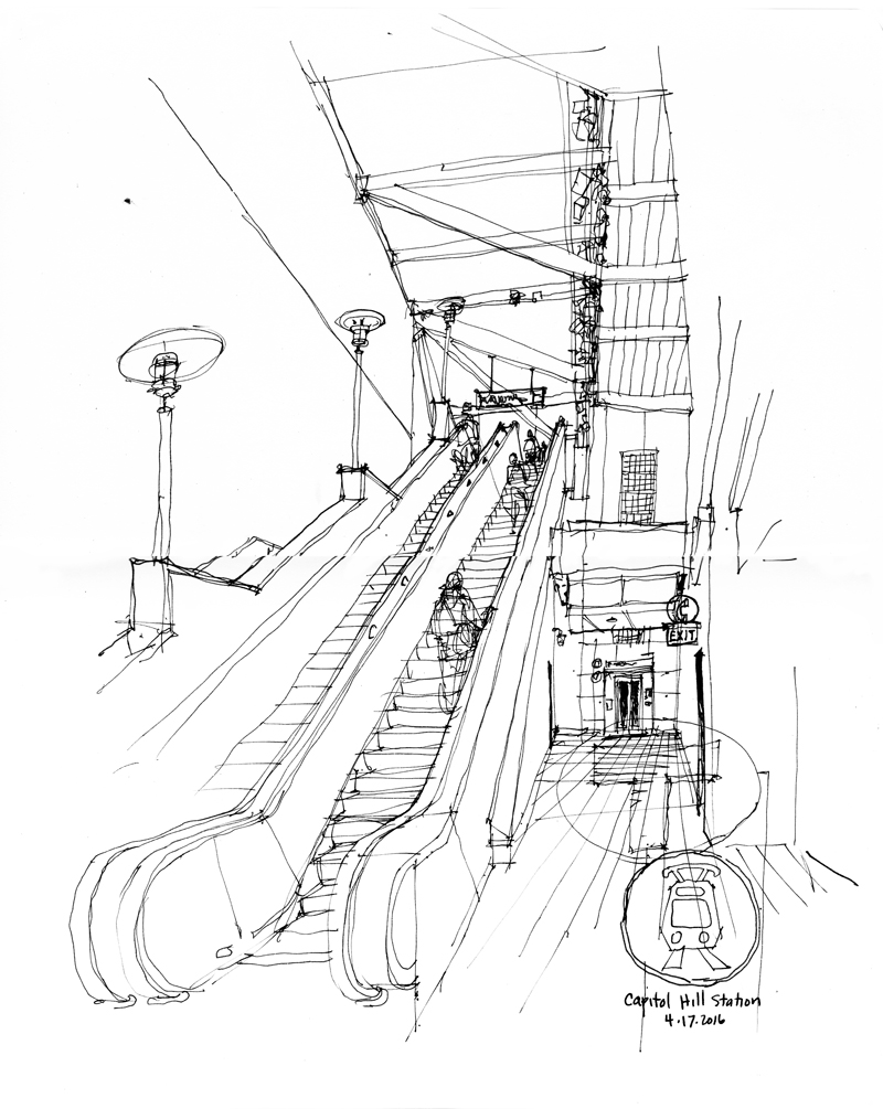
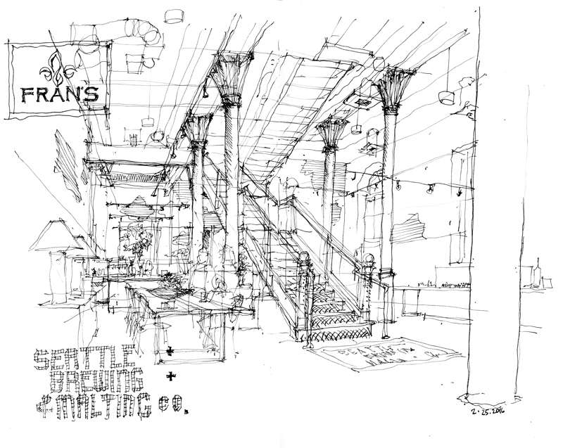
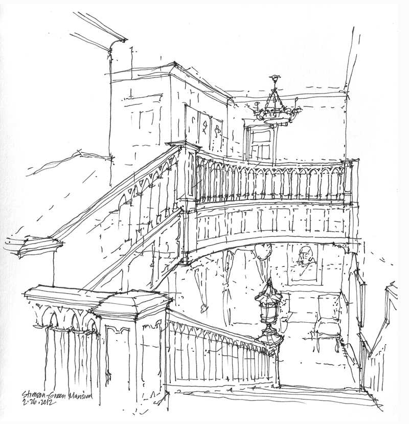
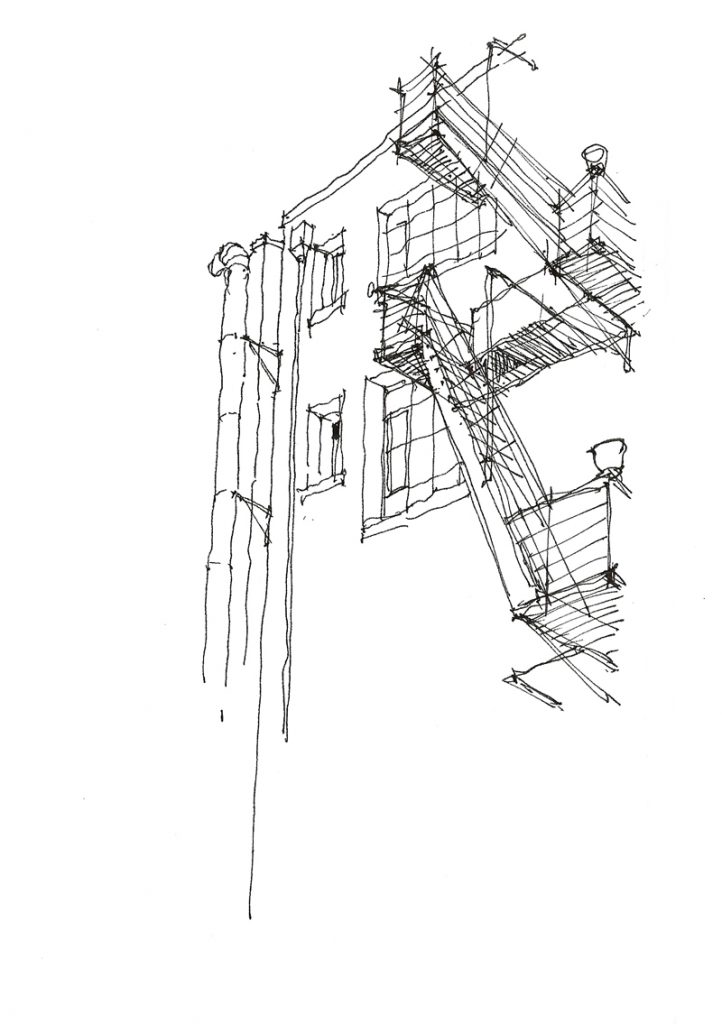
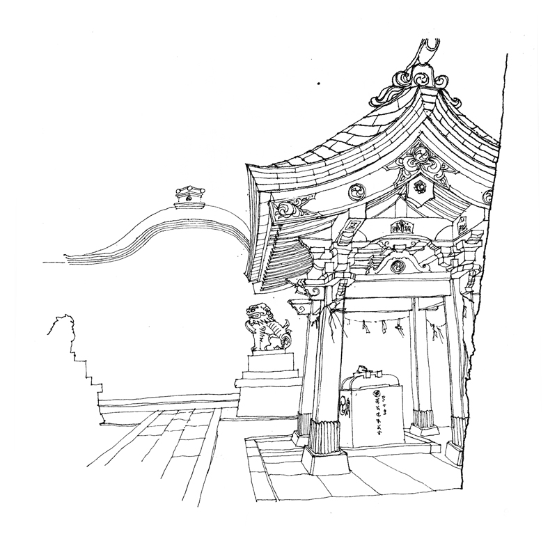
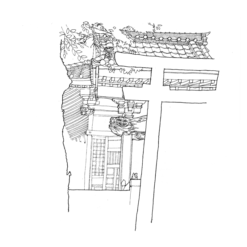
Drawing stairs and stairways in perspective can be daunting because they involve sets of parallel lines that rise or fall as they move away from us and therefore do not converge on the horizon line. Also, their multiple treads and risers make them seem more complex than they are. Here are a few stairways, both exterior and interior, that I have drawn.

One key to drawing stairs and stairways is to first establish the levels or landings that the stairs connect and then treat the stairways first as ramps, before subdividing the ramps into risers and treads. I should note here that reproducing the actual number of risers and treads may not matter as much as capturing their proper scale.

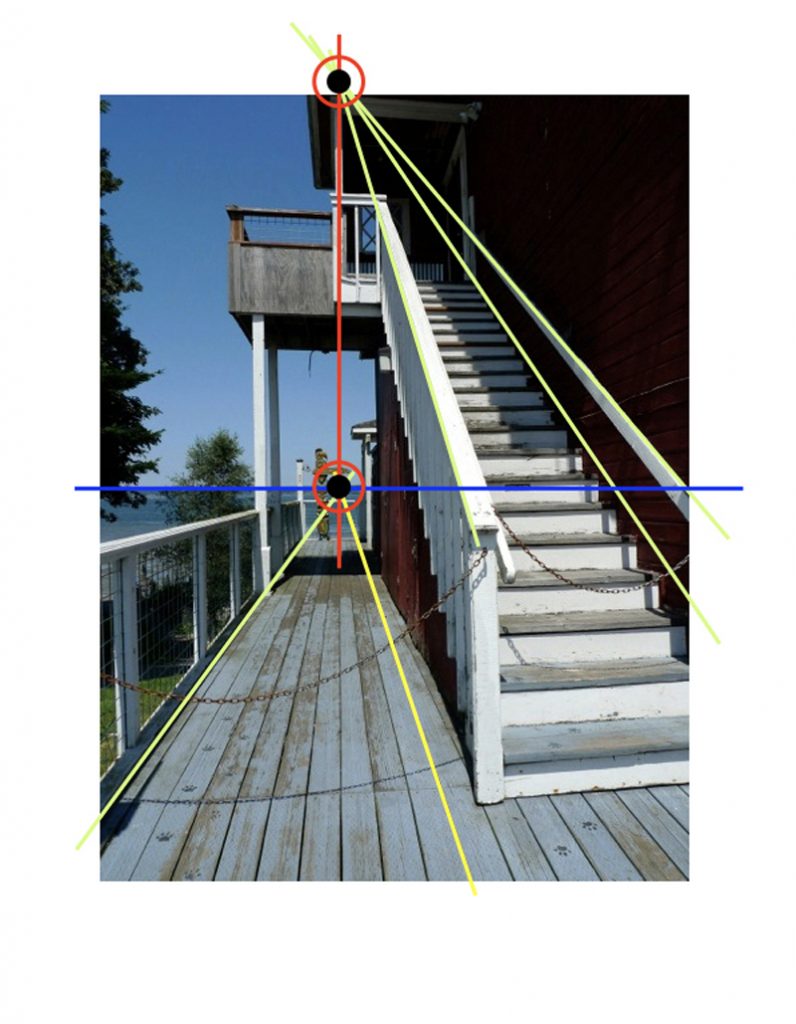
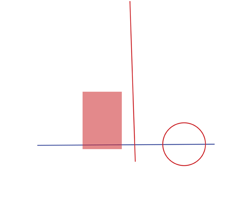
The photo above is overlaid with a diagram that shows how the vanishing point for a rising set of parallel lines is aligned vertically with the vanishing point for a horizontal set of lines that lie in parallel vertical planes.

To Notice

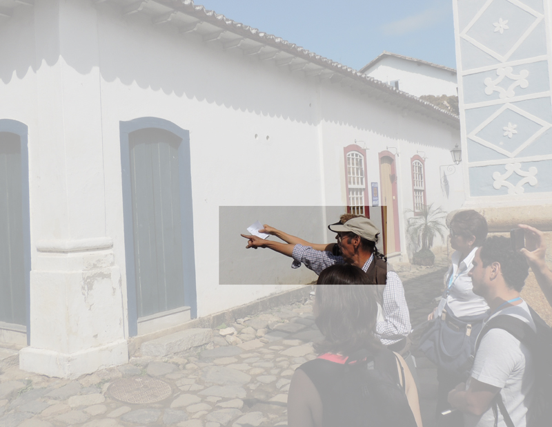
During drawing workshops, I often find myself pointing at things in scenes that students are drawing. What I’m doing is drawing attention to how things are related to each other—certain relationships of size, scale, proportion, and placement—in what we see before us. Paying close attention—not merely learning techniques—is one of the keys to drawing on location.
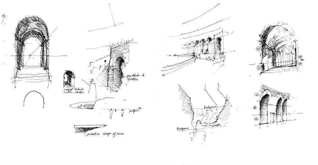
In his book Leonardo da Vinci, Walter Isaacson attributes many of Leonardo’s accomplishments to his acute powers of observation, which were not innate but honed with practice. And Isaacson believes that “to notice” is something we can all do if we make the attempt.
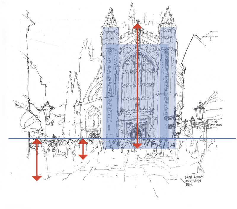
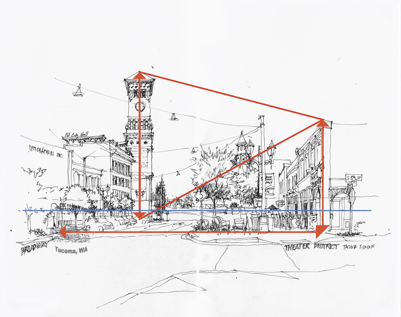
And so it is important to really focus on what one is seeing, not merely glance at the subject matter, before drawing. As I have often said during my workshops: “Look more and draw less.”
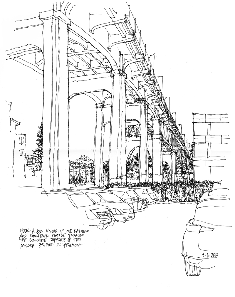
The Essential Emptiness

“We put thirty spokes together and call it a wheel;
But it is on the space where there is nothing
that the utility of the wheel depends.
We turn clay to make a vessel;
But it is on the space where there is nothing
that the utility of the vessel depends.
We pierce doors and windows to make a house;
and it is on these spaces where there is nothing
that the utility of the house depends.
Therefore, just as we take advantage of what is,
we should recognize the utility of what is not.”

Lao-tzu
Tao Te Ching
6th century BC

A related Japanese aesthetic concept is MA, the essential emptiness that surrounds all things. Think of the spaces necessary to form words from a sequence of letters, or the silences that make the music from a sequence of notes.

Punctuation

A quote from the Irish Literary Times: “Punctuation creates sense, clarity, and stress in sentences. It structures and organizes your writing.” I wonder if there is an equivalent element or principle in drawing that would also serve to create “sense, clarity, and stress” and organize the composition of a drawing.

Sense = Meaning; Clarity = Sharpness; Stress = Focus

The Principle of Contrast

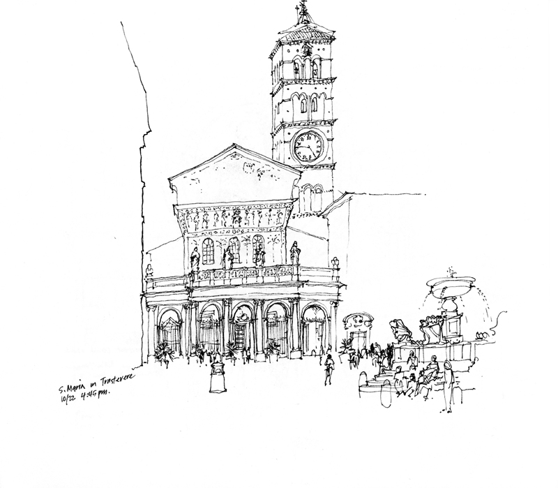
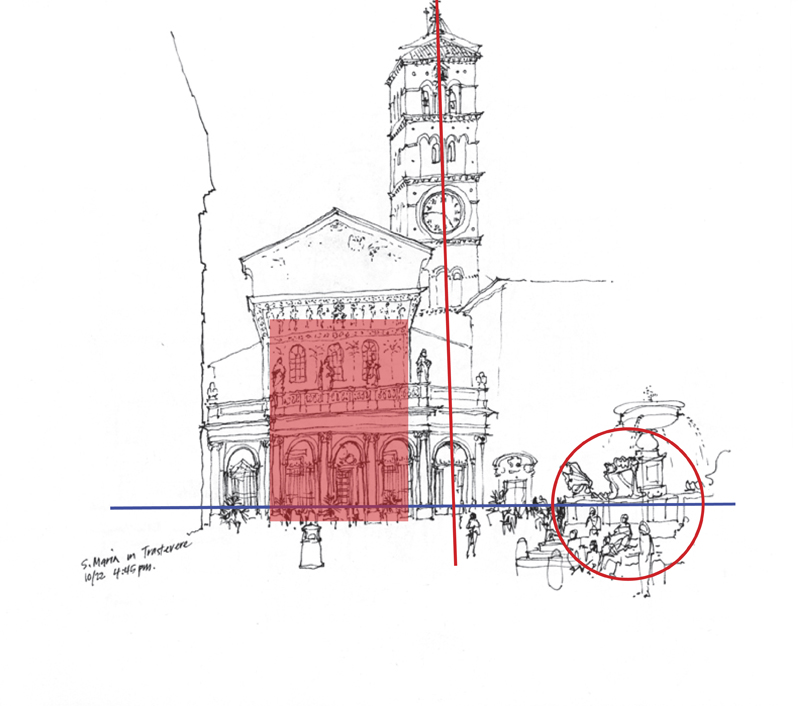
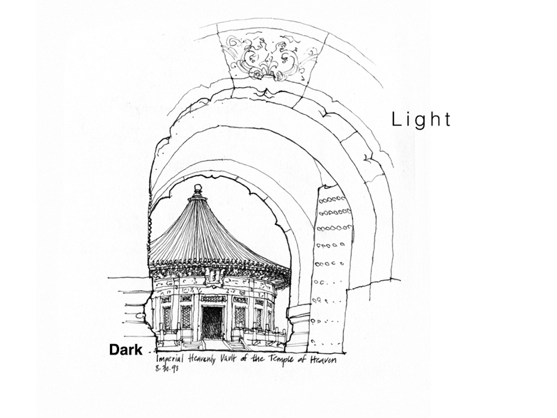
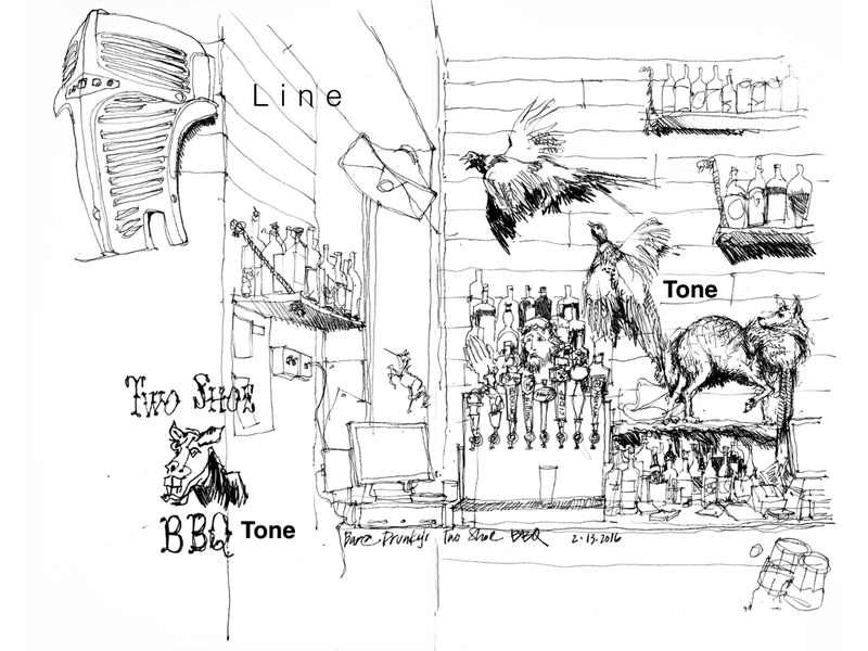
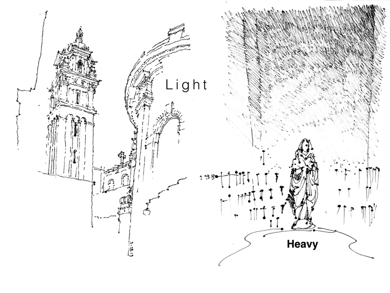
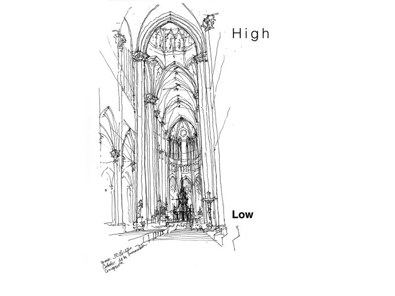
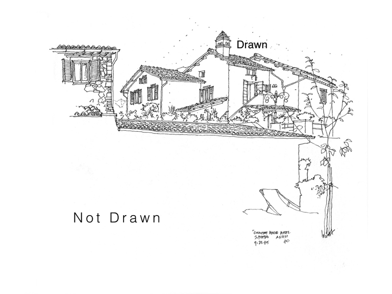
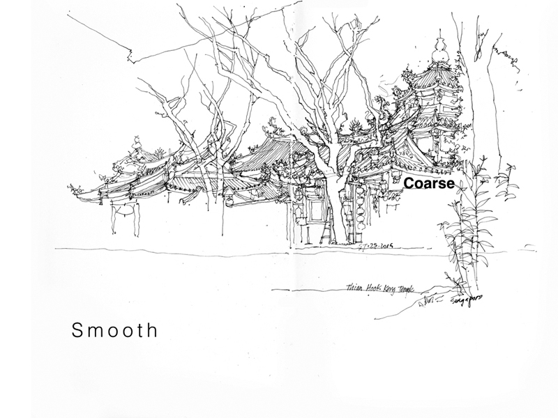
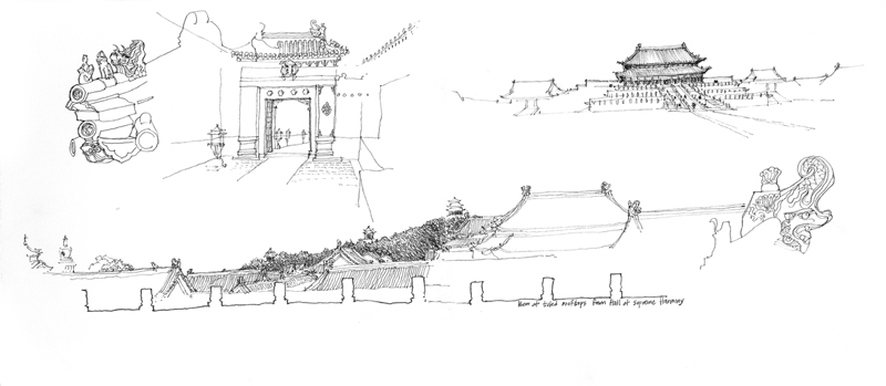
Back in 2012, I had posted a few examples of how I used contrasting tonal values to define form and draw attention to a particular area in a sketch. In this post, I want to expand on the idea of contrast—the discernible distinctions in line weight, tonal values, textures, details, and even relative position on a page—that is essential to avoiding blandness and giving life to a drawing. Here are examples of the different kinds of contrast at our disposal. Note how the visual tension between the two contrasting elements or areas contribute to the composition of a drawing.


Visual Notetaking

A few months ago, I came across an article about notetaking on NPR.org. In research that was originally published in Psychological Science, Pam A. Mueller of Princeton University and Daniel M. Oppenheimer of UCLA studied how notetaking by hand or by typing on a computer might affect learning. A quote from the article:

“When people type their notes they have this tendency to try to take verbatim notes and write down as much of the lecture as they can. (On the other hand) the students who were taking longhand notes in our studies were forced to be more selective — because you can’t write as fast as you can type. And that extra processing of the material that they were doing benefited them.”

One hypothesis that Mueller and Oppenheimer developed is that when a person is taking notes by hand, “the processing that occurs” improved “learning and retention.”

The thought occurs that this might hold true as well when we contrast the benefits of drawing from direct observation with those gained by taking a photo of the same scene. The active seeing that drawing on location encourages can often lead to better understanding and more vivid visual memories.

Upper Queen Anne Hill

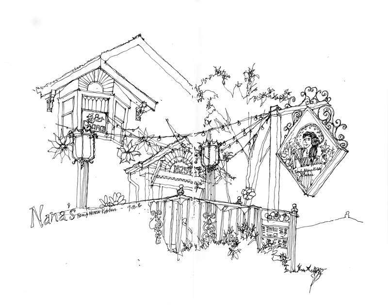
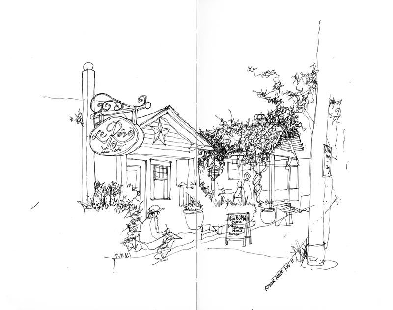
On what turned out to be a beautiful Sunday morning after a few cloudy, showery days, the Seattle Urban Sketchers group met in the upper Queen Anne neighborhood just north of downtown. As I was viewing the subject of my first sketch, Nana’s Mexican Family Restaurant, I realized that the scene presented a multitude of details that would overwhelm the eye. I therefore chose to draw very selectively, leaving a lot of white space for the imagination to fill. This approach required the selection of a dominant element—in this case, the sign above the sidewalk—and then proceeding so that the drawing would lead the eye from one area of interest to the next. The key is never to lead the eye off the page.
I used a similar approach for the remaining two drawings I was able to do during the morning session.

Notational Drawings

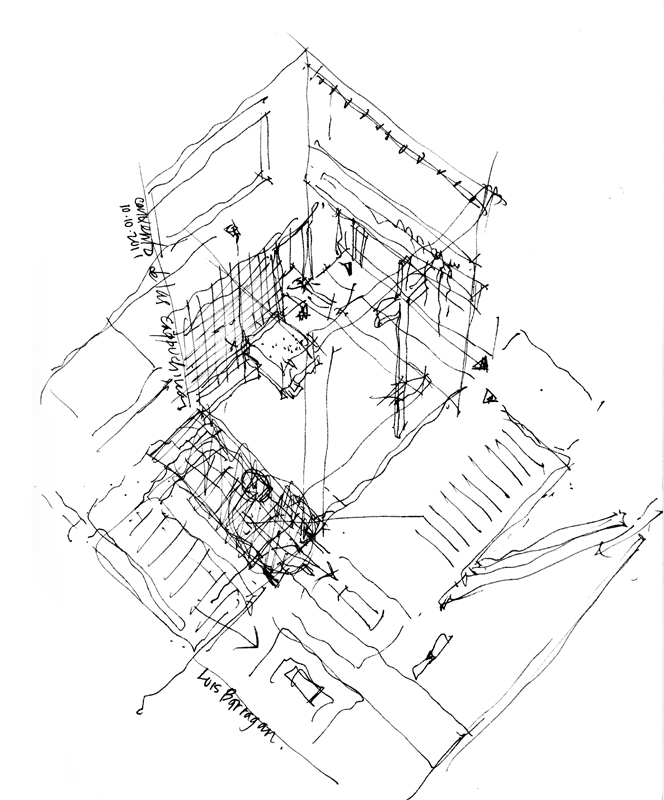
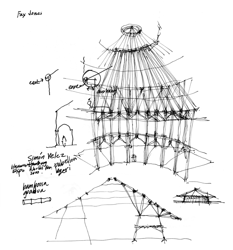
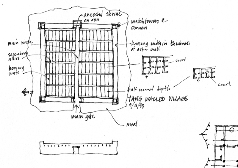
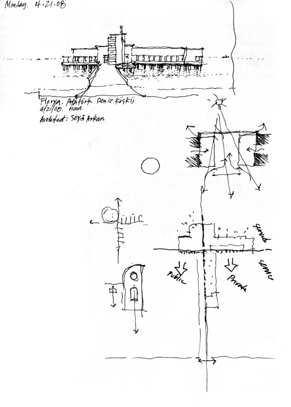
Perusing my sketchbooks, one might discover many small notational drawings that I have used to understand and represent certain aspects of the places visited. When drawing from observation, we can capture not only what the eye perceives but also what the mind conceives. We can use the drawing process to think about, visualize, and explore in imagined and imaginary ways the conceptual basis for the environments we see and experience. These notational drawings may be simple plan or section diagrams or more complex three-dimensional studies but in all cases, they attempt to encapsulate the essence of a place or structure.

3500 First Avenue Northwest

This office building at 3500 First Avenue Northwest reminds me of the formal, geometric modernism of Gwathmey Siegel & Associates and other firms from the 1970s. I was told that Barney Vemo designed and built the structure in that same time period. After walking by this place many times, what I recall in my mind’s eye are these fragments that I drew, not the entirety of the whole as shown in the photograph taken from across the street.

Sometimes, visual memories of places consist of single, iconic images. Think of the Pantheon in Rome or the Eiffel Tower in Paris. At other times, what we remember consists more of a collage of partial views rather than an image of the whole.