Line to Color Workshop

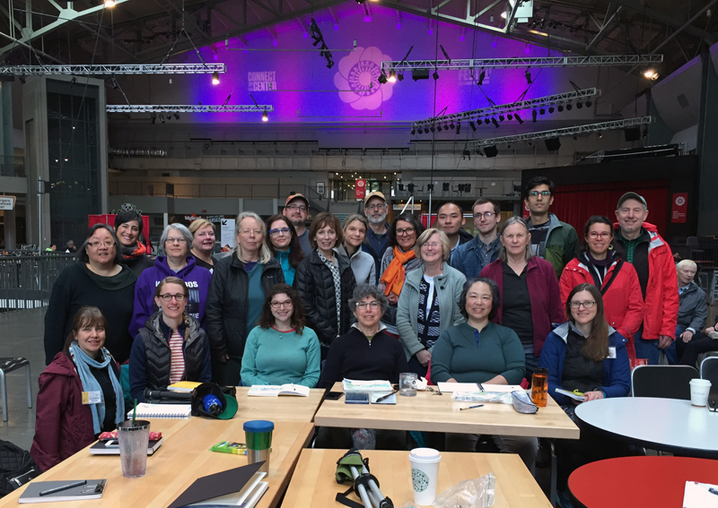
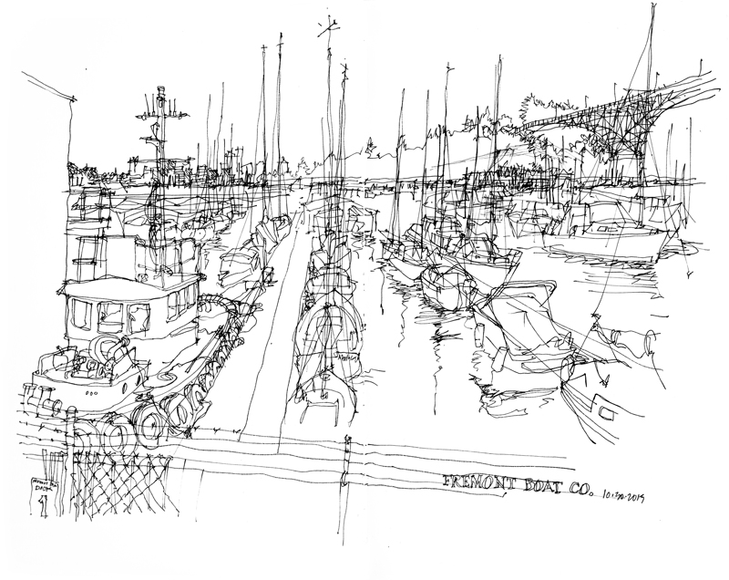
Thanks to all the participants in the Line to Color workshop Gail Wong and I led this past weekend in the Fremont neighborhood and Gasworks Park in Seattle. We appreciated the energy and willingness of everyone to endure the less than ideal weather conditions to draw and paint this weekend. When sketching while traveling or simply out and about, we often cannot control how hot, cold, or wet it is. We can only do the best we can.

After drawing on location for so long, I sometimes forget what it is like to be a beginner. More than a few participants mentioned how mentally tiring it was to draw all day, which, in thinking about it, shouldn’t have surprised me. Drawing, and the seeing it requires, does take effort, especially for beginners struggling to resolve the difference between what we know about something and how it might appear to the eye.

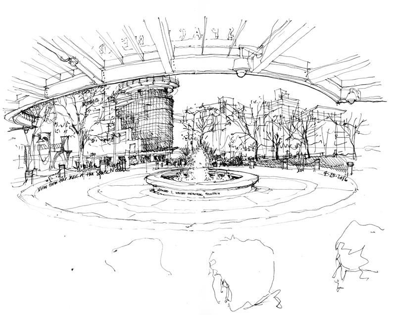
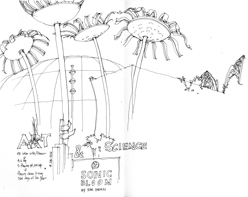
During these workshops, Gail and I rarely have the time to do any drawings of our own except for the quick demos we may do in our sketchbooks as we work with each of the participants one on one. Yesterday, to wrap up the workshop, we gathered at Seattle Center for a final session and I finally had the time to do a couple of sketches. The first is the view looking out from under the canopy at the base of the Space Needle, and the second is a contour line drawing of Space Bloom, an installation that combines art, science, and technology to enable the floral sculptures to sing and dance throughout the year.

Amazon’s Spheres

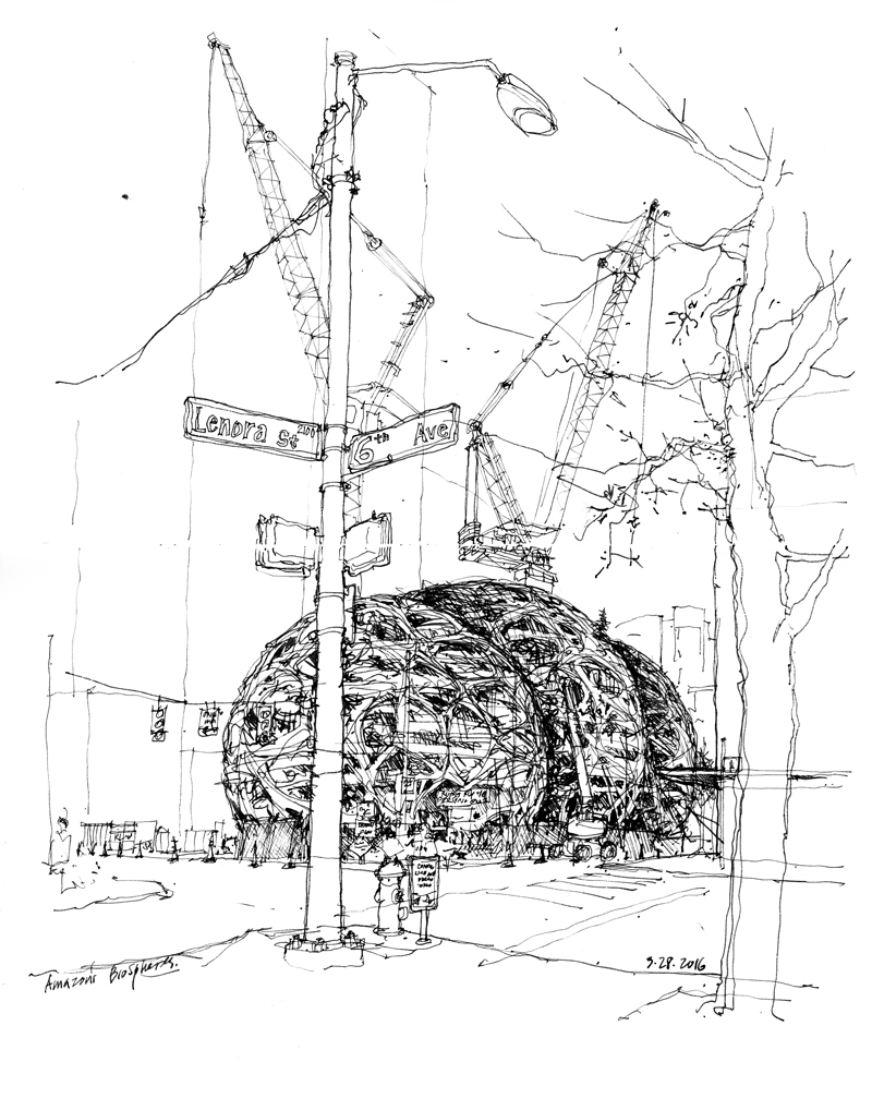
At the heart of Amazon’s urban campus being erected near the Denny Triangle, just north of downtown Seattle, are these three steel-and-glass spheres. The large dome structures, which range from 80 to 95 feet in height and from 80 feet to 130 feet in diameter, contain five floors of experimental spaces for Amazon employees to “work and socialize in a more natural, parklike setting.”

As is typical with projects that veer from the norm, opinions vary as do the descriptors being bandied about—glass orbs, fly eyes, and bubbleators. While some see the spheres as a welcome departure from the geometry of Seattle’s high-rises, others are not as impressed with the audacious display, being more concerned with the public amenities (or lack thereof) being created. Only time will tell.

Architectures of Life

Alva Noë recently wrote an article on NPR.org about a new show Architectures of Life at the Berkeley Art Museum, curated by Lawrence Rinder. To quote from the piece:

“We forget that it is hard to see. To paraphrase Kant (loosely), seeing without understanding is blind, even if understanding without seeing is empty. A good drawing—for example of the working parts of an engine—is often much easier to interpret than an actual perceptual encounter with the engine itself. The engine, after all, is very complicated. What is important? What deserves notice? It’s hard to know. But the drawing, when it is successful, is more than a mere representation; it is, really, the exhibition of what something is, of how it works, of what it is for. A good drawing is an image that has been imbued with thought.”

I like how Noë stresses that drawings are more than mere reproductions of what we see or envision. To read the full article, please visit: <http://www.npr.org/sections/13.7/2016/02/26/468216993/life-and-art-unite-in-architectures-of-life>.

1516 Melrose Avenue


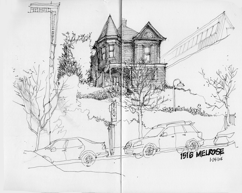
During the last Seattle Urban Sketchers meet-up in the Capitol Hill neighborhood, this particular view drew my attention because of its strong gestalt of a dark house, reached via a series of paths zigzagging up an ivy-covered slope. There appears to be a force field that is repelling the apartment building to the north and a remodel to the south. How much longer will the force field hold up against the forces of development?

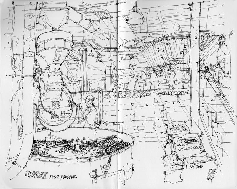
An entirely different type of view is this busy interior of the Starbucks Reserve Roastery and Tasting Room, featuring the Probat P Series solid drum roaster.

Seattle Central Library


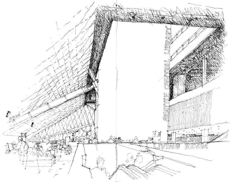
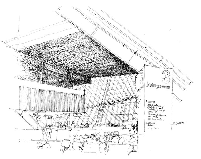
The December meeting of the Seattle Urban Sketchers took place at the Seattle Central Library, where I drew these two views of the Norcliffe Foundation Living Room. Serving as a general purpose reading area adjacent to a coffee shop and gift shop, the Living Room is part of the largest of the dynamic spaces in the library designed by Rem Koolhaaus and Joshua Prince-Ramus of OMA in collaboration with LMN Architects.

In one sense, the irregular geometry of such spaces can be easier to draw since any deviation from what actually exists may be difficult to discern. On the other hand, what is important to convey is a sense of the scale and 3-dimensional volume of the space.

Omission

In a recent issue of The New Yorker, John McPhee wrote an article entitled Omission: Choosing what to leave out. In the essay McPhee references Ernest Hemingway’s Theory of Omission, which encourages writers to let the reader do the creating by leaving white spaces between chapters or segments of chapters, the unwritten thoughts to be articulated by the reader. McPhee advocates letting the reader have the experience and leaving judgment in the eye of the beholder.

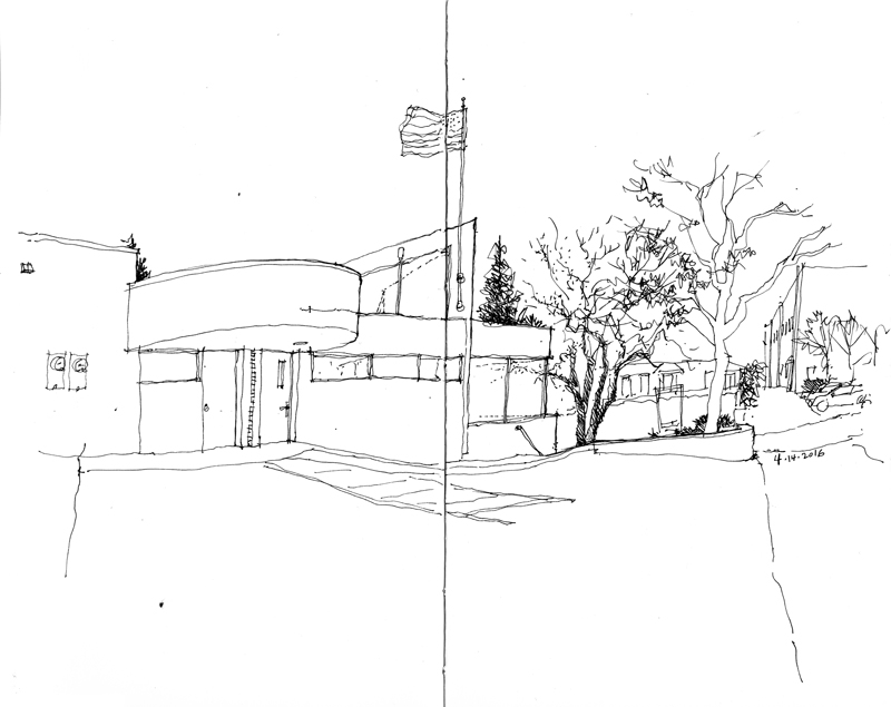
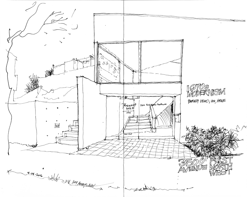
This idea of omission can also be applied to drawing as well. Just as writing is a matter of selecting and stringing words together to create a sentence, a paragraph, or a chapter, sketching is a matter of drawing a line, then another, and another, until one creates shapes and compositions that recall to the seeing eye the scene set before us. And what we omit from a drawing is just as important as what we include.

Masjid Sultan

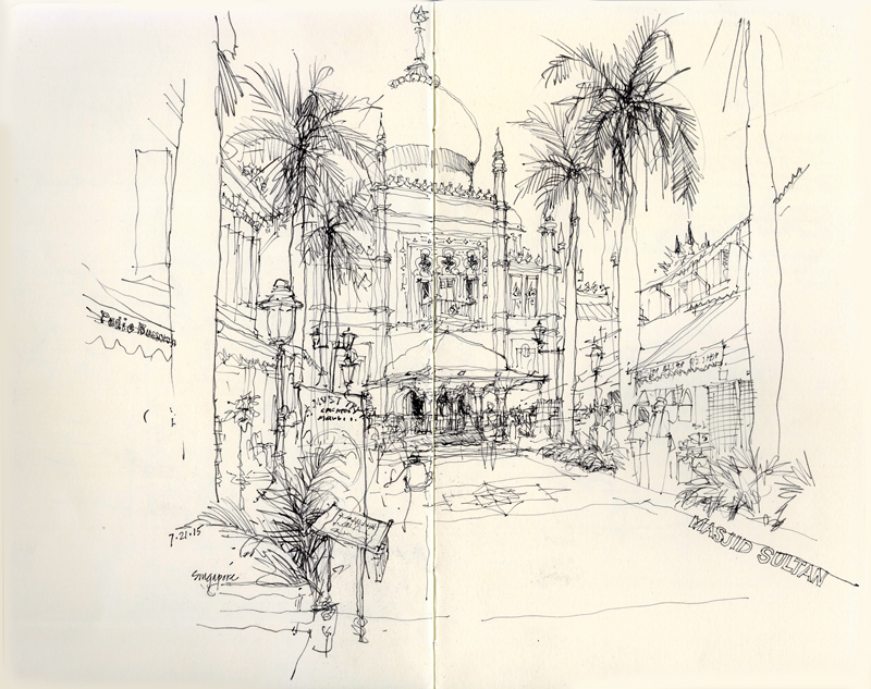
The first day in Singapore, I wandered over to the Kampong Glam neighborhood of Singapore to sketch the Masjid Sultan (Sultan Mosque). Constructed in 1824 as a one-story structure for Sultan Hussein Shah, the first sultan of Singapore, the mosque was remodeled and enlarged in 1932 to its present form. Relative to the surrounding street grid, the mosque was skewed, perhaps to orient the mihrab to Mecca. It was important for me to capture this subtle shift as I drew this view looking down the pedestrian way of Bussorah Street.

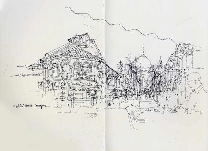
A few days later, I again visited the area hoping to draw one of the side streets. Instead, I chose to enjoy a refreshing iced coffee at an outdoor cafe with a view both of the Masjid Sultan as well as some the shops along Baghdad Street.

More Signs of Fremont

Continuing from a previous post from this past January, these are more signs of Fremont. While I am concentrating on those of places with a history here, a few relative newcomers have probably snuck into the picture. In drawing these, I am struck by the subtle differences in typography that we normally do not notice but which convey the character of a place

Drunky’s Two Shoe BBQ

A recent addition to the Freelard neighborhood is this BBQ joint at 4105 Leary Way NW. Even though the scene contains a lot of detail, I find that picturesque places like this are easier to draw since slight errors in proportion are much less noticeable than when drawing examples of classical architecture, which followed certain principles of proportional relationships. For example, drawing the Tempietto in Rome was a real challenge. Notice the comment that I wrote after finishing—A little too tall… I had exaggerated the height of the structure just a bit too much.

Wide vs. Close-Up Views


I have always preferred taking photographs with a wide-angle lens—a 35 mm, 28 mm, or even a 24 mm fixed lens. This preference shows up in the views I usually select when drawing on location. My inclination to include context and information in my peripheral vision often leads to panoramic views or perspectives that stretch beyond the classic 60° cone of vision for linear perspectives.


Some photographers prefer the more tightly composed shots made possible with telephoto lenses, which can be seen in how they might frame and compose their on-location drawings.

For those who prefer the flexibility of a zoom lens, the choice of subject matter can suggest how it is to be framed, whether it is a panoramic cityscape or a tighter close-up of a building fragment.