Act without Striving

Sometimes, we do our best work when we are the least concerned with the outcome.

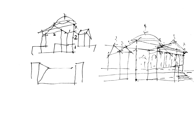
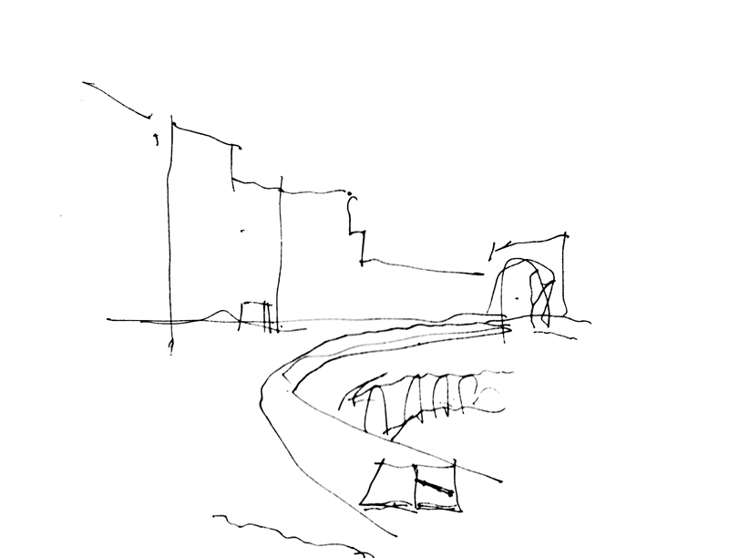
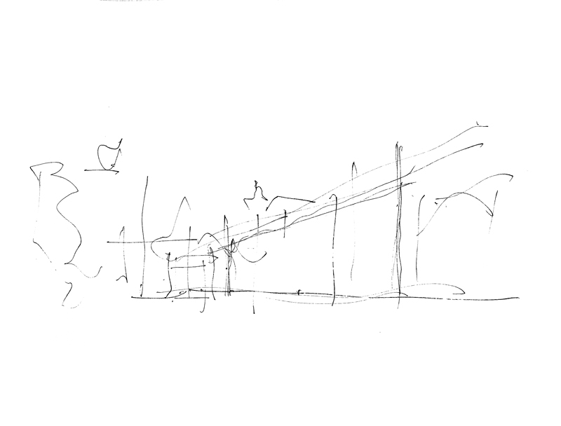
Fresh1 Fresh2 Fresh3

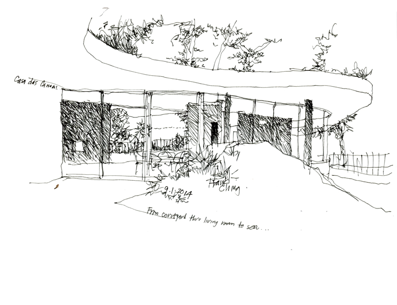
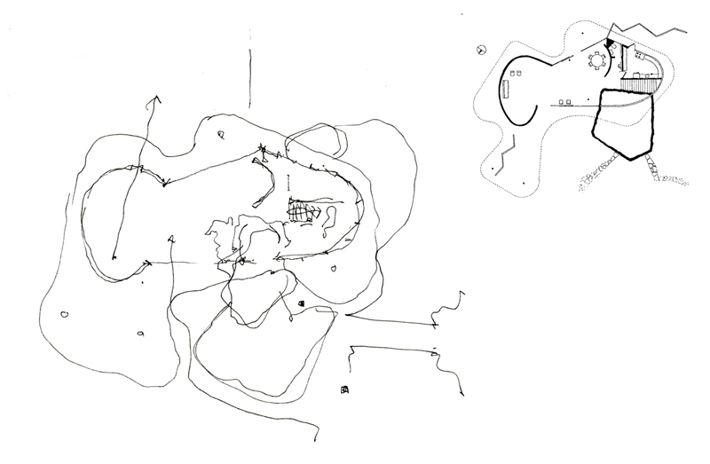
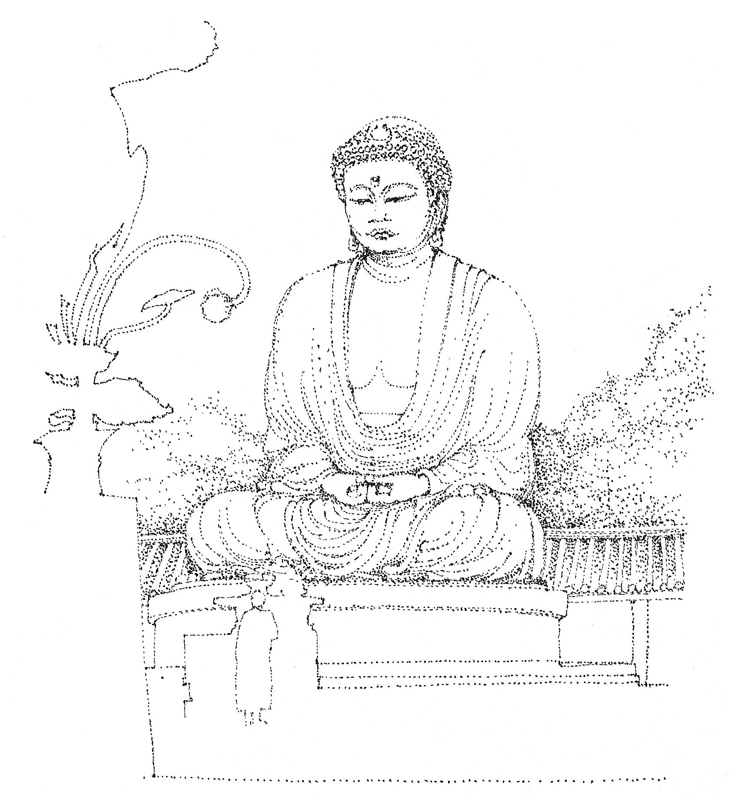
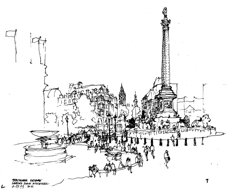
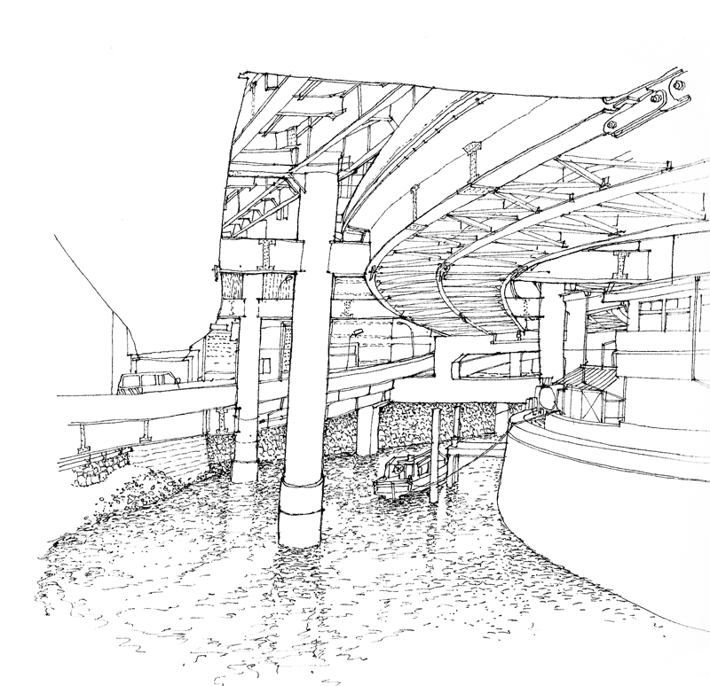
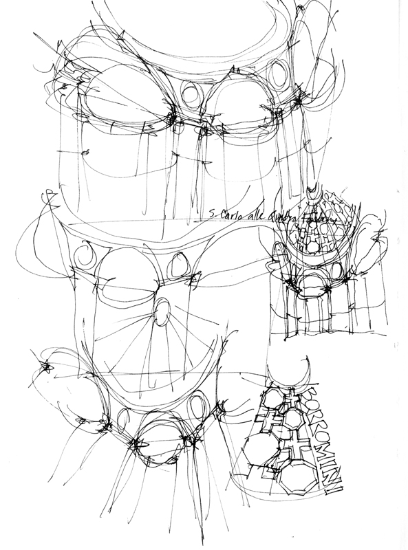
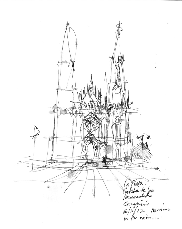
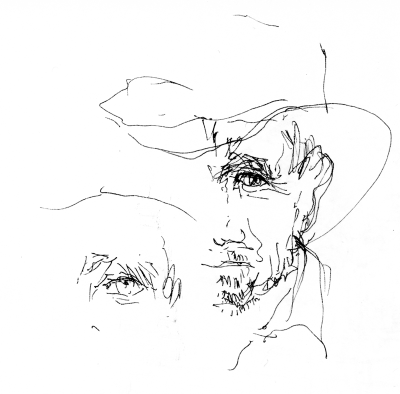
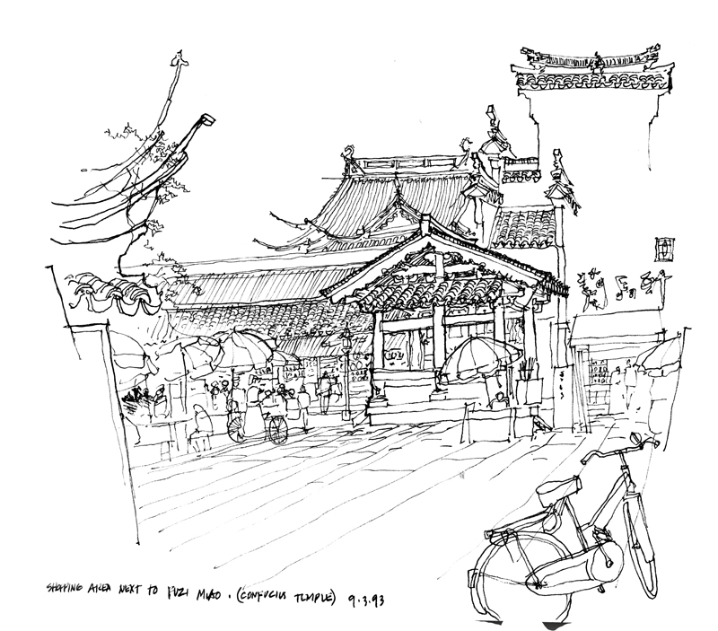
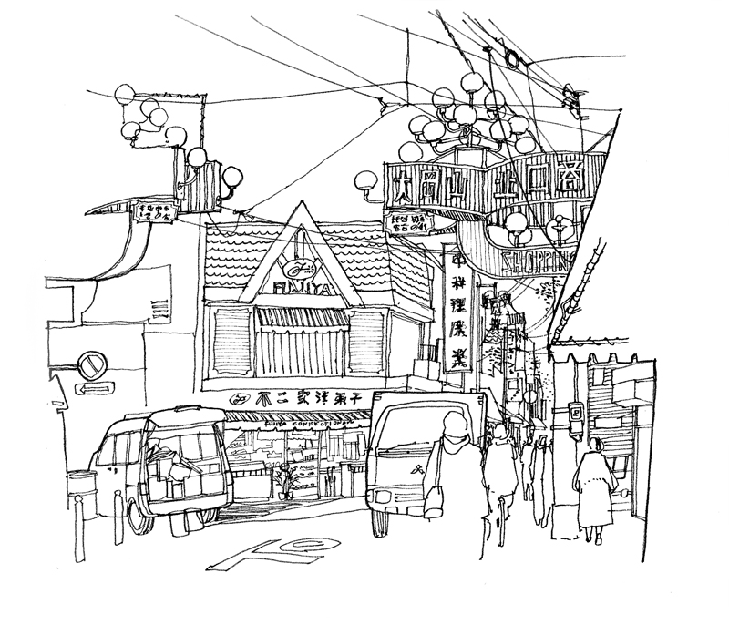
By showing you these images, I do not mean to imply they are examples of my best work but there is a fresh quality to my drawings either when I don’t have the time to overthink a drawing or when I am demonstrating an idea or approach as I am teaching.


Contrast

Whenever I view one of my own drawings or see someone else’s work, my immediate, instinctive reaction is to ask: How could the drawing have been improved? Sometimes, the answer is better composition; at other times, it’s more context. But the more common response for me is increased contrast.

I’ve written about this before but it bears repeating that contrast is a critical part of both seeing and drawing. Without seeing contrast, we are not able to differentiate one thing from another. And without drawing contrast, we diminish the hierarchy that creates interest and focus in a sketch.

ConfuciusTemple

There are several kinds of contrast that we can use in a drawing. Perhaps the most obvious is distinguishing between heavy and light line work to enhance spatial depth—what is near versus what is further away.

Ookayama2

Another is contrasting areas of greater detail with spaces of lesser detail, or areas of precision with those of ambiguity.

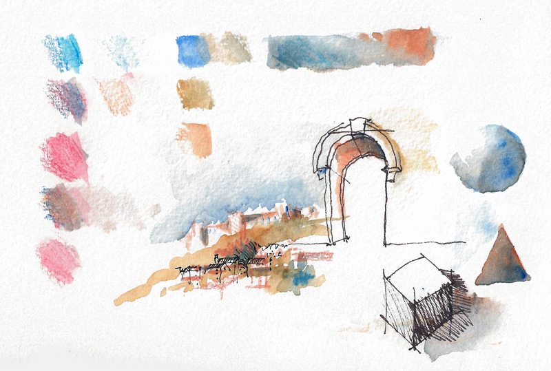
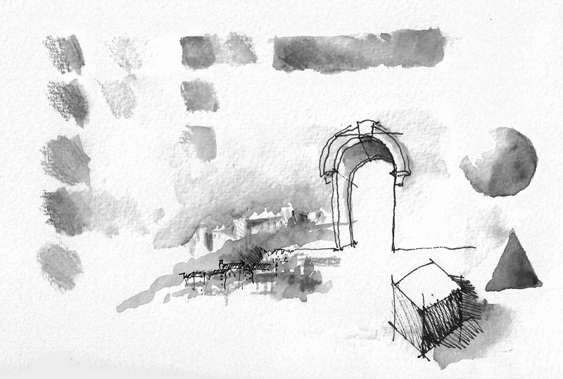
WC2WC2bw

And in the case of watercolor sketches, it is definitely necessary to differentiate not hues but rather zones of tonal values.

Another View of Foreshortening

Print

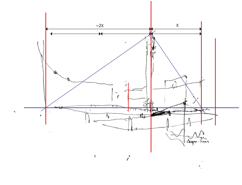
Using the same broad outline of the Campo in Siena from two posts ago, I’ve overlaid the sketch with a diagram of the important points that I visualized in the scene—the extent of my view, the relative position of the Torre del Mangia, and the foreshortening of the Palazzo Pubblico.

CampPlanDiagram

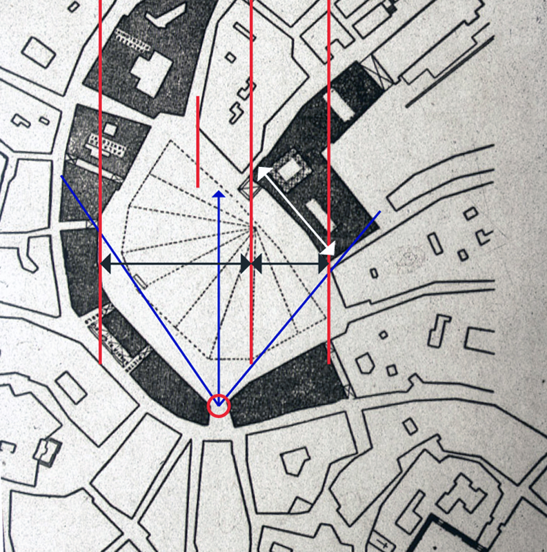
To further illustrate the phenomenon of foreshortening, I’m using a plan diagram of the Campo to show where I stood as I sketched and my angle of view. You can compare the actual width of the Palazzo Pubblico, shown with the white arrow, with my foreshortened view of it, shown with the black arrow, and notice its position relative to the horizontal sweep of the Campo space.

You can also see, both in plan and in the perspective sketch, the positioning of the Torre about one-third of the way across from the right-hand edge of the view. I visualized diagonals to estimate the height of the Torre relative to the width of the space.

While these are necessarily optical judgments, not precise measurements, seeing these types of relationships and imagining them on the page as you set up a drawing on location are important steps in the process.

Foreshortening

Foreshortening

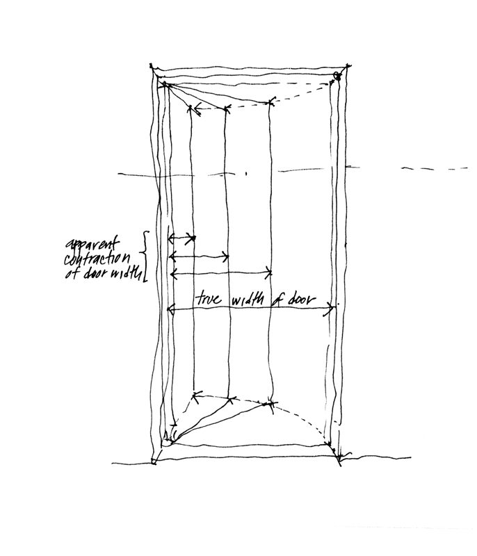
Foreshortening is the apparent change in form an object undergoes as it rotates away from our point of view. This phenomenon is usually seen as a contraction in size or length in the direction of depth, the amount of contraction depending on the degree of rotation. The more a line or plane is rotated away from our point of view, the greater its apparent contraction. You can easily see this as a door opens away from you. Gauging and drawing the phenomenon of foreshortening can be a bugaboo for sketchers because our mind can persuade us to draw what we know—the actual size or length of something—rather than how that thing might appear to the eye—its apparent size or length.

VirginiaV

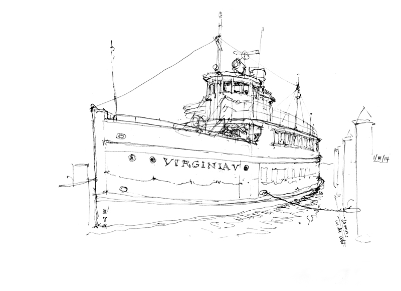
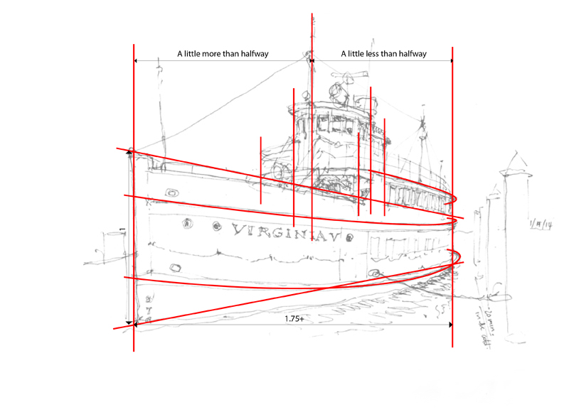
To illustrate a case of foreshortening I want to use this view of the Virginia V that I sketched this past Sunday before the Seattle UrbanSketchers group met at the Museum of History and Industry for its January meeting. One of the reasons for gathering at MOHAI is the beautiful exhibit there of Gabi Campanario’s impressive work documenting the life and times of Seattle over the past six years for the Seattle Times.

The Virginia V, built in 1921 by Anderson & Company and launched in 1922, was part of the mosquito fleet that plied the Puget Sound waters largely between the First and Second World Wars. After WWII, the Virginia V changed hands several times as it served as an excursion vessel. It was placed on the National Registry of Historic Sites in 1973. Completely refurbished by the Steamer Virginia V Foundation, the Virginia V is now anchored at the south end of Lake Union and continues to be used for public excursions and private charters.

Print

In this view of the same Virginia V sketch, I’ve overlaid some markers to show the relationships that I gauged and used to control the foreshortening of the ship. The most important step is ensuring that the apparent length—from the prow on the left to where the hull curves away from our view on the right—is correctly foreshortened relative to the height of the prow. Then, I positioned elements, such as the wheelhouse and bridge, relative to the left and right extents. Note how I try to suggest the way the hull is curved from fore to aft. You can use the span of your hand, the shaft of your pen or pencil, or any similar means to gauge these measurements but it is an essential step in the process. Otherwise, your mind will strongly suggest that you should draw what you know rather than how it appears to the eye.

The First Lines…

When an architect, designer, or builder says that a building has “good bones,” this generally means that it is well built. Like others, however, I would extend the meaning of the phrase to include not just the sturdiness of a construction but also the soundness of its underlying organization and layout. A design with good bones should be able to endure flaws in workmanship or execution and gracefully accept the changes made to improve it.

Bones1

So it is also with a sketch. To begin a drawing done on location, we must first select an advantageous viewpoint that conveys a sense of place and frame the composition to fit on the page. Then, a crucial step is establishing the “bones” of the drawing—its basic structure—with the first lines we draw. I like to say that the number of lines is five but this, of course, is arbitrary. For some views only a few lines may be necessary while for others, more might be required to establish the structure of a drawing.

Bones2

Bones3

It is essential to understand that once this structure is established, changes can still be made to calibrate scale, improve proportional relationships, and adjust the positioning of elements. Drawing these first few lines is simply a way to block out the essential relationships on a page quickly, before expending too much time on a drawing only to find out that a portion might be misplaced or is out of proportion to the rest of the composition.

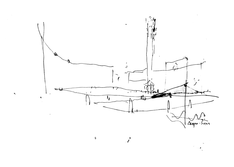
CampoSiena

Here is an example—a very quick outline of a view of the Campo in Siena that I did as a demonstration. With more time and better weather, I might have finished it but I think it is possible to see and visualize the space even in this incomplete state.

Drawing a Self-Portrait

Drawing a self-portrait was the initial assignment we used to give students at the outset of our design drawing class. The process we outlined was as follows:

“Have available a fine-tipped black pen capable of marking a sheet of clear acetate. Select a comfortable, seated position in front of a mirror and tape the acetate sheet to the mirror where your face appears. Carefully consider the shape, proportion, and features of your face.

With the pen and using a line technique, draw your portrait directly on the sheet of acetate. To do this, you must look through only one eye—your dominant eye. To find out which is your dominant eye, mark the tip of your nose on the mirror with both eyes open and then shutting each eye in turn. Seen through your dominant eye, the mark will hardly move; through the weaker one, the mark will shift considerably.”

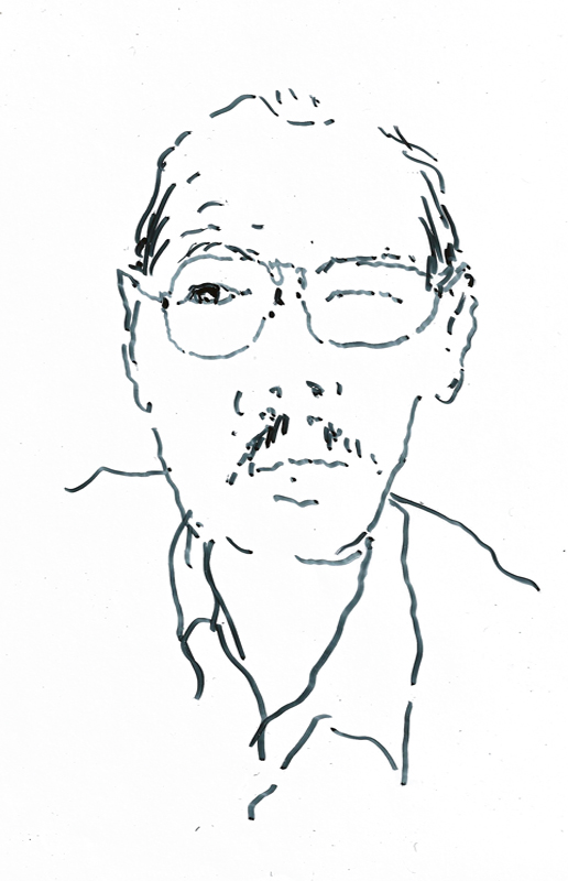
SelfPortrait

This is my attempt, which I’ve flipped so that the image is as you would see me. It seems that I’m looking to my right but I was actually looking straight ahead. While the task itself does not take very long, it is difficult to keep your head steady while trying to trace the contours of your face. You also learn after a few tries not to draw every line you see! This was a fun exercise that not only introduced the students to drawing from observation but also helped us identify students before the age of digital cameras.

Arched Openings

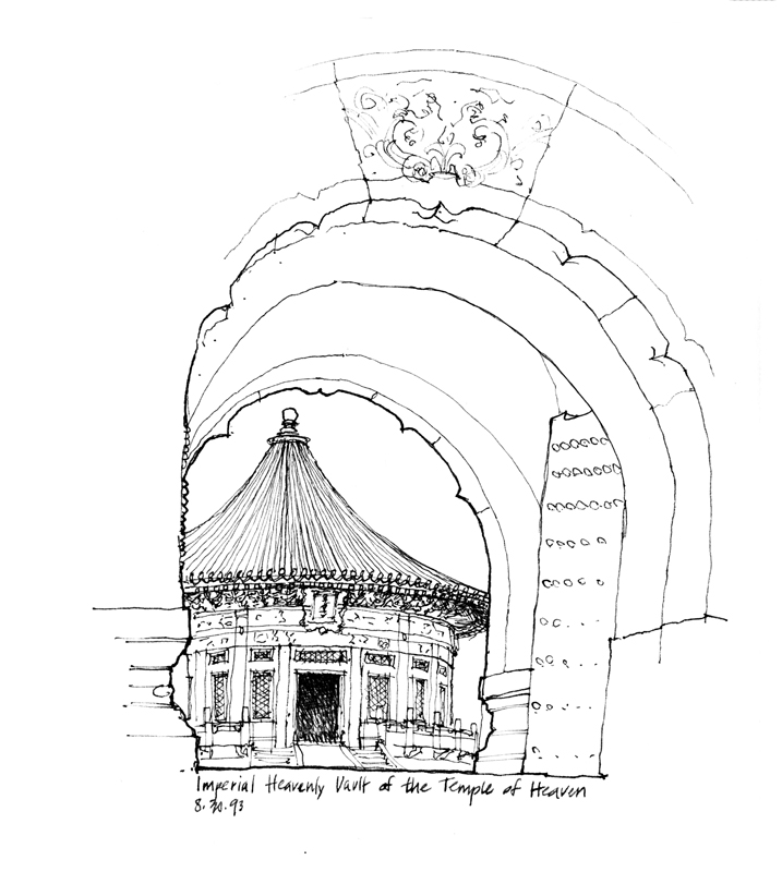
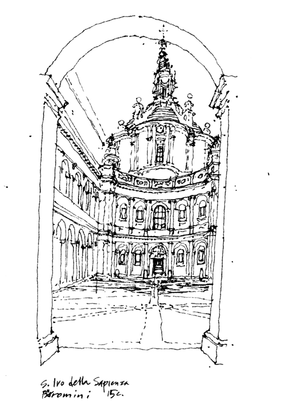
A common technique for composing a drawing is using a window or doorway to frame the scene. I particularly like using arched openings as a framing device since the shape is easily recognizable for what it is. Here are three examples, one of the Temple of Heaven in Beijing, another of S. Ivo in Rome , and the third from an old brewery building in Halifax, Nova Scotia.

TempleHeavenSIvoHalifax5

In each case, I start with the shape and proportions of the arched opening. I then use this shape and size as the measure for everything that is seen and drawn within the arched shape. The arched shape also serves as the foreground element that establishes where I am and my relationship to what I am viewing.

Notice that I drew the archway leading to the courtyard and Borromini’s S. Ivo della Sapienza a little low but I didn’t let this prevent me from drawing the full height of its spire. This is a reminder to never let a framing device alter the proportions of what you are drawing.

The Big Rock

BigRock

In the Wedgewood neighborhood of north Seattle sits this massive rock measuring 80 feet in circumference and 19 feet in height. Geologists call it a glacial erratic, meaning that its composition does not match its present surroundings. It was deposited more than 14,000 years ago by the Vashon Glacier. As the ice sheet moved inexorably from the north into the Puget Sound area, rocks, sediments and boulders such as this one were carried along by the glacier, and then were left behind when the ice retreated. Originally known as the Lone Rock when it was part of a large farmstead, this large mass is now called simply the Big Rock. It became part of a subdivision platted in the 1940s, where it remains surrounded by houses, trees and brush at the corner of 28th Avenue NE and NE 72nd Street.

This is a weird drawing in the sense that we can’t immediately recognize the Big Rock for what it is. What is that large mass of darkness? We have this yearning to know and identify what it is that we see, which is more easily satisfied when we draw buildings, people, trees and other recognizable things.

Understanding Geometry

I’m sure not everyone would share my love for geometry but an appreciation of the subject has served me well in my years as an architect. Understanding geometry, especially spatial relationships in three dimensions, makes it easier to draw these correspondences in real life.

Geometry

Take this interior view of St. James Cathedral. Because of the ornamentation, textures and color, it is easy to get confused when confronted by the richness of the scene. But underlying all of the lavish decorative features is a clear geometric scheme.

Geometry2

Imagine looking from above at the square crossing where the nave of the church intersects the transepts. From each side of the square crossing rises semicircular arches. From the apex of each arch, we can extend lines until they intersect at the center of the dome’s oculus. The diagonal groin lines that mark the intersection of the two vaults rise from each corner to intersect at the same center.

Geometry3

If we understand these geometric relationships and, just as important, we can see them as we sit in one of the pews looking upward at the dome, we can draw the square crossing and estimate the placement of the oculus without guessing. We can place it at the peak of the dome, at the intersection of the crossing groin ribs, directly above the center of the crossing.

Composing the Image

A question that is often asked is: How do I start a drawing? Where do I start? The very first step, before even touching pen to paper, is selecting the subject matter and mentally composing the image—deciding what will be included and what excluded from the scene before us. Will we zoom in on a part of a building, capture one of its interior spaces, or focus on one of its details? Do we see the building merely as an object? Will we try to place a building in its context? Or will we try to capture the life of a street or square with the architecture serving as a container or backdrop?

Fragment

• Fragments

Interior

• Interior space

Object

• Building as object

Context

• Buildings in context

Life

• The life of an urban space