Bogotá, Colombia II

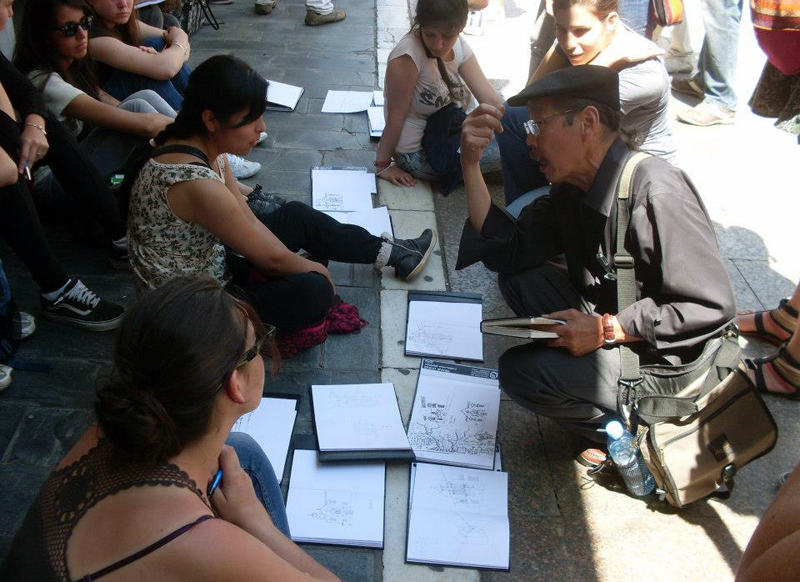
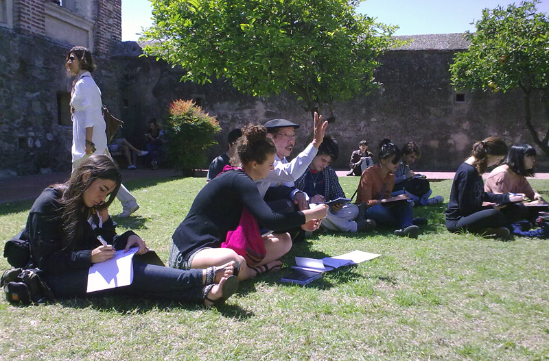
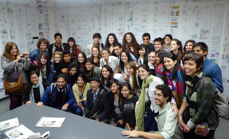
My wife and I had a wonderful time visiting the dynamic city of Bogotá; meeting conference contributors from Spain, Portugal, Argentina, Brazil, Chile, and Canada; and enjoying the warm hospitality of the faculty and students of the Universidad Piloto de Colombia.

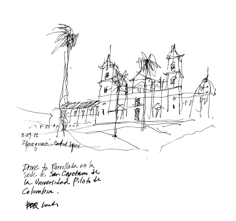
While touring the city and the surrounding countryside with the group in a bus, it was difficult to stop for any length of time to draw but I did manage to sketch a few scenes. This first view shows what is possible even if you only have a few minutes to draw. While the bus dropped us off on one corner of the central square in Zipaquirá and drove around to pick us up in the opposite corner, I managed to quickly sketch this view of the cathedral, noting the way the slope of the square was integrated by mounding the brick pavement around the palm trees.

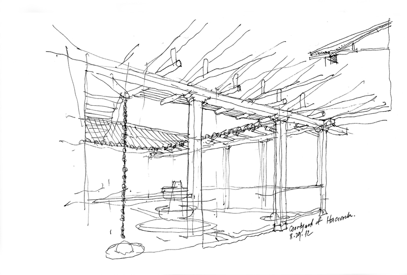
After a tour of the Catedral de Sal and a quick run through Zipaquirá, we drove to the historic Hacienda San Cayetano for a BBQ lunch. This is the courtyard of the hacienda, where a local Colombian noted that we unfortunately transport forms and traditions that are not compatible with the local climate. In this case, the water feature of the courtyard that worked in warmer, dryer climates wasn’t quite as effective in the humid conditions of the high plateau on which Bogotá is located.

A few days is never enough time to fully understand the culture of a place and this is even more true when visiting a country as diverse as Colombia but I hope to return again in the future.

Bogotá, Colombia

Leaving Monday for Bogotá, where I will be attending the International Seminar of Architecture hosted by the Universidad Piloto de Colombia and leading a couple of workshops on representation. I’m excited about experiencing Bogotá, working with the students, and doing some sketching myself.

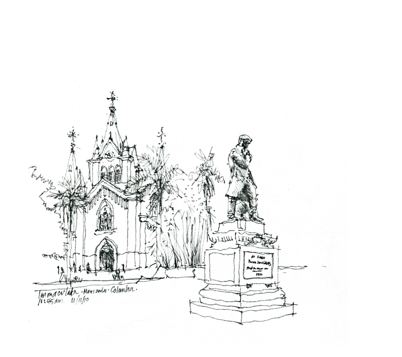
In the meantime, here are a couple of sketches I did the last time I was in Colombia, in 2010, attending a conference on methods for teaching beginning design students held at the Universidad Nacional de Colombia in the beautiful hilltown of Manizales. The first is of Iglesia de la Inmaculada Concepción, which fronts on Parque Caldas, with the statue of Francisco José de Caldas in the foreground. Caldas was a naturalist and geographer who was executed by the Spanish when Colombia (New Granada) was struggling for independence.

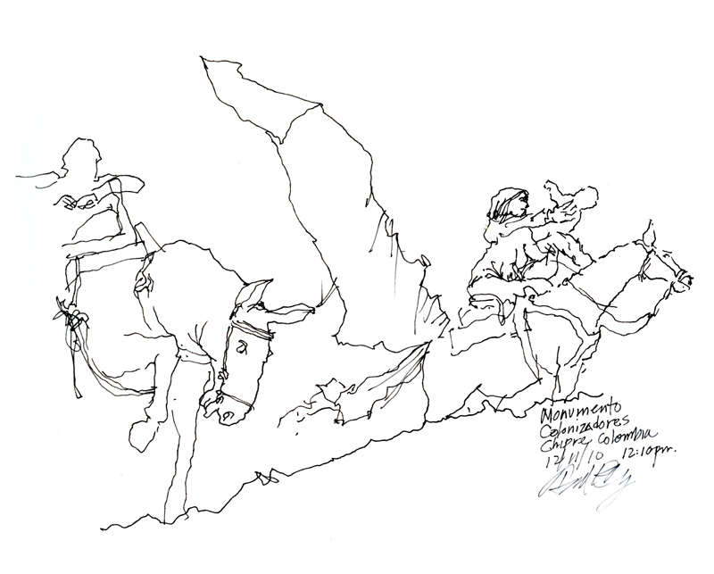
The second sketch is a fragment of a 50-ton bronze sculpture situated above Manizales in the neighborhood of Chipre. The monument pays homage to those who settled the region and founded Manizales. I tried to capture the struggle of the settlers, captured so eloquently by Luis Guillermo Arias, with a simple line drawing.

Pilgrimage Stamps

In my Japan sketchbooks, my favorite page contains neither personal notes nor drawings but rather a pilgrimage “stamp” from Kiyomizu-dera, a Buddhist temple and UNESCO World Heritage site in Kyoto. It was and still is customary for pilgrims in Japan to collect these stamps in a book from each Buddhist temple or Shinto shrine visited. While some temples may only give stamps, at others a temple priest will hand-draw the temple’s “signature” in the pilgrim’s book for a small fee, as was done here. Beautiful calligraphy, artfully composed.

Parque Colón

ParqueColon

While in Santo Domingo, I did a few sketches on my iPad for my ebook project. Here is an early morning view of Parque Colón with the statue of Cristobal Colón (Christopher Columbus) in the center and Catedral Santa Maria de la Encarnacion, the first cathedral in the New World, in the background.

This square is such a vital center of life in Santo Domingo for both locals and visitors alike. During the 36th Worldwide SketchCrawl, I sat at El Conde, a sidewalk cafe on the periphery, enjoying a cold Presidente while I sketched.

USK Santo Domingo

Upon returning to the comfortable temperatures of Seattle from the heat and humidity of Santo Domingo, I am still warmed by the passion and openness with which fellow urban sketchers recorded the life and sights of Santo Domingo’s colonial zone, especially those who attended Liz Steel’s and my workshops.

I did this sketch of Calle El Conde while waiting for La Cafetera (The Coffee Pot) to open. This is where I enjoyed my morning coffee each day of the symposium. You can see the outline of my shadow cast by the early morning sun at my back. Outside on the wall to the right, there is a plaque that reads: “To the Spanish refugee intellectuals and artists of 1939 and to the Dominican ones who welcomed them…” And just inside the entrance is a magazine rack with writings on the Trujillo era. This narrow space remains a meeting place for workers and intellectuals (and tourists) to discuss subjects of the day while enjoying the best coffee in the colonial zone.

Third International Urban Sketching Symposium

Off to Santo Domingo in the Dominican Republic for the Third International Urban Sketching Symposium <http://sdq2012.urbansketchers.org/>, where I will be teaching with Liz Steel of Australia. Looking forward to the sun, walking the colonial zone, and meeting and drawing with fellow urban sketchers from around the world.

Will post some of my work when I return in a week. In the meantime, here is a sketch that I had posted on my facebook page after the symposium last year in Lisbon. In the afternoon of the first day, I drew this view, trying to convey the flow of people, trams, cars and trucks swirling around the statue of poet António Ribeiro, the “Chiado”.

Rome 2000

In the fall of 2000, I had the privilege of teaching in the University of Washington’s Architecture in Rome program. The scaffolding that normally covers many of Rome’s treasures for cleaning and restoration was nowhere to be seen. The Eternal City had been scrubbed and polished for the hosts of pilgrims traveling there for the Jubilee Year. Because I asked the students to keep a journal to record their quarter in Rome—on history walks, during field trips, and in the design studio—I felt obligated to do the same. And I am delighted I did. Looking back at my journals now brings back fond memories of the four times I taught there.

I remember telling the students that if a blank sketchbook was intimidating, skip a few pages, then go back and fill in the first few. Here are the first pages of my journal from 2000. The first shows the view out of my window in Apt. 6 in the Palazzo Pio, looking out onto Campo de Fiori.

The next two are sketches I did as I walked the streets and acquainted myself with the area before the students arrived and the quarter started. If you look carefully toward the bottom of each page, you will notice the very small plans  I used to remind myself of the context for the views I drew. I like to think of drawing on location not only as a mode of appreciation, but also a path to understanding and remembering.

Urban Hubs

Most major cities have one or more hubs where people gather because of the fortuitous mix of transport systems and civic, cultural, and commercial amenities. Here are views of three.

The first is of Shibuya, a center of shopping and nightlife located just outside one of Tokyo’s busiest railway stations. The bustling intersection is dominated by large video news and advertising screens and a sea of people using the “scramble” mode to cross in every direction at the same time while all vehicular traffic is stopped.

The second is of Times Square in the entertainment and Broadway theater district of midtown Manhattan. Again, the brightly lit environment is dominated by the gathering mass of people at ground level and the visual onslaught of oversized electronic billboards.

The third is of the Pike Place Market in Seattle. Though not of the scale of Shibuya and Times Square, this market entrance still serves as an iconic attraction for both Seattleites and visitors from abroad. In each case, it is not the architecture of individual buildings but rather the urban spaces created by the architecture and the overhead visuals that make these attractive urban hubs.

Deciding What to Draw (And What to Omit)

On the same trip to Europe during which I had sketched the Bruges rooftops, my family and I visited London, Paris and points south. I didn’t have a lot of free time but I managed to fit in a few sketches. Looking back at these drawings, I find them to be looser than the pristine contour drawings I had been doing on previous travels.

The quicker technique was no doubt a result of the limited time I had to sketch but another key to saving time was deliberately leaving out parts of the scenes before me. What I’ve come to realize is that deciding what not to draw is as important as choosing what to include. Omitting parts of a scene leads the eye, focuses attention, and allows the imagination of those viewing the drawing to complete the image in their mind’s eye.

Bruge Rooftops


I’m resurrecting this from my Facebook posting of March 12, 2010, which has mysteriously vanished into the ether. This is a whimsical sheet that I composed in Bruges, Belgium, back in 1999. Being attracted to the variety of features that crowned the rooftop gables in the historic city center, I started the page with dotted lines to suggest a sheet of stamps. As I began, I also decided to incorporate numbers into the composition of each image, like the monetary values of postage stamps. An example of how we sometimes draw for the sheer enjoyment of the experience.