Urban Hubs

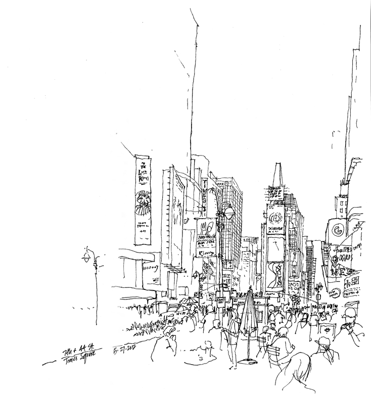
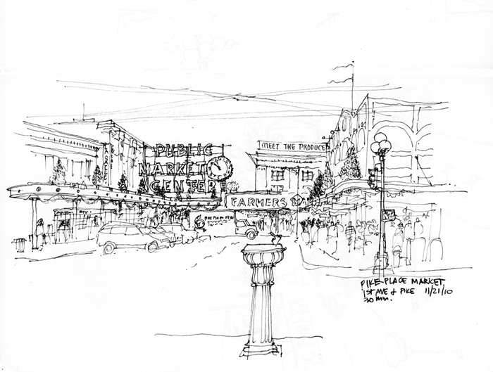
Most major cities have one or more hubs where people gather because of the fortuitous mix of transport systems and civic, cultural, and commercial amenities. Here are views of three.

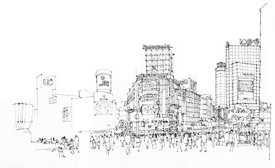
The first is of Shibuya, a center of shopping and nightlife located just outside one of Tokyo’s busiest railway stations. The bustling intersection is dominated by large video news and advertising screens and a sea of people using the “scramble” mode to cross in every direction at the same time while all vehicular traffic is stopped.

The second is of Times Square in the entertainment and Broadway theater district of midtown Manhattan. Again, the brightly lit environment is dominated by the gathering mass of people at ground level and the visual onslaught of oversized electronic billboards.

The third is of the Pike Place Market in Seattle. Though not of the scale of Shibuya and Times Square, this market entrance still serves as an iconic attraction for both Seattleites and visitors from abroad. In each case, it is not the architecture of individual buildings but rather the urban spaces created by the architecture and the overhead visuals that make these attractive urban hubs.

Looking Askance

This unusual phrase came to mind the other day when thinking about how to describe how I view a scene, both in real life and in its graphic form in a drawing. While “looking askance” currently connotes viewing with envy, suspicion, or even contempt, I would apply its more literal meaning—to look obliquely, with a side glance.

In preparing to draw, I often find myself taking a sideways glance at a scene. This slightly off-center view of things gives me a better sense of value patterns and compositional possibilities. Something similar is occuring, I think, when you see someone with their head turned or cocked slightly in evaluating a drawing or painting. I can’t fully explain how or why this happens, but someone more knowledgeable about the human eye and our optical system could provide a physiological reason. Perhaps a sideways glance uses not the cone cells required for our visual acuity but rather the rod cells, which are responsible for black-and-white vision and our peripheral view of the world.

Related to this is how I try to look at my own work-in-progress with “fresh eyes.” When we know what it is that we are drawing, we can often fool ourselves that others will see it in the same way as we do. But to see our own work the way others might, it can be helpful to turn a drawing upside down or sideways, or view it through a mirror. Doing this forces us to see in a new way the purely graphical aspects of our drawing or painting without our knowledge of the subject influencing our self-critique.

Deciding What to Draw (And What to Omit)

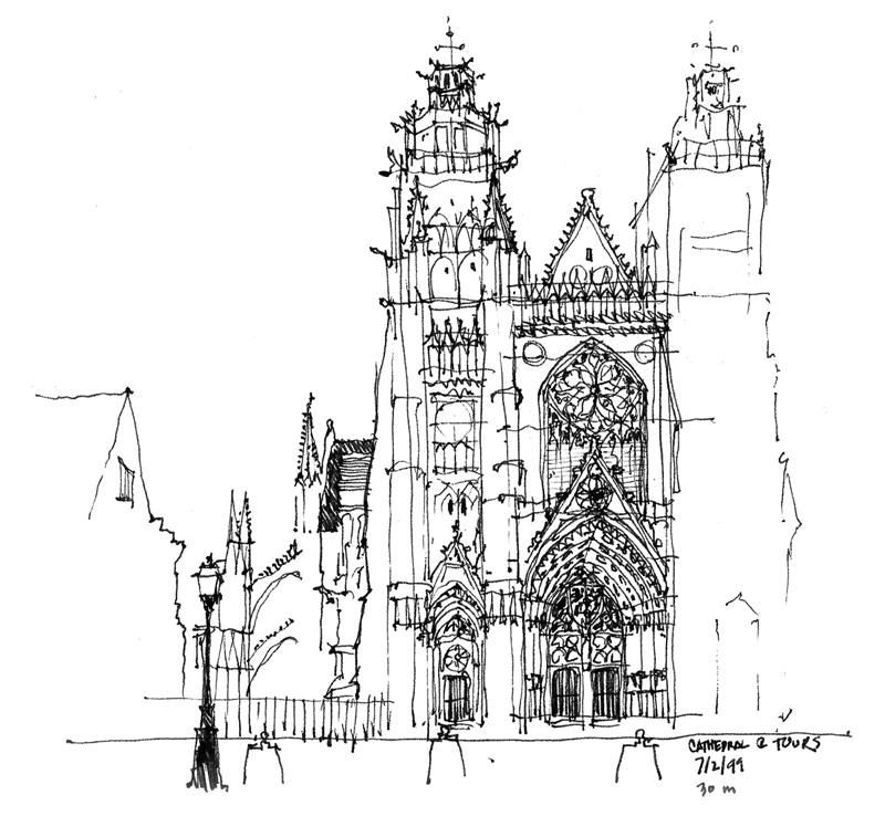
On the same trip to Europe during which I had sketched the Bruges rooftops, my family and I visited London, Paris and points south. I didn’t have a lot of free time but I managed to fit in a few sketches. Looking back at these drawings, I find them to be looser than the pristine contour drawings I had been doing on previous travels.

The quicker technique was no doubt a result of the limited time I had to sketch but another key to saving time was deliberately leaving out parts of the scenes before me. What I’ve come to realize is that deciding what not to draw is as important as choosing what to include. Omitting parts of a scene leads the eye, focuses attention, and allows the imagination of those viewing the drawing to complete the image in their mind’s eye.

Bruge Rooftops


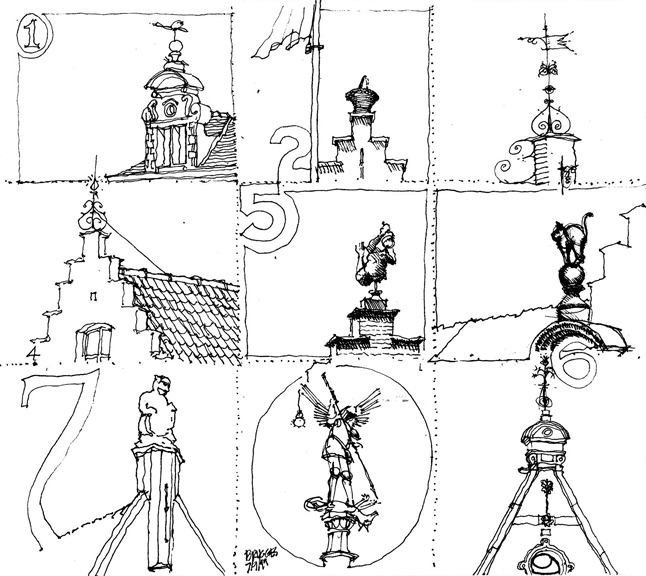
I’m resurrecting this from my Facebook posting of March 12, 2010, which has mysteriously vanished into the ether. This is a whimsical sheet that I composed in Bruges, Belgium, back in 1999. Being attracted to the variety of features that crowned the rooftop gables in the historic city center, I started the page with dotted lines to suggest a sheet of stamps. As I began, I also decided to incorporate numbers into the composition of each image, like the monetary values of postage stamps. An example of how we sometimes draw for the sheer enjoyment of the experience.

Carnegie Free Public Libraries

Andrew Carnegie (1835–1919) was a Scottish-American industrialist who devoted much of the later part of his life as a philanthropist, primarily through grants for the construction of over 2500 libraries in the United States and around the world. Carnegie believed in giving to the “industrious and ambitious; not those who need everything done for them, but those who, being most anxious and able to help themselves, deserve and will be benefited by help from others.” The first of the Carnegie libraries in the U.S. was built in 1889 in Braddock, Pennsylvania, home to one of Carnegie’s steel mills.

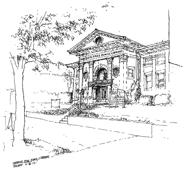
This Carnegie Free Public Library in Ballard was built in 1904 through a $15,000 grant provided by the Carnegie Library Program. Designed by Henderson Ryan, the Classic Revival structure featured radiating stacks, an auditorium, a men’s smoking room, and a women’s conversation room. The Ballard Chain Gang (!) did the landscaping under police supervision. When the city of Seattle annexed Ballard in 1907, the library became the first major branch of The Seattle Public Library.

The library was officially closed in June 1963 when a new, larger public library was built in the area. Since its closure, the library building has been used for a variety of private commercial enterprises. Seattle architect Larry E. Johnson nominated the library for recognition in 1976, and in 1979 it was listed on the National Register of Historic Places.

Contour Drawing

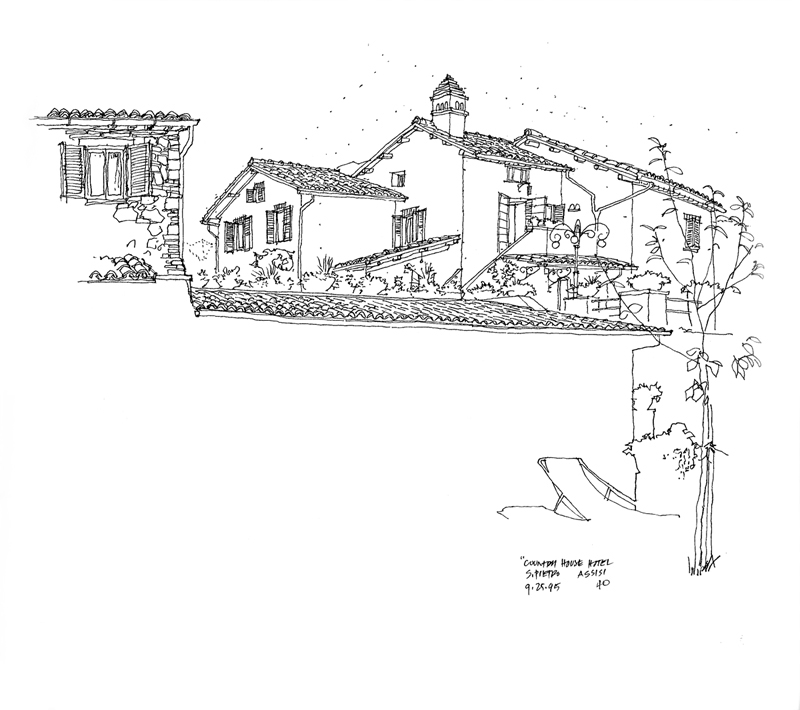
In 1995, my wife and I left the kids behind to travel to Italy, working our way from Varenna on Lake Como to Florence, Cinque Terra, Siena, San Gimignano and Assissi. We had intended to also spend some time in Rome but we found Assissi to be such a spiritually relaxing place that we decided to spend our last few days in Italy at this country house just outside the city walls.

Continuing to employ the contour drawing style I had used in Japan, I made generous use of white space to imply the foreground and draw attention to the main house beyond. Contour drawing requires working from part to part and seeing how shapes and details fit into a larger pattern. Because I was drawing with a fountain pen, I used dots to help me visualize the placement of the image on the page and to work out the roof forms before I started drawing the contours.

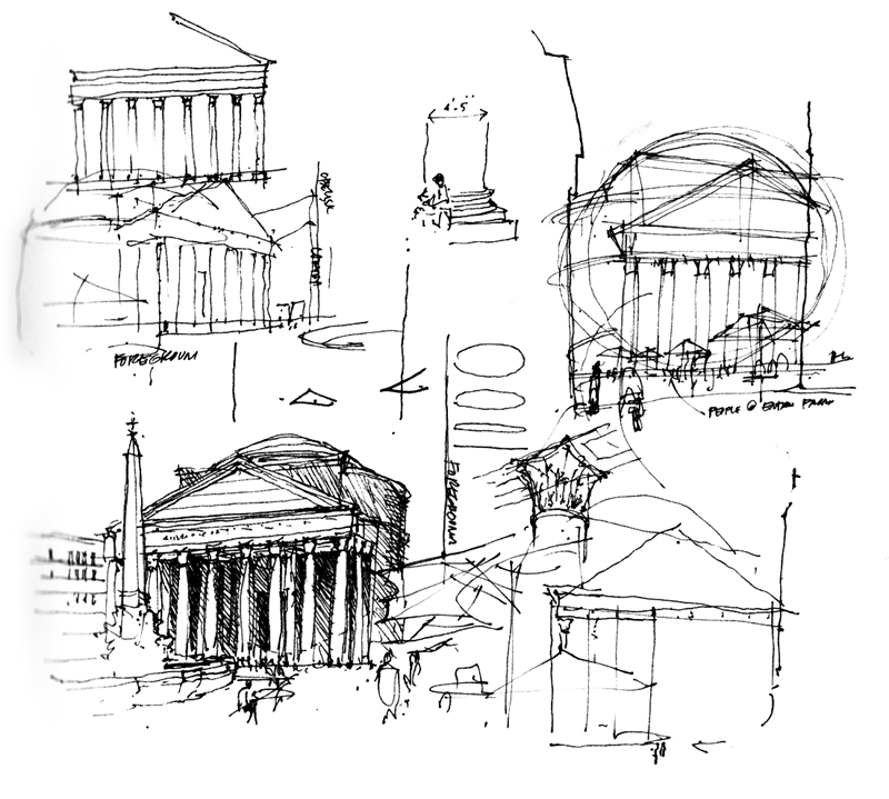
It is interesting that later, in teaching drawing, I advocate a more structural approach based on analysing geometric forms and their spatial relationships. As the years go by, I find myself using a combination of the two approaches, as seen in these studies of the Pantheon done a few years later.