Drawing for Lunch

Last week I met up with Frank Bettendorf, a fellow urban sketcher from Mount Vernon, and spent a few hours roaming around Fremont looking for sketching opportunities. While this was intended to be a sketching session, we ended up talking more about drawing rather than actually placing pen to paper. Frank B. had a lot of questions, and good ones too!

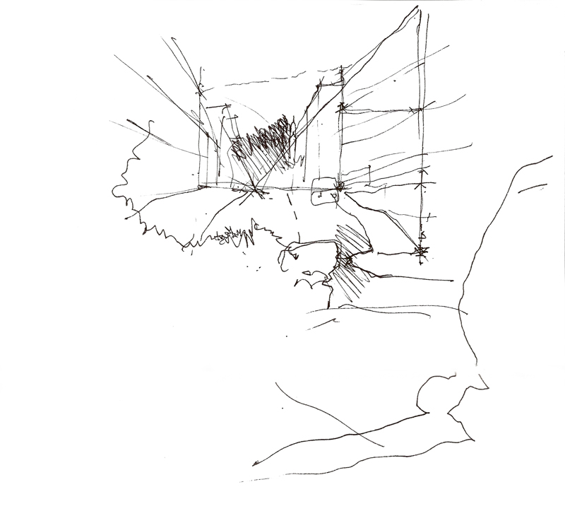
Having to explain my approach, the sequence in which I work, and how I make certain decisions along the way—all of these particulars made me realize how much I take for granted when I draw. It was useful to have to clarify and rationalize how I draw. Above is one of the sketches I used to explain my process.

I also recognize now that while many people might admire a finished drawing, the process by which it came to be can remain an inscrutable process, shrouded in mystery. Some of the keys I put forward are: composing the view by selecting an appropriate viewpoint; envisioning the scope of the drawing and placing it mentally on the page before laying down a line; starting strategically with a few key lines to establish the overall structure of the drawing; and thinking about how to convey the layers of spatial depth we see. This last point is probably the most important key: learning how to see.

And in exchange for spending a few delightful hours with Frank B., I got a free lunch at Tacos Guaymas! I look forward to more drawing sessions with Frank B.

Architecture for Humanity

Architecture for Humanity is “…a nonprofit organization founded in 1999 to promote architectural and design solutions to global, social, and humanitarian crises. Through design/build projects, competitions, workshops, educational forums, partnerships with aid organizations and other activities, Architecture for Humanity creates opportunities for architects and designers from around the world to help communities in need. We believe that where resources and expertise are scarce, innovative, sustainable and collaborative design can make a difference.”

I quote this because the nonprofit is currently hosting a charity auction on eBay of drawings, paintings, and other artwork by a number of designers and architects, which ends on June 29. Check it out at:

http://cgi3.ebay.com/ws/eBayISAPI.dll?ViewUserPage&userid=architectureforhumanity

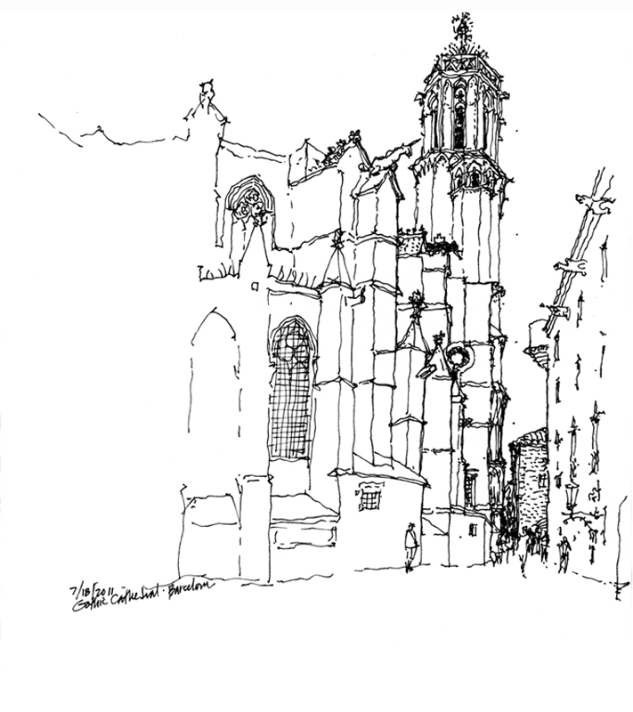
Here is a sketch of the Gothic Cathedral in Barcelona that I submitted for the charity event but It is not available for online bidding since it was actually raffled off at the AIA convention in May. Even if you’re not interested in purchasing anything, the auction site is worth perusing to see some interesting work by well-known designers, all donated for a good cause.

An Introduction to Architecture

Have not been able to post this past week since I’ve been busy working on a new book project, a general introduction to architecture distilled from a number of my previous publications: Architecture: Form, Space and Order, Architectural Graphics, Building Construction Illustrated, A Global History of Architecture, A Visual Dictionary of Architecture, and Interior Design Illustrated. My co-author, James Eckler, is helping me compile an abbreviated but coherent collection of material that would introduce students to the art, science, and discipline of architecture. Still a lot more work to do but here is a sample two-page spread from the chapter on elements and systems that inform architectural design.

Rome 2000

In the fall of 2000, I had the privilege of teaching in the University of Washington’s Architecture in Rome program. The scaffolding that normally covers many of Rome’s treasures for cleaning and restoration was nowhere to be seen. The Eternal City had been scrubbed and polished for the hosts of pilgrims traveling there for the Jubilee Year. Because I asked the students to keep a journal to record their quarter in Rome—on history walks, during field trips, and in the design studio—I felt obligated to do the same. And I am delighted I did. Looking back at my journals now brings back fond memories of the four times I taught there.

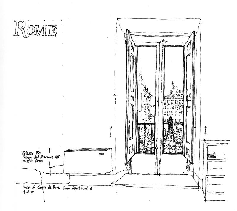
I remember telling the students that if a blank sketchbook was intimidating, skip a few pages, then go back and fill in the first few. Here are the first pages of my journal from 2000. The first shows the view out of my window in Apt. 6 in the Palazzo Pio, looking out onto Campo de Fiori.

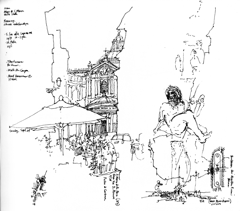
The next two are sketches I did as I walked the streets and acquainted myself with the area before the students arrived and the quarter started. If you look carefully toward the bottom of each page, you will notice the very small plans  I used to remind myself of the context for the views I drew. I like to think of drawing on location not only as a mode of appreciation, but also a path to understanding and remembering.

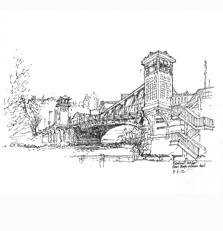
Three Views of the Fremont Bridge

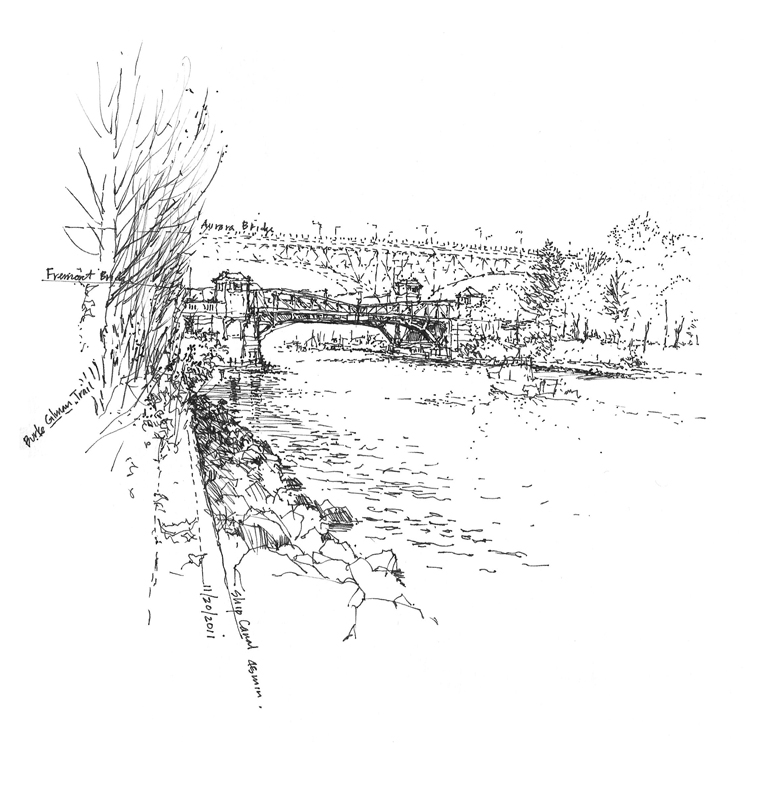
The Fremont Bridge opened in 1917 and continues to open about 30 times a day for boat traffic traversing the Ship Canal connecting Lake Union to the Puget Sound. In 1982 it was listed in the National Register of Historic Places along with the higher George Washington Memorial Bridge seen in the background. More commonly known as the Aurora Bridge, the steel cantilever-and-truss bridge carries State Route 99 across the west end of Lake Union.

This view is of the bridge as it serves as the south gateway to Fremont. The drawbridge is called a double-leaf bascule because it uses counterweights to continuously balance the two spans as they swing upward to provide clearance for the traffic passing beneath it.

Finally, we see the bridge from the Burke-Gilman Trail that passes beneath it on the north side of the Ship Canal. These three views remind us to evaluate our three-dimensional environments, especially the buildings and other artifacts of a city’s infrastructure, from different points of view.