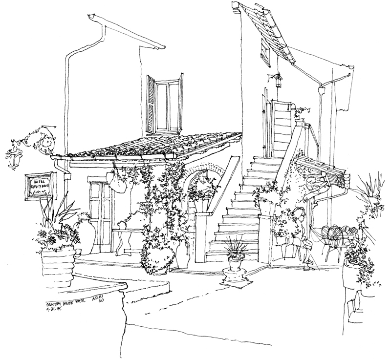
Edward Tufte has crafted a beautiful documentary of Inge Druckrey teaching her students how to see, which can be viewed at <https://vimeo.com/45232468> or <http://www.edwardtufte.com/tufte/>. It’s 37 minutes long but well worth the time to view in its entirety. While Druckery’s insightful and empathetic lessons are clearly appropriate for the education of visual designers, we can also apply many of the basic principles to drawing on location because learning to see—not simply the acquisition of technique—is truly the key to learning how to draw from observation.
Monthly Archives: July 2012
The Power of Suggestion
“Art does not reproduce the visible; it renders visible.” Paul Klee
This quote brings to mind the distinction between the lavishness of our visual perception as we survey a scene and our limited ability to capture that richness in a drawing. So in sketching, rather than attempt to reproduce every detail exactly the way we see it, we should simply try to make what we perceive visible to others. We do this by remembering that all drawing is abstraction, editing what we choose to include in our drawing, and relying upon suggestion rather than exact replication.
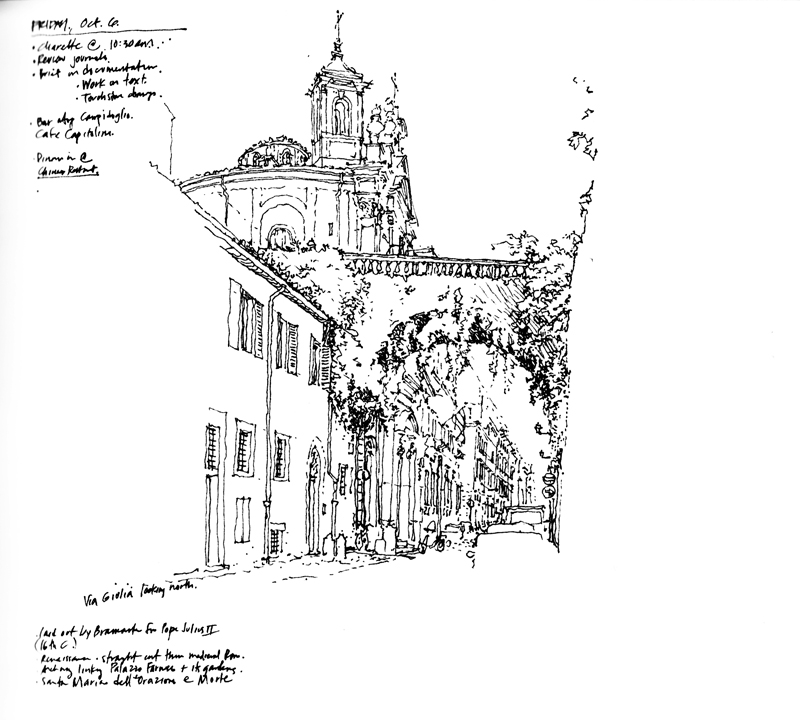
For example, here are progressive enlargements of a portion of a sketch I did of Via Giulia in Rome. The lines and shapes are barely recognizable as being representative of anything. But in the context of the entire drawing, it is convincing enough to suggest to the mind’s eye a scene that we recognize. The whole is truly greater than the sum of the parts.
Parque Colón
While in Santo Domingo, I did a few sketches on my iPad for my ebook project. Here is an early morning view of Parque Colón with the statue of Cristobal Colón (Christopher Columbus) in the center and Catedral Santa Maria de la Encarnacion, the first cathedral in the New World, in the background.
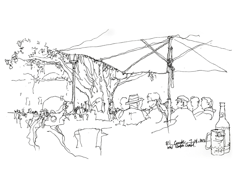
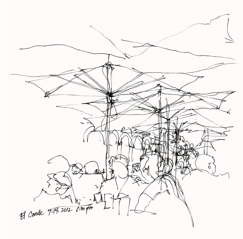
This square is such a vital center of life in Santo Domingo for both locals and visitors alike. During the 36th Worldwide SketchCrawl, I sat at El Conde, a sidewalk cafe on the periphery, enjoying a cold Presidente while I sketched.
USK Santo Domingo
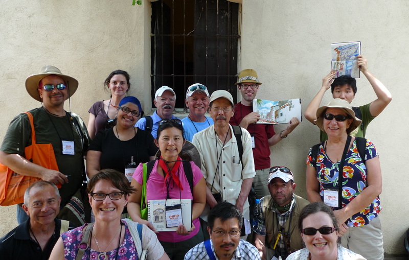
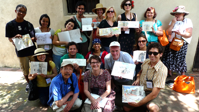
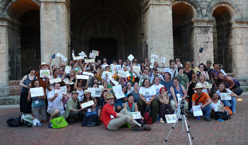
Upon returning to the comfortable temperatures of Seattle from the heat and humidity of Santo Domingo, I am still warmed by the passion and openness with which fellow urban sketchers recorded the life and sights of Santo Domingo’s colonial zone, especially those who attended Liz Steel’s and my workshops.
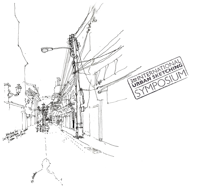
I did this sketch of Calle El Conde while waiting for La Cafetera (The Coffee Pot) to open. This is where I enjoyed my morning coffee each day of the symposium. You can see the outline of my shadow cast by the early morning sun at my back. Outside on the wall to the right, there is a plaque that reads: “To the Spanish refugee intellectuals and artists of 1939 and to the Dominican ones who welcomed them…” And just inside the entrance is a magazine rack with writings on the Trujillo era. This narrow space remains a meeting place for workers and intellectuals (and tourists) to discuss subjects of the day while enjoying the best coffee in the colonial zone.
Third International Urban Sketching Symposium
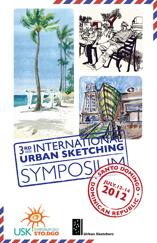
Off to Santo Domingo in the Dominican Republic for the Third International Urban Sketching Symposium <http://sdq2012.urbansketchers.org/>, where I will be teaching with Liz Steel of Australia. Looking forward to the sun, walking the colonial zone, and meeting and drawing with fellow urban sketchers from around the world.
Will post some of my work when I return in a week. In the meantime, here is a sketch that I had posted on my facebook page after the symposium last year in Lisbon. In the afternoon of the first day, I drew this view, trying to convey the flow of people, trams, cars and trucks swirling around the statue of poet António Ribeiro, the “Chiado”.
Learning to Draw
In thinking about how to teach drawing more effectively and how others might better learn how to draw, I find that books are a useful companion to which one can refer early and often. There is something comforting about seeing and feeling physical drawings on a page. When a book is well written and illustrated, one can almost hear the voice of the author. But the thing that books lack is the guiding eyes and hand of a live instructor when looking out upon a scene and trying to understand how to capture whatever it is that interests us. For this, one must take classes that deliver hands-on instruction.
To help fill this gap between the printed book and hands-on instruction, I’ve been working with Nan-Ching Tai on an ebook on architectural sketching. The idea is to develop 40 or 50 focused lessons or modules that can be viewed in any order. While the text is still rough, I’ve been mocking up drafts using the Keynote presentation program, focusing on the content that consists of a combination of photographic analyses, examples of my own sketches, as well as Quicktime movies of sketches that I’ve done using the Brushes app on my iPad. Here is one such module. There’s more work to be done refining the modules, clarifying the text and captions, and adding more videos, but it’s been a fun project thus far.
Spatial Depth
One of the issues Frank B. and I had discussed in our last meeting was establishing layers of depth in a drawing, which is one of the difficulties we face when we try to convey three dimensional environments on a two-dimensional page. There are a number of depth cues that we can rely on, such as linear perspective, size perspective, and overlapping shapes. But the one I want to illustrate here uses one of the principles of atmospheric perspective to enhance spatial depth—contrasting levels of detail to distinguish near from far.
Here are three examples, each one drawing attention to a different extent or range from the viewer. The first focuses on what is near and blurs the background.
The second details the middle ground and blurs the foreground and background by drawing their outlines only.
The third drawing focuses on the Amalfi cathedral toward the rear and suggests the middle ground and foreground to establish the context.
In each case, choosing what to emphasize and then using sufficient contrast are necessary to distinguish near from middle and far.


