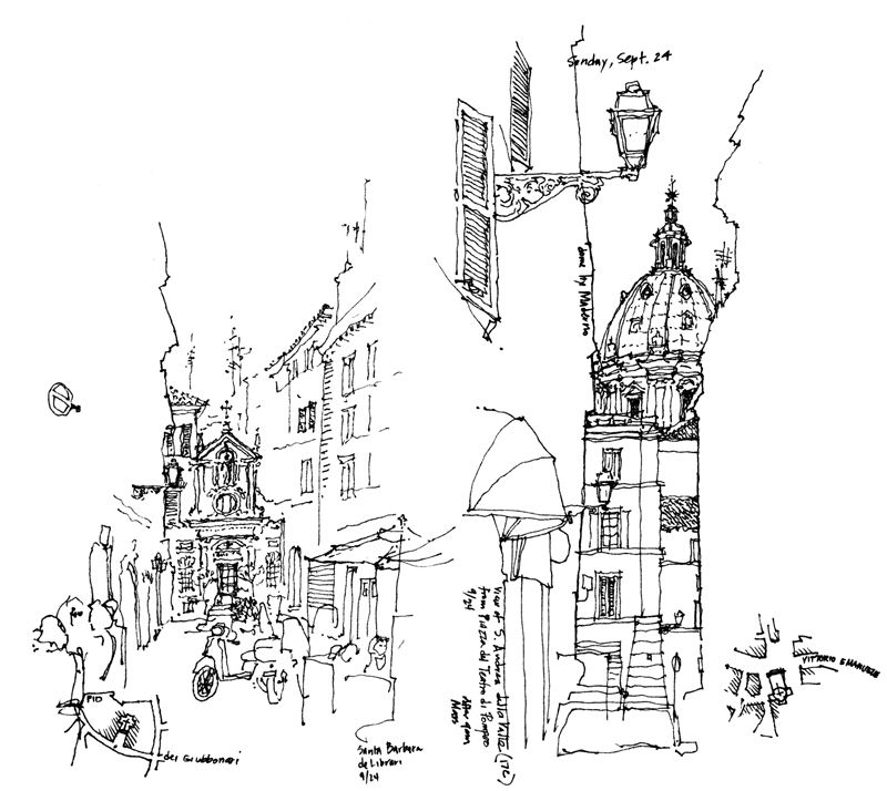
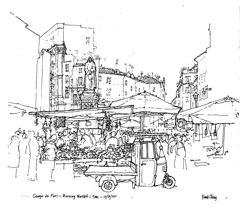
Seattle Workshop

SeattleWorkshop

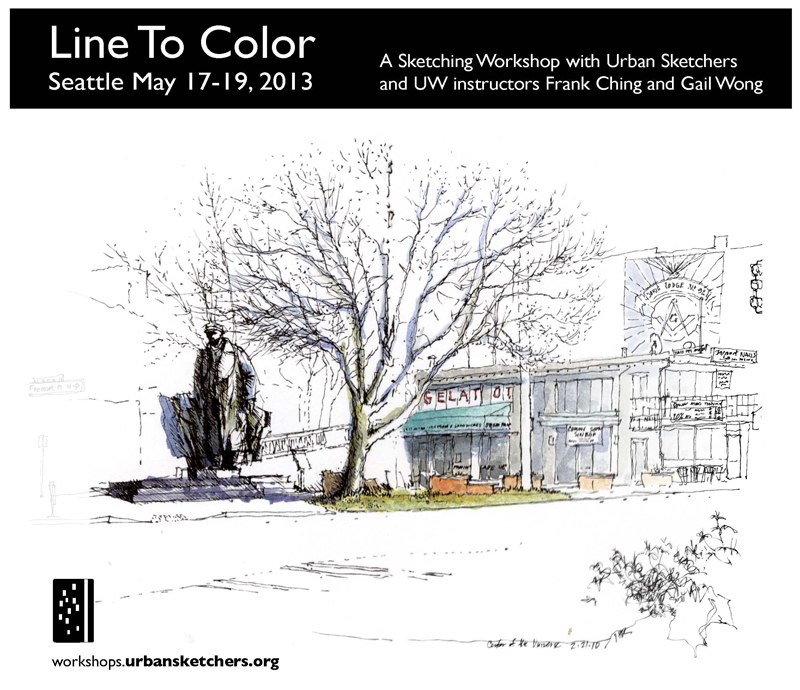
Gail Wong and I will be offering a drawing workshop in Seattle May 17–19. We will begin on Friday evening with an introductory sketching session followed by dinner and presentations at the Ballard Pizza Co. The next day, we will have two sessions, one in the morning at Gas Works Park and another in the afternoon in the Fremont neighborhood. On Sunday, we will spend our last session together with the Seattle UrbanSketchers group in Pioneer Square or Pike Place Market. Should be fun. And beginners are certainly welcome!

For a complete schedule, details, and sign-up info, please see <http://glwsketchworks.blogspot.com/p/may-17-19.html> or <http://workshops.urbansketchers.org/2013/02/line-to-color-workshop-in-seattle-with.html>.

Medium & Surface


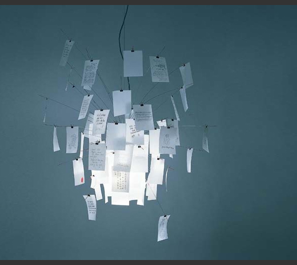
ZettelZ5

We recently purchased an Ingo Maurer-designed Zettel’z 5 Chandelier. The distinguishing feature of the fixture are the 80 stainless steel wires from which hang sheets of Japanese paper that direct and diffuse the light. So this past Saturday, when the Seattle UrbanSketchers met at St. James Cathedral for their monthly get-together, I set myself the task of doing some drawings on the thin translucent sheets that came with the chandelier kit.

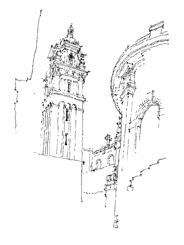
StJames1

I soon found that ink bled on the paper so I had to adjust the way I drew—moving quickly and touching lightly for thinner strokes; proceeding more slowly and pausing even momentarily resulted in blotting.

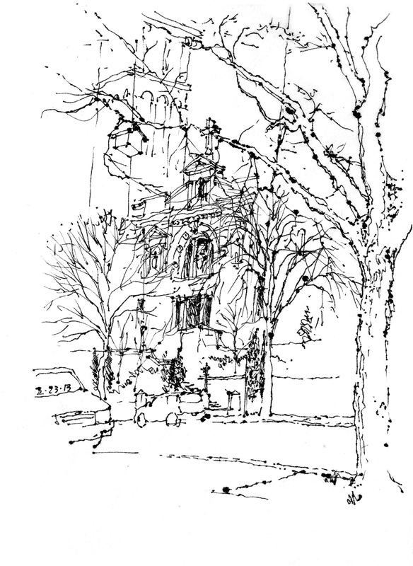
StJames2

Because of the bleeding, I had to be very careful not to overdraw. Some of the blots you see are unintentional but simply part of the process, reflecting the interaction between medium and surface. I think they actually add character to the drawings.

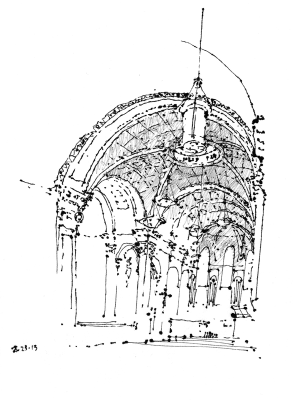
StJames3

This was just another reminder that while the medium we choose may not affect the viewpoint we choose, it certainly affects the way we execute a drawing and the resulting graphic image.


Curtis Steiner

CurtisSteiner

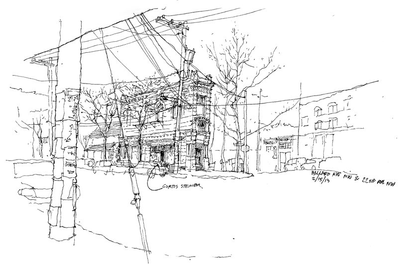
A group of Seattle UrbanSketchers enjoyed a crisp, sunny morning meet-up in Ballard last Friday with Sharon Bryant, who was visiting from Vermont. Here is a view of the building at the corner of Ballard Avenue NW and 22nd Avenue NW, which used to house the Guitar Emporium and is now the shop of Curtis Steiner. I find it difficult to describe Steiner’s work and so I will quote the headline and lead-in to an article from 2008 written by Tyrone Beason in the Seattle Times Pacific NW magazine:

“Artist and entrepreneur, Curtis Steiner shows us the value of objects ordinary or odd. Ballard gift-store owner Curtis Steiner applies his exquisite taste to both creating and finding things people will value as beautiful.”

If you are ever in Ballard, it is well worth a visit.

Composing the Page

The page proportions of our sketchbook influence the composition of our drawings. Tall or narrow pages suggest the drawing of vertical compositions or horizontal panoramas, while rectangular or square formatted pages provide more flexibility in layout. Even so, we should not allow the proportions of a page to cripple our imagined views in unintended ways. The page should not constrain the limits of a drawing nor restrict its composition.

VerticalPlane

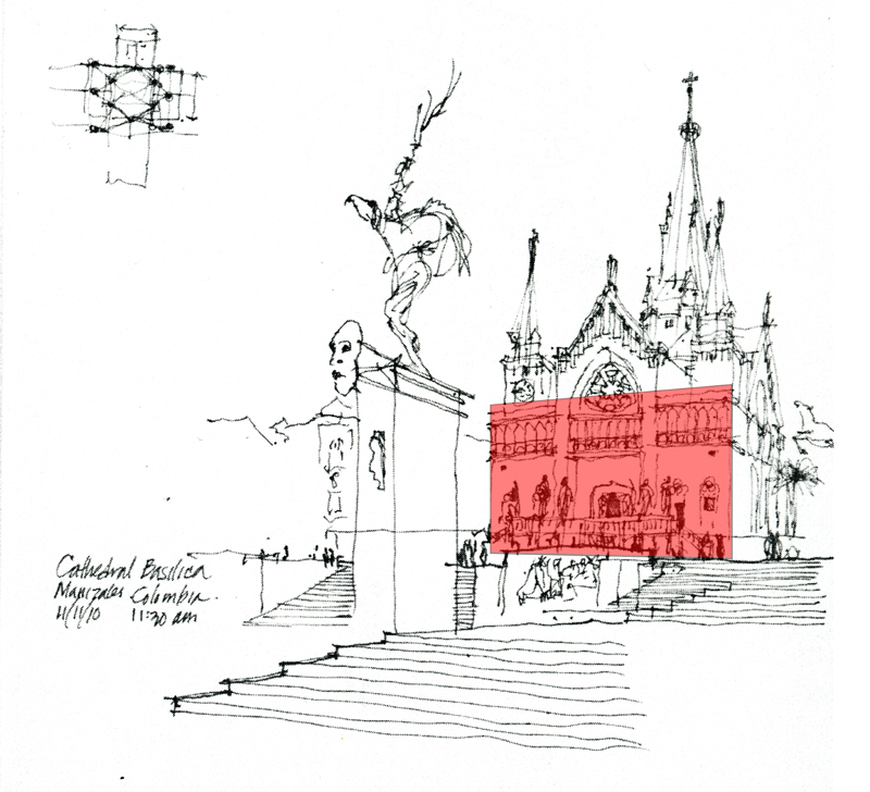
Where do we start a drawing…? Personally, I try to locate a vertical edge—or preferably a vertical plane—in the scene or view and use its size to mentally anchor the composition on the page. This vertical element can be a building facade, an interior wall, or even a row of trees or lamp posts…

VerticalSpace

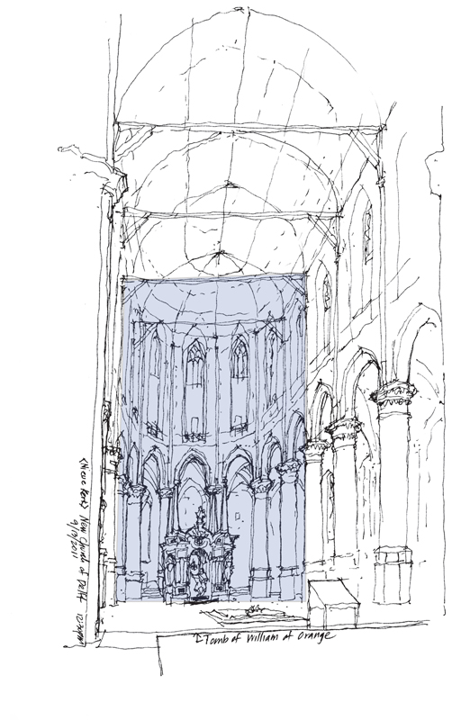
Or it can be the imagined space between two building elements, as in a street scene or the nave of a church.

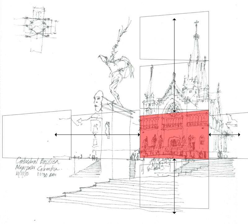
Projection

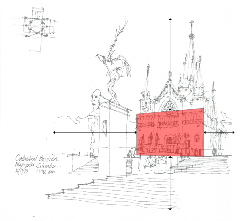
Using a vertical element in this manner requires projecting the imagined view onto the page and locating and sizing the vertical element relative to the overall composition to ensure that the entire scene will fit on the page. Providing breathing space around the intended image is a good strategy. Starting too large or misplacing the vertical element can force us to either cut off part of our intended view or alter the proportions of the scene.

RelativeSizing

Once we have placed the selected vertical element, we can use it to gauge the relative sizes of all of the other elements in the composition.

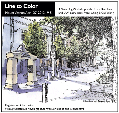
Mt. Vernon Workshop Update

MtVernon2

For more information on the one-day workshop Gail Wong and I will be offering in Mt. http://glwsketchworks.blogspot.com/p/workshops-and-events.htmlVernon, Washington, please see: <http://glwsketchworks.blogspot.com/p/workshops-and-events.html>.

I should note that Gail and I will also be offering a workshop here in Seattle May 17–19, beginning with a pizza dinner and presentation on Friday evening, followed by two sessions on Saturday and a closing session on Sunday with the Seattle Urban Sketchers group. More details to follow.

Composing the Image II


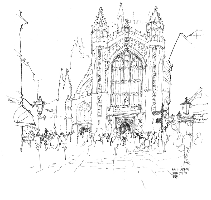
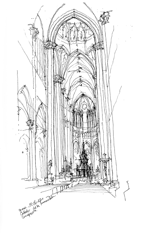
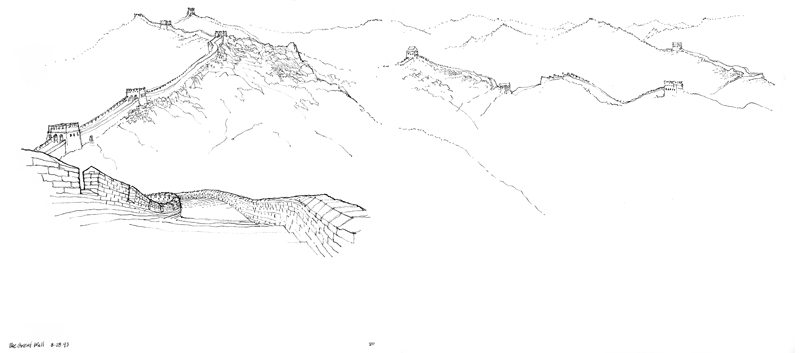
Once we have decided on the subject matter for a sketch and established a particular point of view, we should pay attention to the proportions of the conceived image. Some images may lend themselves to a square or nearly square format, others a vertical composition, and still others a horizontal layout.

BathAbbey Immaculata

GreatWall

At times, the nature of the image we are trying to capture can be odds with the proportions of the pages in our sketchbook. We shouldn’t allow this conflict to alter our intentions. In my next post, I will try to address the question of how to compose the image on the page.

Composing the Image

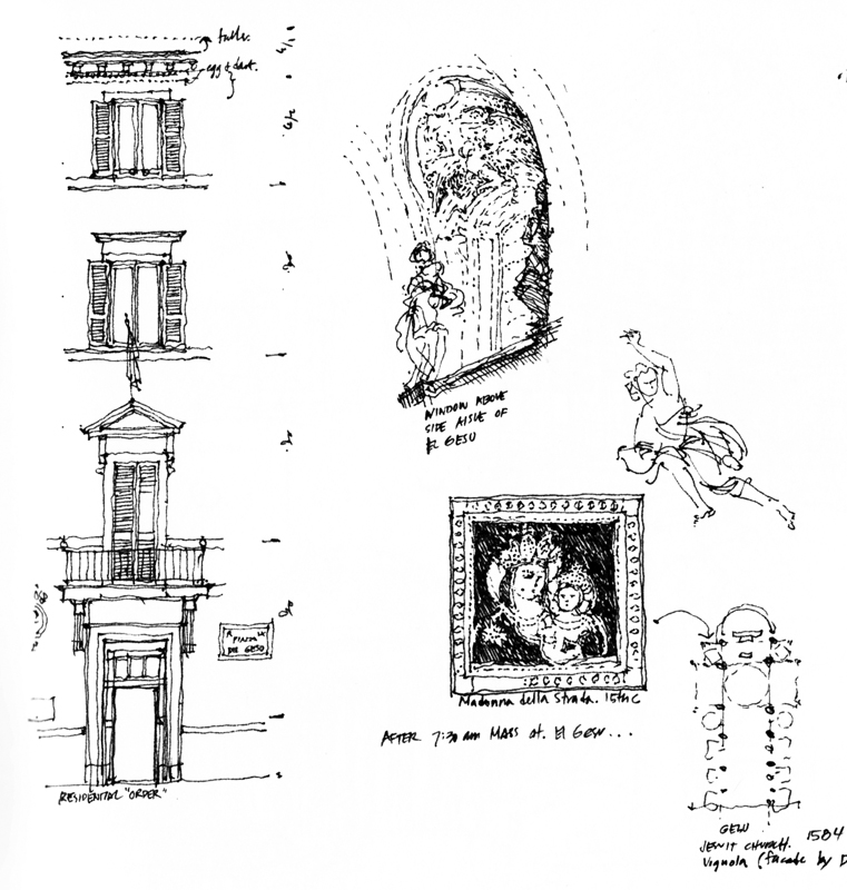
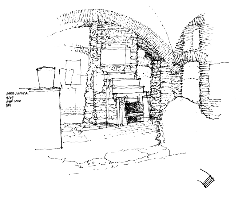
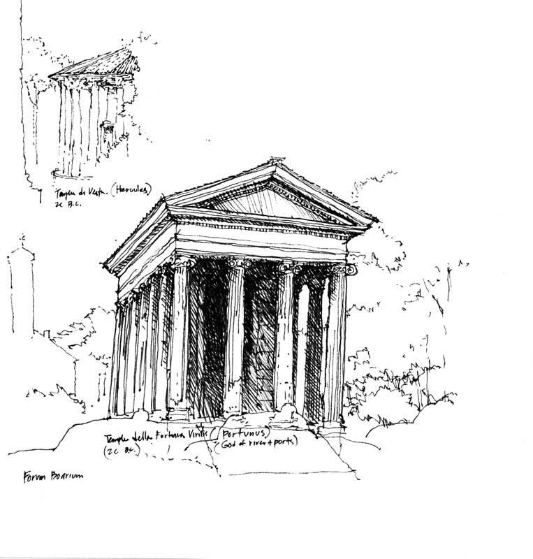
A question that is often asked is: How do I start a drawing? Where do I start? The very first step, before even touching pen to paper, is selecting the subject matter and mentally composing the image—deciding what will be included and what excluded from the scene before us. Will we zoom in on a part of a building, capture one of its interior spaces, or focus on one of its details? Do we see the building merely as an object? Will we try to place a building in its context? Or will we try to capture the life of a street or square with the architecture serving as a container or backdrop?

Fragment

• Fragments

Interior

• Interior space

Object

• Building as object

Context

• Buildings in context

Life

• The life of an urban space