Foreseeing the Future

CanaleScheme

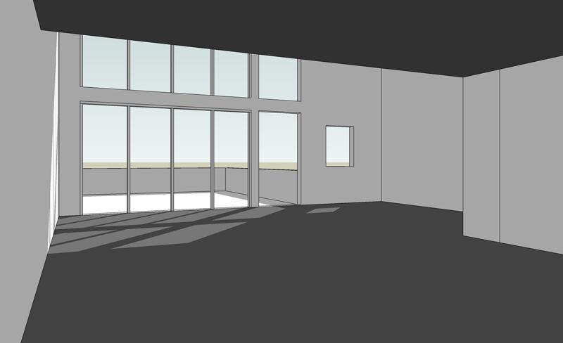
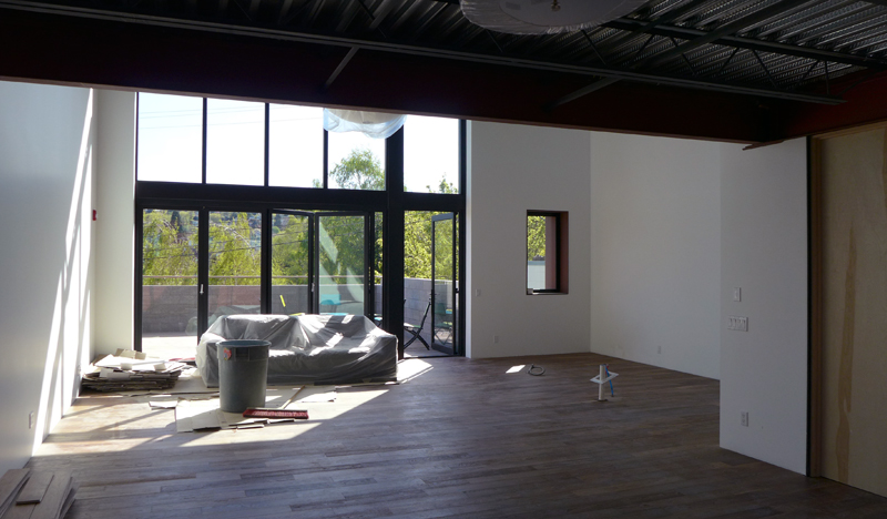
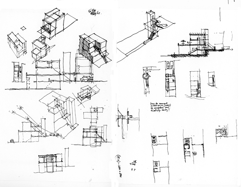
Stepping away from drawing from location for a while, I want to mention design drawings—drawings designers use to initiate and develop ideas and make them visible so that they can be acted upon. Whether we start with orthographic views, such as plans, elevations, and sections, before moving on to 3-dimensional views, or we begin the design process with paraline and perspective drawings, we should move back and forth from 2D to 3D and have the confidence that our visualizations are dependable predictors of future outcomes.

CanaleVision


CanaleBuilt

In an actual project nearing completion, it is interesting to compare a design study created in SketchUp with a photo of the constructed space. While not exactly identical, these two images are similar except for nuances of color and material. This shows the usefulness of preliminary studies to reliably foresee the result of our design decisions. Of course, these studies include not only graphic representations but also study models and prototyping. But for efficiency of time and fluency of thought, it is difficult to beat the graphic tools at our disposal.

Preparing for Mt. Vernon Workshop

In preparing for the Mt. Vernon workshop that Gail Wong and I will be offering this Saturday, I’ve assembled a Keynote presentation to introduce participants to a few basic principles to keep in mind when drawing on location. After teaching for 40 years but continuing to discover aspects of the drawing process through my own as well as others’ observations and experiences, I find it difficult to prepare these presentations.

What I do on an intuitive level—with insights gained through practice and experience—can be difficult to condense into a few fundamental concepts. Yet, in a one-day or even a three-day workshop, one has distill drawing lessons down to a few key ideas that can be more easily digested, especially for beginners. One of these is acquiring a proper point of view, which is vital to producing a good drawing. If one’s vantage point is flawed due to an inherent imbalance of graphic elements, an unexpected or unfortunate alignment of spatial edges, or an ill-considered placement on the page, then all the skill and experience one can muster might not be enough to salvage the drawing. On the other hand, a well composed image can often survive a number of common drawing mistakes.

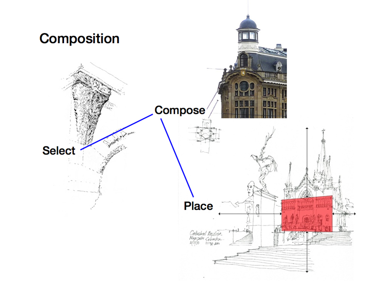
In each slide of the Keynote presentation, I limit myself to a maximum of three, concisely stated points. In this example, I present three keys to drawing composition.
DrawingMtVernon

1. Select: Draw what interests you, what catches your eye—whether it be a detail or a fragment, an entire structure or a spatial environment—but make sure this is a conscious choice.

2. Compose: Vital to composition is walking around until one’s view of the selected subject matter holds the compositional forces that you desire. Understand whether the view is symmetrical or asymmetrical, contains the desired point or area of focus, and has the potential for conveying layers of depth.

3. Place: Understand the proportions and size of the selected image before placing it on the drawing surface or page.

There are, of course, more slides in the presentation and I look forward to seeing how effective they are in the workshop. Preparing a presentation is very much like the drawing process. One never quite knows where it will lead; one can only learn from the experience and improve at the next opportunity.

WorldWide SketchCrawl 39

In 2004, Enrico Casarosa spent a day walking around San Francisco and recording his encounters through drawings. He enjoyed this experience so much that he turned what began as a solitary exploration into a quarterly communal event in numerous cities and towns around the world, a day when groups find an excuse to slow down, look around, and record—through drawing and writing—where they live, work and play.

UVillage

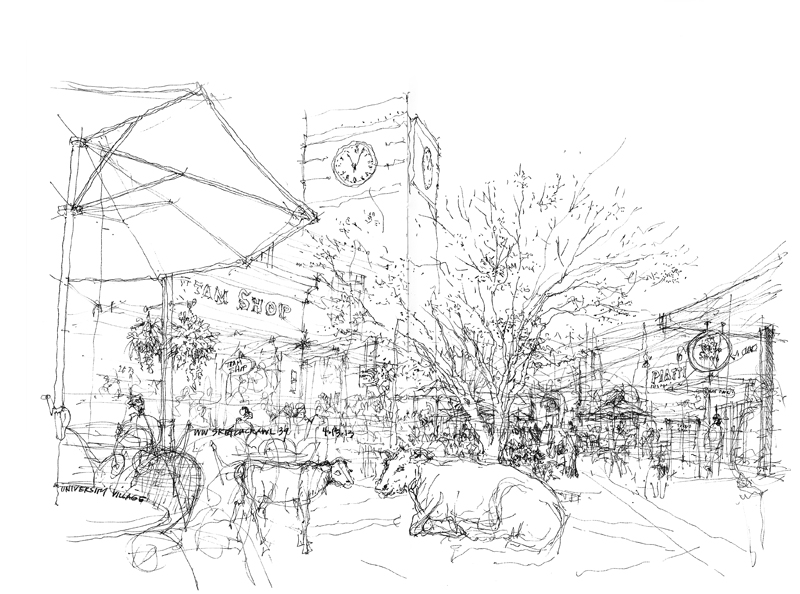
Yesterday was the 39th WorldWide SketchCrawl Day and you can view the results from around the world at <www.sketchcrawl.com> and <www.flickr.com/groups/sketchcrawl/>. To participate, a group of Seattle UrbanSketchers met yesterday at the University Village shopping center. It was so cold that I had to keep my hands moving constantly in an effort to keep my fingers warm.

I drew this scene out after moving one of the many available chairs around to get the viewpoint I wanted—the umbrella and table in the left foreground, Tokyo Sweets to the right to complete the framing, the cow, calf and tree in the middle ground, and the shops and tower in the background.

And no, that is not a real cow and calf, just metal sculptures displayed as public art for kids to climb on.


Surface and Depth

DrawingMagic

We draw by dragging, pulling, or in some cases, pushing a pen, pencil, or brush across a receptive surface to make marks that represent what we see or envision. This is the magic of drawing, that the ink, graphite, or paint marks we create can call to mind what we have seen and experienced, or what we foresee as an imagined future.

Surface

Some drawings simply lay on the surface on which they are created and tend to be seen and appreciated as 2-dimensional graphics or paintings, viewed through a frame. Due to my training as an architect, however, my personal challenge has always been to overcome the flatness of the drawing surface and create the illusion of space and depth on the 2-dimensional plane.

Depth

Depth2

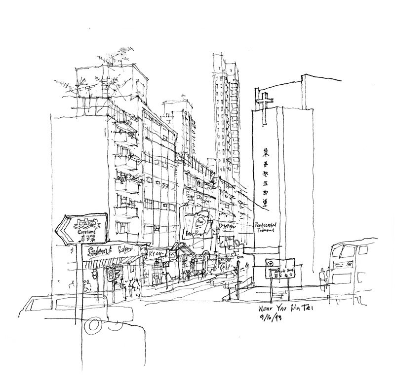
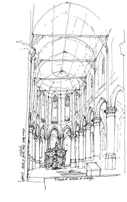
There are a host of visual depth cues, such as overlapping shapes and size differentiation, that I spoke of in a post from July of last year. Even when drawing 2-dimensional plans, sections, or elevations, we can use contrasting line weights, tonal values, or level of detail to imply depth.

LinearPerspective

Of course, when drawing experiential views on location, we rely heavily on linear perspective to create the illusion of spatial depth. The convergence of parallel lines, along with the associated principles of size and texture perspective are powerful devices that convince that we are seeing through the paper surface into the depth of a drawing.

LinearPerspective2

Where the Red Door used to be…

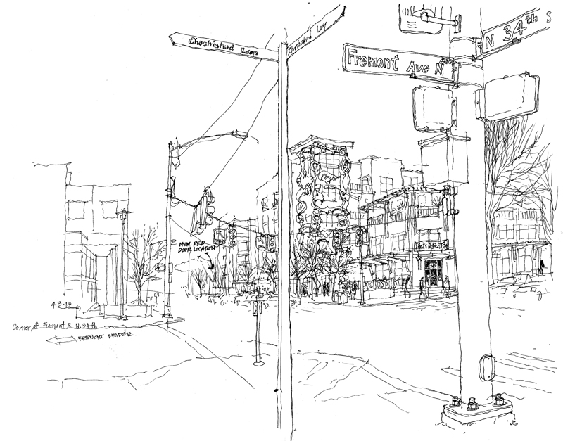
Here is a view of where the Red Door used to be, just a block east at the northwest corner of Fremont Avenue North and North 34th Street, now occupied by the Epicenter Apartment Building.

Epicenter

Peet’s Coffee & Tea occupies the street corner while the PCC Natural Market and other retail spaces fill out the ground level. Five floors of apartments rise above, adorned by an array of welded and polished steel sculptures, Mon Sruang (Thai for “Jewelry of Heaven”), by Fremont artist Mark Stevens. The Fremont Bridge is to the left and the new location of the Red Door Ale House is down North 34th Street.