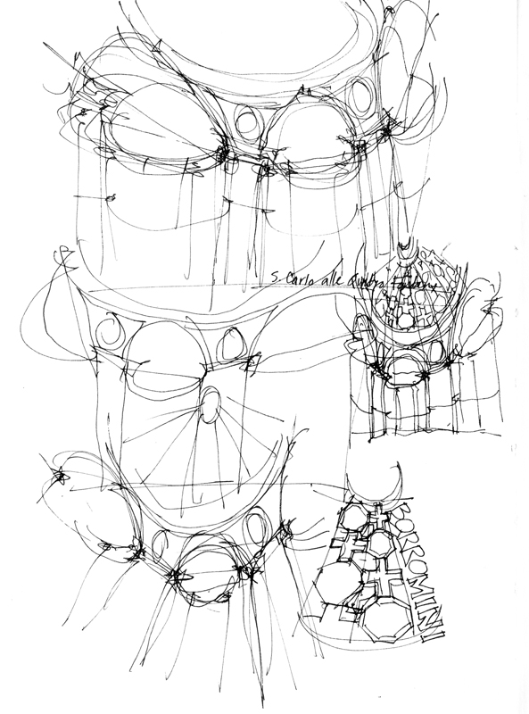
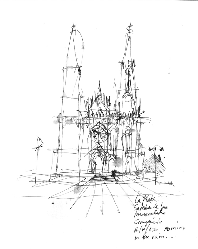
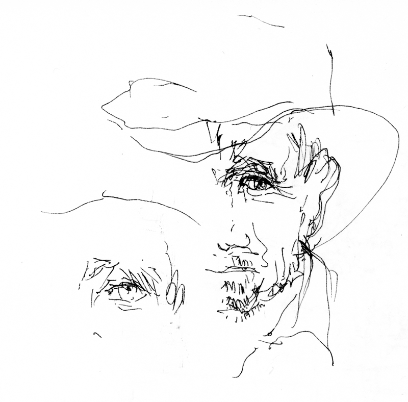
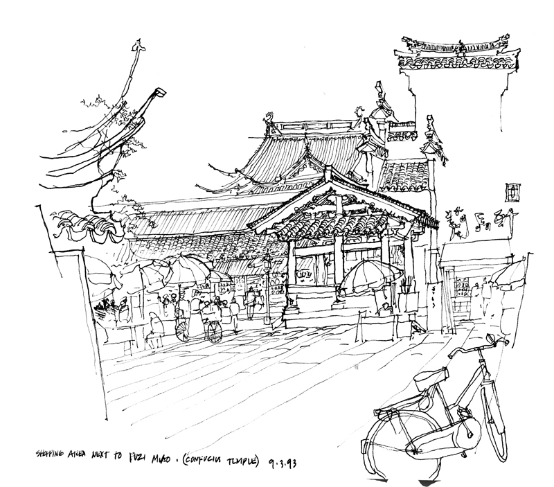
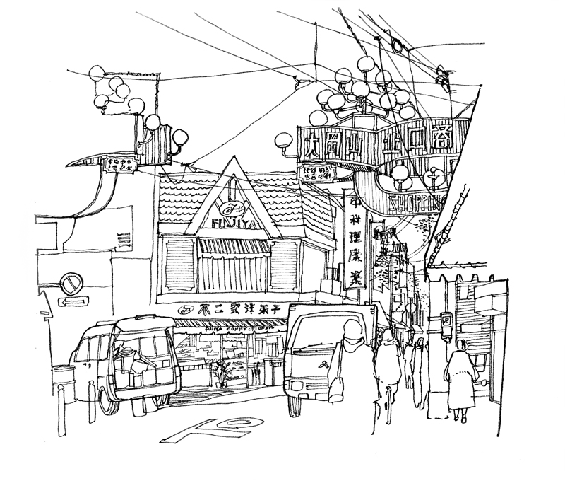
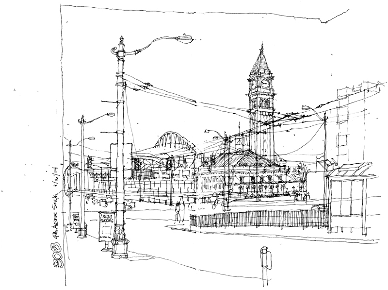
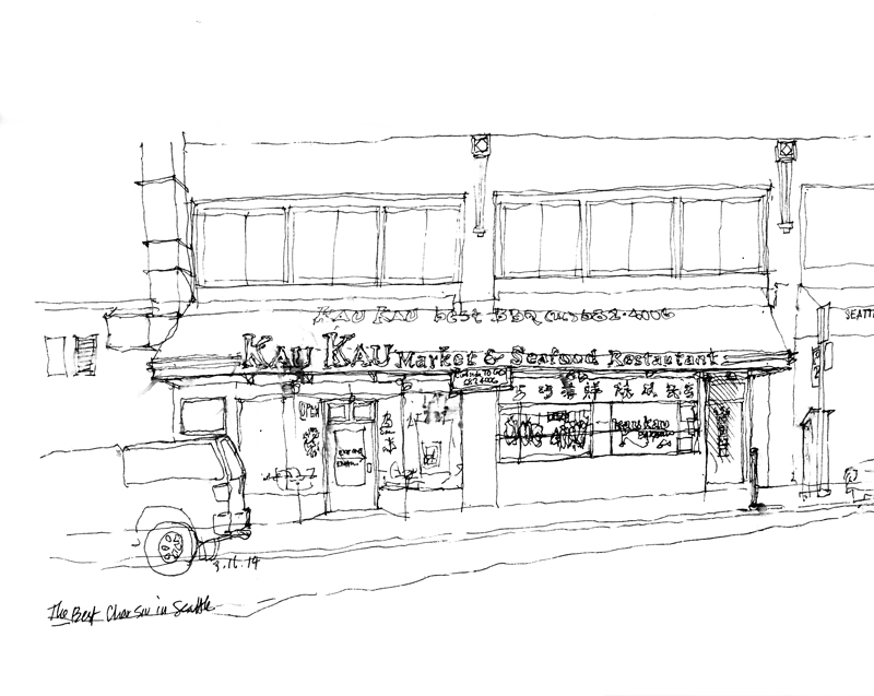
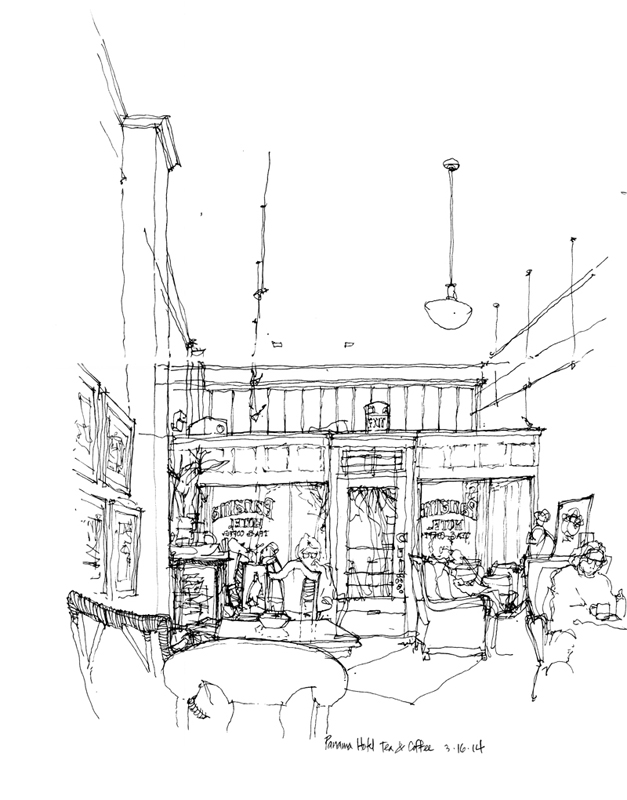
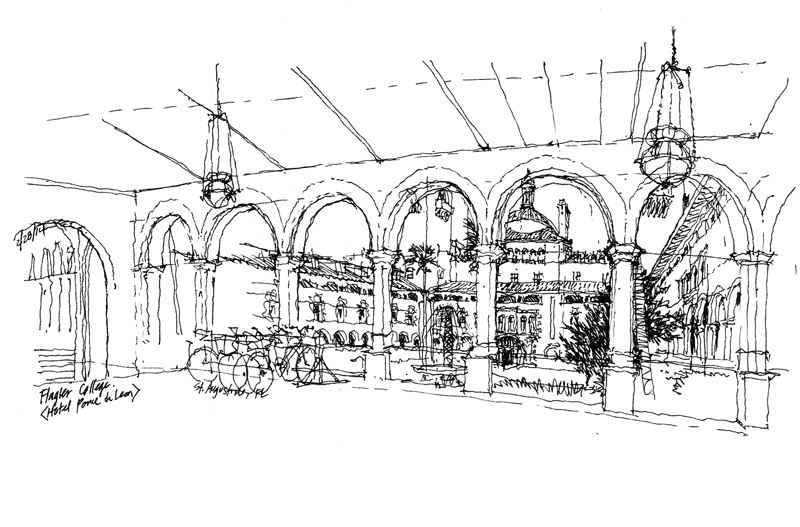
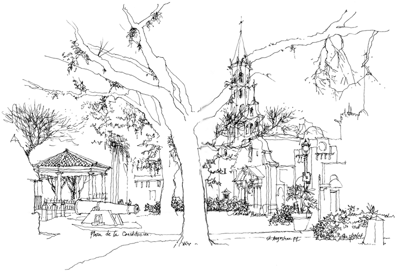
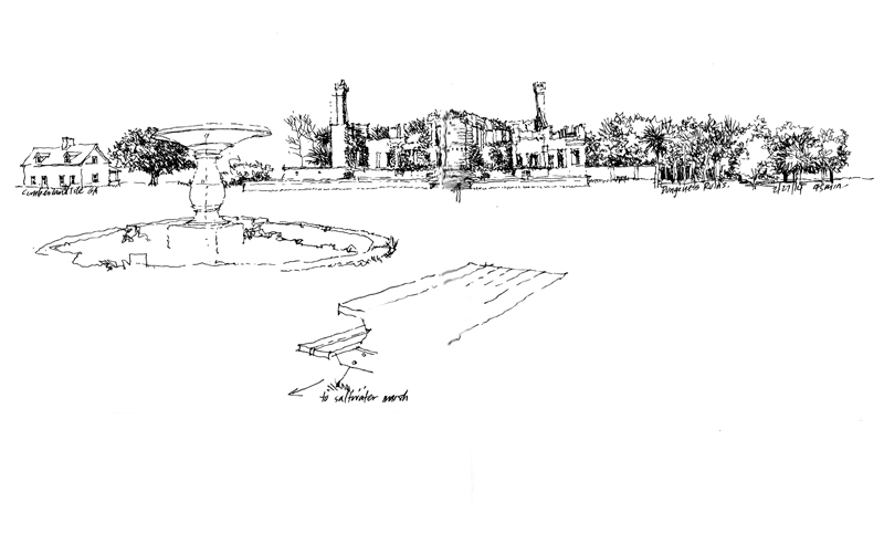
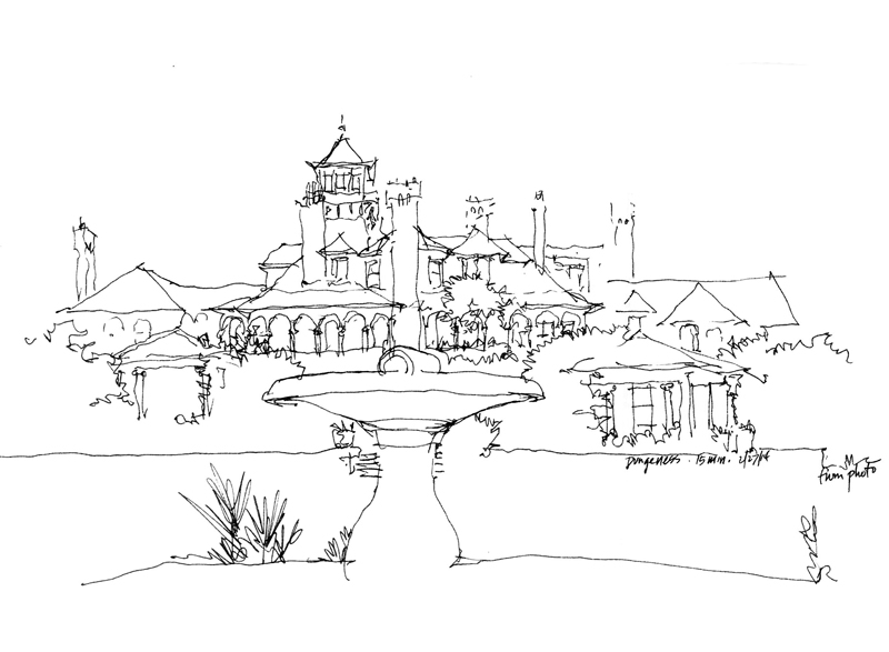
Whenever I view one of my own drawings or see someone else’s work, my immediate, instinctive reaction is to ask: How could the drawing have been improved? Sometimes, the answer is better composition; at other times, it’s more context. But the more common response for me is increased contrast.
I’ve written about this before but it bears repeating that contrast is a critical part of both seeing and drawing. Without seeing contrast, we are not able to differentiate one thing from another. And without drawing contrast, we diminish the hierarchy that creates interest and focus in a sketch.

There are several kinds of contrast that we can use in a drawing. Perhaps the most obvious is distinguishing between heavy and light line work to enhance spatial depth—what is near versus what is further away.

Another is contrasting areas of greater detail with spaces of lesser detail, or areas of precision with those of ambiguity.


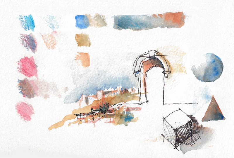
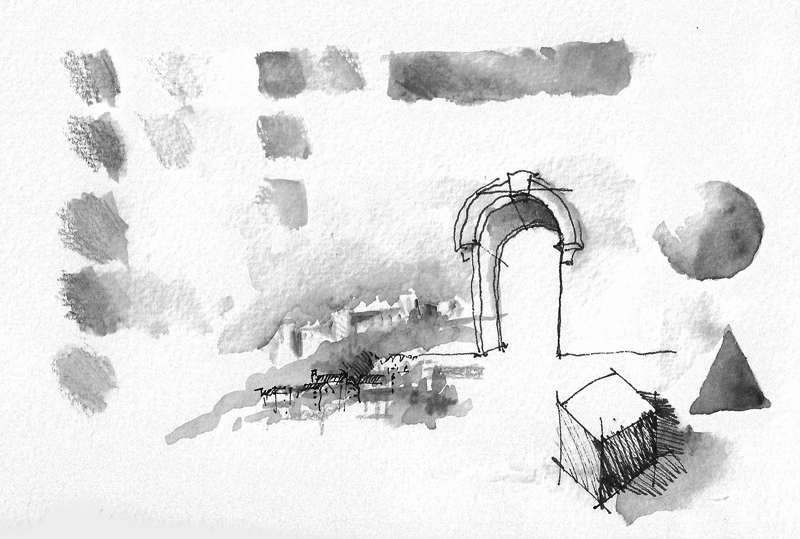
And in the case of watercolor sketches, it is definitely necessary to differentiate not hues but rather zones of tonal values.

