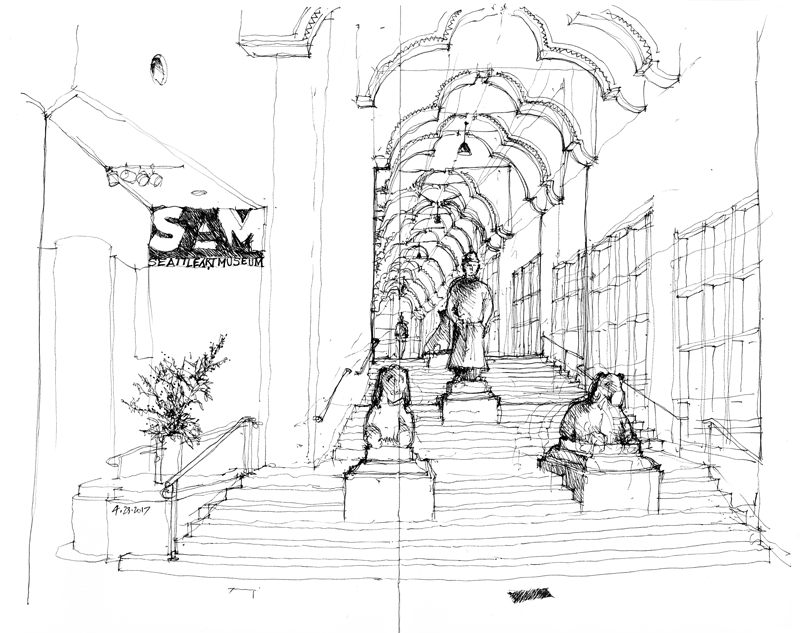
Seattle Art Museum


This is the original lobby of the Seattle Art Museum, designed by Venturi, Scott Brown & Associates in 1991, before the museum was expanded in 2006 in a design by Brad Cloepfil of Allied Works Architecture. A grand staircase traverses the rise from First to Second Avenues, mirrored on the outside with a similar set of stairs.

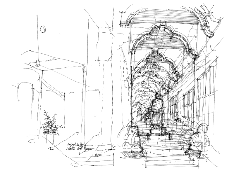
For comparison, below is the same view from 6 years ago, showing how I struggled with the issues of proportion and scale.

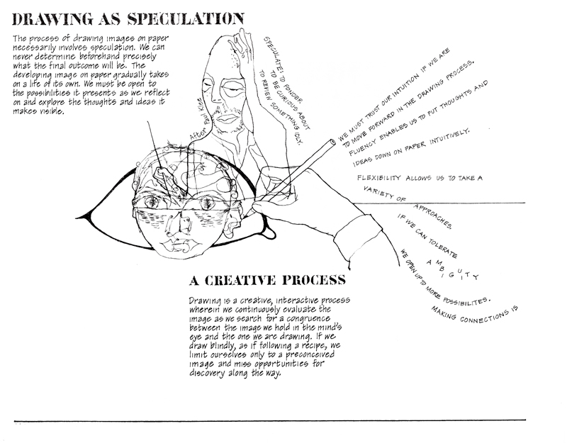
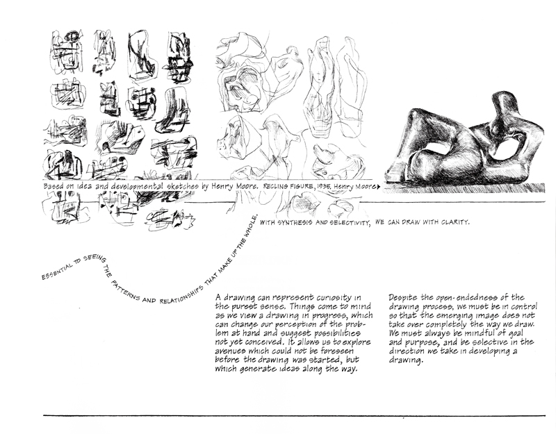
Drawing as Speculation

Taking a break from drawing on location, I am sharing two pages from Drawing: A Creative Process, a book I wrote and illustrated in 1990. I am referencing here drawing as a means of making thoughts and ideas visible, which is pertinent to the use of hand drawing in the design process. The discussion is not so much about technique as it is about the attitude with which one draws.

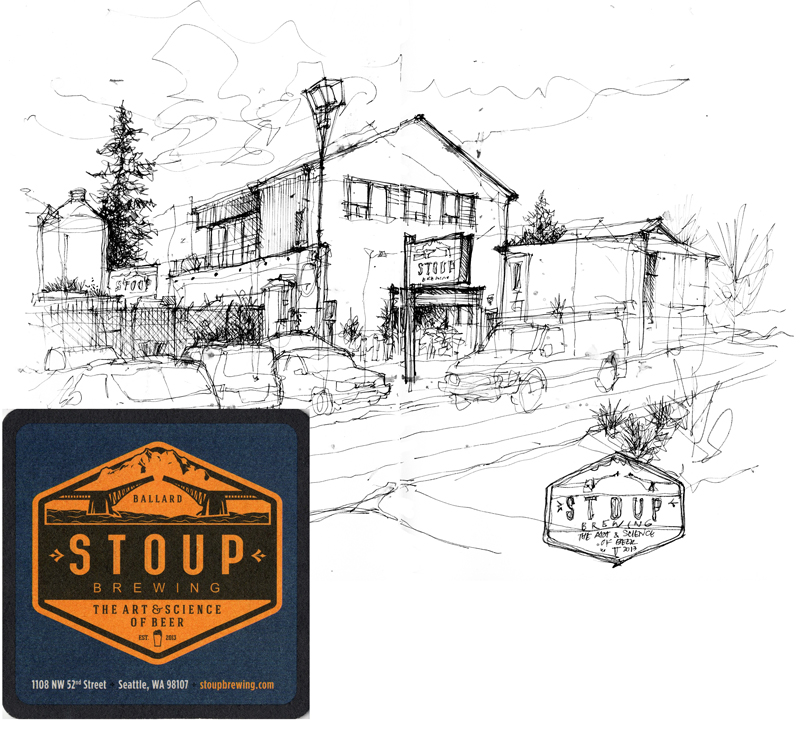
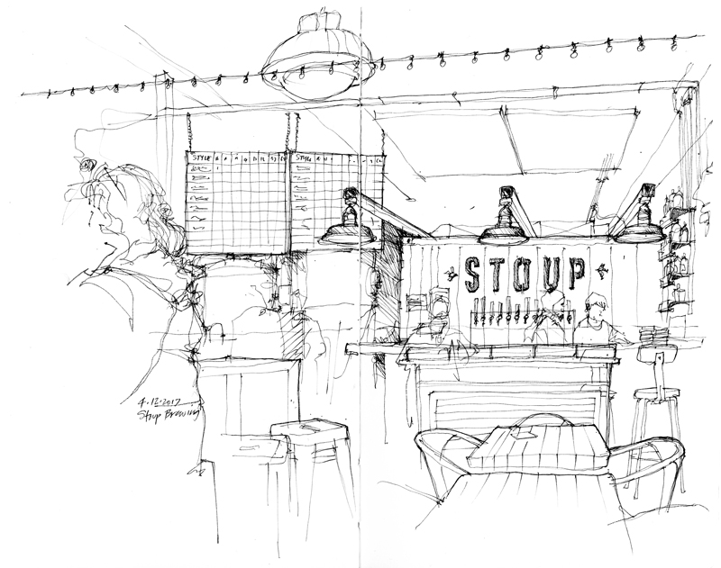
Stoup Brewing

Stoup, a word that originally referred to a flagon or beaker for drink, is the name of a small craft brewery in the heart of the Ballard Brewing District, just a few blocks away from Reuben’s Brews. Founded by Brad Benson, Lara Zahaba, and Certified Cicerone Robyn Schumacher, the brewery is housed in an industrial metal building, which you can see in the view above, just before it began to rain. I used the rain as an excuse to then go inside and savor a Citra IPA while I drew the interior view below.

Punctuation

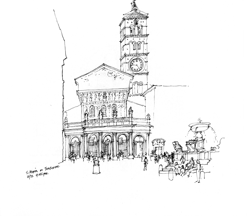
A quote from the Irish Literary Times: “Punctuation creates sense, clarity, and stress in sentences. It structures and organizes your writing.” I wonder if there is an equivalent element or principle in drawing that would also serve to create “sense, clarity, and stress” and organize the composition of a drawing.

Sense = Meaning; Clarity = Sharpness; Stress = Focus

The Principle of Contrast

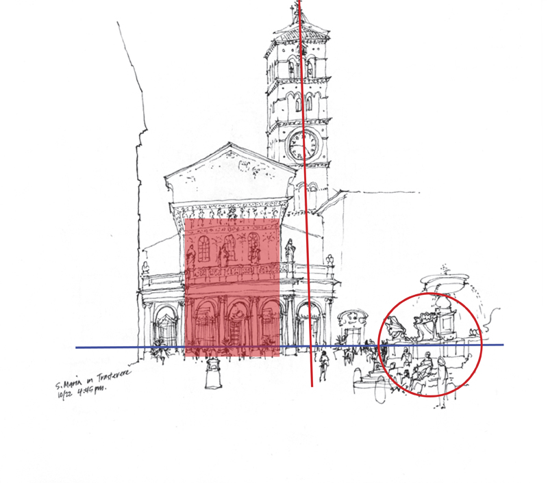
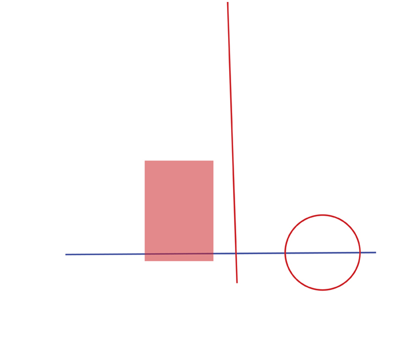
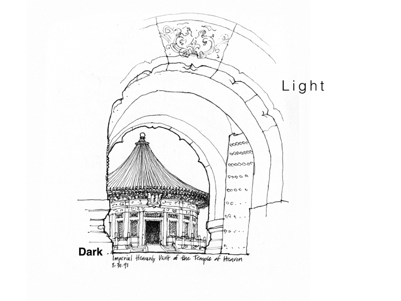
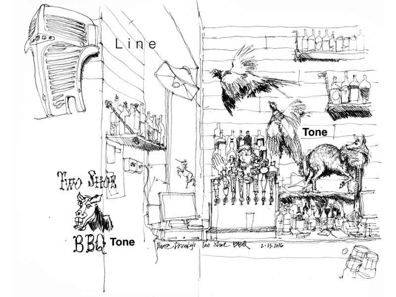
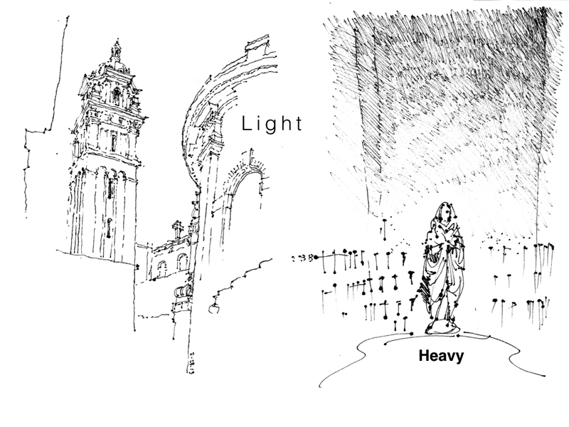
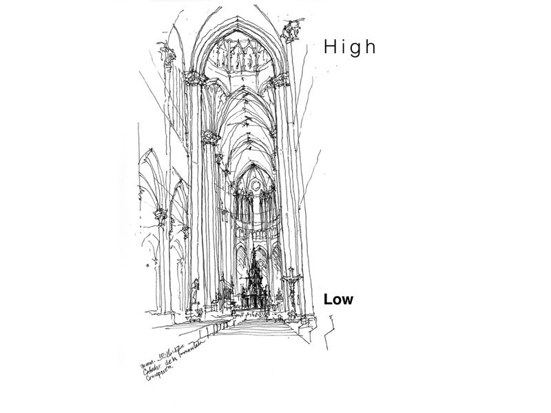
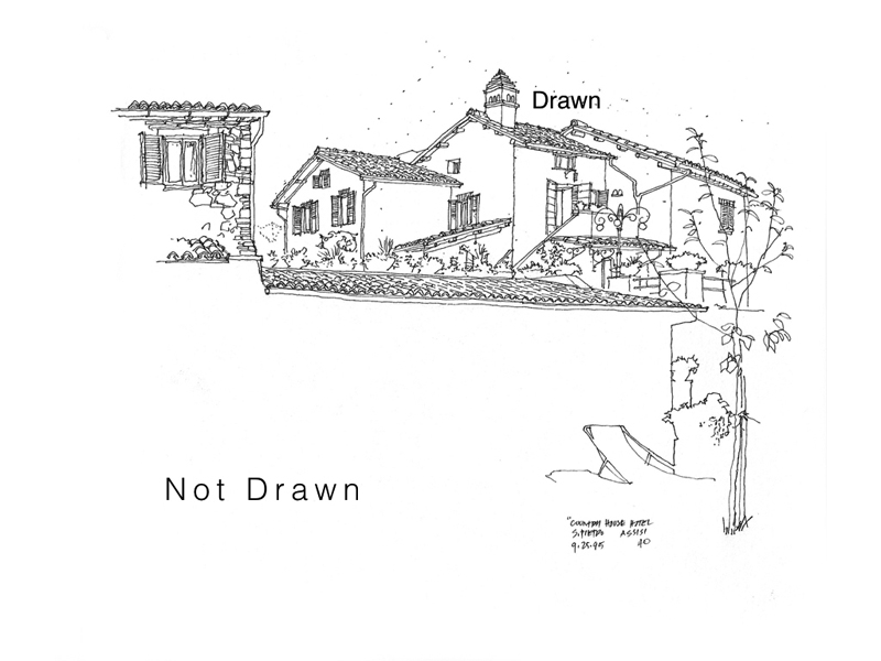
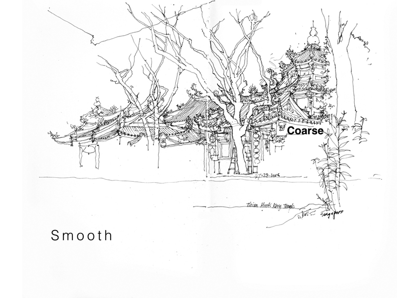
Back in 2012, I had posted a few examples of how I used contrasting tonal values to define form and draw attention to a particular area in a sketch. In this post, I want to expand on the idea of contrast—the discernible distinctions in line weight, tonal values, textures, details, and even relative position on a page—that is essential to avoiding blandness and giving life to a drawing. Here are examples of the different kinds of contrast at our disposal. Note how the visual tension between the two contrasting elements or areas contribute to the composition of a drawing.