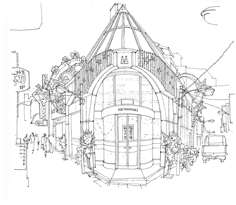
Stairs and Stairways


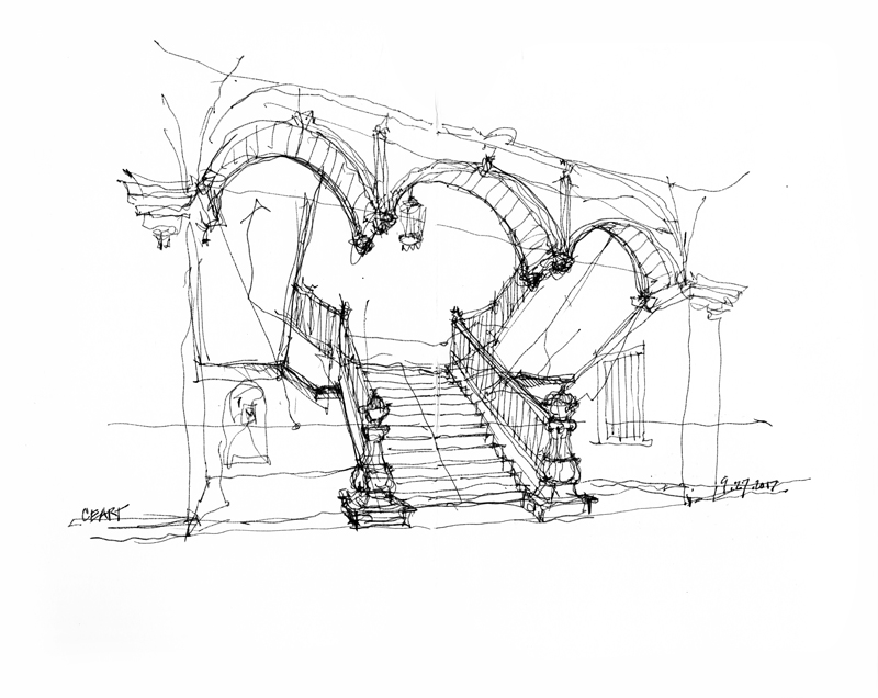
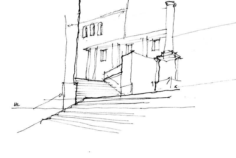
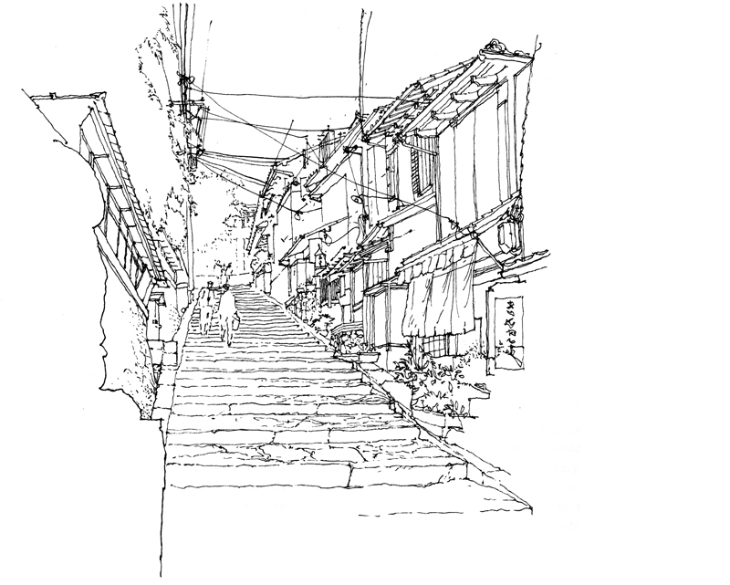
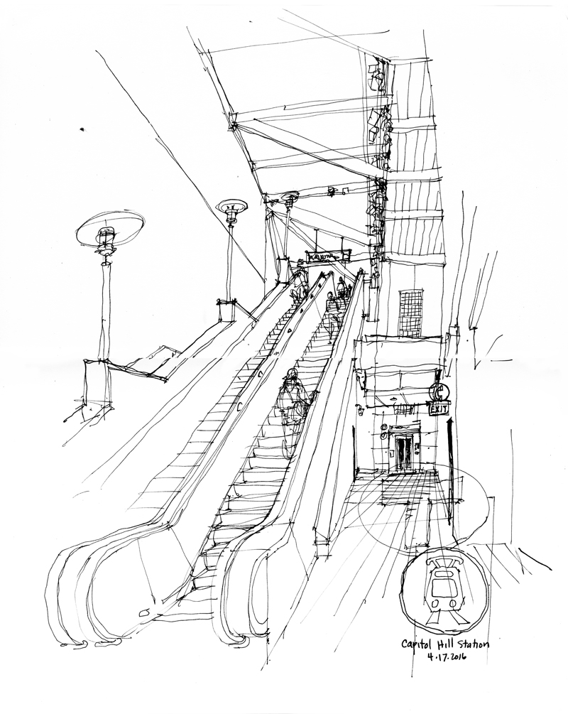
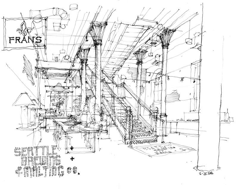
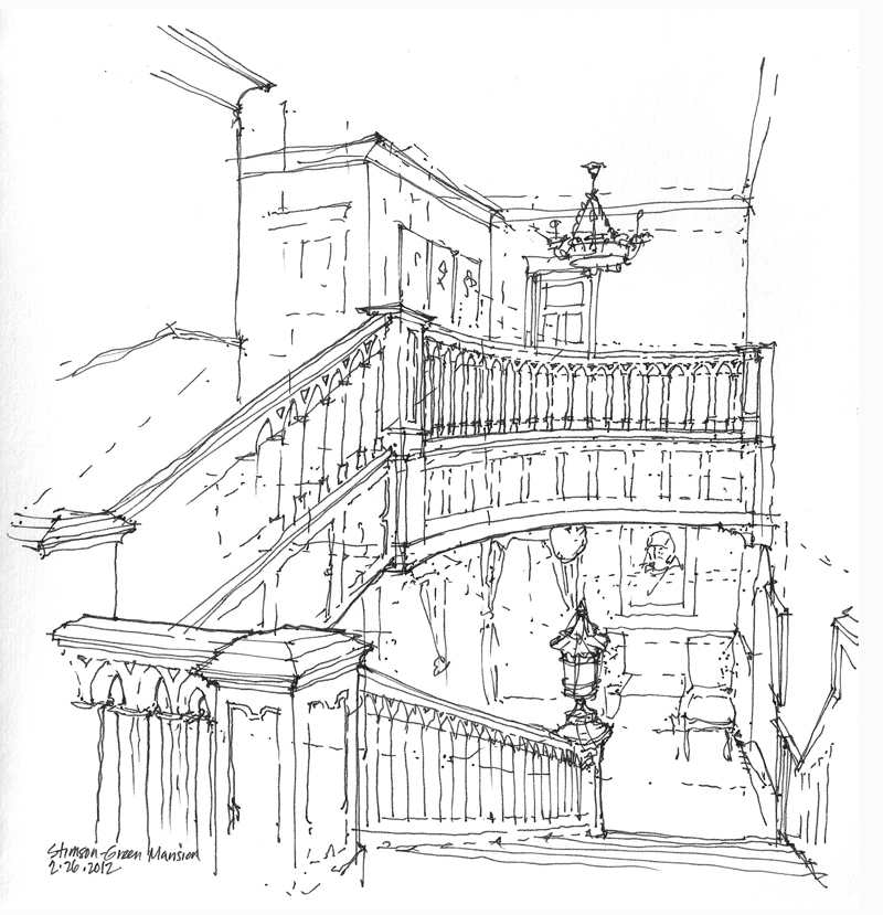
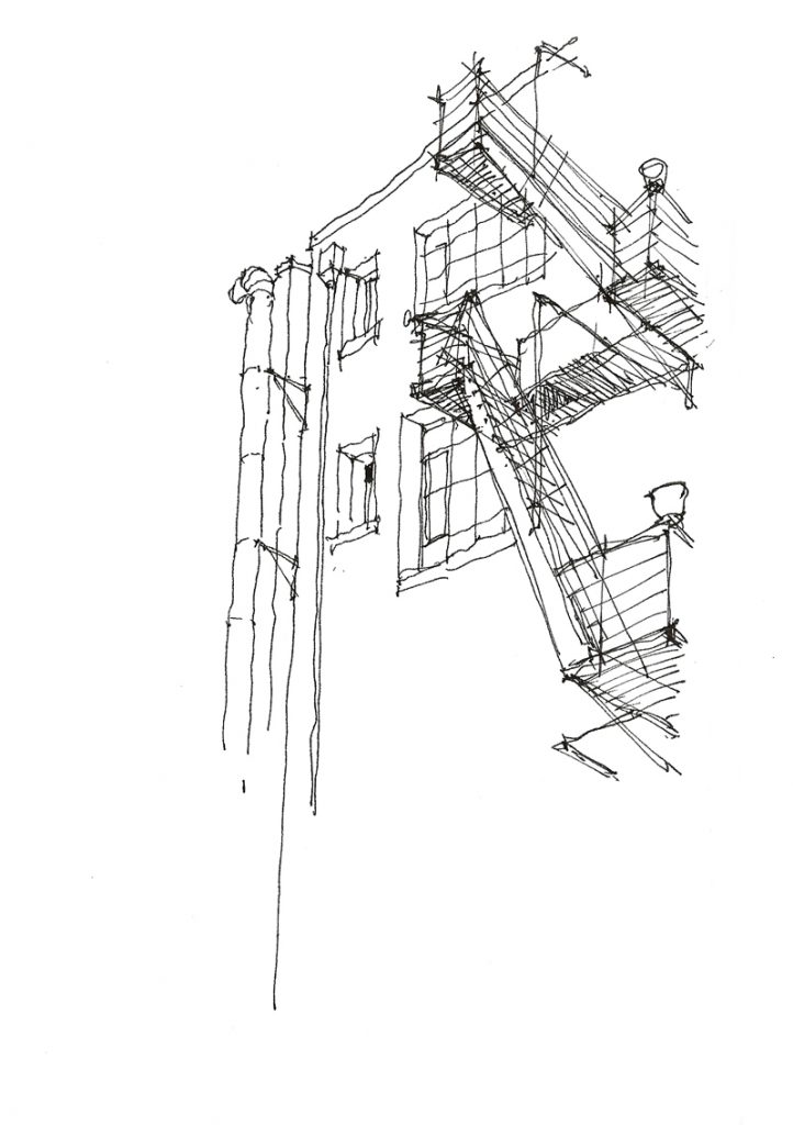
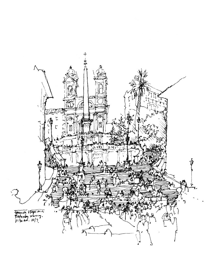
Drawing stairs and stairways in perspective can be daunting because they involve sets of parallel lines that rise or fall as they move away from us and therefore do not converge on the horizon line. Also, their multiple treads and risers make them seem more complex than they are. Here are a few stairways, both exterior and interior, that I have drawn.

One key to drawing stairs and stairways is to first establish the levels or landings that the stairs connect and then treat the stairways first as ramps, before subdividing the ramps into risers and treads. I should note here that reproducing the actual number of risers and treads may not matter as much as capturing their proper scale.

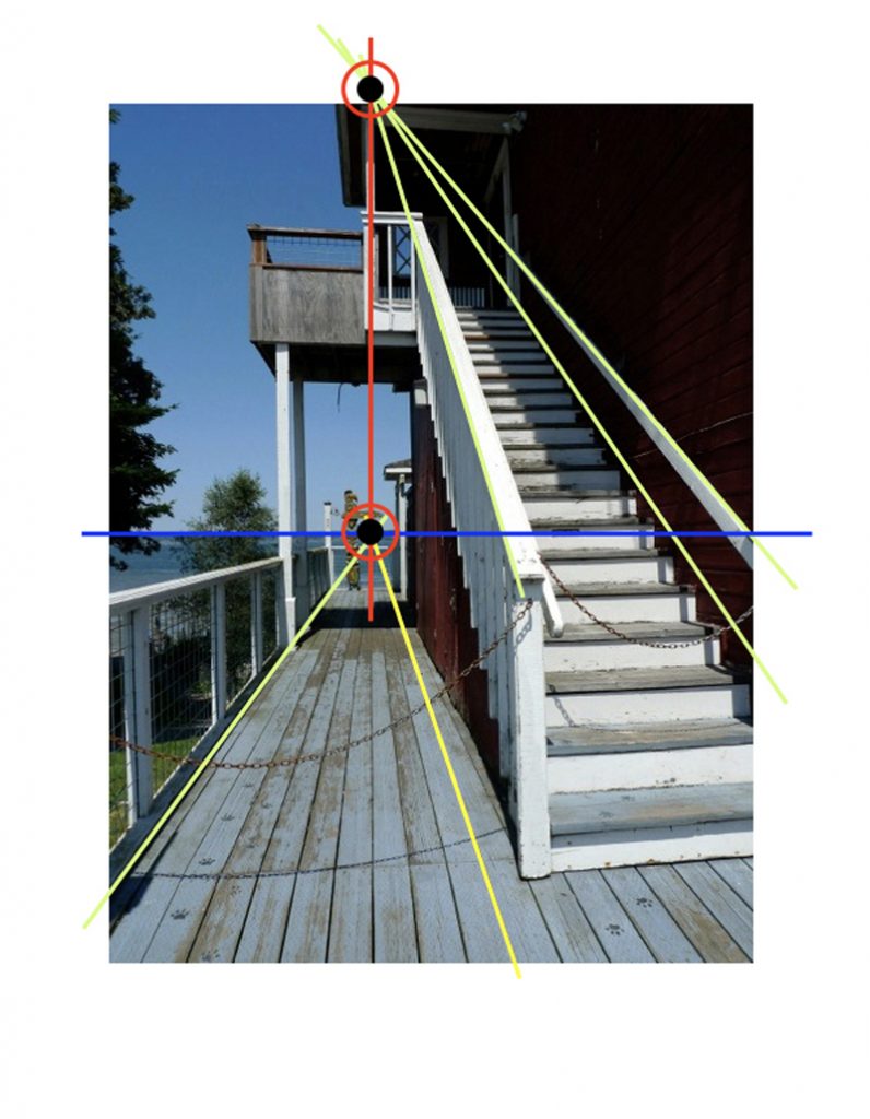
The photo above is overlaid with a diagram that shows how the vanishing point for a rising set of parallel lines is aligned vertically with the vanishing point for a horizontal set of lines that lie in parallel vertical planes.

Happy Lunar New Year!

Happy Lunar New Year and welcome to the Year of the Dog. The dog is the eleventh sign of the Chinese Zodiac and is the symbol of loyalty, honesty, and responsibility.

The above is a portrait of Xena, our Warrior Princess, a Red Heeler-Terrier mix we rescued a few years ago. Bearing a striking resemblance to Xena is Laika in a news photo by Alexander Chernov below. Laika was a stray rescued from the streets of Moscow to participate in the Soviet space program. Last November was the 60th anniversary of Laika’s trip aboard Sputnik 2. While not the first animal shot into space, she was the first to orbit the earth. Unfortunately, Laika didn’t survive her journey into the cosmos.

Panama Hotel Tearoom

I joined a few other Seattle Urban Sketchers last Friday at the Panama Hotel, a National Historic Landmark in Seattle’s ID District. This is a view of the tearoom, looking toward the main entrance backlit from the daylight streaming in through the storefront windows.

As a point of comparison, here is a similar view I sketched three years ago when I was seated a little closer to the front of the room. This illustrates how moving just a little bit—back or forward, left or right—can make a significant difference in the resulting view of a space. And also how contrasting tonal values influences our reading of spatial depth.


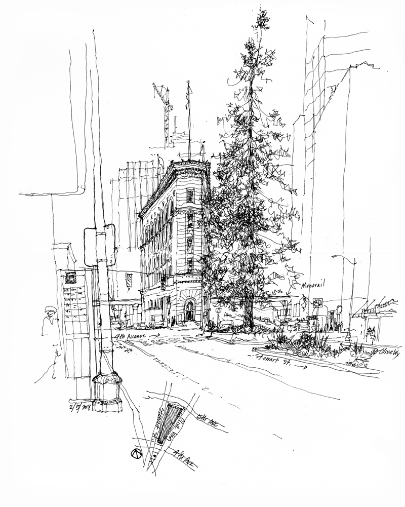
Times Square Building

This iconic triangular-shaped building, situated between 4th and 5th Avenues where Olive Way splits off of Stewart Street, was designed by Bebb & Gould and completed in 1915 for the editorial offices of the Seattle Times newspaper, which occupied its seven stories until 1930. It was added to the National Register of Historic Places in 1983 and designated as a city landmark in September 1984.

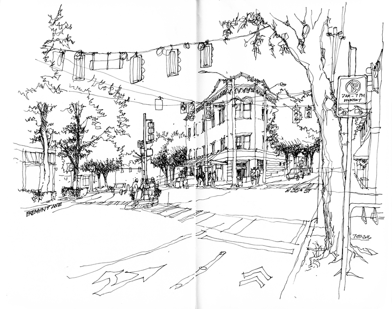
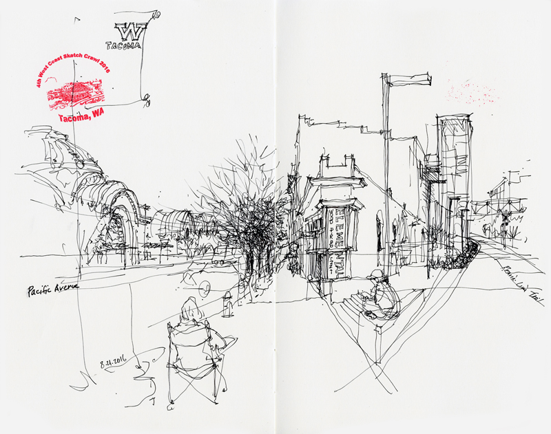
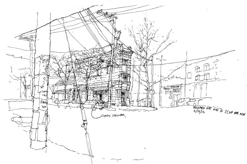
Below are views of buildings that also occupy acutely angled sites in various locations and at different scales.