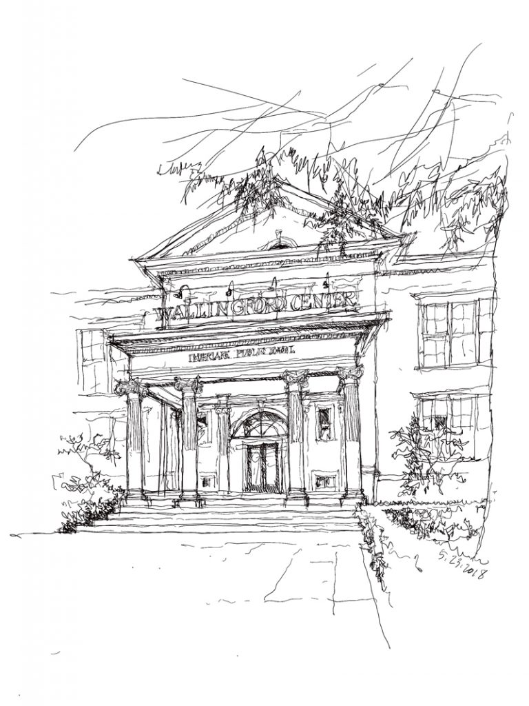
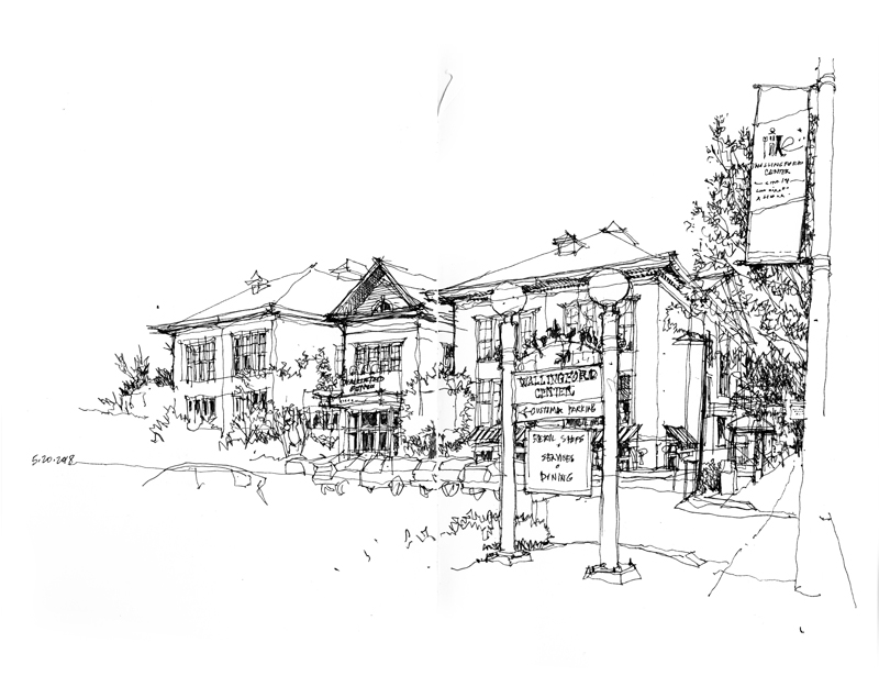
Here is another aspect of Wallingford Center, from the side opposite the view in my last post, showing the main entrance to the former Interlake Public School. Once I had completed the drawing, I noticed that the column-supported porch does not appear to be quite centered on the gabled projection. So if I were to draw this view again, I would make sure as I blocked the structure out to describe this alignment correctly—before filling in the details.
Monthly Archives: May 2018
Wallingford Center
A fine example of the adaptive re-use of a landmark building is Wallingford Center, developed in 1985 by Lorig Associates and designed by the architecture firm of Tonkin Hoyne Lokan. The original 3-story, wood-frame structure, built in 1904 to house the Interlake Public School, now houses a mix of shops, restaurants, and apartments. It is a historic Seattle landmark and is listed on the National Register of Historic Places.
Horn & Hardart
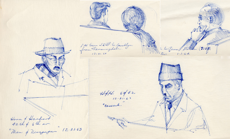
Finding things while rummaging around looking for other items from long ago always triggers memories. One example are these ballpoint-pen sketches from 1963, when an ND classmate invited me to spend Christmas break with his family on Long Island. During a day trip into the City, I was drawn to these individuals—creating “characters”—dining at a Horn & Hardart, an early version of a fast-food restaurant at the corner of 42nd Street and 6th Avenue. I still remember perusing the stacks of glass-doored dispensers containing a variety of hot and cold foods, putting nickels into the selected slot, and removing the plate of food.
A Charcoal Study
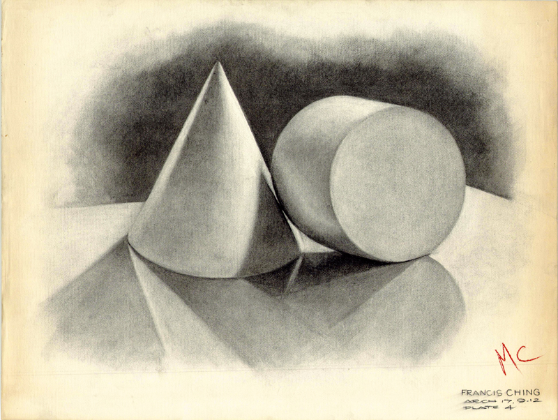
When I entered the architecture program at the University of Notre Dame in the fall of 1961, my first freehand drawing course began with charcoal studies of plaster casts. Being young and naive, I didn’t fully appreciate the pedagogy behind these tasks, but in hindsight, I can see now that these studies helped promote looking closely at geometric forms, noticing how light illuminated and reflected off of their surfaces, and appreciating the resulting subtle gradations of value. And then the challenge was trying to capture these visual qualities with a charcoal stick, a paper stump for smoothing and blending, and a kneaded eraser for lightening and creating highlights.
The Fremont Troll
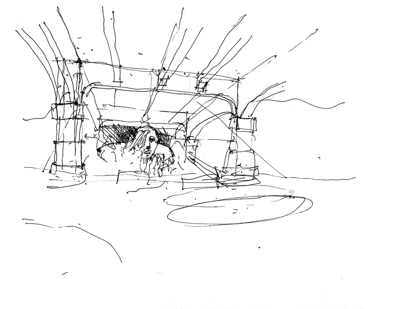
Much appreciation to all those who signed up for my Seattle 10×10 workshop and braved the cool temperatures and showers this past Saturday to draw outdoors at the Fremont Troll. Above is a drawing of the troll that I had done 6 years ago, and below is a quick demo of how I would begin to block out a view from across the street.

