To Meet or Not to Meet

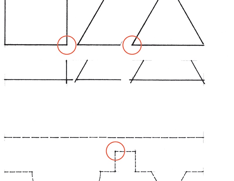
Before the advent of computer graphics, meeting lines deliberately at a corner had long been a maxim in the manual drafting of architectural and engineering documents. This may appear to be a minor detail, but in freehand drawing—from direct observation—how lines meet, or not meet, can convey much about the nature of the forms we are capturing.
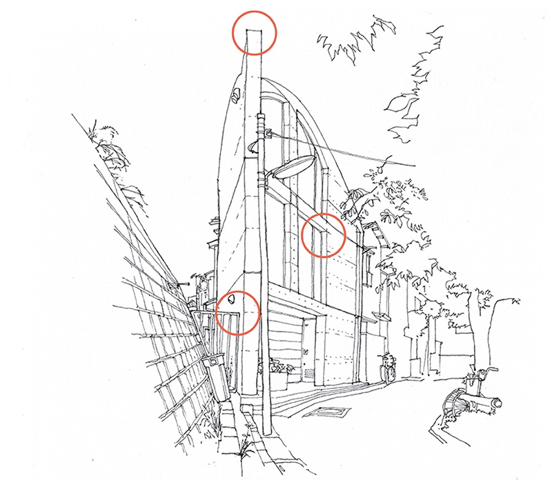
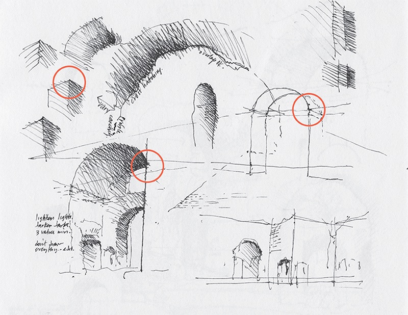
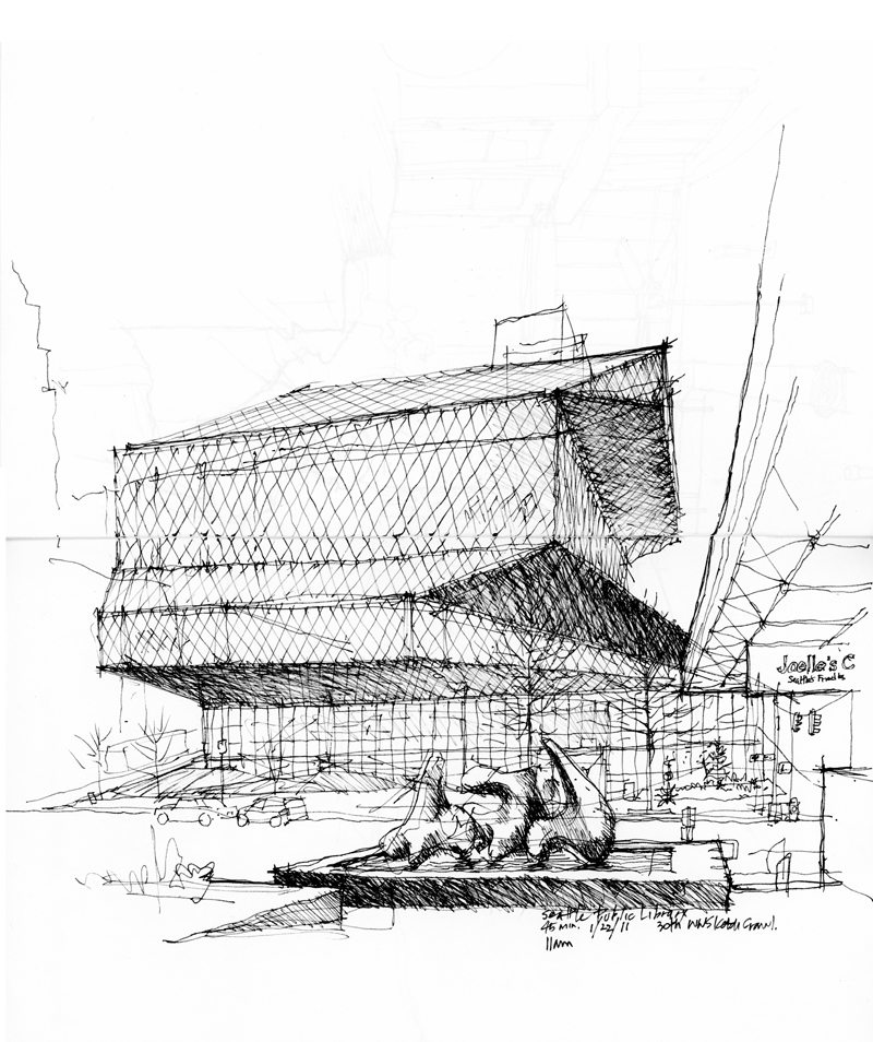
Take, for example, the drawings above, where meeting lines at corners can convey a crispness of planes and edges of volumes.
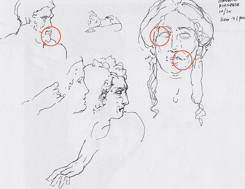
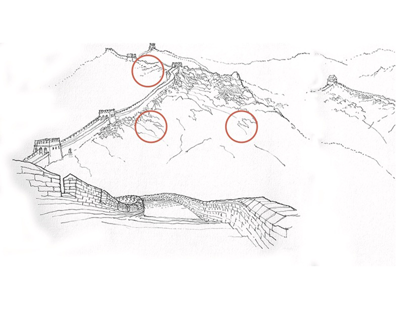
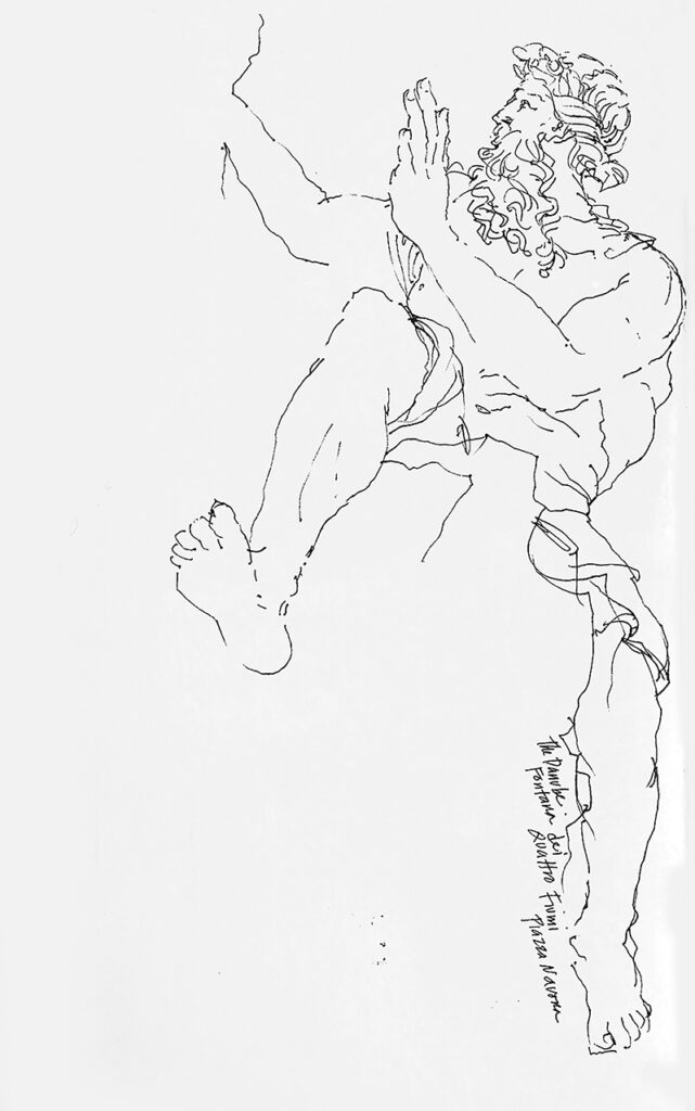
On the other hand, not meeting lines can convey the softness of curves and curvilinear forms, as in the sculpted nature of a marble bust or the contours of a landscape.
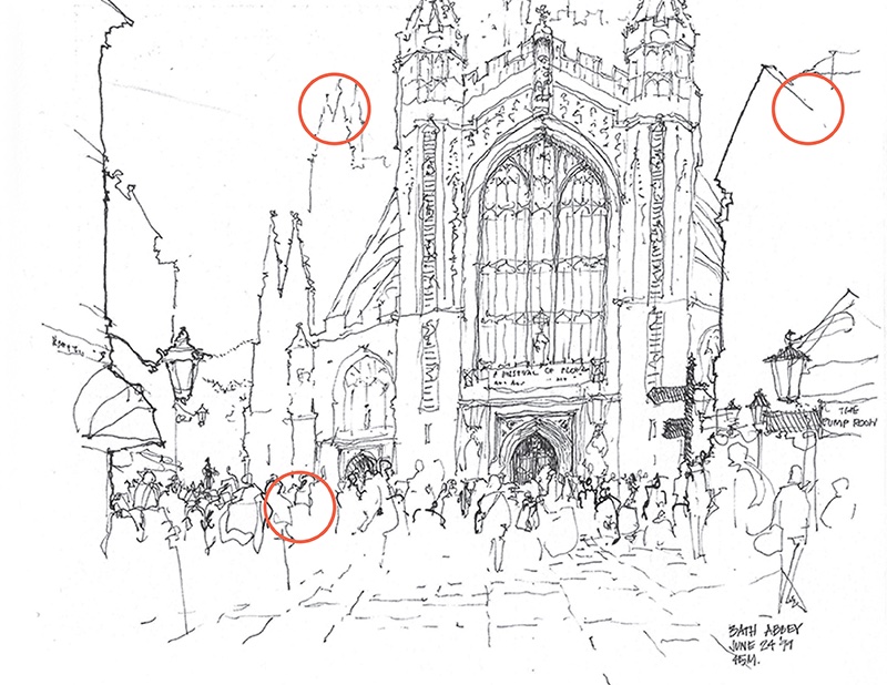
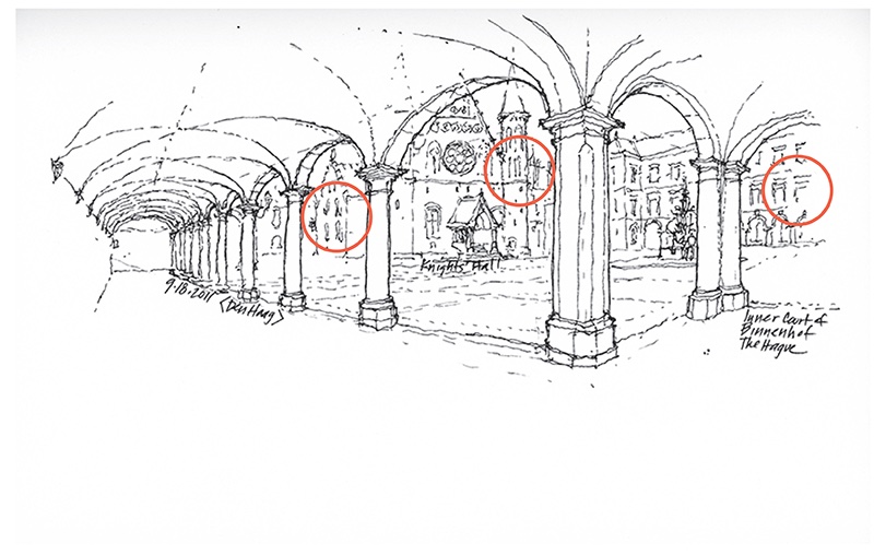
At times, the deliberate gaps between lines can merely suggest a form or create context without calling too much attention and detracting from the focus of a drawing.

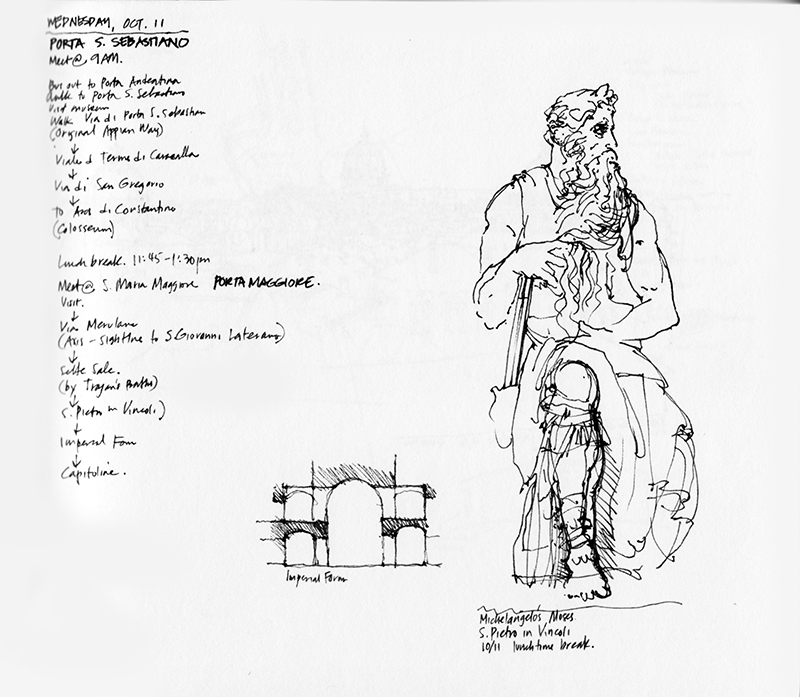
Trial and Error

In shifting our gaze from the subject before us to the paper surface with pen in hand, we must be able to hold the seen image in our head and recreate it on paper. Oftentimes, this translation can result in faulty proportions, as in this drawing of Michelangelo’s Moses in S. Pietro in Vincoli, in Rome. You will notice that I made a couple of attempts at getting the length of the lower right leg to match what I believed I saw in Michelangelo’s sculpture. This is an example of how the process of drawing from observation requires continually assessing whether the proportions and scale of the drawn image matches those of what is seen—a matter of trial and error.

Above is another example, where, beneath the gridded facets, you might be able to see my initial attempts in roughing out the forms of the Seattle Central Library by OMA/Koolaus. Initially, I drew the forms too narrowly given the building’s height. I kept increasing the width as the drawing developed. In looking at the drawing now, it seems that it could be wider still.

Notan

This a line drawing of the Danube, one of the Four River Gods in Bernini’s fountain in Rome’s Piazza Navona. The line is the quintessential element of drawing, able to convey to the mind’s eye three-dimensional forms in space, often not by its presence but rather by its absence—where we decide to stop a contour…and pick it up again.

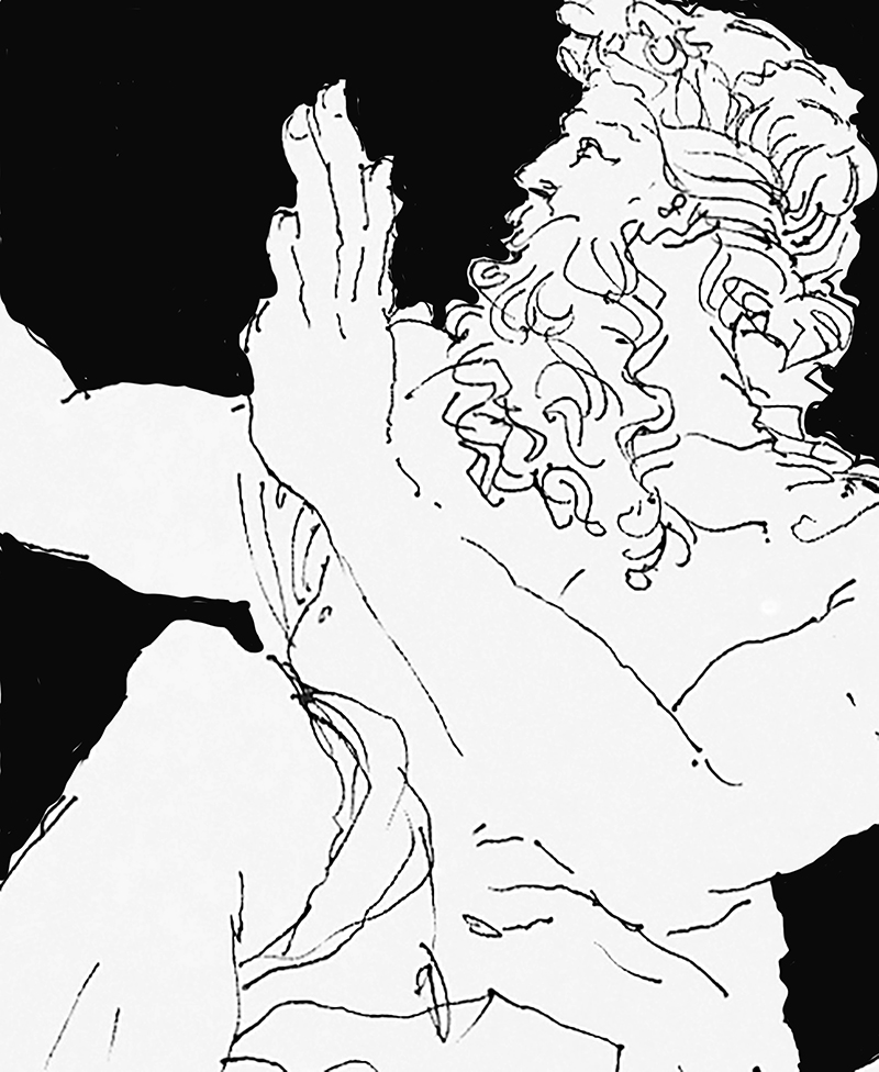
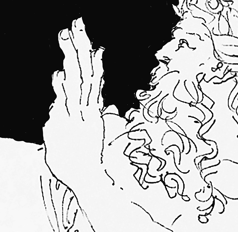
These cropped enlargements of the original drawing use areas of black to emphasize the negative spaces of the drawing and the white of the sculpture. This brings to mind notan, the Japanese term for “light dark;” some translate it as “light dark harmony.” It is a concept revolving around the placement and interplay of light and dark elements in the composition of a collage, drawing, or painting. It is valued as a way to study possible compositions without the distractions of color, texture, or details.

Drawing Lessons

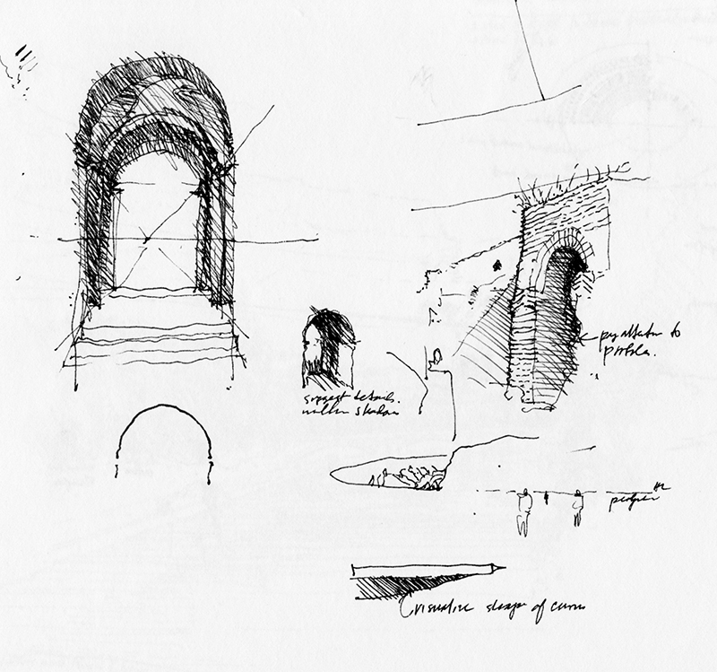
From a Rome journal, two pages of sketches drawn during a teaching session. The first page contains explanatory sketches accompanied by bits of concise text: “Pay attention to profiles”…“Suggest details within shadows”…“Visualize shape of curves.”

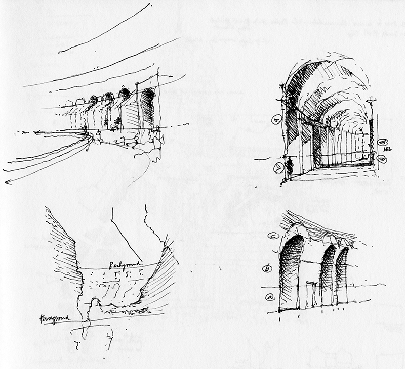
The second page illustrates how to estimate proportional heights above and below an imagined horizon line.