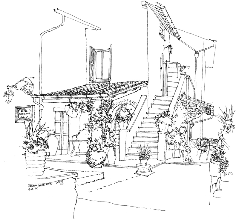
One of the issues Frank B. and I had discussed in our last meeting was establishing layers of depth in a drawing, which is one of the difficulties we face when we try to convey three dimensional environments on a two-dimensional page. There are a number of depth cues that we can rely on, such as linear perspective, size perspective, and overlapping shapes. But the one I want to illustrate here uses one of the principles of atmospheric perspective to enhance spatial depth—contrasting levels of detail to distinguish near from far.
Here are three examples, each one drawing attention to a different extent or range from the viewer. The first focuses on what is near and blurs the background.
The second details the middle ground and blurs the foreground and background by drawing their outlines only.
The third drawing focuses on the Amalfi cathedral toward the rear and suggests the middle ground and foreground to establish the context.
In each case, choosing what to emphasize and then using sufficient contrast are necessary to distinguish near from middle and far.


