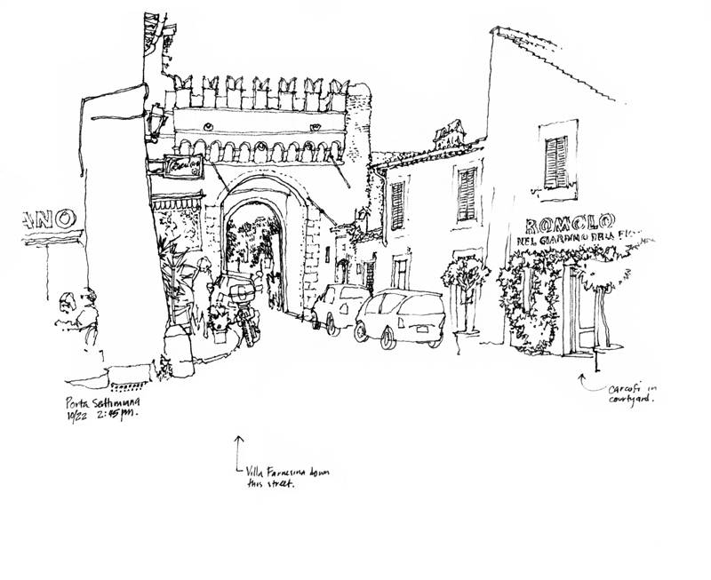
Once we have decided on the subject matter for a sketch and established a particular point of view, we turn our attention to framing and composing the view on the page. A useful guide about which I had posted five years ago is the rule of thirds. Many photographers are familiar with this strategy of divided the image field into nine equal parts with two equally spaced horizontal and vertical lines, and placing points of interest at any of the points of intersection or laying out important compositional elements along any of the horizontal or vertical lines.
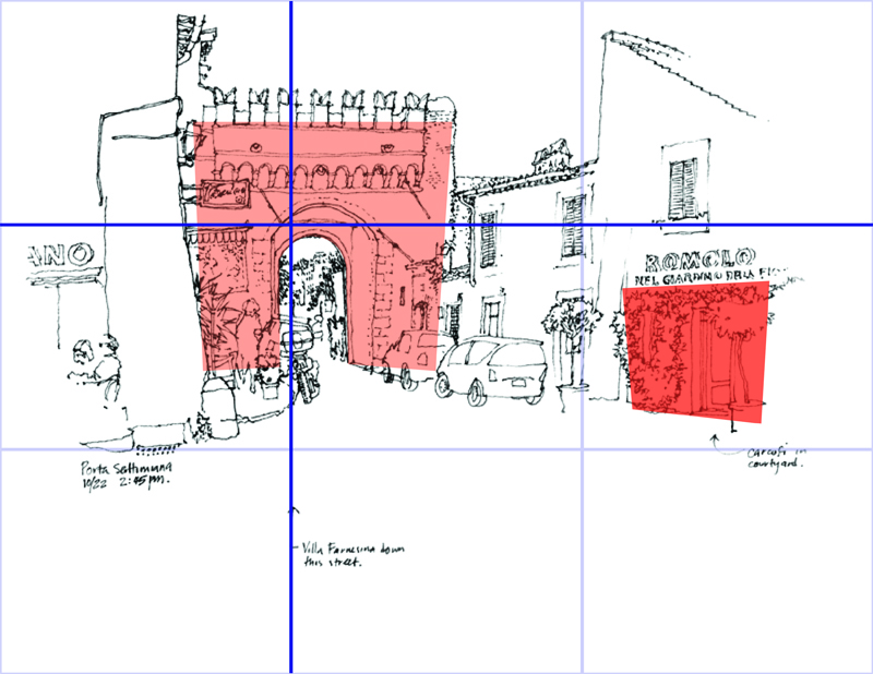
Overlaying this grid of thirds onto the above drawing shows how the plane of the porta is placed at the upper left intersection and is balanced by the element on the right.
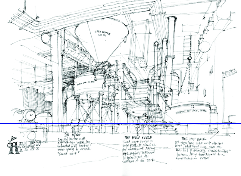
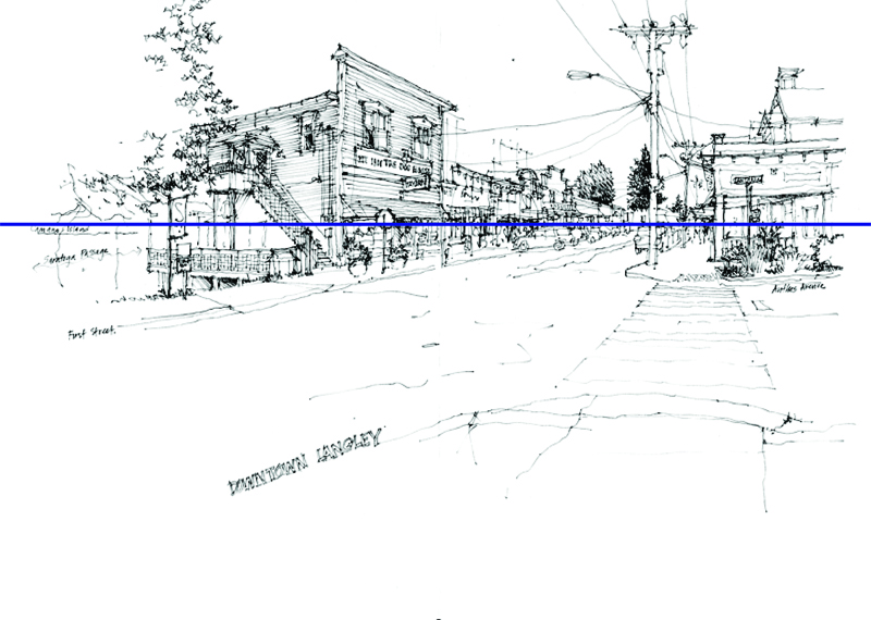
Here are two drawings, both of which use a horizontal line as the basis for the composition. One is along the lower third to emphasize the view upward while the other is on the upper third to show the foreground and convey a greater distance between the viewer and what is viewed.
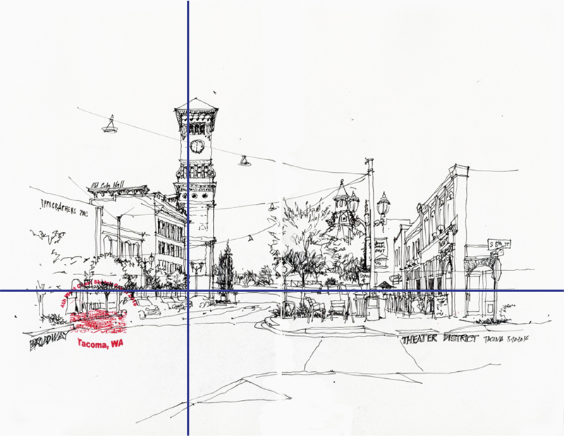
In this drawing, both a horizontal and a vertical grid line serve to organize the urban scene.
Of course, the rule of thirds is not a precise method for placing compositional elements. Rather, the general idea is to place important points of interest off-center to create greater visual tension and more dynamic compositions.
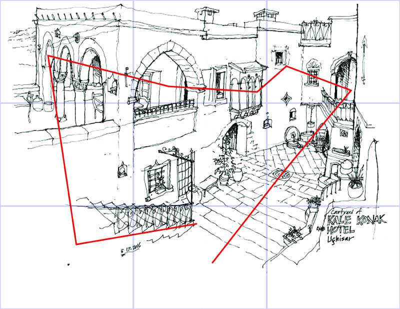
And sometimes, the scene requires accommodating multiple centers of interest that draw the eye into and around a drawing.
