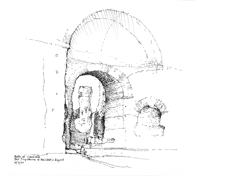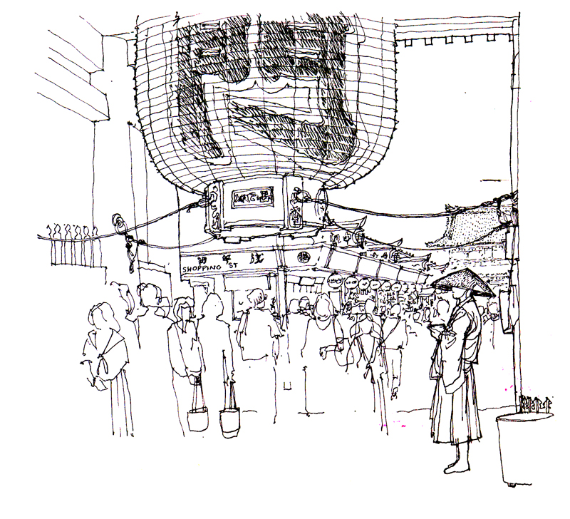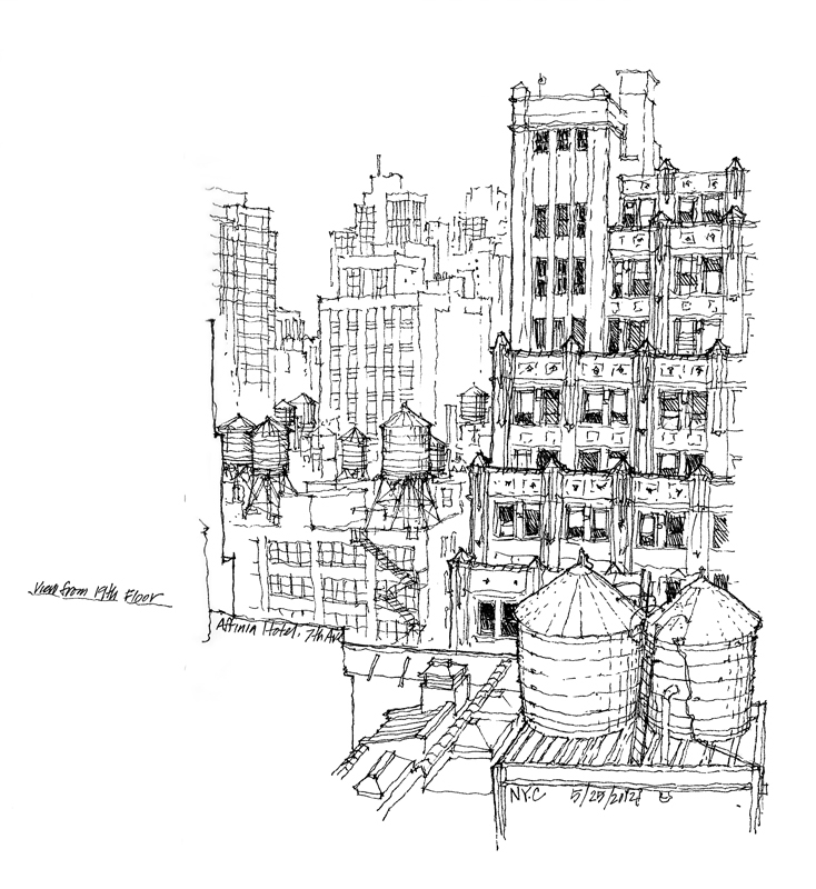
Looking out at a scene, whether it be an interior space or a public square, we can usually discern three zones of depth—what is near to us in the foreground, what is in the middle ground, and what lies beyond, in the background. As we scan what lies before us, both at what is near and what is farther away, our eyes are capable of focusing and refocusing extremely fast, making it seem that everything is in focus all of the time.
But to convey a sense of space and depth—spatial depth—on the page, an effective graphic means is to treat each zone of depth differently. So we might, as in the first example above, treat the background with more emphasis and merely outline or suggest what lies in the foreground and middle ground, which we use to frame the view.

Or we can focus on what is in the foreground and blur or merely hint at what lies beyond, as in the view of Asakusa Temple in Tokyo above.

Or we can emphasize the middle ground and outline the foreground and fade out the background, as in the above view of New York City.
