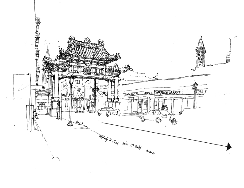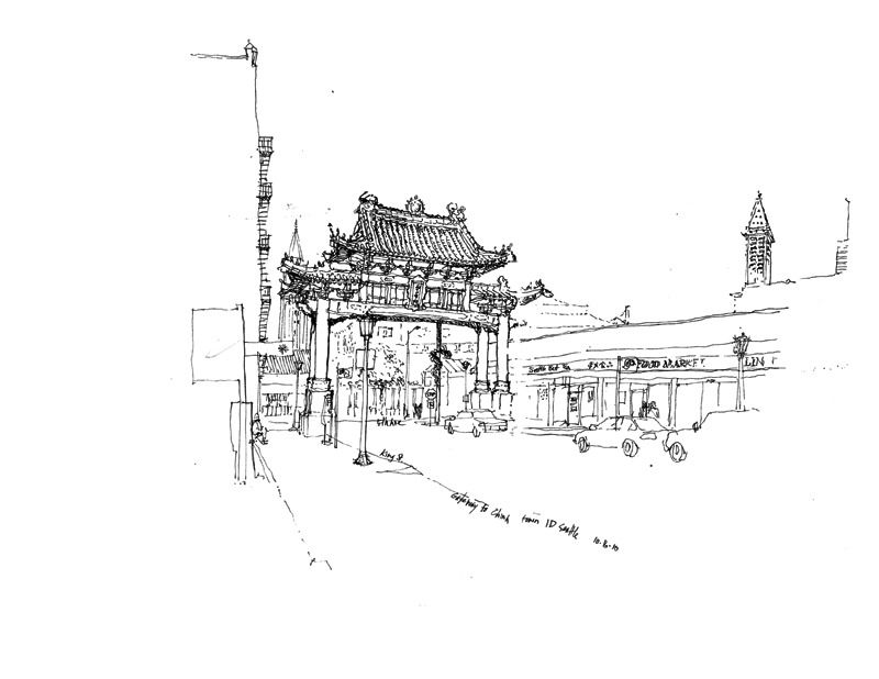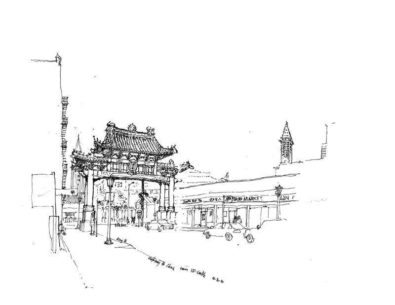
The Chinatown gateway in the last post is a good subject to use in illustrating how placing the focus or principal subject of a drawing on a page affects drawing composition. I tend to see that certain subjects, such as the gateway, have a directional aspect to them. They face a certain way and project visual energy in that direction. So in placing such subjects, I use white space to absorb that energy.
Here are two other possibilities for placing the gateway on a page.


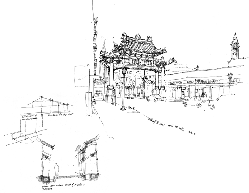
Of course, if the gateway is not the only drawing on a page, then other elements can be used to rebalance the drawing composition.

