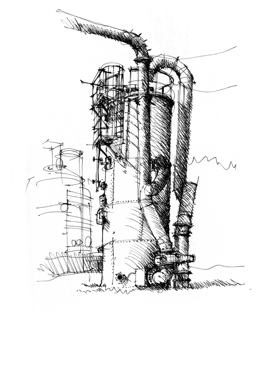
An important principle that can be applied to any drawing, regardless of the style or technique one employs in its execution, is the principle of contrast. Without contrast, we see none of the differences that contribute to identity and meaning—distinctions in line weight, tonal values, textures, details, and the use of white space.
Here are three examples. The first is of structures at Gas Works Park, where I exaggerated the range of tonal values—making the dark values darker than they really are and correspondingly, lightening the light areas—to emphasize the cylindrical nature of the tanks and pipes.
The second is of the Pantheon, where I used a simple contour line to define the building in the foreground, drew some details to establish the people-filled space of the square dominated by the obelisk, and applied tonal values to draw attention to the portico.
The third is of Red Square on the UW campus. Here, I deliberately dropped off detail on the facade of Suzzallo Library from right to left so that the darkened obelisk sculpture would contrast with and stand out in the left foreground. From there, the eye moves from the obelisk sculpture to Rainier Vista on the right between Suzzallo Library and Gerberding Hall.


Pingback: Frank Ching as a Hand Drawing Expert and Author | Drawing + Hand