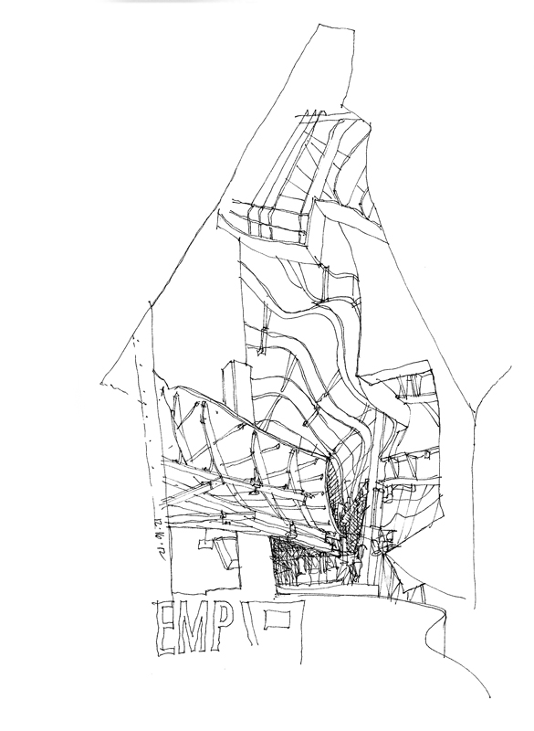
The Seattle Urban Sketchers met yesterday on a cool, rainy Sunday morning at the Experience Music Project, designed by Frank Gehry. While I may not be a fan of the design as a whole, I do appreciate the amazing spatial compositions and vignettes created by the curved steel framework and the metal and plywood sheathing.
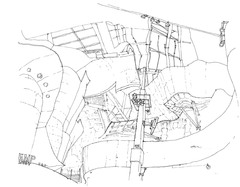
On the one hand, spaces such as this lobby of the EMP are relatively easy to draw because there are few straight lines and one need not pay too much attention to the pesky subject of perspective. On the other hand, what is often difficult is ensuring that the curvilinear surfaces do not overpower the sense of space as they hover overhead.
In this case, I started with the one measurable item I could see, the vertical column, and then worked my way from the contours of one curved surface to the next…and the next…and the next, all the time trying to maintain the spatial relationships of the major forms. The view is obviously beyond one’s normal cone of vision but it does replicate the feeling of being enveloped by the space. The only thing missing are the bright colors of the metal sheathed walls.


