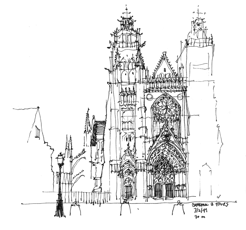
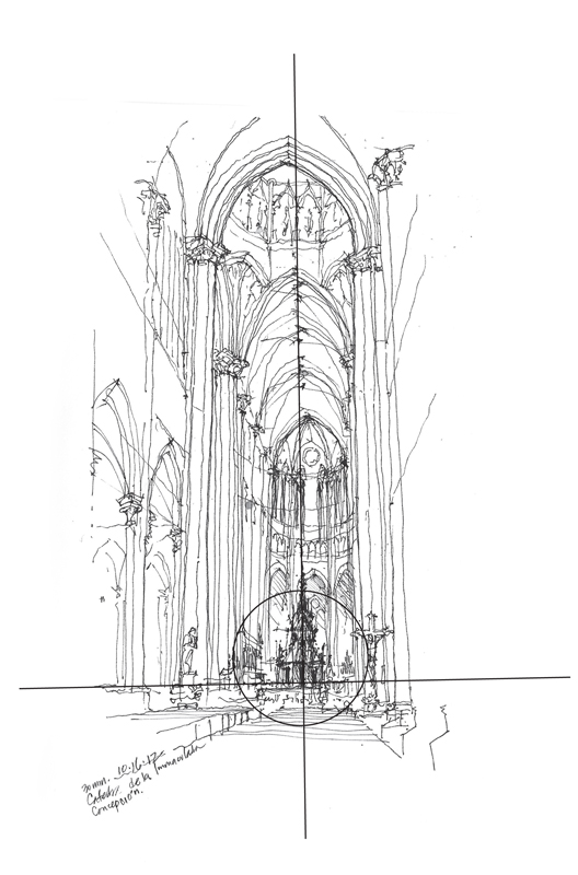
As we decide how we are going to compose a scene and lay it out on a page, we are juggling drawing elements to maintain a delicate balance between a static state and one of dynamic disarray. The elements that we balance are points of interest that draw the eye—an area of contrasting tone or increased line weights, a level of enhanced detail, even a field of emptiness. Here are a few examples of different ways of maintaining a delicate balance in a drawing composition.
When we want to emphasize the stability or serenity of the subject matter, we can use a symmetrical layout and still introduce visual tension through contrast.
For more dynamic compositions, we can offset one or more points of interest in an asymmetrical composition that leads the eye. We can emphasize height by raising the composition on the page or lead the eye by placing the central point of interest to the left or the right.
In the end, what we should strive for is a delicate balance that engages the eye and never lets it stray off the page.


