The page proportions of our sketchbook influence the composition of our drawings. Tall or narrow pages suggest the drawing of vertical compositions or horizontal panoramas, while rectangular or square formatted pages provide more flexibility in layout. Even so, we should not allow the proportions of a page to cripple our imagined views in unintended ways. The page should not constrain the limits of a drawing nor restrict its composition.
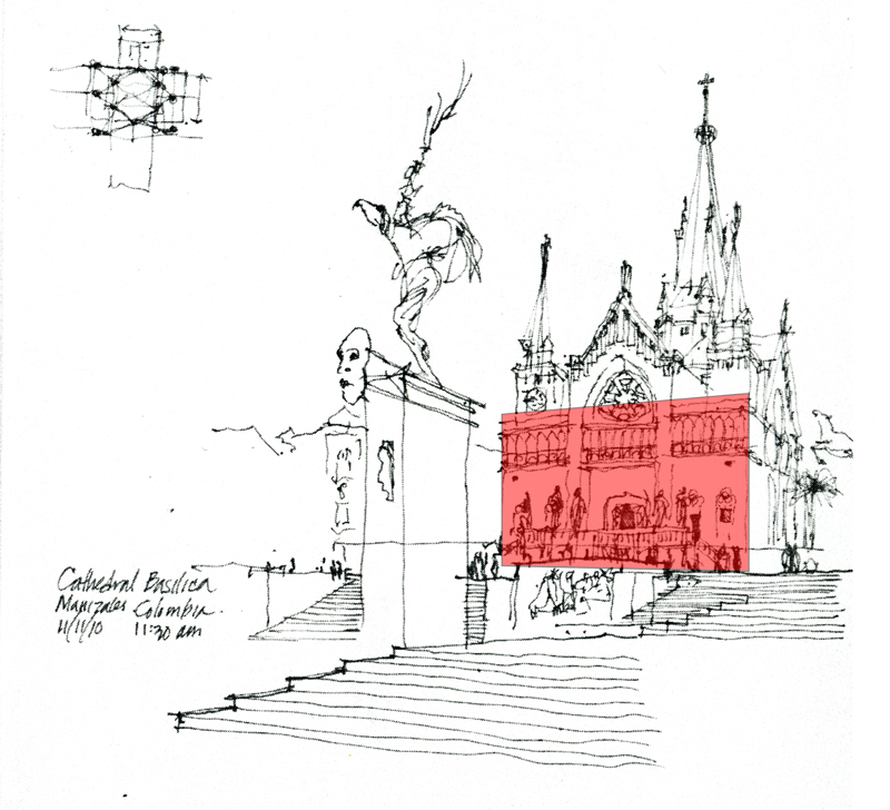
Where do we start a drawing…? Personally, I try to locate a vertical edge—or preferably a vertical plane—in the scene or view and use its size to mentally anchor the composition on the page. This vertical element can be a building facade, an interior wall, or even a row of trees or lamp posts…
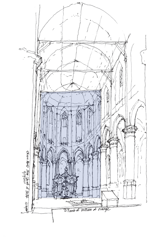
Or it can be the imagined space between two building elements, as in a street scene or the nave of a church.
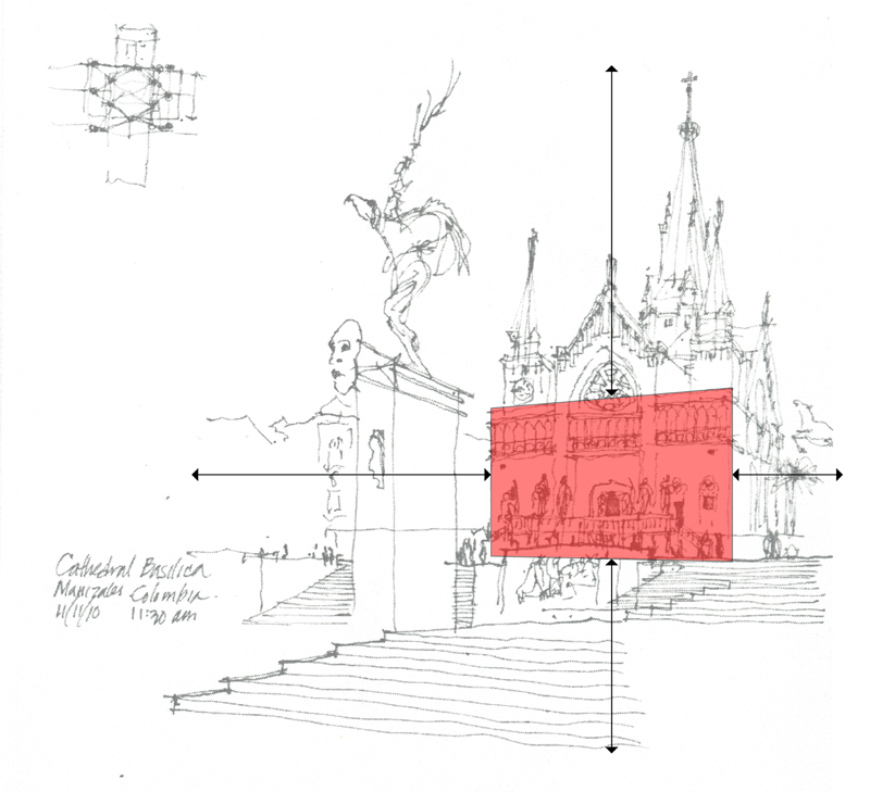
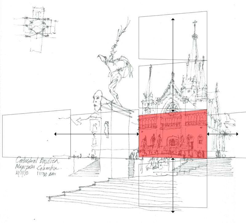
Using a vertical element in this manner requires projecting the imagined view onto the page and locating and sizing the vertical element relative to the overall composition to ensure that the entire scene will fit on the page. Providing breathing space around the intended image is a good strategy. Starting too large or misplacing the vertical element can force us to either cut off part of our intended view or alter the proportions of the scene.
Once we have placed the selected vertical element, we can use it to gauge the relative sizes of all of the other elements in the composition.


