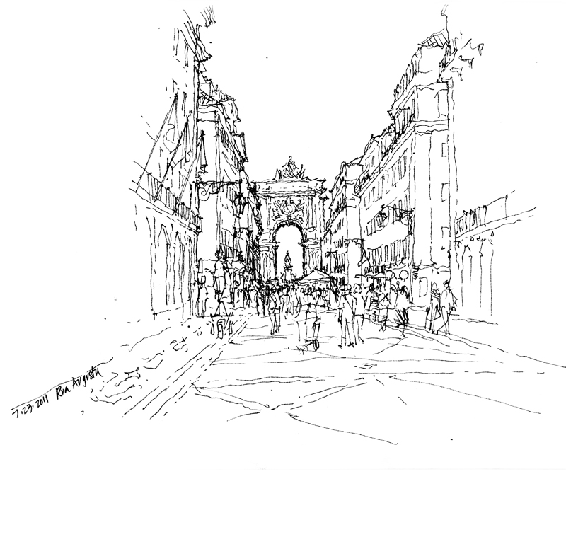
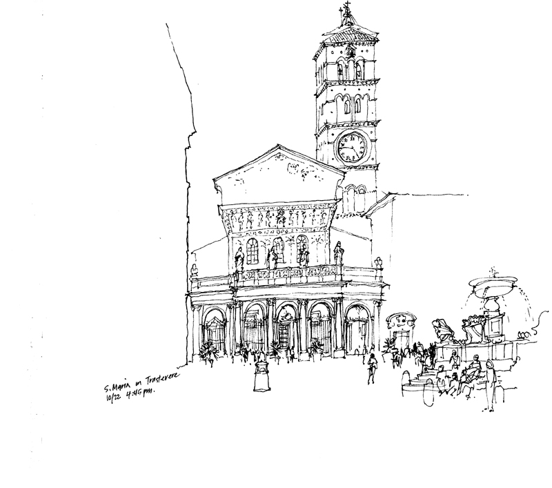
Back in January, I posted a piece on maintaining a delicate balance between a static state and one of dynamic disarray when composing a scene and laying it out on a page. Thinking about this subject again brought to mind the rule-of-thirds, a principle of composition that has been used for centuries by painters, photographers, and other artists.
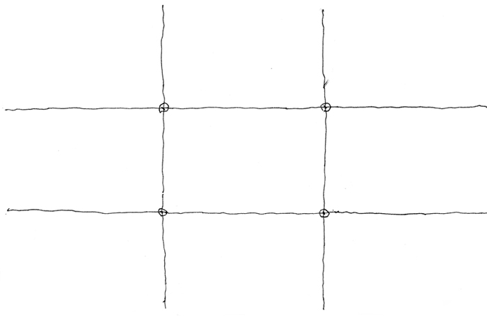
We can visualize this principle by dividing our canvas or page into nine equal parts with two horizontal and two vertical lines spaced equally apart.
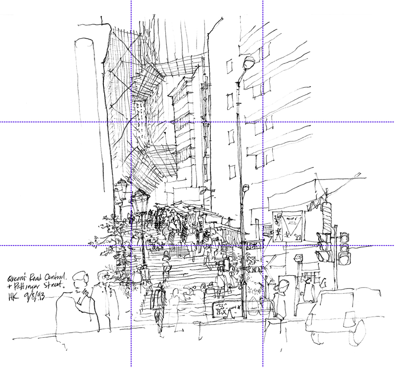
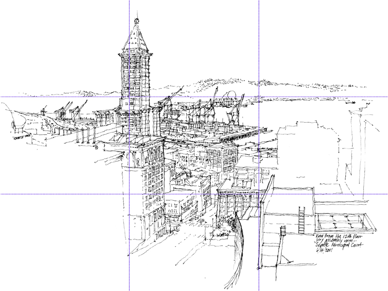
The rule-of-thirds postulates that we should place points of interest at any of the four points of intersection or lay out important compositional elements along these lines. Applying the rule-of-thirds in these ways is supposed to create visual tension and an image that is more dynamic than one with the subject matter simply centered on the page.
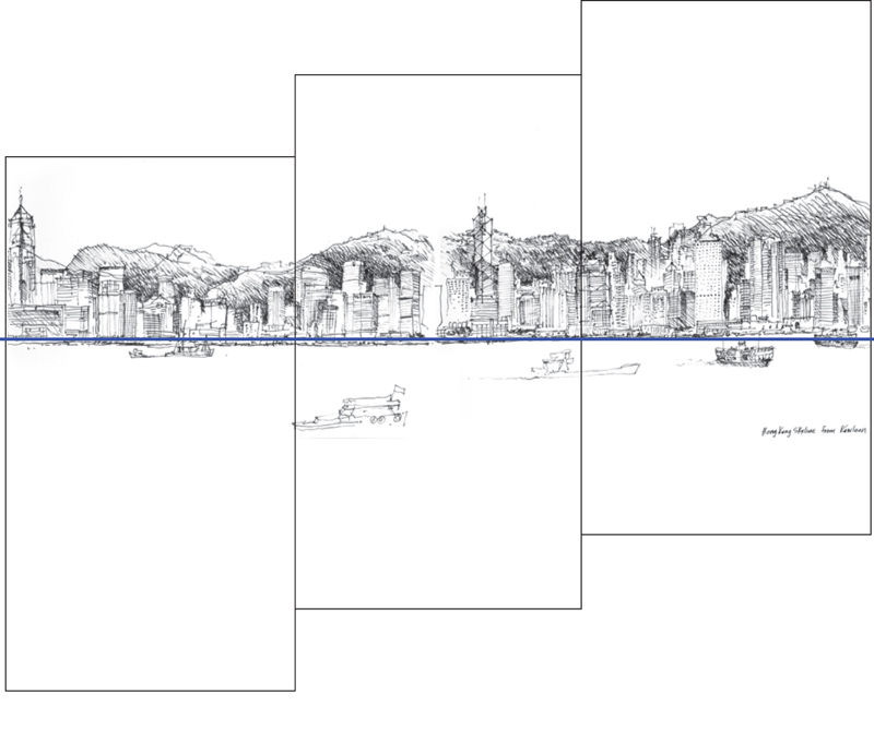
Consider how moving the horizon line in these three compositions can affect how we perceive the same subject matter in subtle ways.
Of course, rules are alway subject to being broken but experimenting with the rule-of-thirds is a good first step before deciding to disregard it. Even when applying the rule-of-thirds, we should remember that it is not an exact rule to be applied in a precise manner. It merely serves as a guide.
The first decision we have to make is whether a composition is to be balanced in a symmetrical or asymmetrical manner. If the latter, then the rule-of-thirds can serve us well.


