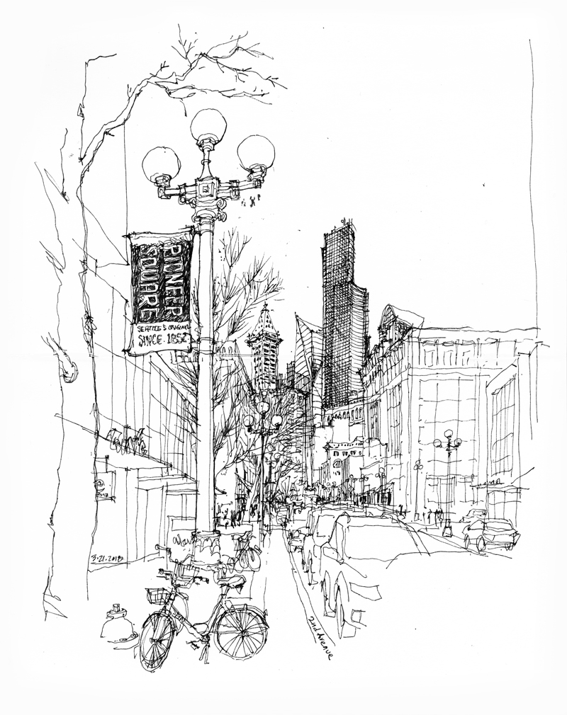
A view of Second Avenue in Pioneer Square looking north toward the Smith Tower, Columbia Center, and in between, the recently completed F5 Tower, forming a distinctive skyline of downtown Seattle.
Safeco Field
 With opening day for the 2018 MLB season approaching, I thought it might be appropriate to post these sketches of Safeco Field, home of the Seattle Mariners. The stadium, designed by NBBJ and 360 Architecture along with the structural engineering firm of Magnusson Klemencic Associates, features a retractable roof that serves as an umbrella during inclement weather.
Although King County voters had initially turned down a proposal to fund a new baseball stadium to replace the aging Kingdome, the Mariners’ first appearance in the MLB postseason in 1995 and their victory in the American League Division Series reignited a public drive to keep the team in town. As a result, the Washington State Legislature approved an alternate means of funding comprising a mix of food and beverage taxes in King County restaurants and bars, car rental surcharges, a ballpark admissions tax, and sales of a special stadium license plate.
The stadium is often referred to as “The House that Griffey Built” because many believe major league baseball would not exist in Seattle without Ken Griffey, Jr.’s outstanding career with the Mariners. Griffey helped break ground for the new stadium in 1997 and a capacity crowd of 47,000 attended the Inaugural Game against the San Diego Padres on July 15, 1999.
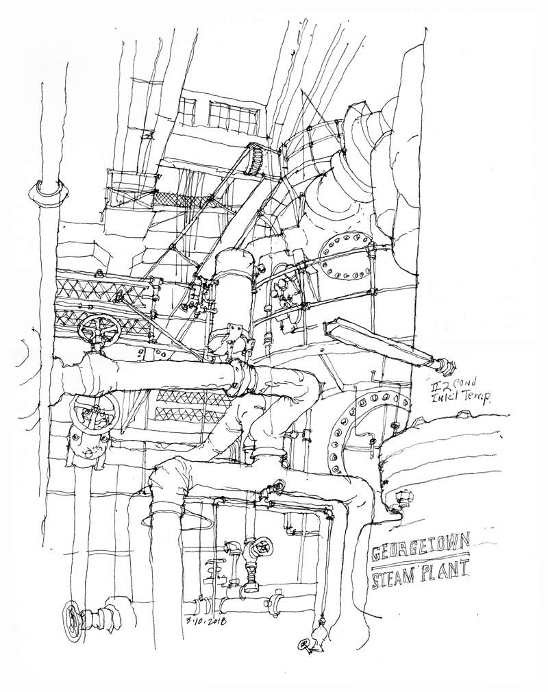
Georgetown Steam Plant
Designed by Frank Gilbreth and built in 1906 for the Seattle Electric Company, the Georgetown Steam Plant is an early example of a reinforced concrete structure. It houses two vertical Curtis steam turbines manufactured by General Electric, which initially produced 11,000 kilowatts of power. Later, in 1919, a horizontal Curtis turbine was added, almost doubling the output of the plant. In addition to providing direct current for Seattle’s streetcar system and the interurban railway between Seattle and Tacoma, the plant also generated alternating current for Georgetown, which was at the time an independent city. In 1951, Seattle’s Department of Lighting—today’s Seattle City Light—purchased the facility and continued to operate the plant on a limited basis until 1972.
The steam plant was declared a National Historic Landmark in 1984. It is also listed on the Washington State Register of Historic Places, is a City of Seattle Landmark, and is recognized by the American Society of Mechanical Engineers as a National Historic Mechanical Engineering Landmark.
Today, the steam plant is still owned by Seattle City Light and is maintained by City Light staff and a group of volunteers as the Georgetown PowerPlant Museum. It contains operable examples of early vertical steam generating turbines, as well as reciprocating steam engines and a collection of vintage machining tools.
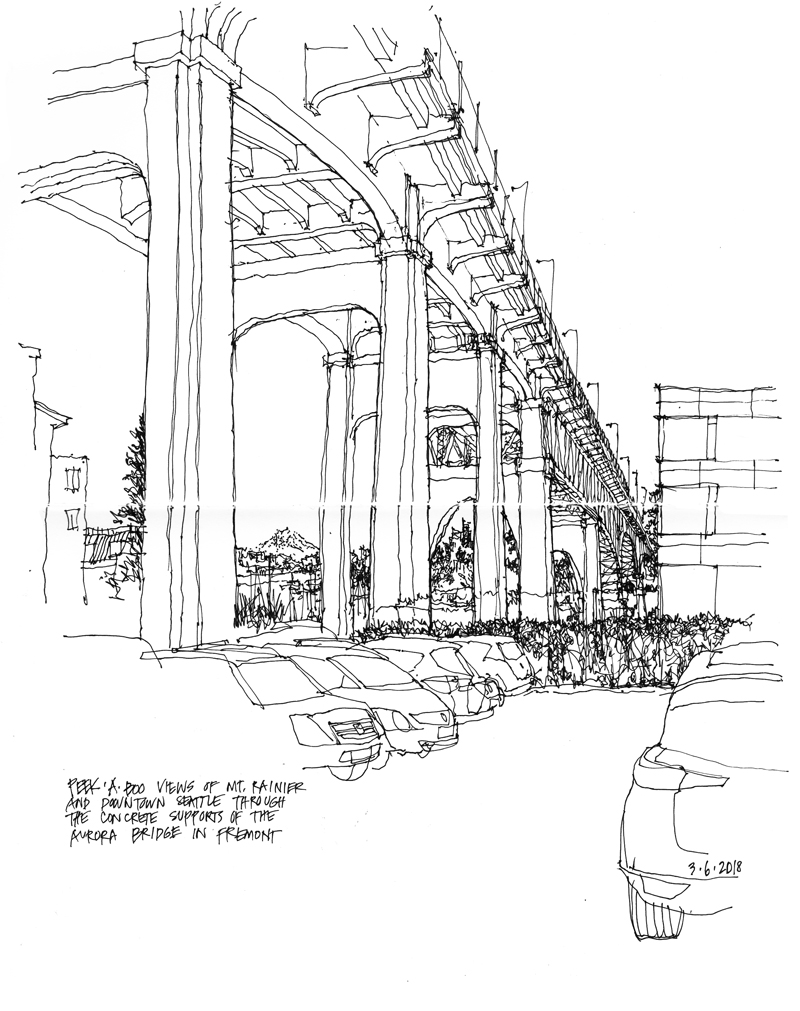
A Peek-a-Boo View
Middle Fork
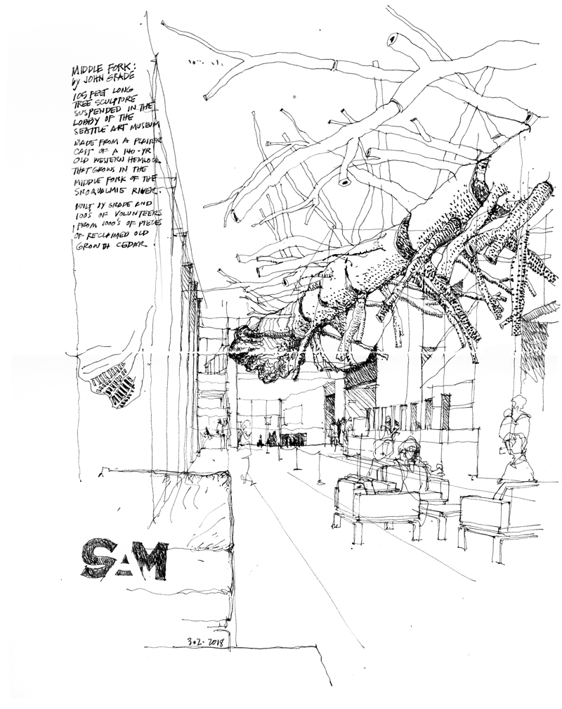
Hanging in the lobby of the Seattle Art Museum is this 105-foot long tree sculpture by John Grade. Grade first made a plaster cast of a living 140-year old western hemlock growing along the Middle Fork (hence the name) of the Snoqualmie River east of Seatle. Then he along with hundreds of volunteers used the plaster mold to recreate the form of the tree from thousands of pieces of reclaimed old-growth cedar.
Stairs and Stairways
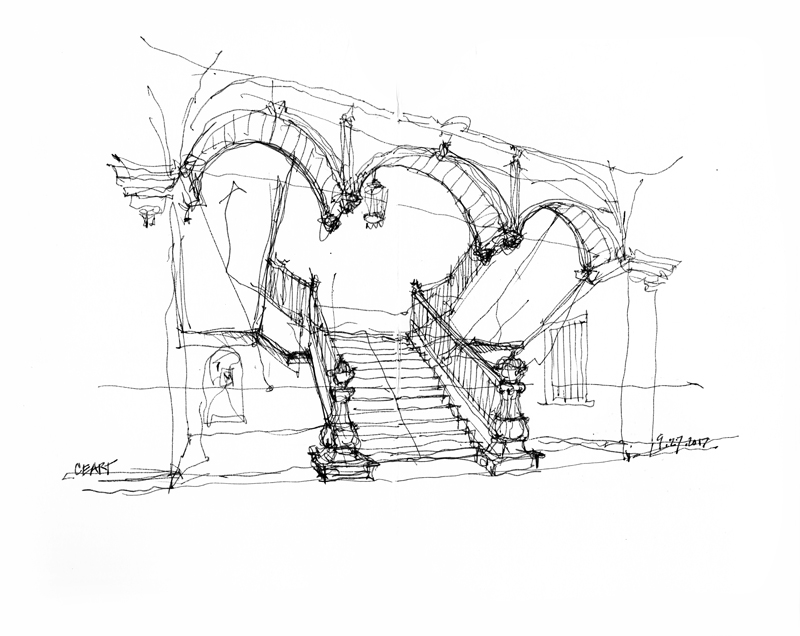
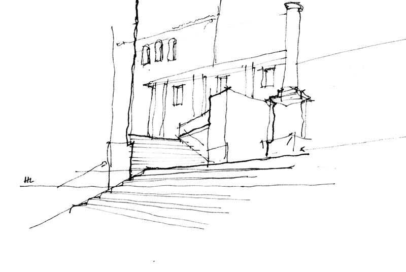
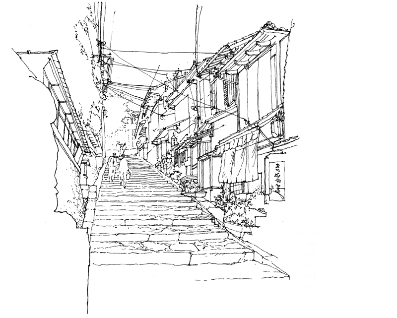
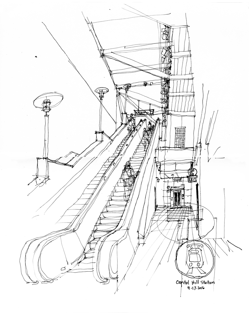
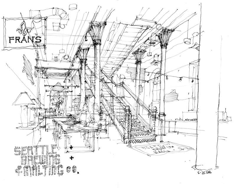
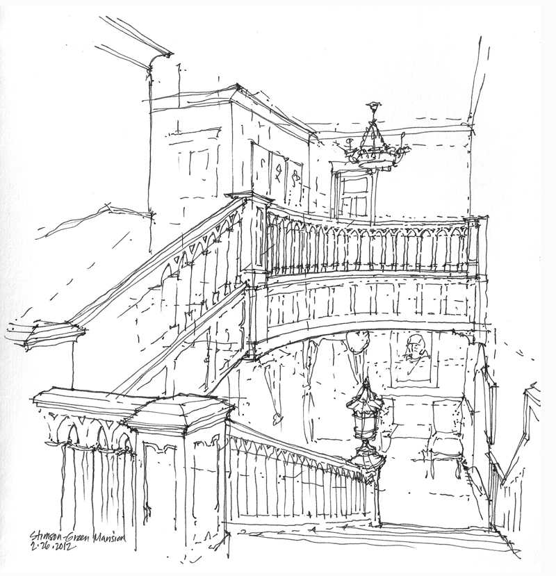
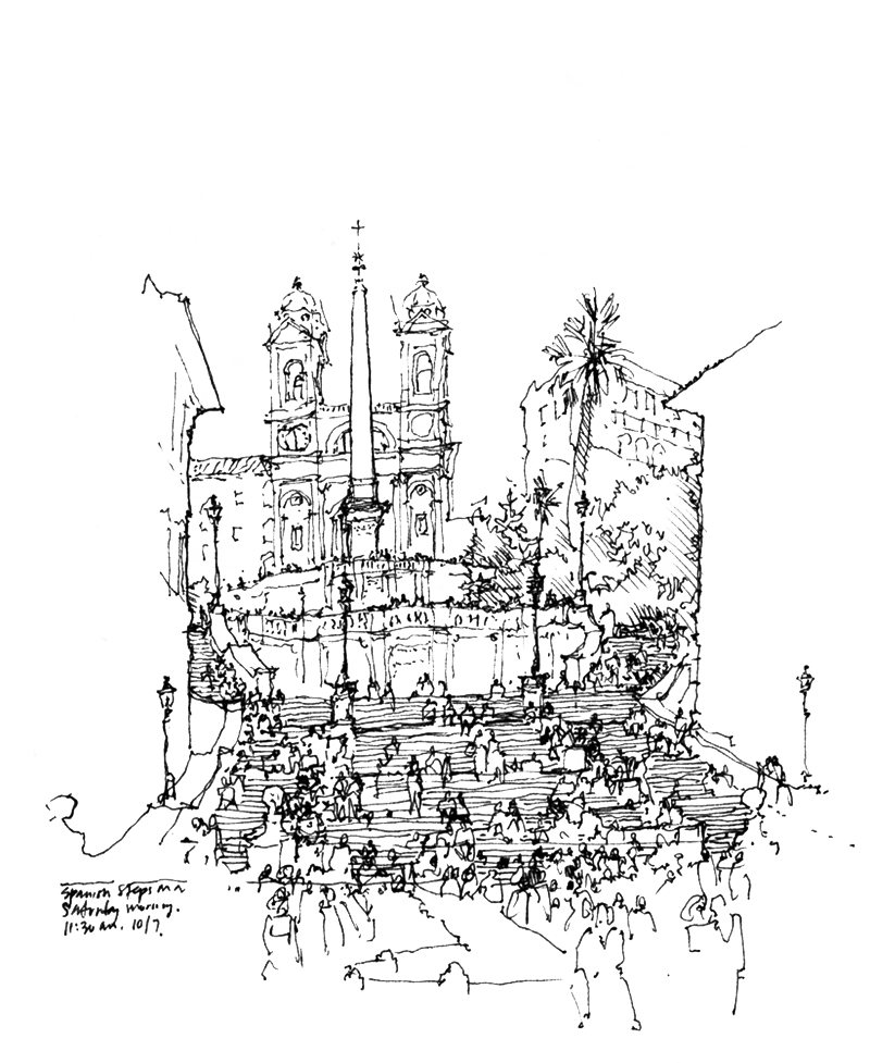 Drawing stairs and stairways in perspective can be daunting because they involve sets of parallel lines that rise or fall as they move away from us and therefore do not converge on the horizon line. Also, their multiple treads and risers make them seem more complex than they are. Here are a few stairways, both exterior and interior, that I have drawn.
One key to drawing stairs and stairways is to first establish the levels or landings that the stairs connect and then treat the stairways first as ramps, before subdividing the ramps into risers and treads. I should note here that reproducing the actual number of risers and treads may not matter as much as capturing their proper scale.
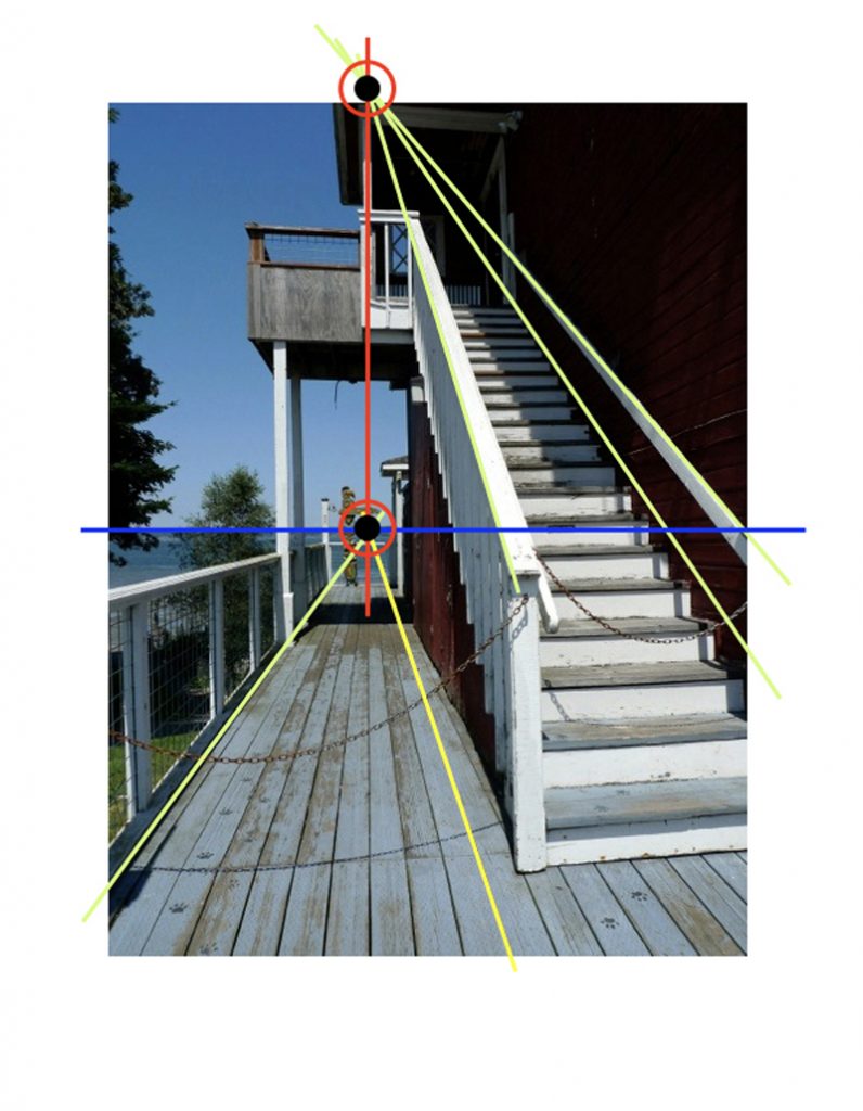
The photo above is overlaid with a diagram that shows how the vanishing point for a rising set of parallel lines is aligned vertically with the vanishing point for a horizontal set of lines that lie in parallel vertical planes.
Happy Lunar New Year!
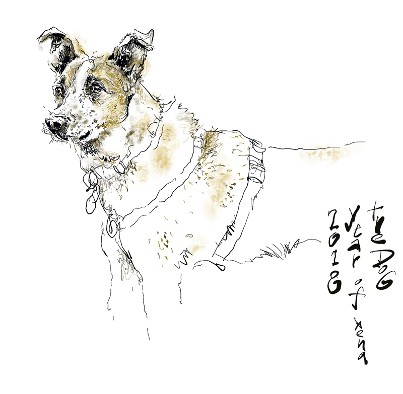
Happy Lunar New Year and welcome to the Year of the Dog. The dog is the eleventh sign of the Chinese Zodiac and is the symbol of loyalty, honesty, and responsibility.
The above is a portrait of Xena, our Warrior Princess, a Red Heeler-Terrier mix we rescued a few years ago. Bearing a striking resemblance to Xena is Laika in a news photo by Alexander Chernov below. Laika was a stray rescued from the streets of Moscow to participate in the Soviet space program. Last November was the 60th anniversary of Laika’s trip aboard Sputnik 2. While not the first animal shot into space, she was the first to orbit the earth. Unfortunately, Laika didn’t survive her journey into the cosmos.
Panama Hotel Tearoom
I joined a few other Seattle Urban Sketchers last Friday at the Panama Hotel, a National Historic Landmark in Seattle’s ID District. This is a view of the tearoom, looking toward the main entrance backlit from the daylight streaming in through the storefront windows.
As a point of comparison, here is a similar view I sketched three years ago when I was seated a little closer to the front of the room. This illustrates how moving just a little bit—back or forward, left or right—can make a significant difference in the resulting view of a space. And also how contrasting tonal values influences our reading of spatial depth.
Times Square Building
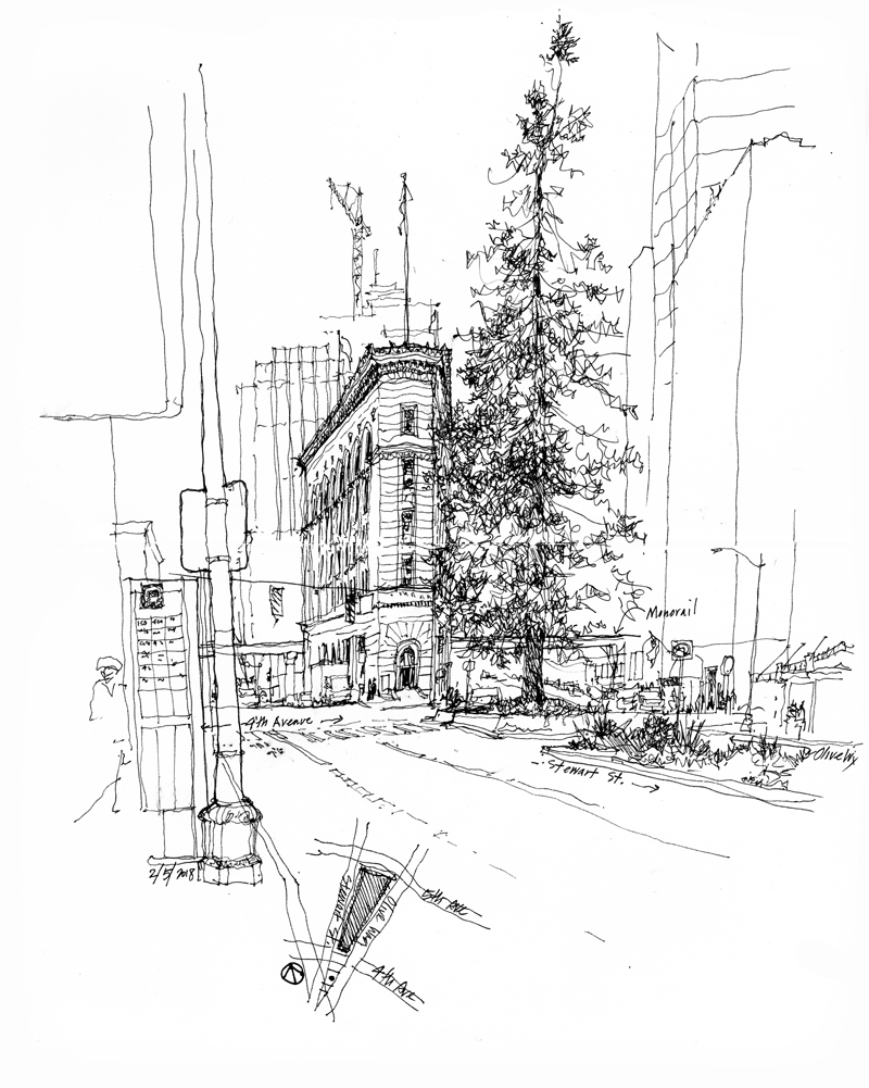
This iconic triangular-shaped building, situated between 4th and 5th Avenues where Olive Way splits off of Stewart Street, was designed by Bebb & Gould and completed in 1915 for the editorial offices of the Seattle Times newspaper, which occupied its seven stories until 1930. It was added to the National Register of Historic Places in 1983 and designated as a city landmark in September 1984.
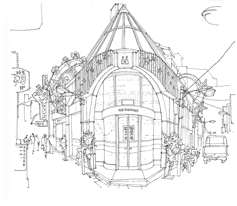
Below are views of buildings that also occupy acutely angled sites in various locations and at different scales.
To Notice
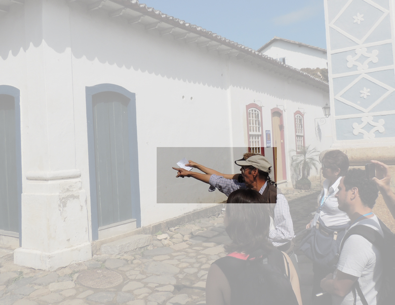
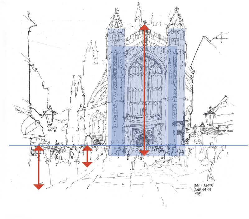
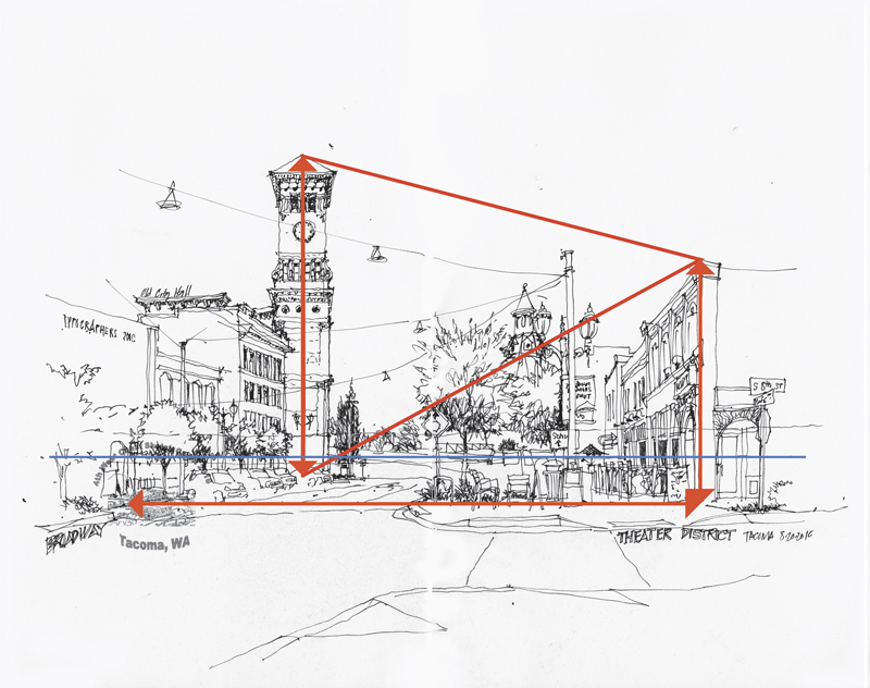
During drawing workshops, I often find myself pointing at things in scenes that students are drawing. What I’m doing is drawing attention to how things are related to each other—certain relationships of size, scale, proportion, and placement—in what we see before us. Paying close attention—not merely learning techniques—is one of the keys to drawing on location.
In his book Leonardo da Vinci, Walter Isaacson attributes many of Leonardo’s accomplishments to his acute powers of observation, which were not innate but honed with practice. And Isaacson believes that “to notice” is something we can all do if we make the attempt.
And so it is important to really focus on what one is seeing, not merely glance at the subject matter, before drawing. As I have often said during my workshops: “Look more and draw less.”

