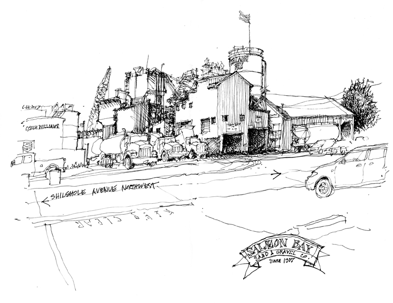
The Essential Emptiness

“We put thirty spokes together and call it a wheel;
But it is on the space where there is nothing
that the utility of the wheel depends.
We turn clay to make a vessel;
But it is on the space where there is nothing
that the utility of the vessel depends.
We pierce doors and windows to make a house;
and it is on these spaces where there is nothing
that the utility of the house depends.
Therefore, just as we take advantage of what is,
we should recognize the utility of what is not.”

Lao-tzu
Tao Te Ching
6th century BC

A related Japanese aesthetic concept is MA, the essential emptiness that surrounds all things. Think of the spaces necessary to form words from a sequence of letters, or the silences that make the music from a sequence of notes.

Seattle Art Museum


This is the original lobby of the Seattle Art Museum, designed by Venturi, Scott Brown & Associates in 1991, before the museum was expanded in 2006 in a design by Brad Cloepfil of Allied Works Architecture. A grand staircase traverses the rise from First to Second Avenues, mirrored on the outside with a similar set of stairs.

For comparison, below is the same view from 6 years ago, showing how I struggled with the issues of proportion and scale.

Drawing as Speculation

Taking a break from drawing on location, I am sharing two pages from Drawing: A Creative Process, a book I wrote and illustrated in 1990. I am referencing here drawing as a means of making thoughts and ideas visible, which is pertinent to the use of hand drawing in the design process. The discussion is not so much about technique as it is about the attitude with which one draws.

Stoup Brewing

Stoup, a word that originally referred to a flagon or beaker for drink, is the name of a small craft brewery in the heart of the Ballard Brewing District, just a few blocks away from Reuben’s Brews. Founded by Brad Benson, Lara Zahaba, and Certified Cicerone Robyn Schumacher, the brewery is housed in an industrial metal building, which you can see in the view above, just before it began to rain. I used the rain as an excuse to then go inside and savor a Citra IPA while I drew the interior view below.

Punctuation

A quote from the Irish Literary Times: “Punctuation creates sense, clarity, and stress in sentences. It structures and organizes your writing.” I wonder if there is an equivalent element or principle in drawing that would also serve to create “sense, clarity, and stress” and organize the composition of a drawing.

Sense = Meaning; Clarity = Sharpness; Stress = Focus

The Principle of Contrast

Back in 2012, I had posted a few examples of how I used contrasting tonal values to define form and draw attention to a particular area in a sketch. In this post, I want to expand on the idea of contrast—the discernible distinctions in line weight, tonal values, textures, details, and even relative position on a page—that is essential to avoiding blandness and giving life to a drawing. Here are examples of the different kinds of contrast at our disposal. Note how the visual tension between the two contrasting elements or areas contribute to the composition of a drawing.


Bad Jimmy’s Brewing Company

In contrast to Hale’s Ales, Bad Jimmy’s is a relatively small craft operation. I’m not sure but I think “5 beer lovers” started the brewery as a Kickstarter project in 2013. It’s housed in a converted garage behind several food establishments in the neighborhood being touted as Freelard, between Fremont and Ballard.

Hale’s Ales Brewery and Pub

Mike Hale opened his first brewery in Colville, Washington, in 1983. Since that time, Hale’s has become the longest running, continuously owned, and independent craft brewery in the Pacific Northwest. This is a view of the brewing equipment in the Seattle brewery and pub, which opened in 1995 in the Frelard neighborhood between Fremont and Ballard. The notes below the sketch explain the brewing process as described on signs attached to the railing.

After the cracked barley malt is saturated with hot water sprays, the resulting sweet wort is boiled and clarified. Adding hops at this point imparts some bitterness to balance the sweetness of the wort. In the Hop Back, the wort is whirlpooled for greater clarity and more hops added to give the wort certain herbal and aromatic characteristics before being transferred to fermentation barrels.

As a point of comparison, below is another sketch of the brewing vats done six years ago.

Amazon’s Spheres


An ad-hoc group of Seattle Urban Sketchers met this past Friday at the Via6 apartment and retail complex, right across the street from these spheres being erected at the heart of Amazon’s urban campus. It’s been almost a year since I first drew these steel-and-glass orbs under construction (see sketch below.)

Even though some may find curves to be difficult to capture, spheres are actually quite easy to draw in perspective because they are always seen as circles; they only vary in size, depending on their scale and distance from us. The drawing of circles themselves, however, can be daunting. I find that using a smooth, continuous, lightly drawn stroke works better than a series of short, jerky strokes. The difficult part of drawing these spheres, then, is how to suggest the surface pattern of the steel- and-glass panels, and to convey the overall roundness of the orbs.

Drawing these spheres a second time brought to mind a question. I wonder why the clients or designers chose to use an organic framing pattern rather than an established prefabricated structure, such as Buckminster Fuller’s geodesic system.

Notebook Elements

In addition to the imagery of drawings and sketches, the pages of our journals can also include other elements that contribute to the making of memories. We can paste clippings and memorabilia onto the pages; we can draw maps of our journeys through towns and across the countryside; and we can write down notes to supplement the images we draw. And adding these elements to the page is a balancing act in composition.