Season’s Greetings to One and All…
Seattle Central Library
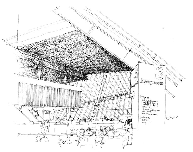
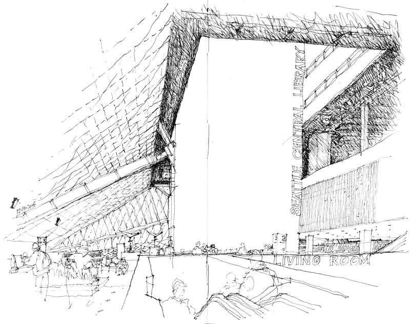 The December meeting of the Seattle Urban Sketchers took place at the Seattle Central Library, where I drew these two views of the Norcliffe Foundation Living Room. Serving as a general purpose reading area adjacent to a coffee shop and gift shop, the Living Room is part of the largest of the dynamic spaces in the library designed by Rem Koolhaaus and Joshua Prince-Ramus of OMA in collaboration with LMN Architects.
In one sense, the irregular geometry of such spaces can be easier to draw since any deviation from what actually exists may be difficult to discern. On the other hand, what is important to convey is a sense of the scale and 3-dimensional volume of the space.
Singapore Art Museum
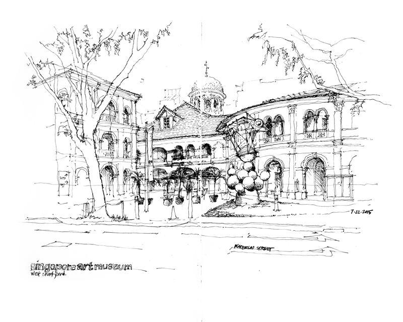
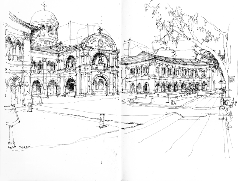
During last summer’s Urban Sketchers Symposium, the Singapore Art Museum was the site for my workshops. Opening in 1996, the museum is housed in what was originally St. Joseph’s, a 19th-century mission school run by the La Salle Brothers.
Both before and after the workshops, I had the opportunity to draw two exterior views of the the museum, which focuses on the contemporary arts of Singapore, Southeast Asia, and Asia. The difficult aspect of both of these views was controlling the amount the wings of the building curve as they extend out from the main body of the complex, neither exaggerating, nor minimizing the amount of curvature.
Context Matters
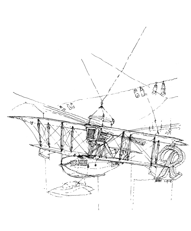
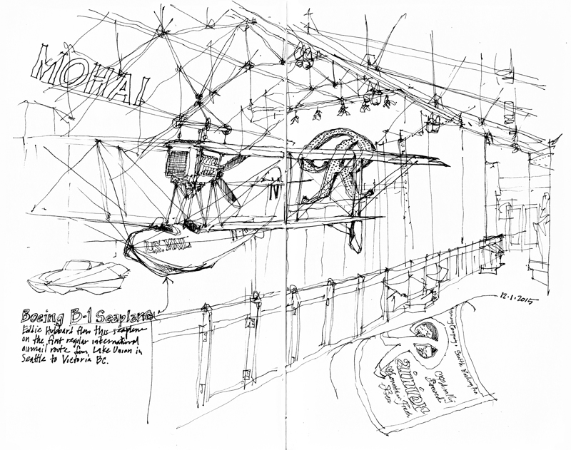
The Boeing B-1 seaplane, the first and only one built, began flying the international airmail route from Lake Union in Seattle to Victoria, British Columbia, in 1919. I drew the first view of the seaplane last year, which merely hinted at its context. The second view was drawn when a small group of urban sketchers met this past Tuesday at the Museum of History and Industry (MOHAI) to sketch with Laurie Wigham, who was visiting from San Francisco. This time, I included a greater sense of the central hall space in which the seaplane is suspended. Context matters.
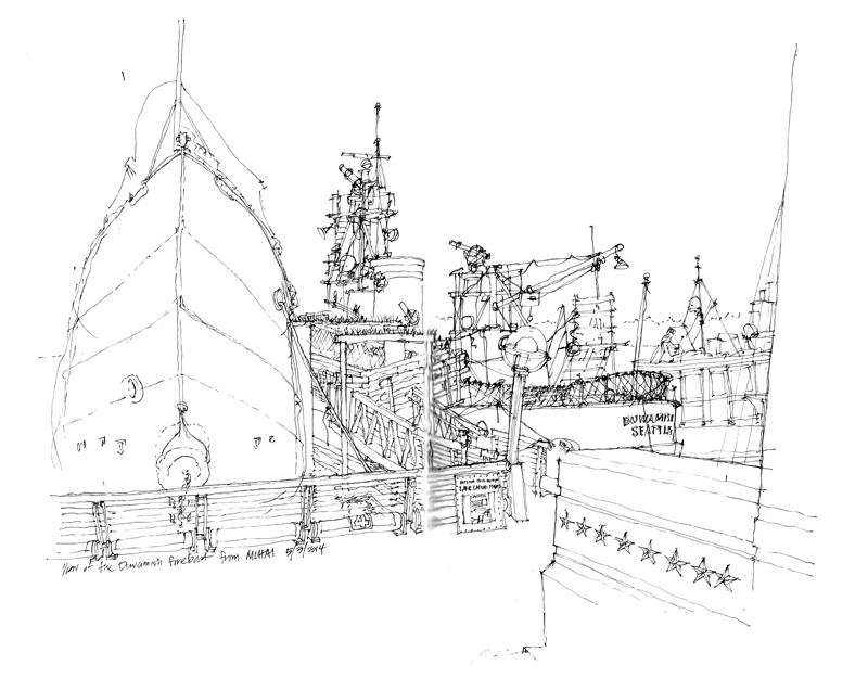
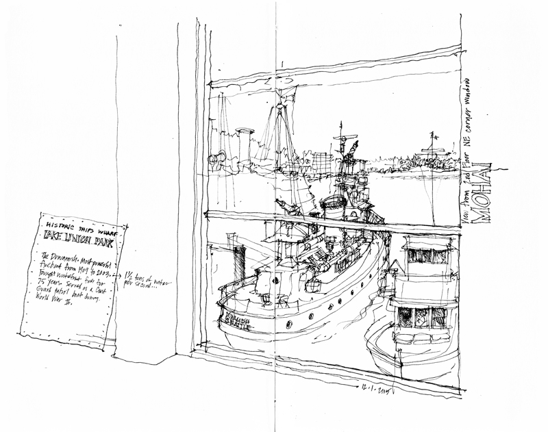
Here are two views of the Duwamish, a fireboat built in 1909 and now moored at the Historic Ships Wharf just north of MOHAI. The first is taken from the wharf itself while the second is drawn from the northeast corner window of the second floor of MOHAI. The window itself serves as a framing device for the drawing. Context matters.
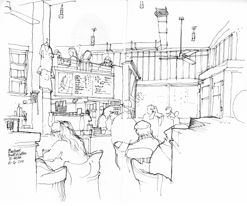
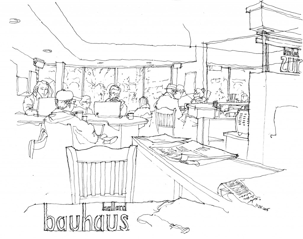
Bauhaus Coffee
San Andrés
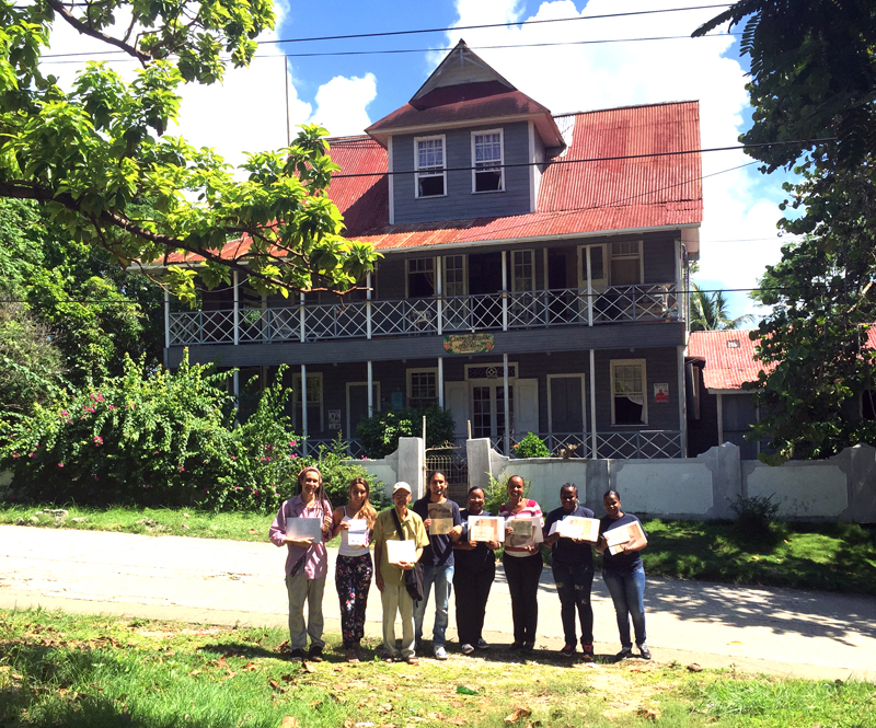
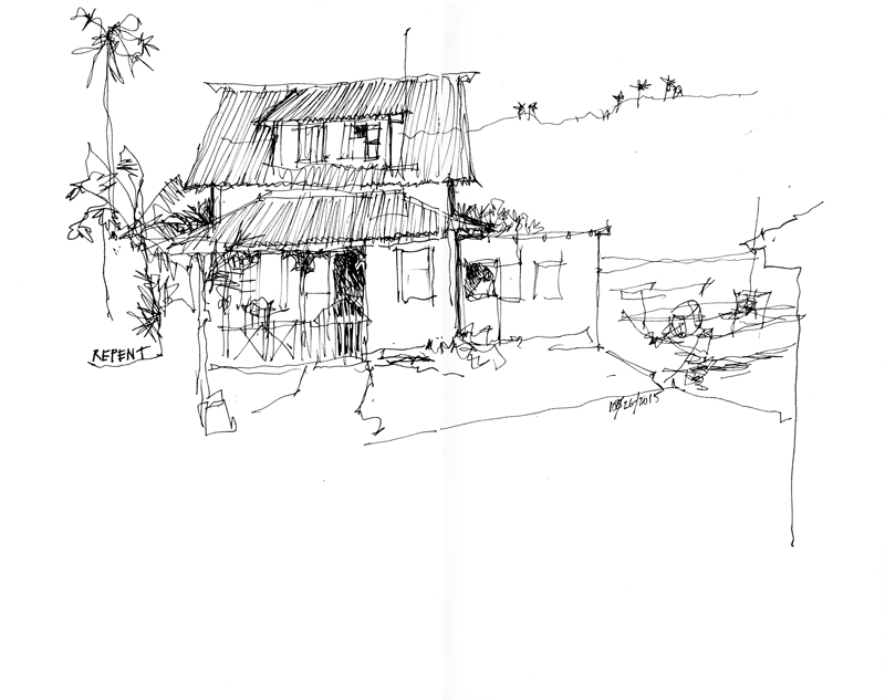
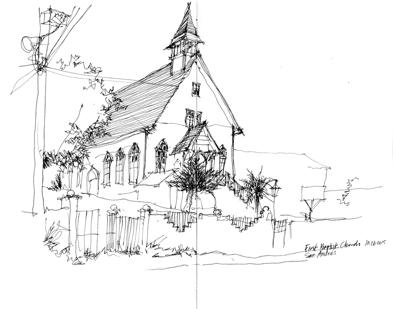
Before returning to Seattle from Medellin, we were fortunate to have the opportunity to spend a couple of days on San Andrés, an island in the Caribbean Sea with an English past but tied politically to Colombia. Situated 470 miles north of Colombia but only 140 miles east of Nicaragua, it is, along with Providencia and Santa Catalina, part of a UNESCO Biosphere Reserve. I was able to spend a day drawing some of the historic structures on the island with a small group of staff and students from the Jardin Botanico de San Andrés.
A View Down Pike Street
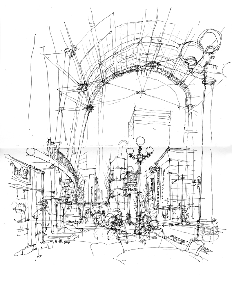
I sketched this view looking west down Pike Street while sitting outside the Washington State Convention Center in downtown Seattle. This is not a particularly beautiful or picturesque city scene. It is a rather pedestrian assemblage of urban elements—street lamps, sidewalk tables and chairs, store fronts and canopied entrances. What makes it unique is the arched vault of steel and glass that spans this one-block section of Pike Street between 7th and 8th Avenues.
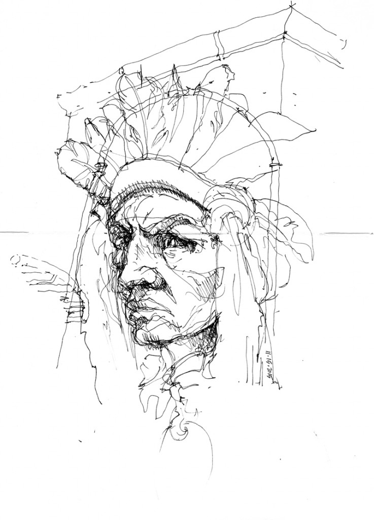
Stepping inside the lobby of the convention center and dropping in scale from the street to a sculpture, this is a study of the terra cotta head of an American Indian that once adorned the 1910 Cobb Building.
El Peñol de Guatapé
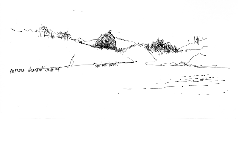
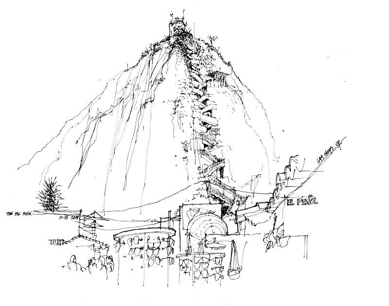
Two hours northeast of Medellin is El Peñol, a massive monolithic rock formation that rises more than 650 feet above the town of Guatapé. Once worshipped by the Tahamies Indians, it is now a popular tourist attraction. Along a vertical break in the face is built a staircase of 649 steps leading to a three-story observatory at the top. While I did not physically make the ascent, I did climb the stairs with my eyes as I drew this view from the base.
More Scenes from Medellin
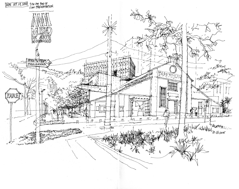
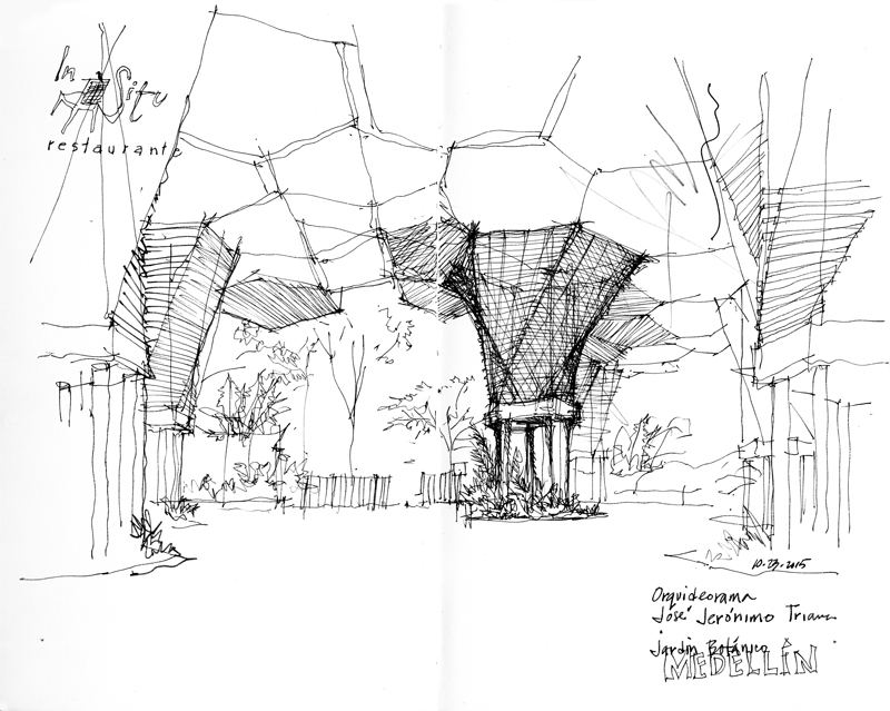
The choice of what to sketch is almost always a matter of personal preference. For me, I am drawn to subjects that are unique to a place. Here are two examples from Medellin, the city of eternal spring.
Just across from the hotel where we stayed in Medellin is the Museo de Arte Moderno, founded in 1978 but relocated in 2009 to the space of the Talleres Robledo, a steel mill from the 1930s. Onto to this historic structure was grafted a new addition through the collaborative efforts of 51+1, an architectural firm from Peru, and CtrlG, a firm from Medellin.
In the Medellin Botanical Gardens is the Orquideorama, which consists of 14 structures that rise like giant wooden flowers more than 50 feet into the air. Designed by Plan B Architects in 2006, the large canopies provide filtered sunlight and shelter for permanent and temporary exhibitions amidst the natural landscape of the gardens.
Public Spaces in Medellin
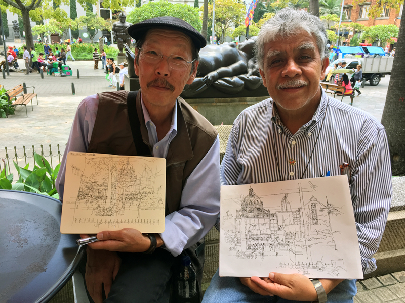
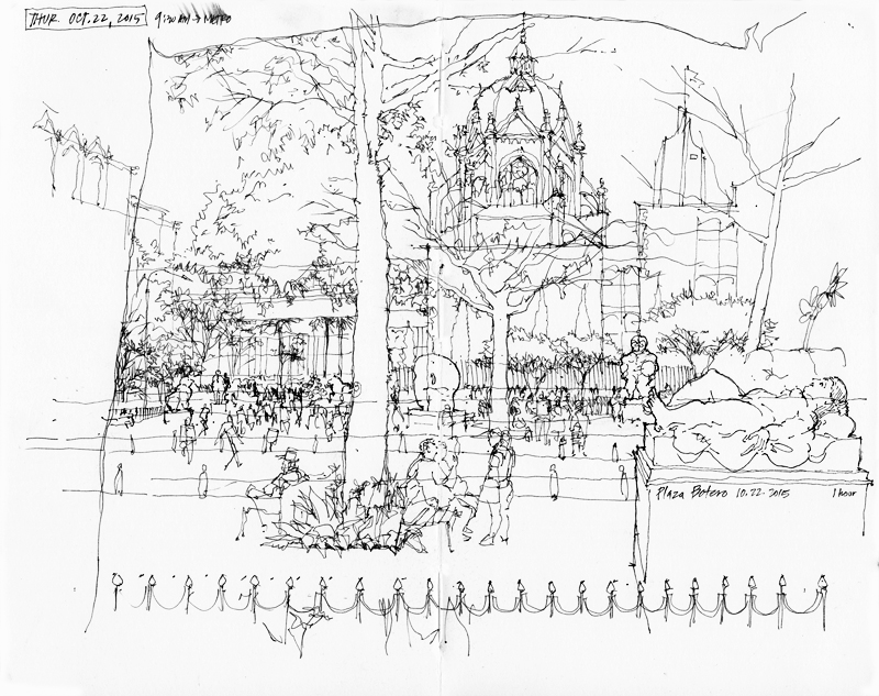
The day after the workshop with students at Botero Square, I met Fernando Saldaña Cordova from Sonora, Mexico, so that we could draw our own personal views of the public space in the old quarter of Medellin.
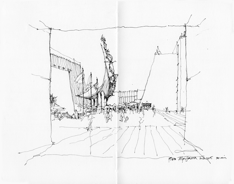
An hour and a short walk later, we came upon the Plaza Alpujarra, the administrative center of the city featuring a large, sweeping sculpture Monumento a La Raza (Monument to Race) by Rodrigo Arenas Betancur. Upon entering the public space, we decided we had to stop and do another drawing before lunch.
In my next post, I will show more scenes from Medellin, the City of Eternal Spring.

