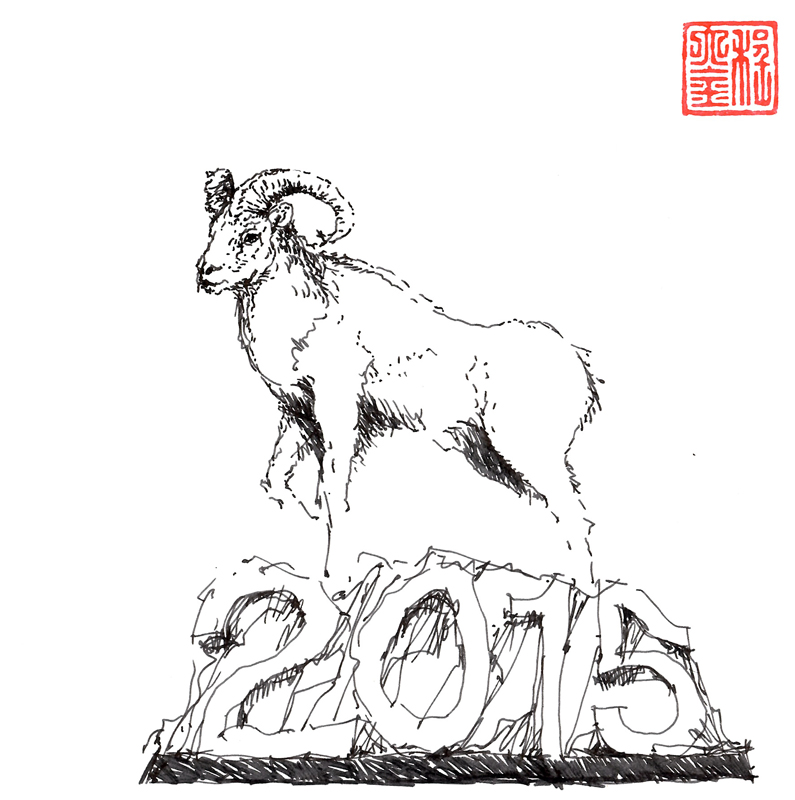
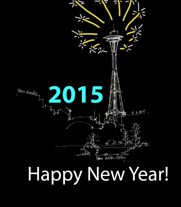
The Lunar New Year 2015, the Year of the Sheep (or Ram), looks to be an auspicious year since the sheep is the eighth sign in Chinese astrology and the number “8” is considered to be a very lucky number. And besides, the sheep, which symbolizes loyalty, kindness, wisdom, and prosperity, is my personal Chinese zodiac sign. Kung Hee Fat Choy!
Mamallapuram
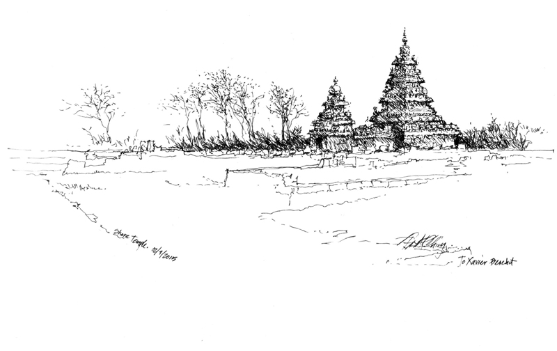
After last weekend’s workshop, Xavier Benedict and I took a day trip to Mamallapuram, site of several Hindu shrines and temples. These examples of the stone-carving tradition of Pallava art and architecture are set amid a landscape strewn with mammoth granite boulders on the Bay of Bengal, 35 miles south of Chennai.
The Shore Temple, a Unesco World Heritage Site, is so named because of its siting on a promontory close by the shore of the Bay of Bengal. The 8th-century complex of three temples is famous for its profile surrounded by a low enclosure surmounted by Nandis, seated bulls that serve as the mount of the god Shiva.
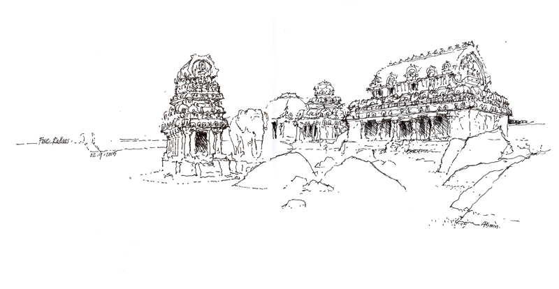
Unlike the Shore Temple, which is constructed and carved from granite blocks, the Five Rathas is a 7th-century complex of monolithic rathas (chariots) hewn whole from enormous boulders of granite. These South Indian Dravidian structures, also classified as a UNESCO World Heritage Site, were never completed nor consecrated.
***
Thanks again to Xavier Benedict for his generous and gracious hospitality. For photos of the workshop, see Xavier Benedict’s Facebook page at <https://www.facebook.com/xavier.benedict.581/media_set?set=a.10204523441180918&type=1&pnref=story>.
Kapaleeshwarar Temple
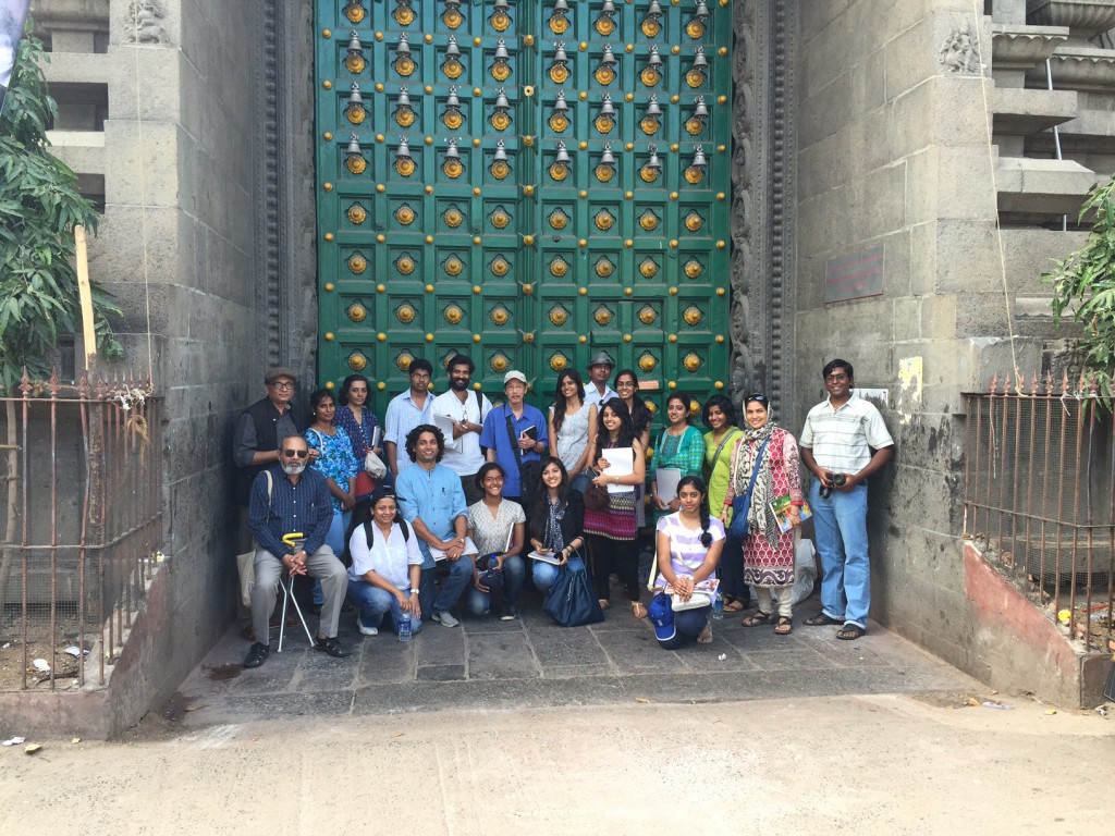
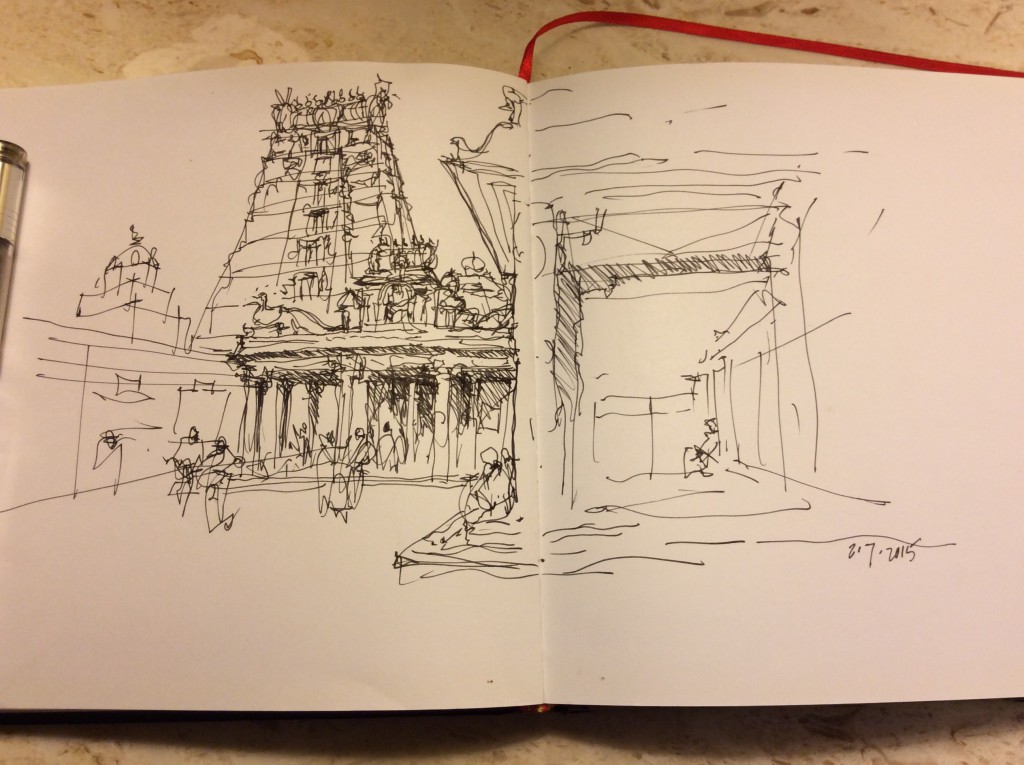
My second attempt at entering India was successful and we began the first of two days of a drawing workshop sponsored by the AARDE foundation. Many thanks to Xavier Benedict for hosting my visit and to the students and architects who persevered and returned to make this weekend possible. We began at the Luz Church, built in 1516, and then moved onto the 7th century Kapaleeshwarar Temple in the Mylapore neighborhood of Chennai. Here is the group in front of the main doorway and a quick study I did of the interior of the temple complex. The temple architecture is a difficult subject because of the multiple layers of sculptural details. The approach has to first establish the geometric framework that holds the details together. Tomorrow we head to Parry’s Corner to visit a prime example of Indo-Saracenic architecture.
Frye Art Museum
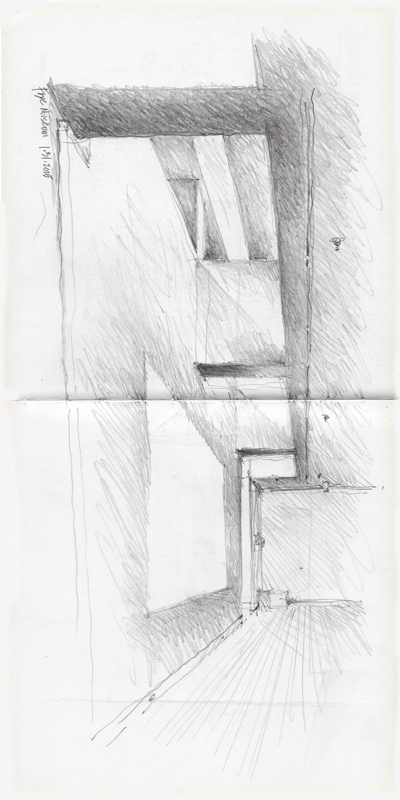
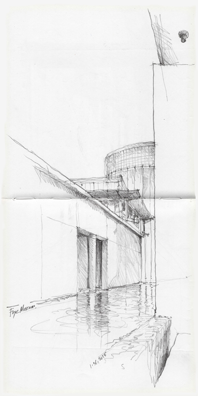
A small group of Seattle Urban Sketchers met yesterday at the Frye Art Museum to participate in the 46th World Wide Sketchcrawl. Because only graphite or colored pencils are allowed in the museum, I brought along an old-fashioned mechanical lead holder equipped with a 4B lead.
Switching from a fountain pen to a graphite pencil forced me to adjust my usual approach. Graphite pencils respond to pressure much more readily than an ink pen and encourage the use of tonal values. So the process I used was to first sketch the structure out lightly and then hatch broad areas of gray. I then wend back and darkened selected portions to achieve the desired gradation and contrast. Each of these sketches took about 30 minutes to complete.
Signs of Fremont
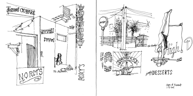
With a historic snowstorm bearing down on the northeast, we’re enjoying sunny 60° weather here in Seattle. To take advantage of this unseasonably warm period, I went out to draw Fremont. While I had originally intended to sketch the entrance to Revel, the local Korean fusion restaurant, I soon detoured to collecting some of the signs of Fremont. I didn’t sketch them all but plan on continuing the series in the future.
A Lesson Learned
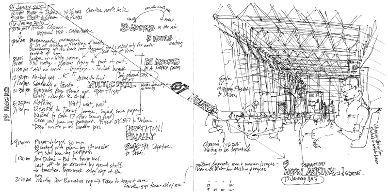
Last Wednesday, I departed Seattle for Chennai, India, for a presentation and two days of drawing workshops. Upon arriving in Chennai, to my chagrin, I was denied entry due to an expired visa. Clearly a mistake had been made by the processing agency that had handled my visa application, but just as clearly, I had made a critical error in not checking the visa upon receipt. The immigration authority officially declared me to be a deportee and booked me on a flight back to Seattle.
By the numbers:
- 20 hours travel time from Seattle to Dubai to Chennai.
- 5 hours of frustration, anger, and embarrassment waiting in the Chennai airport, hoping that I might be able to enter the country.
- 12 hours detained in a locked room in the Chennai airport.
- 2 hours waiting for departure from Chennai.
- 28 hours travel time from Chennai to Dubai to Seattle.
- 67 hours total from the moment my flight left Seattle on Wednesday to the return flight landed on Saturday. During this time, I was either on a plane or in the Dubai and Chennai airports.
I must apologize to all those who were inconvenienced by my failure to check the dates on my visa before departing Seattle—my host, the AARDE foundation; the architects who were planning to attend my talk; and especially the students who had made the effort to travel to Chennai to attend my workshops.
During all of this, I was not in a mood to sketch. However, I did document the events as they occurred and managed a quick sketch of the Chennai departure terminal where I awaited deportation from India. One doesn’t appreciate the freedom of movement we enjoy until it is taken away, even if only for 12 hours being detained in a locked room in the Chennai airport.
I am not giving up. I plan to return to Chennai soon to fulfill my obligations. This is assuming, of course, that the immigration authority there allows me to enter India after my last failed attempt.
Iconic Images
If we think of the Eiffel Tower, the Sydney Opera House, or the Chrysler Building in New York City, we can see the image in our head, even if we have never seen the real thing. It appears as though the stream of images we have seen in photographs and movies have been seared into our memory banks. And we might even be able to sketch reasonable facsimiles if asked to.
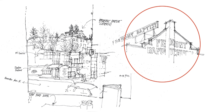
After we have visited a place several times, or lived near to, driven by, or walked past a place for a number of years, we might also form an iconic image of that place. A personal example is the Fremont Baptist Church, established in 1892 with the current brick building being constructed in 1924, perched on a hill above downtown Fremont in Seattle.
For me, this iconic image of Fremont has materialized over the years. Yet the image I hold in my mind’s eye does not correspond to what you can actually see from any position on the street. What seems to occur is that our mind is able to recombine the fragmented, partial views we’ve experienced into a single iconic, memorable image.
The First Starbucks Store
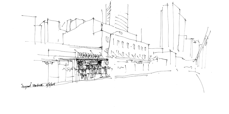
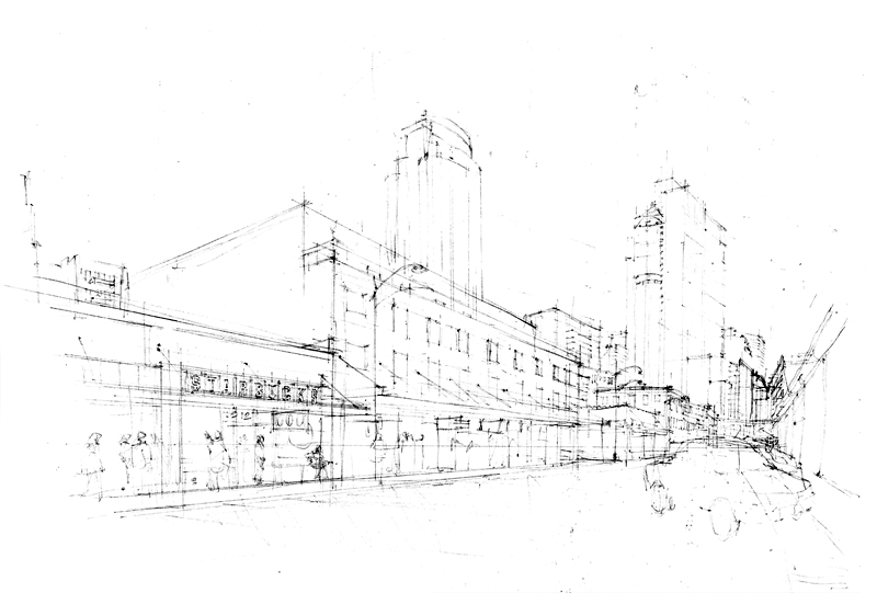
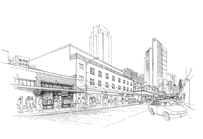
Tucked in amongst a row of buildings on Pike Place in Seattle is the “first” Starbucks store, which is one of the main tourist attractions in the historic Pike Place Market district. You still see this store being photographed at all hours of the day and throughout the year. Even though a plaque inside proclaims this to be the first Starbucks store, from 1971 through 1976 there was an earlier Starbucks at 2000 Western Avenue, which sold only whole coffee beans while serving free samples of brewed coffee.
As with my drawing of the Starbucks Reserve Roastery and Tasting Room, the drawing of the first Starbucks store involved three phases: a quick compositional study, a rough pencil layout submitted for approval, and finally, the finished ink-line drawing.
Happy New Year!
Before looking forward to new and rewarding sketching prospects in 2015, I want to take a look back with appreciation for the opportunities to conduct workshops during the past year. I will always be grateful for these chances to connect with others who share the same passion for drawing.
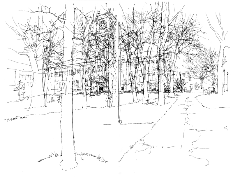
A sketch of the campus clock tower at the ending session of the workshop at Washington State University with Gail Wong and Gabi Campanario.
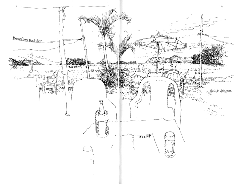
Enjoying a cool Itaipava on the Praia do Jabaquara during the Urban Sketchers Symposium in Paraty, Brazil.
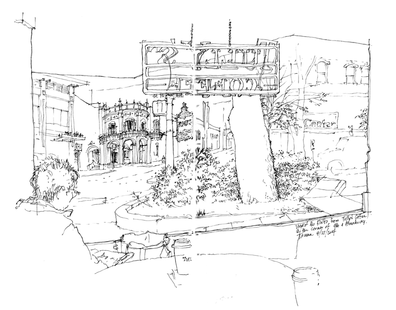
A view from inside Tully’s coffee shop during the Line to Color workshop with Gail Wong in Tacoma, Washington.

