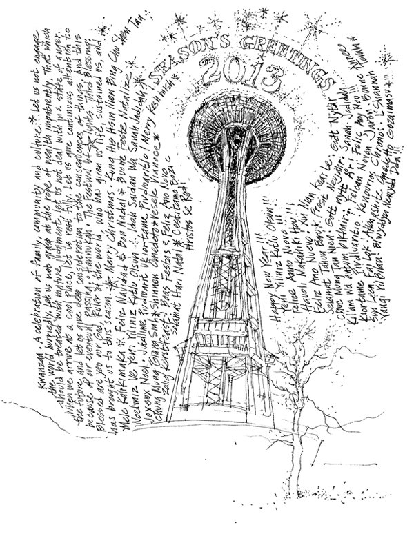
To one and all, Season’s Greetings from Seattle and my Best Wishes for Peace and Happiness this Holiday Season and throughout the New Year!
The Power of the Line II
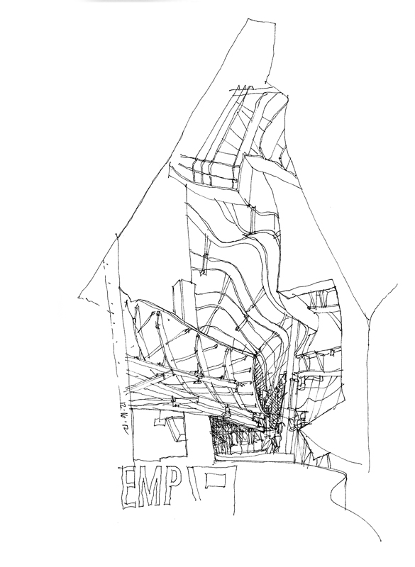
The Seattle Urban Sketchers met yesterday on a cool, rainy Sunday morning at the Experience Music Project, designed by Frank Gehry. While I may not be a fan of the design as a whole, I do appreciate the amazing spatial compositions and vignettes created by the curved steel framework and the metal and plywood sheathing.
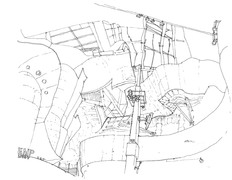
On the one hand, spaces such as this lobby of the EMP are relatively easy to draw because there are few straight lines and one need not pay too much attention to the pesky subject of perspective. On the other hand, what is often difficult is ensuring that the curvilinear surfaces do not overpower the sense of space as they hover overhead.
In this case, I started with the one measurable item I could see, the vertical column, and then worked my way from the contours of one curved surface to the next…and the next…and the next, all the time trying to maintain the spatial relationships of the major forms. The view is obviously beyond one’s normal cone of vision but it does replicate the feeling of being enveloped by the space. The only thing missing are the bright colors of the metal sheathed walls.
Barcelona!
Urban Sketchers has just announced that the 4th International Urban Sketching Symposium will take place in Barcelona, July 11–13, 2013. A beautiful setting for what looks to be an exciting event, with lots of workshops, panels and lectures.
For more information and to sign up for updates, see <www.urbansketchers.org>.
The Power of the Line
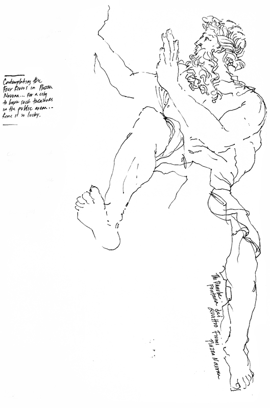
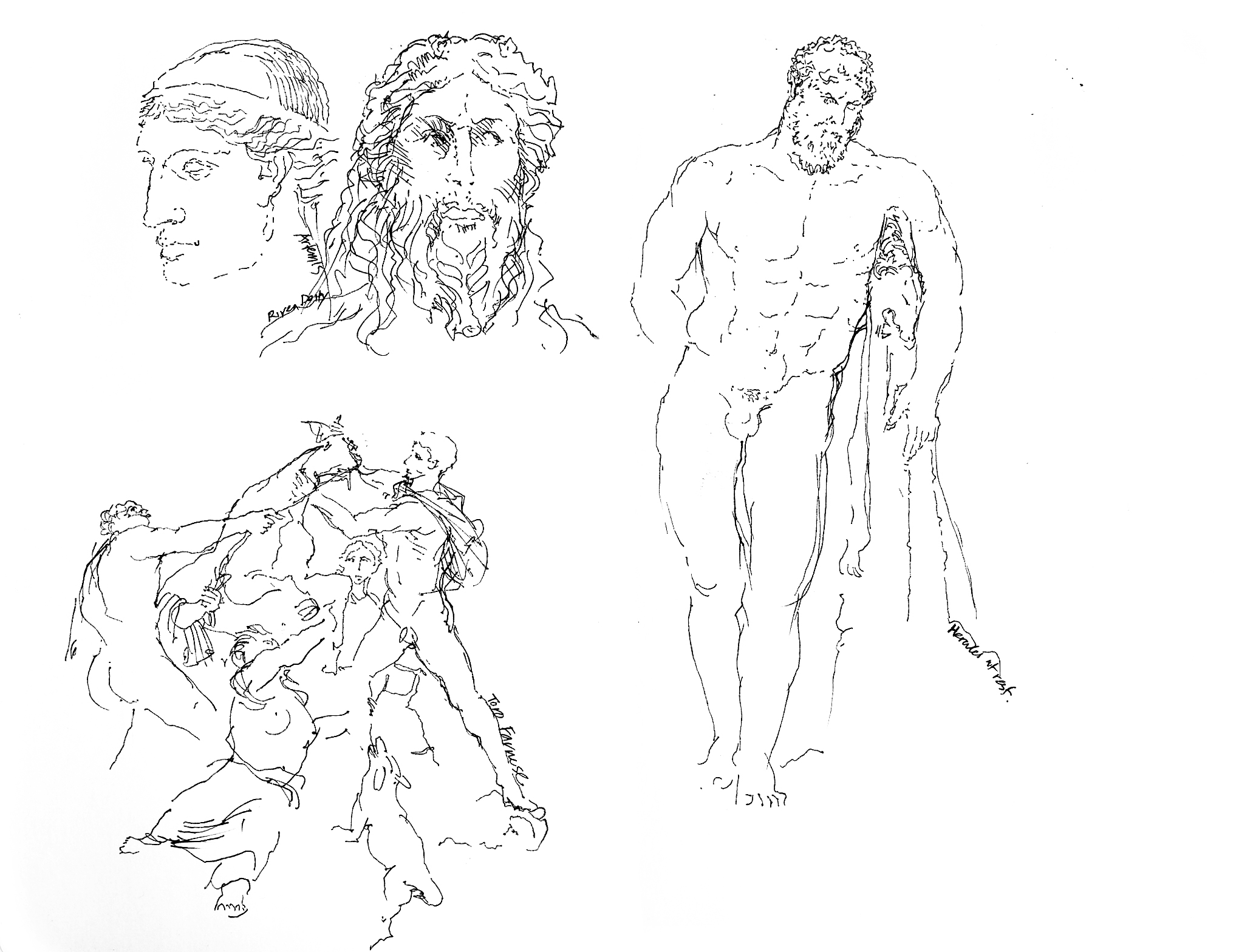
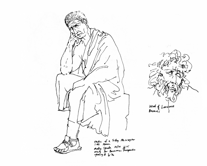
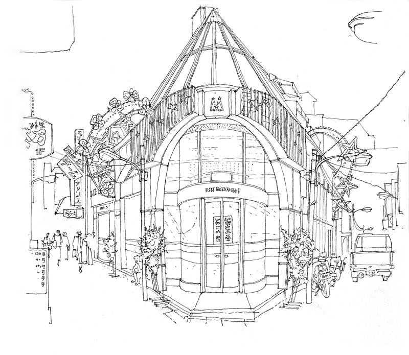
The line is the essence of drawing. It is a humble element, made simply by the tip of a pen or pencil as we move it across a receptive surface. Once drawn, a line chronicles the movement by which it was created. It can describe contour and shape, even texture.
More importantly, the line is able to convey to the mind’s eye three-dimensional forms in space, often not by its presence but rather by its absence—where we decide to stop a contour…and pick it up again.
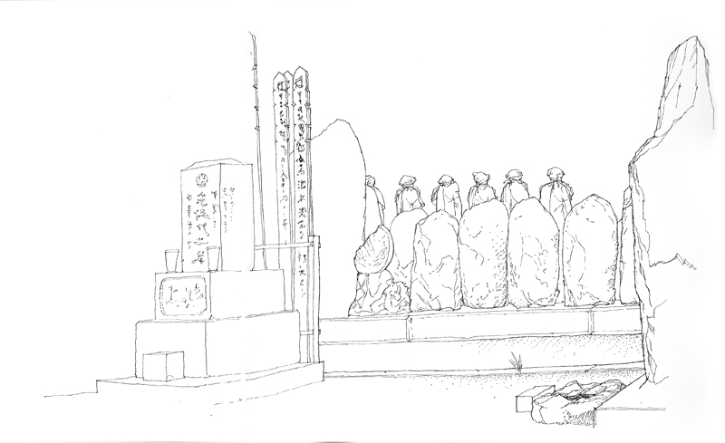
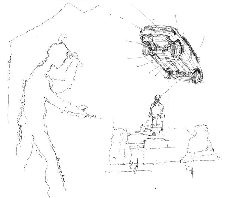
These sketches of sculptures in and around Rome and Naples are prime examples of this amazing power of drawn lines to suggest what in reality is not present on the page.
A Story to be Told
I have often dreamed of writing and illustrating a children’s book, or at a larger scale maybe even a graphic novel. Always stopping me, however, was the lack of a genuine story to be told, a narrative with emotional and intellectual content. Technique, no matter how well developed, could only carry me so far.
That is why drawing on location suits me. Instead of having to create imaginary settings and characters, I can rely on the visual stimuli derived from direct observation. Real settings that can be experienced in a straightforward manner provide the raw material for my sketches, which I can then interpret in a purely descriptive manner or alter to suit my temperament.
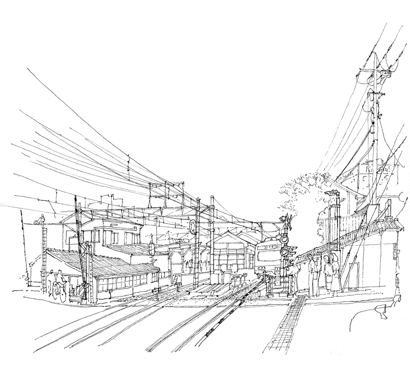
This view of the train leaving O-Okayama for Tokyo is from real life, but even when drawing from a photograph, which lacks the immediacy of drawing on location, the visual information provides a starting point for thinking about and responding in a graphic manner. It’s a matter of fiction versus reality and I imagine even a lot of fiction is based on personal experiences, perceptions, and insights.
Behind each of these sketches lies a possible story. Maybe some day, if I am fortunate enough, I will be able to knit these into a more compelling one.
Have You Ever…?
Have you ever tried deliberately to do a “bad” drawing?
A while ago, I heard an interview on the radio where a voice teacher was discussing one of her students who was having trouble with a certain range of notes. To address this issue, the teacher asked her student to first try to sing those notes badly, to make the worst sounds she could imagine! Which got me to thinking. How difficult would it be to do a deliberately “bad” drawing? And could this actually help us to draw “better”?
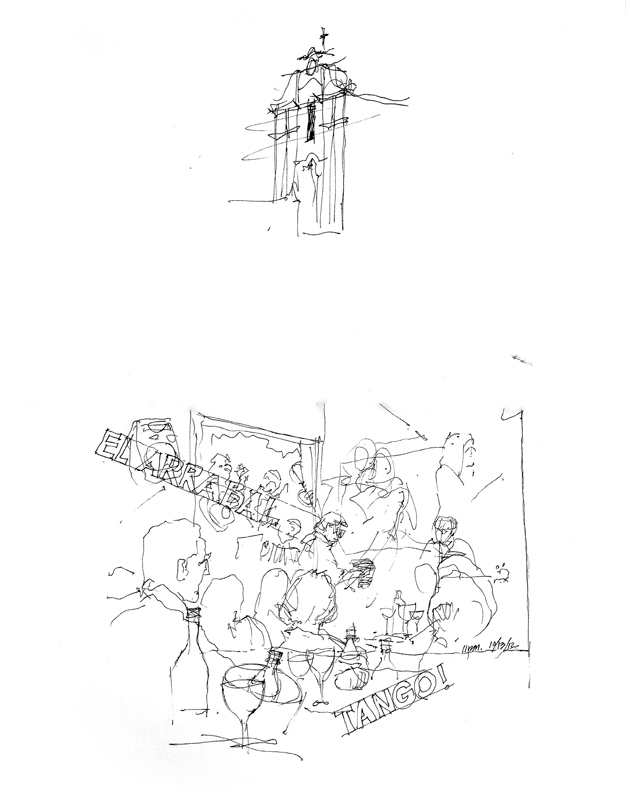
We are so used to striving to do our best that to do the opposite is almost unthinkable. It’s like drawing in the dark, as I did with this scene of a tango performance at El Arrabal in Córdoba. In times like this, one has to trust the eye and the hand, and the mind that controls both.
Happy Thanksgiving
A Fool’s Errand
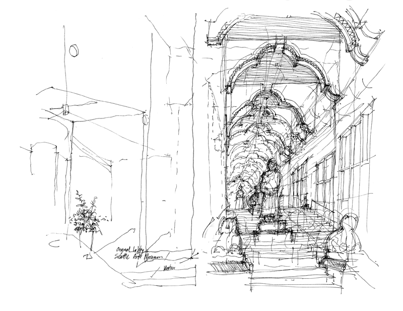
Returning from early spring in the southern hemisphere to impending winter here in Seattle, I joined the Seattle UrbanSketchers group yesterday for a sketching session at the Seattle Art Museum. What you see above, in the lower right portion of the page, is actually my second attempt at drawing the lobby of SAM, designed by Robert Venturi and Denise Scott Brown in 1991. Below is my first attempt, which I had abandoned because I was having trouble with the proportions of the statuary and the scale of the space as it moved up the stairway between First and Second Avenues. Soon after beginning the second drawing, however, I decided to return to my first attempt and continue to develop it further. You can see a lot of the initial marks as I struggled with positioning and sizing elements but in the end, I think these tentative, exploratory strokes add character to the finished drawing.
This is something I remember telling my students but sometimes forget to follow myself—it is usually a fool’s errand to keep starting over when one has difficulties with a drawing. Better to stick with the task at hand and see where the process leads.
South America
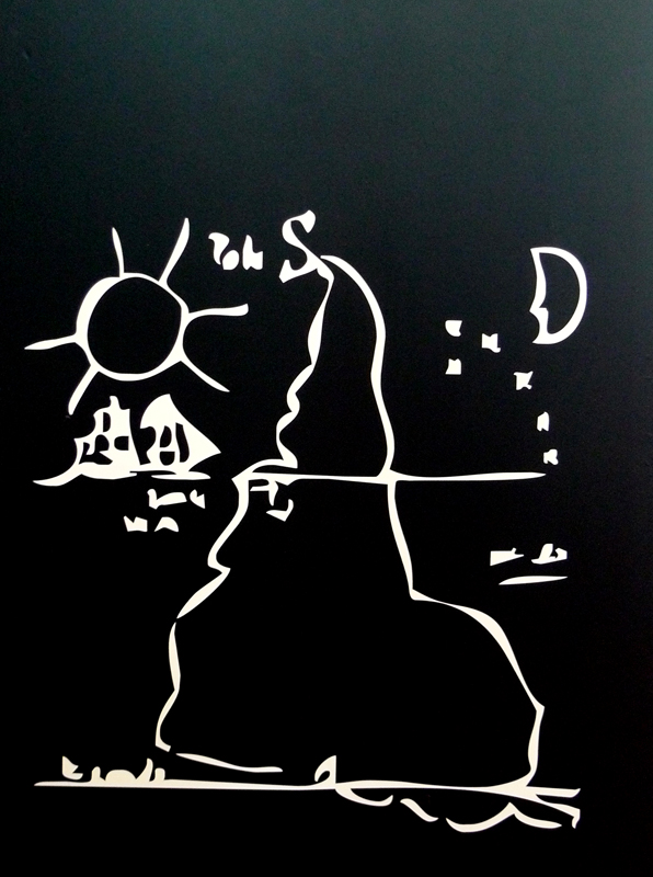
We happened on this graphic of South America during our recent visit to Universidad Nacional de Córdoba in Argentina. It figuratively turned our heads upside down. We had been so accustomed to maps of the world having north oriented up and south down. This graphic shows that there are other ways of seeing our world.
This idea of (dis)orientation manifested itself in another way on our first day in Córdoba, as we walked around the historic center with map in hand. I am usually pretty good at reading maps and orienting myself in new environments but something was amiss. It took a while but I finally realized this was because I had assumed that the sun was in the southern sky. But here in Córdoba, the sun was actually illuminating the northern sides of buildings and so what I had thought was south was actually north on the street map. And even knowing this, it remained difficult to overcome a lifetime of assumptions.
The Argentina Experience III
In each city we visited in Argentina I was asked to do a drawing demonstration. Public demonstrations always make me a little nervous but the warm reception to these made it worthwhile. The first demonstration was at Alta Gracia, where I explained my approach to selecting a viewpoint, composing the view, and beginning the drawing.
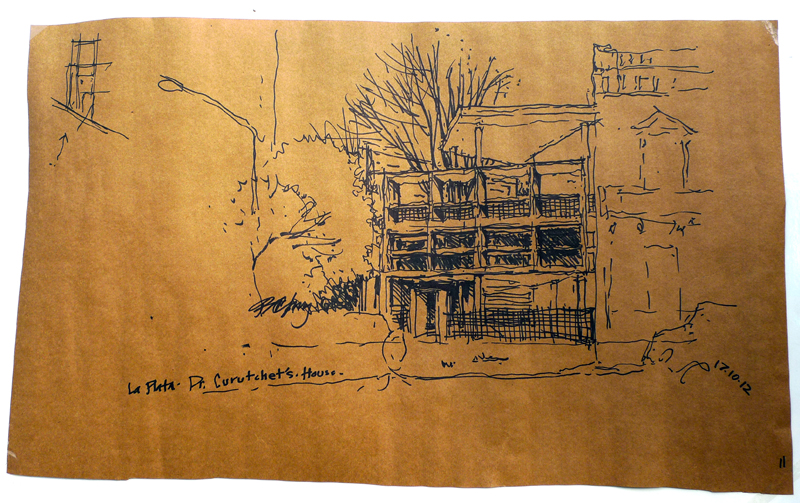
Le Corbusier’s Casa Curutchet in La Plata is an truly amazing work of architecture. Here is the demo I did of the exterior after we had toured and sketched the rich, light-filled interior spaces. It was exhilirating to see how well Le Corbusier was able to translate his Five Points of Architecture to a new continent and culture.

