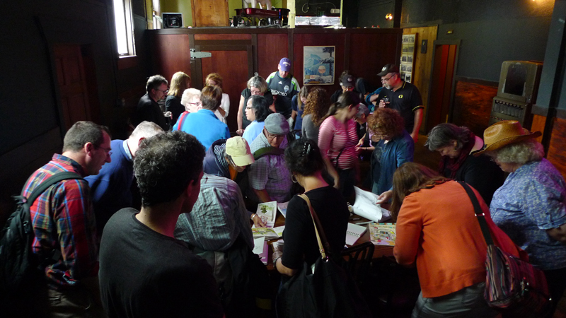
Third International Urban Sketching Symposium

Off to Santo Domingo in the Dominican Republic for the Third International Urban Sketching Symposium <http://sdq2012.urbansketchers.org/>, where I will be teaching with Liz Steel of Australia. Looking forward to the sun, walking the colonial zone, and meeting and drawing with fellow urban sketchers from around the world.

Will post some of my work when I return in a week. In the meantime, here is a sketch that I had posted on my facebook page after the symposium last year in Lisbon. In the afternoon of the first day, I drew this view, trying to convey the flow of people, trams, cars and trucks swirling around the statue of poet António Ribeiro, the “Chiado”.

Learning to Draw

In thinking about how to teach drawing more effectively and how others might better learn how to draw, I find that books are a useful companion to which one can refer early and often. There is something comforting about seeing and feeling physical drawings on a page. When a book is well written and illustrated, one can almost hear the voice of the author. But the thing that books lack is the guiding eyes and hand of a live instructor when looking out upon a scene and trying to understand how to capture whatever it is that interests us. For this, one must take classes that deliver hands-on instruction.

To help fill this gap between the printed book and hands-on instruction, I’ve been working with Nan-Ching Tai on an ebook on architectural sketching. The idea is to develop 40 or 50 focused lessons or modules that can be viewed in any order. While the text is still rough, I’ve been mocking up drafts using the Keynote presentation program, focusing on the content that consists of a combination of photographic analyses, examples of my own sketches, as well as Quicktime movies of sketches that I’ve done using the Brushes app on my iPad. Here is one such module. There’s more work to be done refining the modules, clarifying the text and captions, and adding more videos, but it’s been a fun project thus far.

ArchSkModule

Spatial Depth

One of the issues Frank B. and I had discussed in our last meeting was establishing layers of depth in a drawing, which is one of the difficulties we face when we try to convey three dimensional environments on a two-dimensional page. There are a number of depth cues that we can rely on, such as linear perspective, size perspective, and overlapping shapes. But the one I want to illustrate here uses one of the principles of atmospheric perspective to enhance spatial depth—contrasting levels of detail to distinguish near from far.

Here are three examples, each one drawing attention to a different extent or range from the viewer. The first focuses on what is near and blurs the background.

The second details the middle ground and blurs the foreground and background by drawing their outlines only.

The third drawing focuses on the Amalfi cathedral toward the rear and suggests the middle ground and foreground to establish the context.

In each case, choosing what to emphasize and then using sufficient contrast are necessary to distinguish near from middle and far.

Drawing for Lunch

Last week I met up with Frank Bettendorf, a fellow urban sketcher from Mount Vernon, and spent a few hours roaming around Fremont looking for sketching opportunities. While this was intended to be a sketching session, we ended up talking more about drawing rather than actually placing pen to paper. Frank B. had a lot of questions, and good ones too!

Having to explain my approach, the sequence in which I work, and how I make certain decisions along the way—all of these particulars made me realize how much I take for granted when I draw. It was useful to have to clarify and rationalize how I draw. Above is one of the sketches I used to explain my process.

I also recognize now that while many people might admire a finished drawing, the process by which it came to be can remain an inscrutable process, shrouded in mystery. Some of the keys I put forward are: composing the view by selecting an appropriate viewpoint; envisioning the scope of the drawing and placing it mentally on the page before laying down a line; starting strategically with a few key lines to establish the overall structure of the drawing; and thinking about how to convey the layers of spatial depth we see. This last point is probably the most important key: learning how to see.

And in exchange for spending a few delightful hours with Frank B., I got a free lunch at Tacos Guaymas! I look forward to more drawing sessions with Frank B.

Architecture for Humanity

Architecture for Humanity is “…a nonprofit organization founded in 1999 to promote architectural and design solutions to global, social, and humanitarian crises. Through design/build projects, competitions, workshops, educational forums, partnerships with aid organizations and other activities, Architecture for Humanity creates opportunities for architects and designers from around the world to help communities in need. We believe that where resources and expertise are scarce, innovative, sustainable and collaborative design can make a difference.”

I quote this because the nonprofit is currently hosting a charity auction on eBay of drawings, paintings, and other artwork by a number of designers and architects, which ends on June 29. Check it out at:

http://cgi3.ebay.com/ws/eBayISAPI.dll?ViewUserPage&userid=architectureforhumanity

Here is a sketch of the Gothic Cathedral in Barcelona that I submitted for the charity event but It is not available for online bidding since it was actually raffled off at the AIA convention in May. Even if you’re not interested in purchasing anything, the auction site is worth perusing to see some interesting work by well-known designers, all donated for a good cause.

An Introduction to Architecture

Have not been able to post this past week since I’ve been busy working on a new book project, a general introduction to architecture distilled from a number of my previous publications: Architecture: Form, Space and Order, Architectural Graphics, Building Construction Illustrated, A Global History of Architecture, A Visual Dictionary of Architecture, and Interior Design Illustrated. My co-author, James Eckler, is helping me compile an abbreviated but coherent collection of material that would introduce students to the art, science, and discipline of architecture. Still a lot more work to do but here is a sample two-page spread from the chapter on elements and systems that inform architectural design.

Rome 2000

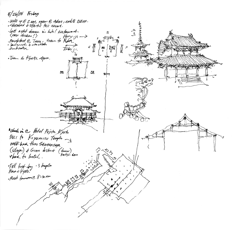
In the fall of 2000, I had the privilege of teaching in the University of Washington’s Architecture in Rome program. The scaffolding that normally covers many of Rome’s treasures for cleaning and restoration was nowhere to be seen. The Eternal City had been scrubbed and polished for the hosts of pilgrims traveling there for the Jubilee Year. Because I asked the students to keep a journal to record their quarter in Rome—on history walks, during field trips, and in the design studio—I felt obligated to do the same. And I am delighted I did. Looking back at my journals now brings back fond memories of the four times I taught there.

I remember telling the students that if a blank sketchbook was intimidating, skip a few pages, then go back and fill in the first few. Here are the first pages of my journal from 2000. The first shows the view out of my window in Apt. 6 in the Palazzo Pio, looking out onto Campo de Fiori.

The next two are sketches I did as I walked the streets and acquainted myself with the area before the students arrived and the quarter started. If you look carefully toward the bottom of each page, you will notice the very small plans  I used to remind myself of the context for the views I drew. I like to think of drawing on location not only as a mode of appreciation, but also a path to understanding and remembering.

Three Views of the Fremont Bridge

The Fremont Bridge opened in 1917 and continues to open about 30 times a day for boat traffic traversing the Ship Canal connecting Lake Union to the Puget Sound. In 1982 it was listed in the National Register of Historic Places along with the higher George Washington Memorial Bridge seen in the background. More commonly known as the Aurora Bridge, the steel cantilever-and-truss bridge carries State Route 99 across the west end of Lake Union.

This view is of the bridge as it serves as the south gateway to Fremont. The drawbridge is called a double-leaf bascule because it uses counterweights to continuously balance the two spans as they swing upward to provide clearance for the traffic passing beneath it.

Finally, we see the bridge from the Burke-Gilman Trail that passes beneath it on the north side of the Ship Canal. These three views remind us to evaluate our three-dimensional environments, especially the buildings and other artifacts of a city’s infrastructure, from different points of view.

Urban Hubs

Most major cities have one or more hubs where people gather because of the fortuitous mix of transport systems and civic, cultural, and commercial amenities. Here are views of three.

The first is of Shibuya, a center of shopping and nightlife located just outside one of Tokyo’s busiest railway stations. The bustling intersection is dominated by large video news and advertising screens and a sea of people using the “scramble” mode to cross in every direction at the same time while all vehicular traffic is stopped.

The second is of Times Square in the entertainment and Broadway theater district of midtown Manhattan. Again, the brightly lit environment is dominated by the gathering mass of people at ground level and the visual onslaught of oversized electronic billboards.

The third is of the Pike Place Market in Seattle. Though not of the scale of Shibuya and Times Square, this market entrance still serves as an iconic attraction for both Seattleites and visitors from abroad. In each case, it is not the architecture of individual buildings but rather the urban spaces created by the architecture and the overhead visuals that make these attractive urban hubs.

Looking Askance

This unusual phrase came to mind the other day when thinking about how to describe how I view a scene, both in real life and in its graphic form in a drawing. While “looking askance” currently connotes viewing with envy, suspicion, or even contempt, I would apply its more literal meaning—to look obliquely, with a side glance.

In preparing to draw, I often find myself taking a sideways glance at a scene. This slightly off-center view of things gives me a better sense of value patterns and compositional possibilities. Something similar is occuring, I think, when you see someone with their head turned or cocked slightly in evaluating a drawing or painting. I can’t fully explain how or why this happens, but someone more knowledgeable about the human eye and our optical system could provide a physiological reason. Perhaps a sideways glance uses not the cone cells required for our visual acuity but rather the rod cells, which are responsible for black-and-white vision and our peripheral view of the world.

Related to this is how I try to look at my own work-in-progress with “fresh eyes.” When we know what it is that we are drawing, we can often fool ourselves that others will see it in the same way as we do. But to see our own work the way others might, it can be helpful to turn a drawing upside down or sideways, or view it through a mirror. Doing this forces us to see in a new way the purely graphical aspects of our drawing or painting without our knowledge of the subject influencing our self-critique.