Deciding What to Draw (And What to Omit)

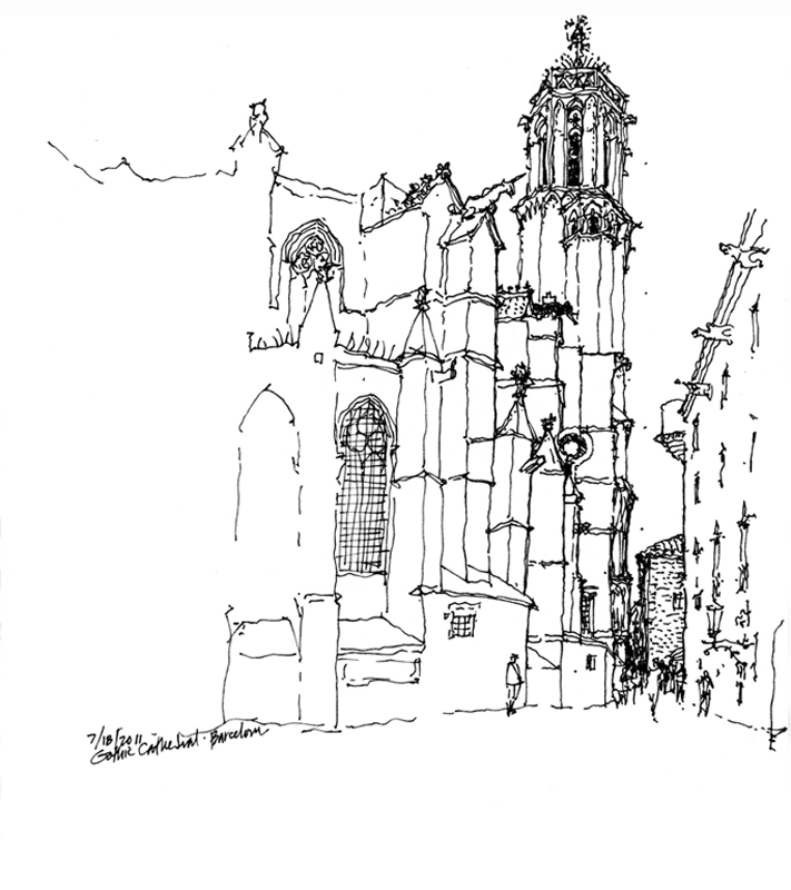
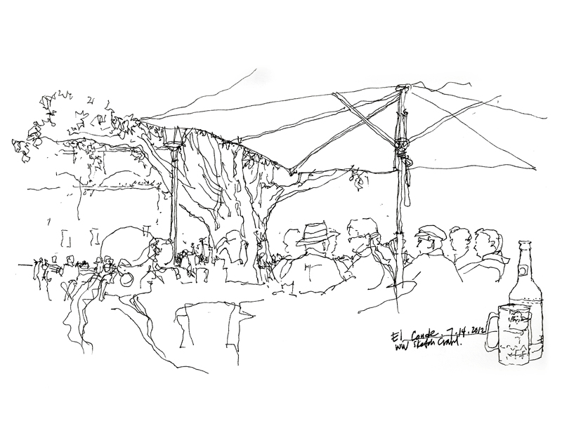
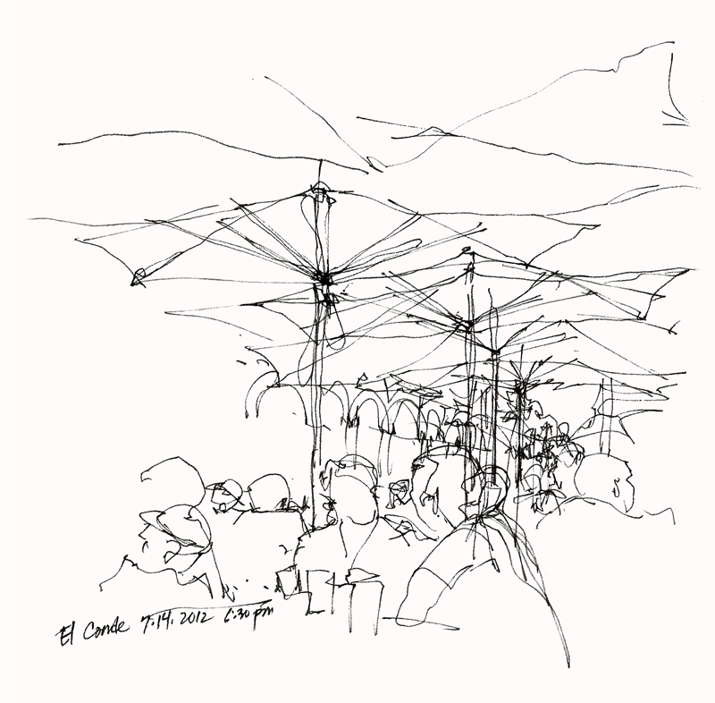
On the same trip to Europe during which I had sketched the Bruges rooftops, my family and I visited London, Paris and points south. I didn’t have a lot of free time but I managed to fit in a few sketches. Looking back at these drawings, I find them to be looser than the pristine contour drawings I had been doing on previous travels.

The quicker technique was no doubt a result of the limited time I had to sketch but another key to saving time was deliberately leaving out parts of the scenes before me. What I’ve come to realize is that deciding what not to draw is as important as choosing what to include. Omitting parts of a scene leads the eye, focuses attention, and allows the imagination of those viewing the drawing to complete the image in their mind’s eye.

Bruge Rooftops


I’m resurrecting this from my Facebook posting of March 12, 2010, which has mysteriously vanished into the ether. This is a whimsical sheet that I composed in Bruges, Belgium, back in 1999. Being attracted to the variety of features that crowned the rooftop gables in the historic city center, I started the page with dotted lines to suggest a sheet of stamps. As I began, I also decided to incorporate numbers into the composition of each image, like the monetary values of postage stamps. An example of how we sometimes draw for the sheer enjoyment of the experience.

Carnegie Free Public Libraries

Andrew Carnegie (1835–1919) was a Scottish-American industrialist who devoted much of the later part of his life as a philanthropist, primarily through grants for the construction of over 2500 libraries in the United States and around the world. Carnegie believed in giving to the “industrious and ambitious; not those who need everything done for them, but those who, being most anxious and able to help themselves, deserve and will be benefited by help from others.” The first of the Carnegie libraries in the U.S. was built in 1889 in Braddock, Pennsylvania, home to one of Carnegie’s steel mills.

This Carnegie Free Public Library in Ballard was built in 1904 through a $15,000 grant provided by the Carnegie Library Program. Designed by Henderson Ryan, the Classic Revival structure featured radiating stacks, an auditorium, a men’s smoking room, and a women’s conversation room. The Ballard Chain Gang (!) did the landscaping under police supervision. When the city of Seattle annexed Ballard in 1907, the library became the first major branch of The Seattle Public Library.

The library was officially closed in June 1963 when a new, larger public library was built in the area. Since its closure, the library building has been used for a variety of private commercial enterprises. Seattle architect Larry E. Johnson nominated the library for recognition in 1976, and in 1979 it was listed on the National Register of Historic Places.

Contour Drawing

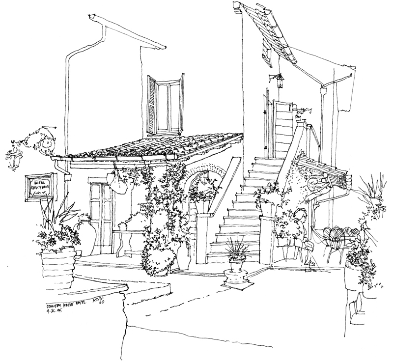
In 1995, my wife and I left the kids behind to travel to Italy, working our way from Varenna on Lake Como to Florence, Cinque Terra, Siena, San Gimignano and Assissi. We had intended to also spend some time in Rome but we found Assissi to be such a spiritually relaxing place that we decided to spend our last few days in Italy at this country house just outside the city walls.

Continuing to employ the contour drawing style I had used in Japan, I made generous use of white space to imply the foreground and draw attention to the main house beyond. Contour drawing requires working from part to part and seeing how shapes and details fit into a larger pattern. Because I was drawing with a fountain pen, I used dots to help me visualize the placement of the image on the page and to work out the roof forms before I started drawing the contours.

It is interesting that later, in teaching drawing, I advocate a more structural approach based on analysing geometric forms and their spatial relationships. As the years go by, I find myself using a combination of the two approaches, as seen in these studies of the Pantheon done a few years later.

Studies of a Japanese Folk House

Another example of drawing from the imagination while on location. In this case, I was intrigued by the tectonic qualities of this Gassho-zukuri style house in the Hida Folk Village (Kida-no-Sato) just outside of Takayama. While walking through the interior spaces and visualizing a section cut through the structure, I drew the timber framing for the floors and the steep thatched roof and noted the way members were tied and braced. In this way, I was able to better understand and remember how material, structure, and construction came together to shape the architectural qualities of the spaces.

On the same page you can also see studies of the scale of the space created by the overhanging thatched roof along the eaves as well as sketches of types of traditional Japanese storehouses that I had observed.

These are all examples of how drawing from observation (on location) can serve as a springboard for drawing from the imagination (in design).

Drawing Conceptual Views

On a visit to the New Territories, we stopped at this walled Tang village, featuring a hierarchical grid layout, as well as examples of traditional ancestral halls, which have similar grid layouts organized by masonry and timber structural systems—seemingly simple yet capable of such spatial richness.

When drawing from observation, we can capture not only what the eye perceives but also what the mind conceives. We can use the drawing process to think about, visualize, and explore in imagined and imaginary ways the conceptual basis for the environments we see and experience. In this case, simple plan diagrams of the structural and spatial layout along with side views of the gable-roofed portions help us first to understand, then remember, and finallly convey the three-dimensional attributes of the ancestral halls.

My Ancestral Village

In 1993, accompanied by Dr. Ho Puay Peng of the Chinese University of Hong Kong, I took a ferry to Zhongsan Harbor and then a taxi to Nam Bin, my ancestral village near Sun Yat-Sen’s home village of Cuiheng in Guangzhou prefecture. There I met Ching Yoon In—our grandfathers were brothers who both emigrated to Hawaii. Being the older of the two, his grandfather had to return to China to take care of our common great grandfather while mine remained in Hawaii. Yoon is about the same age as me and when he told me this story, I immediately thought that if our grandfathers’ birth order were reversed, I could have been standing in his shoes and he in mine. To help me make sense of how Yoon and I were related, I drew this diagram. You can also see other small sketches of our ancestral gravesite, Yoon’s sister’s house, and a tower-house, a typical defensive structure built with overseas money in the 1920s.

Sketches from China

After Japan, the next travel opportunity I had was at the invitation of Tunney Lee, chair of the newly founded School of Architecture at the Chinese University of Hong Kong. Before arriving in Hong Kong in 1993, however, I made brief stops in Beijing and Nanjing. In the journal I kept for these visits, I wrote more of my day-to-day experiences, something I regretfully did not do in Japan. You can see a portion of my writing to the left of these small sketches I did as we flew into Beijing and drove into the city.

While in Beijing, one has to, of course, visit the Great Wall, the Ming Tombs, the Forbidden City, and the Temple of Heaven, all monuments of impressive scope and scale.

While thirteen of the Ming Tombs are near Beijing, one is outside Nanjing—Mingxiaoling Tomb (tomb of the founder of the Ming Dynasty). I used this small, pictorial diagram to remember the configuration of the path and the Spirit Way (Shen Dao) leading to the tomb.

In contrast to this small diagram, the expansive view often tempts us. In Hong Kong, this would be the Hong Kong Central skyline as seen from Kowloon.

Storyboarding

Before I began using a computer in the early 1990’s to design and layout my books—before Aldus Pagemaker, QuarkXPress, and Adobe InDesign—I produced camera-ready pages by hand using white bond paper, a Scripto pencil with 1.1 mm leads, and a couple of drafting triangles. Later, I switched to Clearprint paper and 0.3 and 0.5 mm lead pencils but the hand-lettering and hand-drawing process remained essentially the same.

For me, the way a book is laid out and organized is an essential part of the message and so I often storyboarded my ideas before developing the final pages. Here is a sample storyboard for Drawing: A Creative Process. Even though the content and layout often changed as ideas were refined with lots of yellow trace overlays, storyboarding was an essential step in the book design process.

The beginning phase is always the most exciting time for a book project, involving floating a lot of ideas and experiencing false starts as well as a lot of trials and numerous errors, but once the basic structure of a book’s organization is established in outline form, the real and time-consuming work of production begins. And for that, I am happy to be able to use Adobe InDesign and the Tekton font.

Sensoji Temple

Another drawing from my Japan sketchbook, this time of the Hozomon, a two-story gate leading to the courtyard of Sensoji Temple in the Asakusa district of Tokyo. Next to it I’ve placed a photo of Ando Hiroshige’s woodblock print, Kinryusan Temple at Asakusa, from his One Hundred Famous Views of Edo (1856). Different media but similar points of view, executed a hundred and thirty-six years apart. Hiroshige’s print is particularly interesting for his use of one-point perspective.